Aqua 2021 - 2020
References
Aqua mission status and imagery in the period 2021-2020
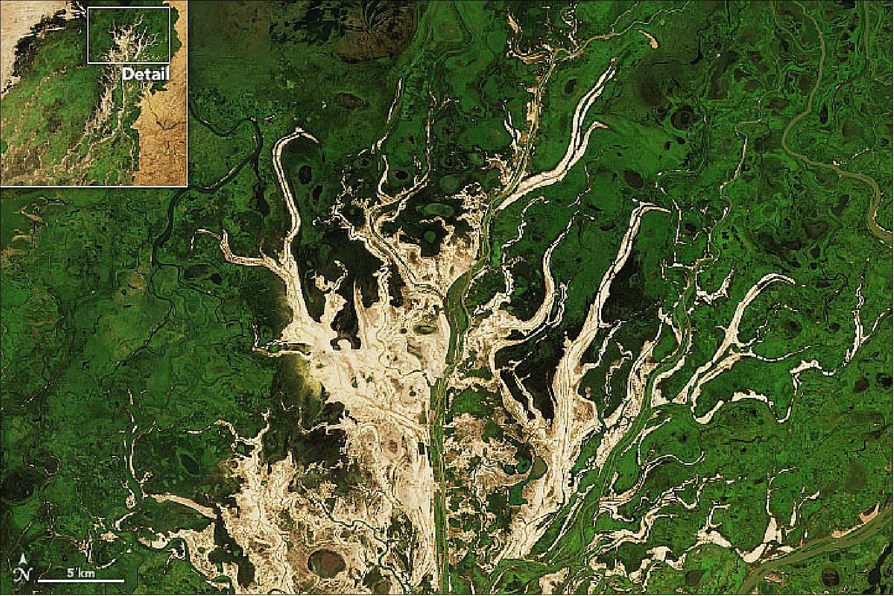
• November 28, 2021: It is one of the world’s most productive wetlands, even though it is mostly dry for nearly half of each year. Depending on the abundance and timing of rainfall upstream, the inland delta of the Niger River in Mali typically floods with water from roughly August to December. The result is a seasonal burst of green vegetation at the intersection of the Sahara Desert and the Sahel. 1)
- Inland deltas generally occur where rivers split and branch out across inland depressions, valleys, or former lake beds, often in arid areas. According to geomorphologist and NASA Earth scientist Justin Wilkinson, there are at least 86 inland deltas—sometimes referred to as megafans—spread across Africa. The Inland Niger Delta is the largest in western Africa.
- The waters that bathe this delta originate in the Guinea Highlands, where wet season rains usually start to fall in July and then wind their way northeast into Mali on the Niger River. Upon reaching the southern reaches of the Inland Niger Delta, the waters spread out across floodplains and swamps full of reeds and wetland grasses (particularly bourgou). The northern portion of the delta is full of branching sand ridges and drying stream channels that emerge from the wetlands as the season progresses.

- The Niger River runs more than 500 km (300 miles) across the flatlands and channels of the inland delta before merging again and continuing into Niger, Benin, and Nigeria. By the time the seasonal pulses of river water reach the northeast part of the delta, water levels are usually dropping in the southwestern part. Wilkinson added that the greenup occurs in the “active lobe” of the megafan delta, which is actually twice as large as the area shown.
- Birds, fish, and other wildlife flock to this area in the flood season, including West African manatees. At least one million people draw a livelihood from the inland delta through fishing, rice farming, and livestock herding and grazing.
• November 18, 2021: Every November, satellites detect large plumes of smoke and heightened fire activity in northwestern India as farmers burn off excess paddy straw after the rice harvest. Many farmers, particularly in the states of Punjab and Haryana, use fire as a fast, cheap way to clean up and fertilize fields before planting winter wheat crops. However, the surge of fires in the heart of the densely populated Indo-Gangetic Plain often contributes to a sharp deterioration of air quality in November and December. 2)
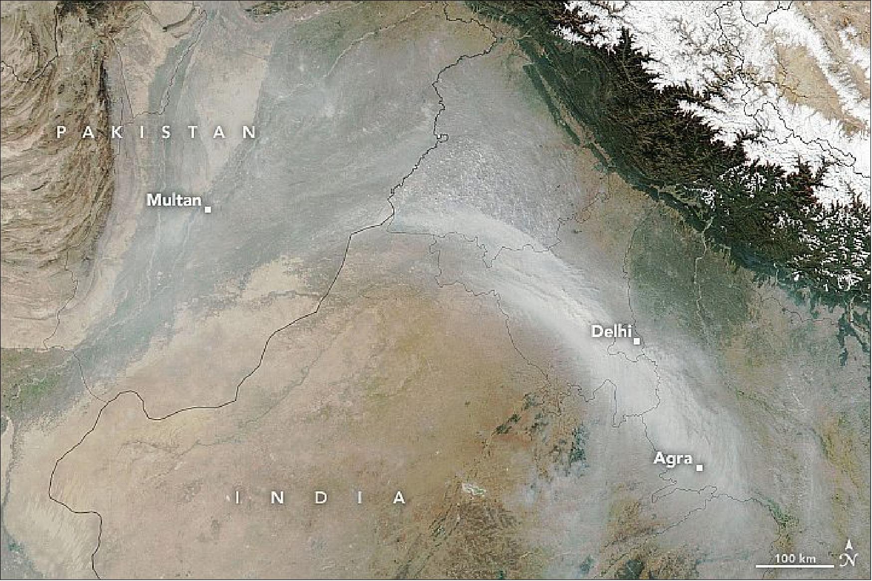
- Though lingering monsoon rains this year kept fire activity at low levels for a few weeks longer than usual, satellites observed elevated fire activity in November as the pace of burning accelerated.
- “Looking at the size of the plume on November 11 and the population density in this area, I would say that a conservative estimate is that at least 22 million people were affected by smoke on this one day,” said Pawan Gupta, a Universities Space Research Association (USRA) scientist at NASA’s Marshall Space Flight Center.
- As in years past, sensors in Delhi and elsewhere in northern India have recorded soaring levels of air pollution. Sensors in the capital area—including one at the U.S. Embassy—recorded concentrations of fine particulate matter (PM2.5) and coarse particulate matter (PM10) well above 400 micrograms per cubic meter on several occasions in November. Since particulate matter is linked to a range of respiratory, cardiovascular, and other health problems, World Health Organization guidelines recommend that 24-hour mean PM2.5 concentrations be kept below 15 micrograms per cubic meter. The high pollution levels led to partial lockdowns, school closures, and halts in construction in Delhi and other cities.
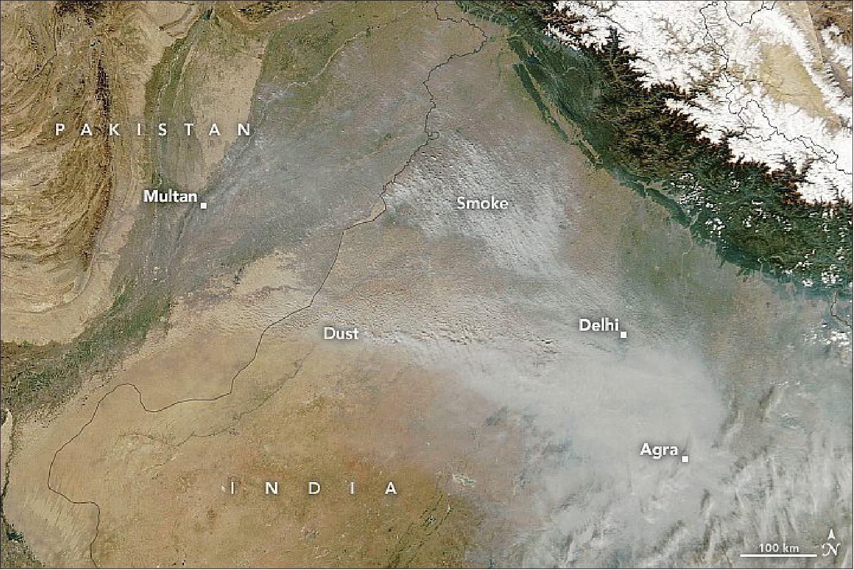
- Geography and weather also exacerbate the region’s air quality problems. Temperature inversions are common in November and December as air rolls off the Tibetan Plateau and mixes with smoky air from the Indo-Gangetic plain. An inversion can function like a lid, with the warm air trapping pollutants near the surface and helping hem pollutants in between the Himalayan Mountains to the north and the Vindhya Mountains to the south.
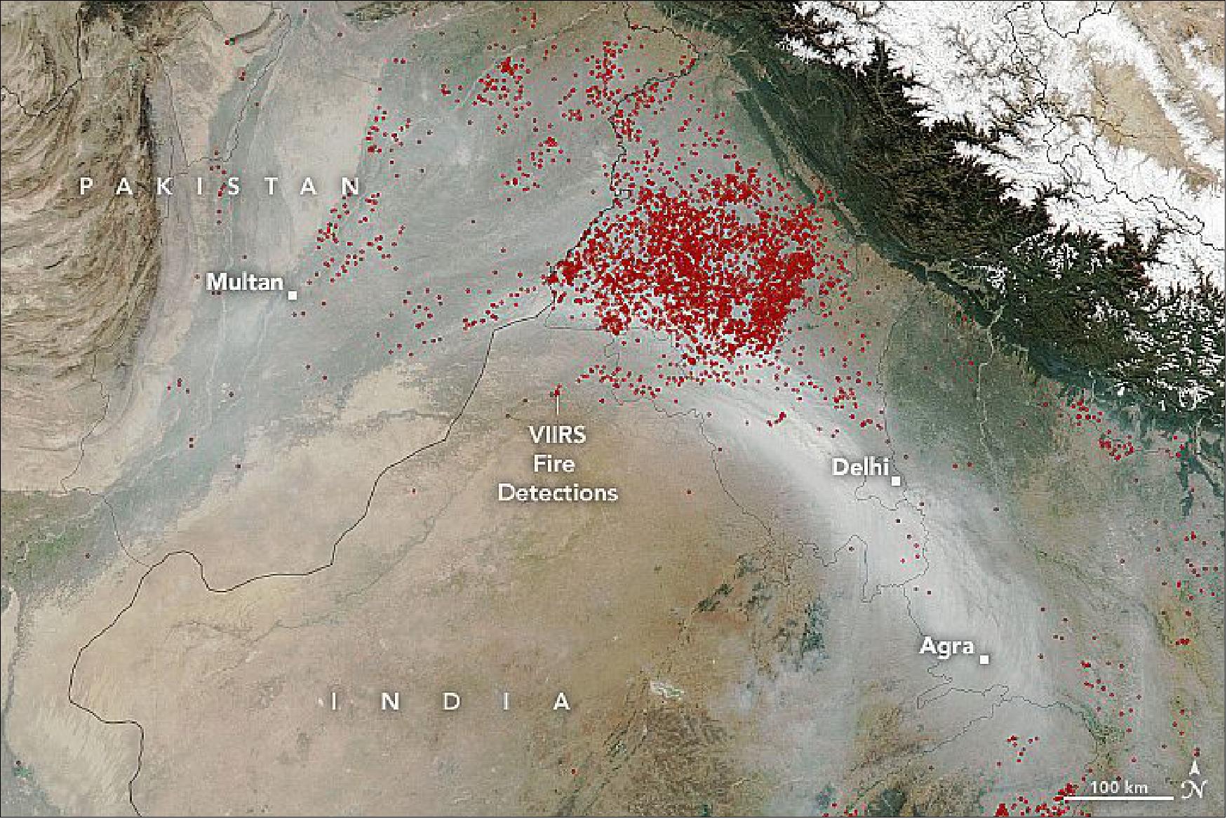
- Hiren Jethva, a Universities Space Research Association (USRA) scientist based at NASA’s Goddard Space Flight Center, uses measures of the “greenness,” or Normalized Difference Vegetation Index (NDVI) to anticipate fire activity each year. The data he uses comes from the Moderate Resolution Imaging Spectroradiometer (MODIS) on NASA’s Aqua satellite.
- “Earlier in the summer, we saw one of the largest NDVI values in the 20-plus year record. Based on that, I predicted this would be one of the most active fire seasons on record, and that is exactly what we have seen,” said Jethva. “We still have a few weeks of burning to go, but already Aqua MODIS has detected more than 17,000 hotspots in Punjab and Haryana—making this the most active fire season on record.” Aqua MODIS began collecting data in 2002.
- The Visible Infrared Imaging Radiometer Suite (VIIRS) sensor makes similar measurements, but it can detect many small and low-temperature hotspots that MODIS misses. As of November 16, VIIRS had detected more than 74,000 hotspots in Punjab. “That’s approaching the nearly 85,000 the sensor detected in 2016, the most active year in the VIIRS record,” said Gupta.
- While total fire counts have remained consistently high in Punjab, satellite data indicate that campaigns to get farmers to clear fields without using fire have proven more successful in Haryana. “Over nine years of VIIRS observation, we don’t see much of a trend in Punjab. However, in Haryana, we saw a 45 percent decrease in the total number of fires in 2020 compared to the 2012-2019 average,” Gupta added. “But fire counts seem to be on the higher end in Haryana again this year.”
• November 17, 2021: As global agriculture scales up over the next century to meet the needs of growing populations, it is likely that atmospheric ammonia (NH3) emissions will rise, too. Ammonia is naturally emitted by soils and vegetation fires, but most of it is added to the atmosphere by humans through agricultural activities such as fertilizer use and livestock ranching. When present in excess amounts in an ecosystem, ammonia can make soils more acidic and hinder plant growth. As an air pollutant, it can provoke heart- and lung-related illness. 3)
- In a new NASA-led study, scientists examined changing atmospheric ammonia concentrations over Africa, where human populations are predicted to double by 2050. In many African countries, governments are promoting fertilizer use to increase food production. In addition, the burning of living or dead trees and plants (biomass burning) is common in Africa; by one estimate, as much as 70 percent of the planet’s burned area each year occurs on the vast continent. It is an important area for examining ammonia on both a regional and global scale.
- Using satellite data from the European Space Agency’s Infrared Atmospheric Sounding Interferometer (IASI), a team led by Jonathan Hickman of Columbia University and NASA’s Goddard Institute for Space Studies identified increases and decreases in ammonia concentrations across Africa between 2008 and 2018. They also identified some likely causes of those changes.
- “We have shown here that we can use satellite data to observe trends and monitor emissions of ammonia in specific regions, linked to specific activities or environmental events,” said Enrico Dammers, a scientist at the Netherlands Organization for Applied Scientific Research and a co-author of the paper.
- The researchers found “multiple distinct stories about how air quality changes in response to growing agricultural activity across Africa,” said Hickman, the principal investigator. For instance, in West Africa, the end of the dry season and the peak in biomass burning corresponded with increases in atmospheric ammonia concentrations over the study period. Previous studies had attributed rising ammonia levels here to fertilizer use. However, Hickman and Dammers found that NH3 pollution increased most when farmers were preparing their land by burning it, yet before they started adding fertilizer.
- In the Lake Victoria region, the expansion of farming led to increased fertilizer use. The IASI data (on EUMETSAT's MetOp-A) indicated that much of the growth in ammonia concentrations in this region could be linked to areas where farmers were applying more fertilizer on both new and existing agricultural land.
- In South Sudan, a 30,000 km2 wetland fed by the Nile River—called the Sudd—was the only region that showed a clear decrease in atmospheric NH3 over the study period. About half of the Sudd is permanently flooded, while the other half is a floodplain that may or may not flood depending on how wet the year is. The researchers found that in drier years, when a larger portion of the wetlands dried up, ammonia concentrations increased. As the soil dried, it naturally emitted ammonia. In wetter years, ammonia concentrations were lower.
- As Africans expand agricultural production in coming years, many areas could see higher concentrations of atmospheric ammonia. Similar trends have already played out across the globe. “Satellite analyses can help start to bridge the monitoring gap, providing early analyses of how changes in agriculture and other sources of ammonia are affecting the atmosphere,” Hickman said.
- “These results are important to keep in mind as the world experiences a growing population and huge challenges with food security,” Hickman added. “Understanding how human-made and natural ammonia emission sources are changing is important for ensuring policies and technologies that promote sustainable agricultural development.”

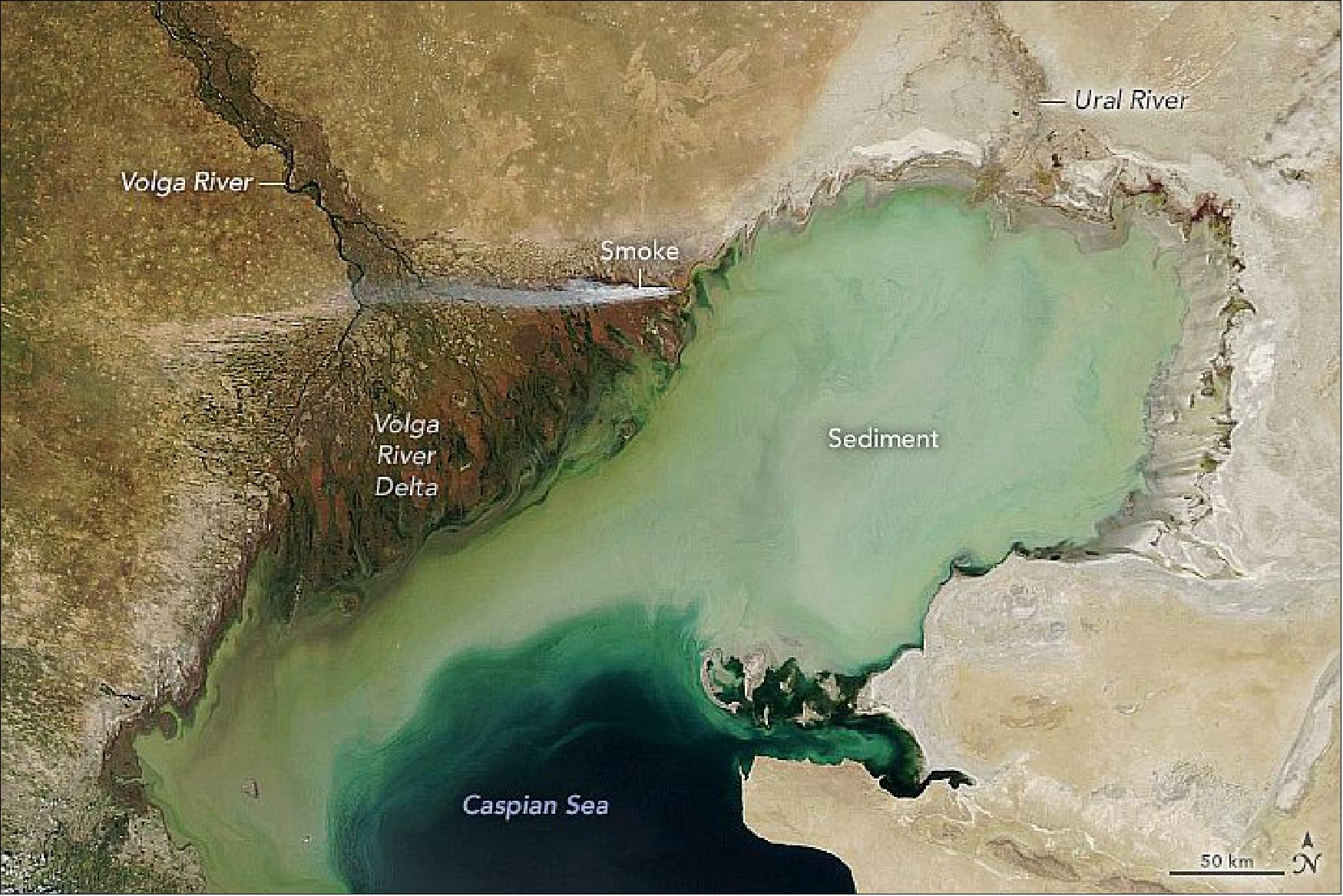
• November 6, 2021: In many parts of the world, sea levels are rising due to global warming. But scientists note that warming and increased evaporation are likely to play out differently for inland seas and lakes. 5)
- By one estimate, Caspian water levels could drop by 9 to 18 meters (30 to 59 feet) by the end of the 21st century, enough that it would lose about a quarter of its area and uncover about 93,000 km2 (36,000 square miles) of dry land. That is an area about as large as Portugal.
- Much of the new land would come from the northern Caspian, a shallow zone that holds just 1 percent of the lake’s volume and has an average depth of 5 to 6 meters (16 to 19 feet). For comparison, the deepest parts of the lake stretch down more than 1,000 meters below sea level. The MODIS instrument on NASA’s Aqua satellite acquired this natural-color image of the northern Caspian on July 17, 2021 (Figure 7). Suspended sediment delivered by the inflowing Volga and Ural rivers had discolored the waters in the northern part of the lake, while winds may have also stirred up sediment.
- Losing the northern part of the Caspian could have major ecological consequences. Its shallow waters teem with mollusks, crustaceans, fish, and birds. Seals raise their pups on winter ice that usually only forms in this part of the lake. “Current protected areas in the Caspian Sea, most of which cover coastal ecosystems including highly coveted wetlands such as the Volga Delta and other Ramsar sites (wetlands of international importance named after the Caspian coastal city of Ramsar, Iran) will be transformed beyond recognition,” a group of European scientists wrote in Communications Earth & Environment.
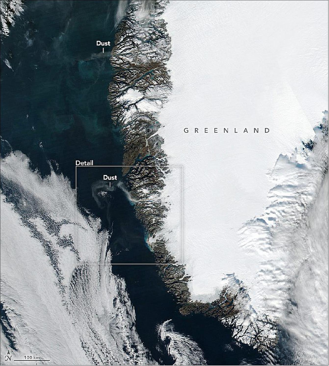
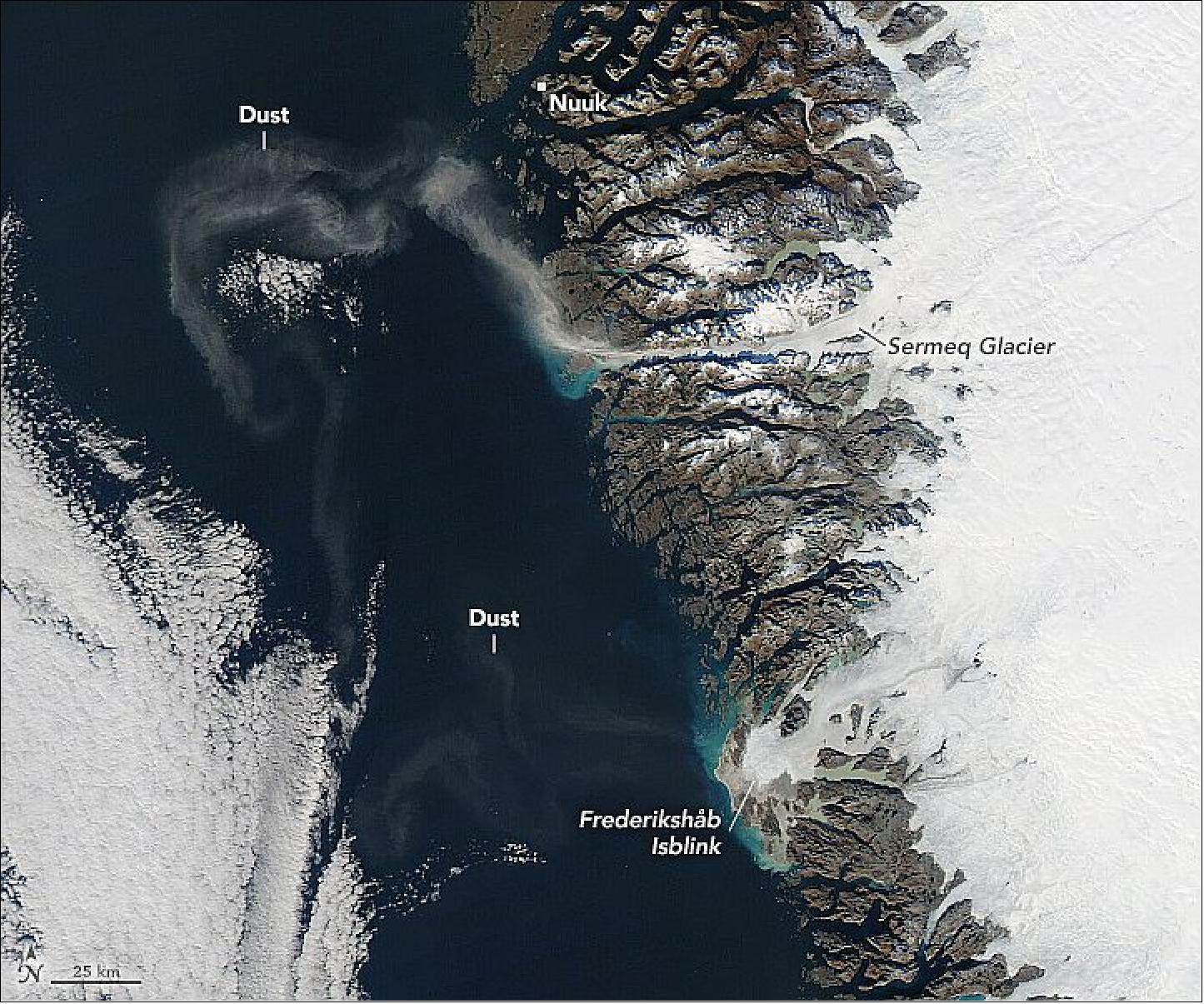
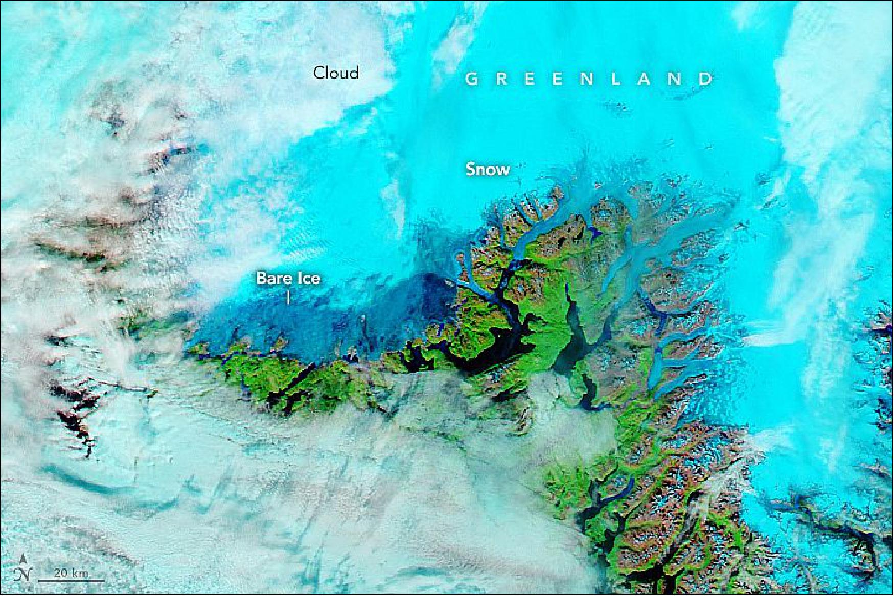
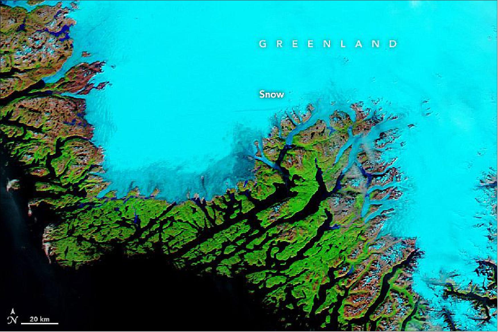
• October 27, 2021: Nearly 80 percent of Greenland—the planet’s largest island—is covered by ice. But signs of autumn still show up on the landscape, especially along the island’s ice-free coastal areas. In addition to colorful changes in the Arctic tundra, large dust storms can arise at this time of year. 6)
- According to NASA remote sensing scientist Santiago Gassó, large plumes like these are most common during the transition from summer to winter. In summer, rapidly moving streams and rivers carry meltwater away from the ice sheet and toward the ocean. By autumn, cooler temperatures cause melting to slow and rivers to recede, exposing large playas of glacial silt.
- Even when silt is exposed at the surface, you still need strong winds to produce the plumes. Unlike dust from the Sahara—where convection can loft dust high into the atmosphere—the dust in these images stayed relatively low—Gassó estimated no higher than 1 to 2 kilometers in altitude.
- Still the winds that are channeled through Greenland’s glacial valleys can produce strong gusts and carry dust hundreds of kilometers in a day. “This dust could get carried very far from the coast, potentially bringing nutrients to areas where nutrients are not easy to come by,” Gassó said.
- The dust can also deliver nutrients locally. A study in 2021 showed that dust lofted from Greenland can provide mineral phosphorus that supports blooms of ice algae. Like soot or dust particles, algae can darken the ice, which lowers its albedo and hastens melting. 7)
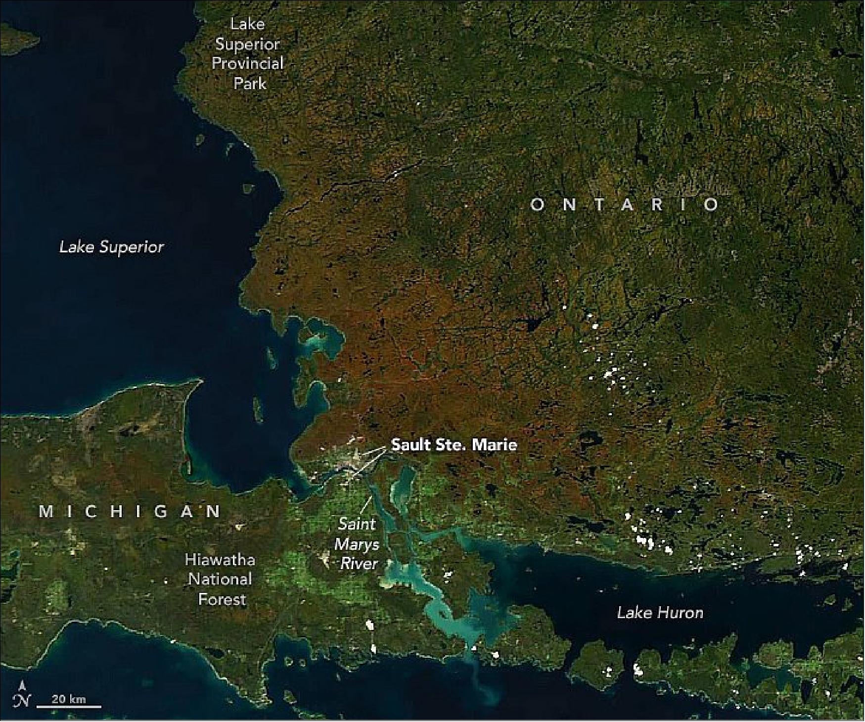
• October 11, 2021: The region around Sault Ste. Marie is steeped in history. Native peoples have lived and fished here for at least 2,000 years. French missionaries and fur traders arrived in the 1600s, and soon after the city of Sault Ste. Marie was established—the first city in North America’s Great Lakes region. After the War of 1812, the city was split into two—one part in the U.S. state of Michigan and the other in the Canadian province of Ontario. 8)
- Sault Ste. Marie is routinely included on lists of the best places to view the changing foliage. So far, autumn 2021 is supporting that claim. According to news reports, the summer weather in the area was warmer and wetter than usual, but not overly so. The favorable conditions led to healthy, unstressed trees capable of displaying vibrant color.
- Fall color reaches its peak when air temperatures drop and shortened daylight triggers plants to slow and stop the production of chlorophyll—the molecule that plants use to synthesize food. When the green chlorophyll pigment fades, various yellow and red pigments become visible.
- For a closer look at the foliage, leaf peepers in Sault Ste. Marie, Ontario, could find color around the city, on a scenic drive north along the shore of Lake Superior, or via train through the Agawa Canyon. An Ontario Parks website provides updates on the status of leaves across this area; many trees were already peaking in the first week of October.
- Leaf peepers in Sault Ste. Marie, Michigan, had to wait a bit longer. Peak color tends to reach Michigan’s eastern Upper Peninsula as late as the second week of October. The trails and overlooks in Hiawatha National Forest offer plenty of access to view the arboreal display.
- The color, however, can leave faster than it arrived. Experts warn that once color has peaked the leaves can quickly turn brown and blow away with a decent gust of wind. But if history is any indication, the symphony of colors should return next year.
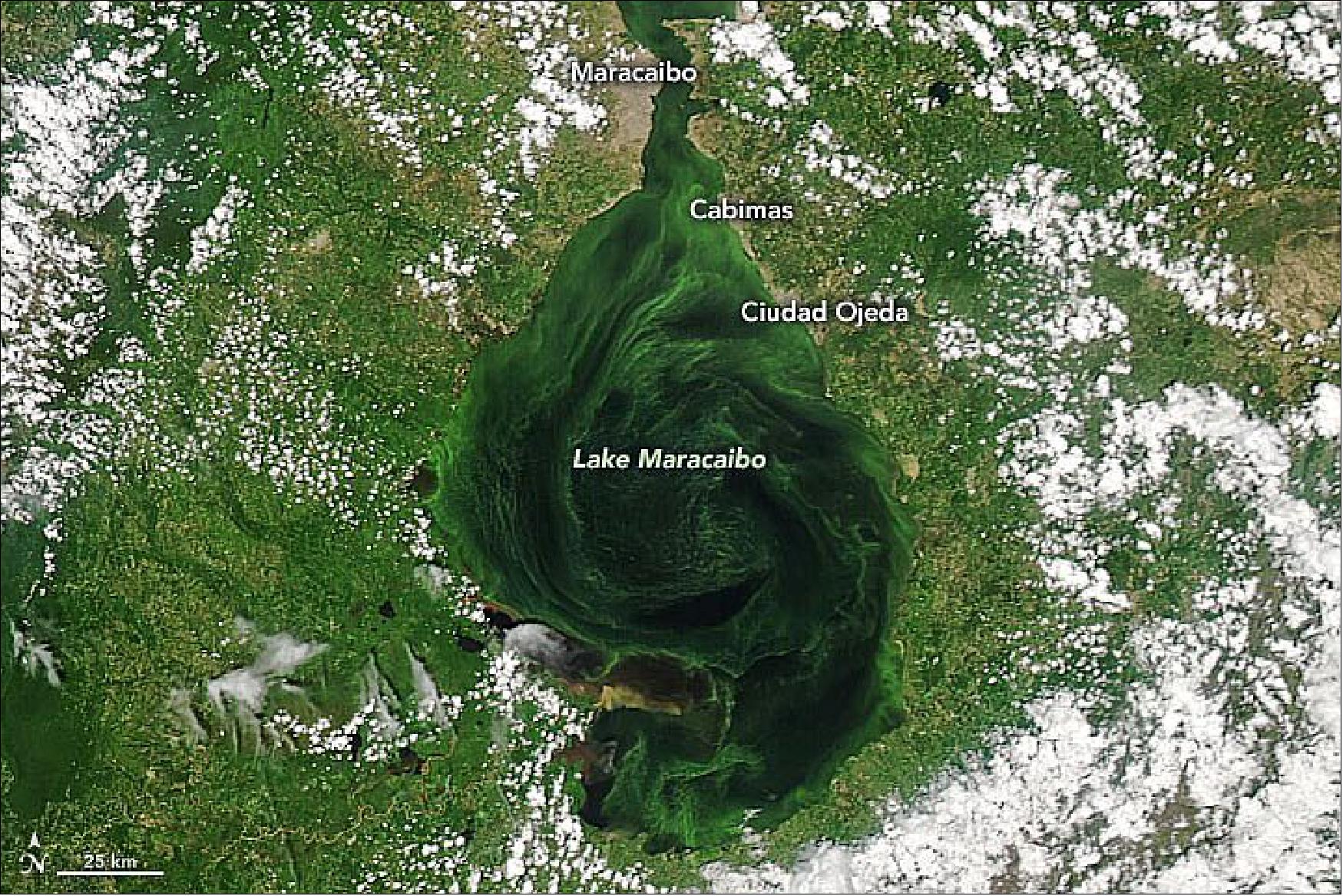
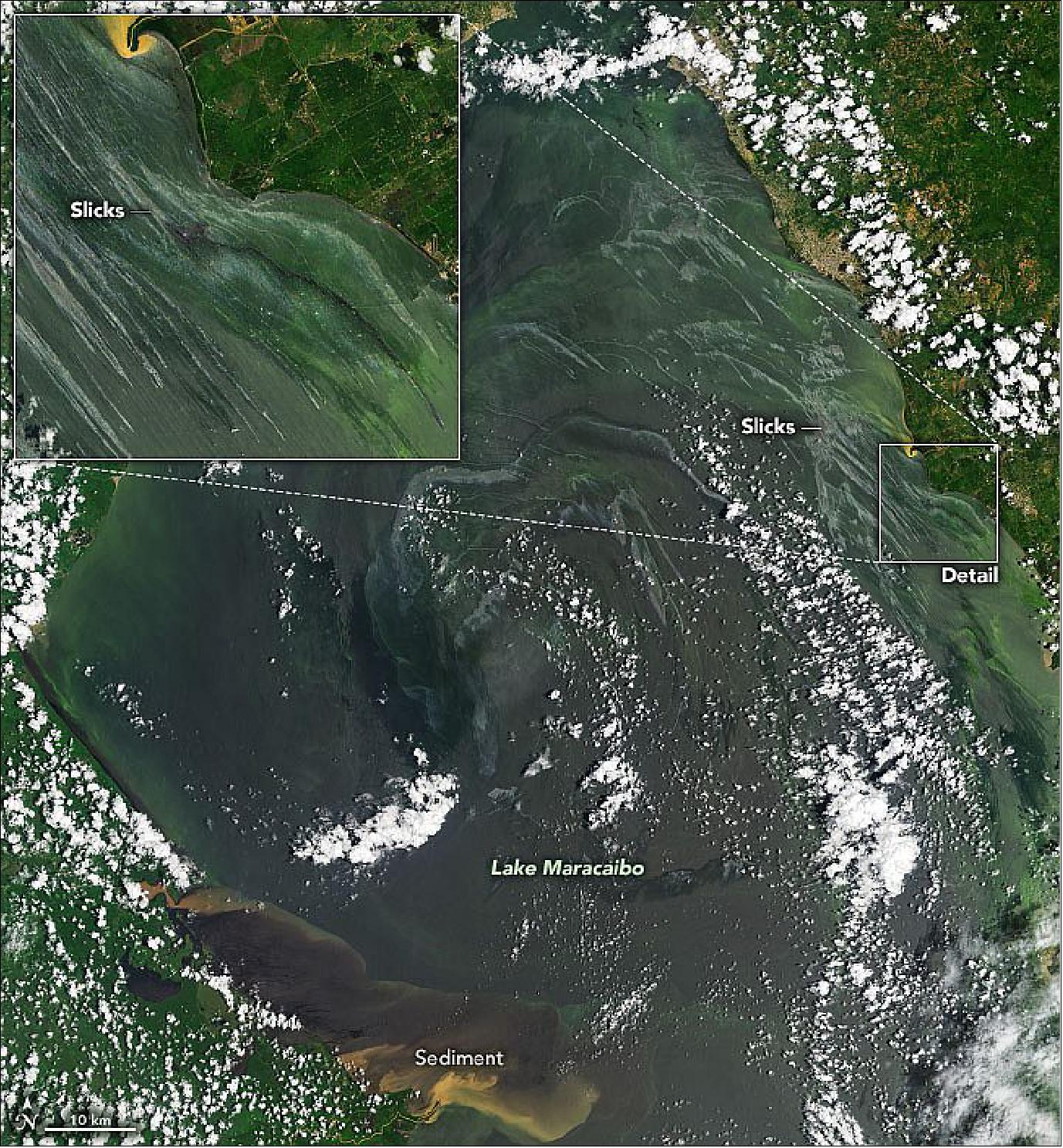
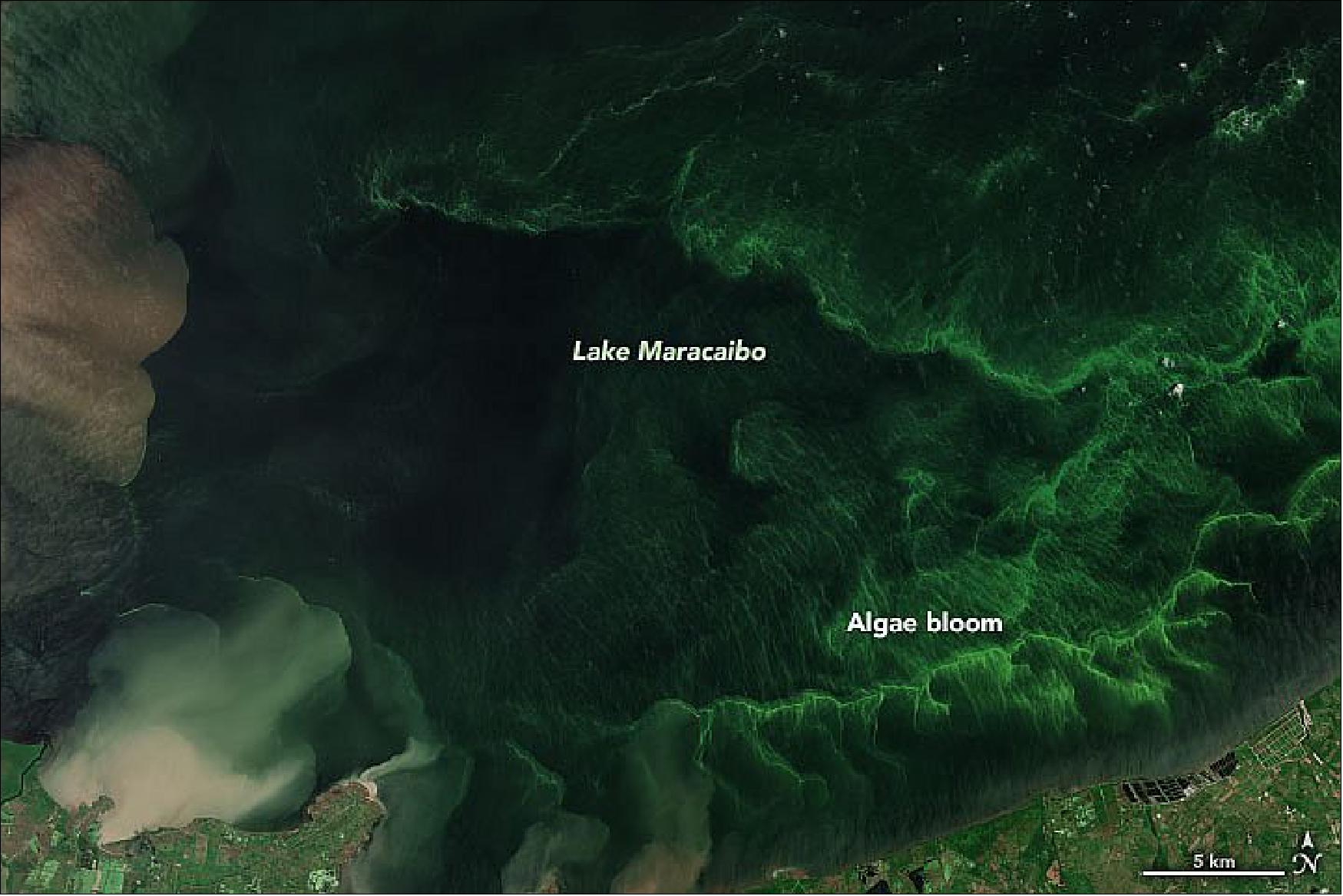
• October 4, 2021: Troubled Waters Venezuela’s Lake Maracaibo is choking with oil slicks and algae. - It was once a source of great abundance—particularly fossil fuels and fish—for the people of Venezuela. Now Lake Maracaibo is mostly abundant with pollution from leaking oil and excess nutrients. 9)
- Spanning 13,000 km2 (5,000 square miles) in northwestern Venezuela, Lake Maracaibo is one of South America’s largest lakes and one of the oldest in the world. Though it was filled with freshwater thousands of year ago, Maracaibo is now an estuarine lake connected to the Gulf of Venezuela and the Caribbean Sea by a narrow strait. That strait was significantly expanded in the 1930–50s by dredging for ship traffic. Now the north end of the lake is brackish, while the south end is mostly fresh due to abundant flows from nearby rivers.
- One of the largest known oil and gas reserves in the world sits beneath Lake Maracaibo. Thousands of wells have been drilled into the lake since World War I, first by foreign companies and then by Venezuela’s state-run oil company. About two-thirds of the oil produced by the country comes from this region.
- But the fuel that once made Maracaibo prosperous is now endangering wildlife, water quality, and human health. According to many news and scientific reports, the region’s oil-extraction and delivery infrastructure is in serious disrepair. Slicks have been a regular occurrence on the lake for many years, and crude oil often washes up on the shores. “The oil spills are multiple and continuous, and you can easily spot the sources,” noted Eduardo Klein-Salas, a remote sensing scientist at Simón Bolívar University. “Maracaibo Lake has more than 10,000 oil-related installations and a network of thousands of kilometers of underwater pipelines, most of them 50 years old.”
- According to reports from news agencies, environmental groups, and human rights advocates, as many as 40,000 to 50,000 oil leaks and spills occurred between 2010 and 2016 across Venezuela, including Lake Maracaibo. Thousands of oil derricks and thousands of miles of pipelines are decaying or leaking due to a reported lack of capital to repair them. Local fishermen often find their nets and their catch soaked in crude.
- “The oil is spilling from many aging, submerged pipelines that are not maintained, mostly not even mapped,” said Frank Muller-Karger, a University of South Florida marine scientist who has studied the lake with MODIS data. “Other oil slicks come from leaking above-surface storage tanks and vessels, and still others from drilling platforms.”
- In the early 2000s, Lake Maracaibo was the scene of several vast blooms of Lemna obscura, more commonly called duckweed. (It is locally referred to as lenteja de agua, or water lentil.) Though duckweed is not toxic, it can clog water intakes and ship engines; it can also crowd out or suffocate other marine species. Under the right conditions, the marine plants double in size in just a day. In 2004, extreme rains freshened and mixed Lake Maracaibo, and excessive nutrients from the lake floor and from nearby farmland and sewage systems triggered a massive bloom that lasted eight months.
- The lake is still overloaded with nutrients, and duckweed still blooms occasionally in some smaller lagoons. But much of the green in the lake now comes from abundant green algae like Scenedesmus and Chlorella. “The green blooms you see are phytoplankton and cyanobacteria blooms, locally called verdín,” said Klein-Salas. “They are a permanent feature of the lake, dependent on the seasonal cycle of mixing of the already highly eutrophic environment.”
- “The NASA satellite data on both problems [duckweed and oil] were amply circulated in Venezuela a decade ago and still are,” said Muller-Karger. “The ecological problems with oil spills are cumulative and affect many local fishermen, not just in Lake Maracaibo but in many places along the Venezuelan coast from Lake Maracaibo to the Gulf of Paria. Yet there is no effort by the government to change things; rather, the oil spills have gotten worse with time.”
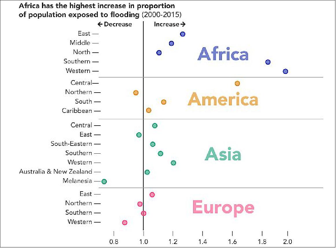
• September 27, 2021: In a study published in August 2021, scientists found that the proportion of the world’s population exposed to floods grew by 20 to 24 percent. Although researchers expected an increase in the number of people living in flood-prone areas, the new estimates were ten times greater than what previous models predicted. 10)
- “We need to understand why people are moving into floodplains and what ways we can support flood mitigation,” said lead author Beth Tellman, a geography researcher at the University of Arizona. “I think satellite and Earth observations can be transformative in how we think about building resilience in a world marked by climate change.”
- The research, published in Nature and funded in part by NASA and Google Earth Outreach, relied on direct satellite observations from the Moderate-resolution Imaging Spectrometer (MODIS) instruments aboard NASA’s Terra and Aqua satellites. Building off of previous mapping efforts, members of the team built a new Global Flood Database, the world’s largest open library of flood maps. Tellman’s team included researchers from Cloud to Street, NASA, the University of Colorado, the University of Arizona, Columbia University, the University of Washington, the University of Texas, and the University of Michigan. 11)
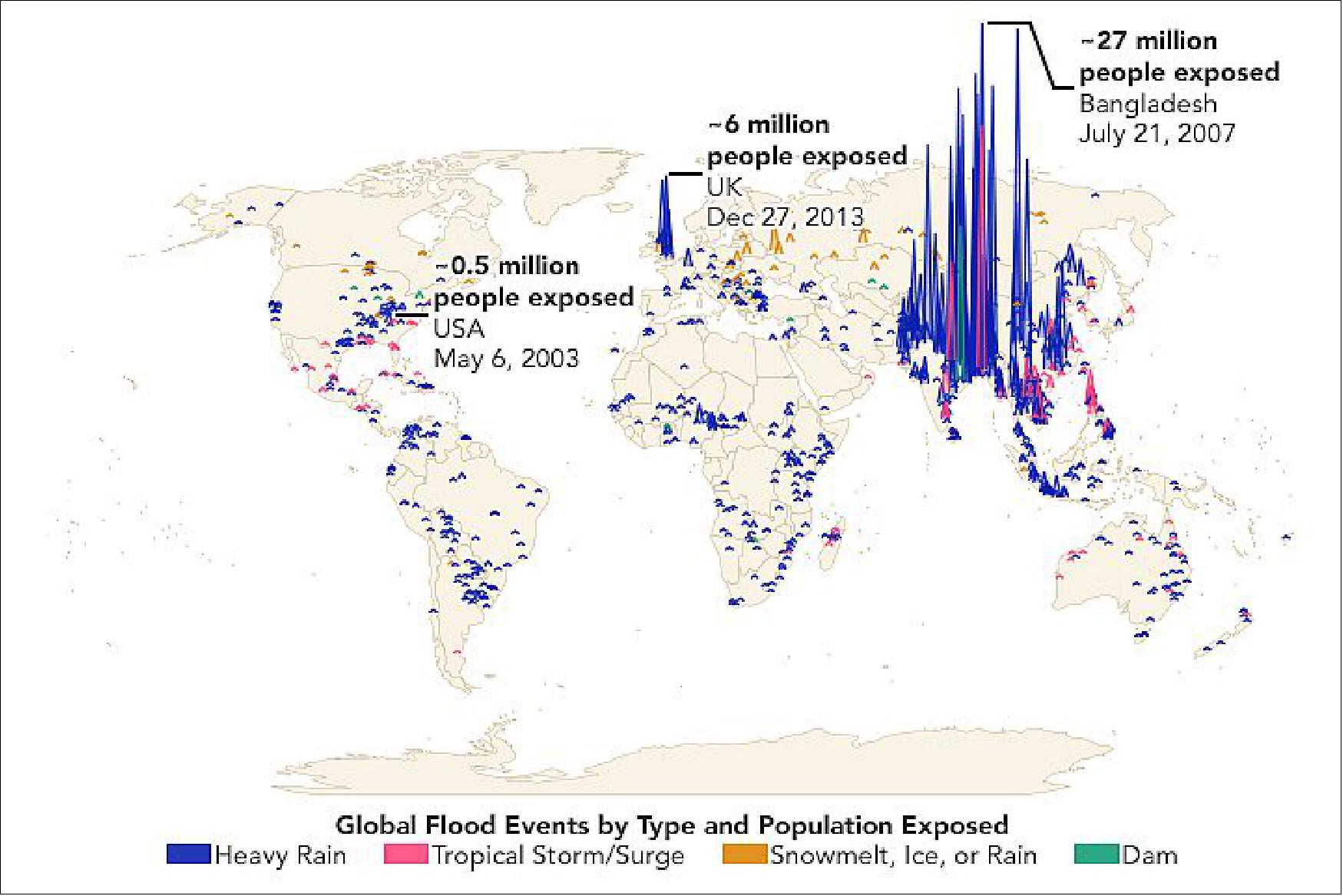
- According to the study, the proportion of people exposed to floods increased in 70 countries across all continents. Increased flood exposure was concentrated in middle- and low-income countries, with many of the countries located in Asia and Sub-Saharan Africa. At least 213 million people were shown to be exposed to flooding in South and Southeast Asia alone.
- In the United States, North Carolina saw a 25 percent increase in population exposed to flooding—a change influenced by severe floods that displaced 1.5 million people after hurricanes Florence and Michael in 2018. New Orleans was one of the few areas that saw a decrease in exposure to flooding, which can likely be attributed to mitigation projects built after major flooding from Hurricane Katrina in 2005.
- According to Sullivan, satellite observations can improve global flood models by estimating the impacts of flood risk on population and by accounting for dam breaks and snowmelt that have not always been taken into account in past models. “The way we typically think about flooding is from a risk perspective, but satellite imagery can help us understand things like the impact on households, income, wealth, and human health after a flood,” Sullivan added. “Once we have observed and know that it is flooding in a place, we can ask: what are the material impacts on people’s livelihoods?“
- The dataset created by the research team can help with both retrospective analysis and future planning. “A unique and important result of this work is the historical record now available in Cloud to Street’s Global Flood Database,” said co-author Dan Slayback, a remote sensing scientist at NASA’s Goddard Space Flight Center. “At NASA, we have been generating a near real-time flood product for about a decade, but were not yet able to reprocess the full historical archive back to 2000. This project provides tremendous added value by giving us a longer historical context, which can then be compared to newly detected floods.”
- Officials at every level of government can use tools like the Global Flood Database and NASA’s new sea level projection tool to assess the impacts of floods on local communities and plan for future flood events. Using such tools, city planners and government agencies can determine the best action to protect against future flooding.
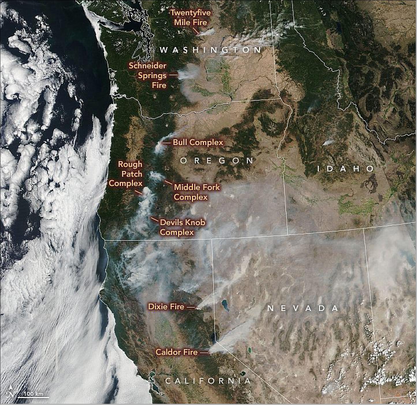
• September 1, 2021: As August 2021 came to an end, 42,647 fires had scorched 4,879,574 acres (~1,975,000 hectares) across the United States in 2021—close to the ten-year average for the first eight months of a year, according to statistics from the National Interagency Fire Center. But among the 83 fires still actively burning on August 31, some were especially fierce; two of them had crossed the crest of the Sierra Nevada for the first time in recent record-keeping. 12)
- The Caldor fire spread rapidly amid dry and gusty conditions, prompting officials to expand mandatory evacuation orders to the Tahoe Basin, including South Lake Tahoe, a lakeside city of nearly 22,000 people. According to news reports, Caldor is only the second-known fire to have crested the ridge of the Sierra Nevada, burning from one side to the other. It follows the Dixie fire, which crossed over the ridge earlier in the month.
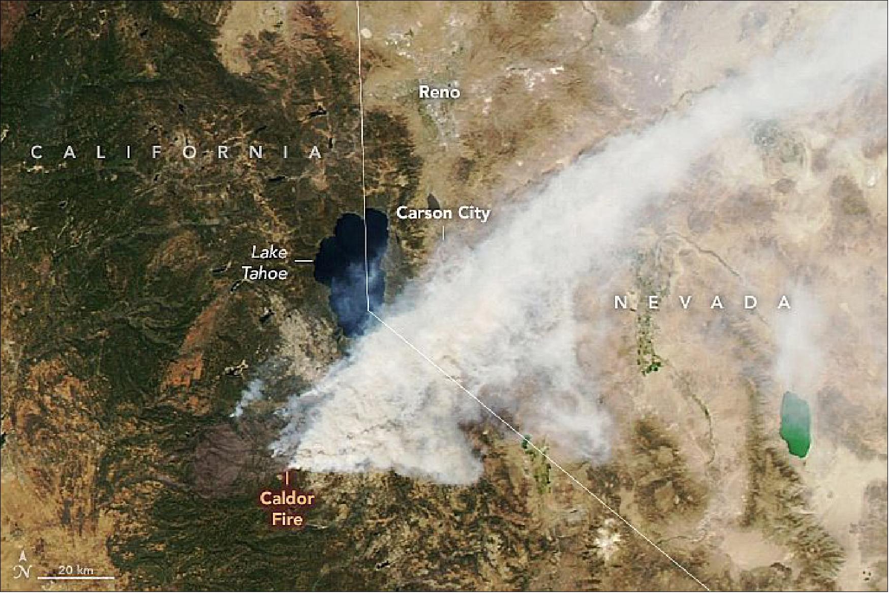
- Meanwhile, the Dixie fire continues to spread. Since igniting on July 13, the fire has burned more than 800,000 acres and has surpassed the August Complex to become the second-largest fire on record in California. The Dixie fire was nearly 50 percent contained as of August 31.
- Smoke from the Dixie fire is visible in the second image above, acquired on August 28, 2021, with the Operational Land Imager (OLI) on Landsat 8. The infrared signatures of actively burning areas are outlined in red. Evacuation orders have been lifted on the fire’s western side, but they were replaced on August 30 with new evacuation orders as the fire approached Lake Davis.
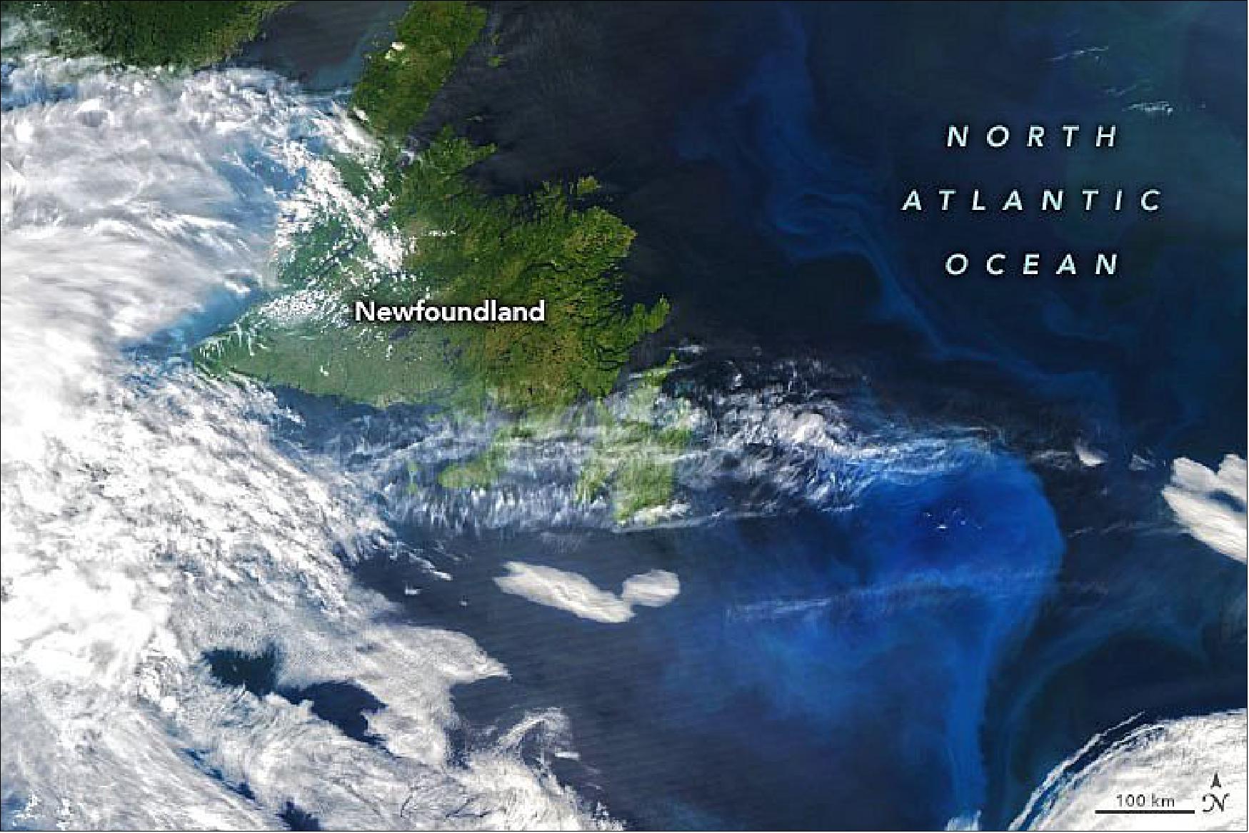
• August 24, 2021: In mid-June 2021, hints of a phytoplankton bloom brewed off the coast of Newfoundland, Canada. In the following weeks, the faint patch transformed into a brilliant blue expanse as the number of microscopic plant-like creatures exploded. 13)
- The color of the ocean here is a good indication that the bloom is composed of coccolithophores, likely Emiliania huxleyi. The phytoplankton are covered in chalky calcite plates that are highly reflective, which make the ocean surface appear milky blue. Each cell is just a few nanometers across, but when enough of them congregate over a large area they become visible from space.
- The region’s currents and circulation patterns help enrich the water with nutrients, which can enhance the productivity of phytoplankton when combined with sunlight. The organisms become food for zooplankton, shellfish, and other marine creatures, which has helped make this region one of the richest fisheries in the world.
- It remains to be seen if coccolithophores will persist into September, as they did in 2019 and again in 2020. In previous years, E. huxleyi has been most abundant around mid-summer and less common in autumn.
- This bloom is also likely dominated by coccolithophores. E. huxleyi is common here from around late July into autumn, replacing blooms of diatoms that thrive in spring and early summer.
• August 20,2021: The Greenland Ice Sheet underwent two bouts of intense melting in July 2021, and forecasts called for even more to follow. They were right. Summer heat spurred another major melt event on August 14–15, 2021, but this time, the melting was exacerbated by rainfall. 14)
- Every year from around May to early September, melting takes place across the vast sheet of ice that covers Greenland. Besides contributing directly to sea level rise, meltwater can flow to the base of the ice sheet via crevasses and moulins, accelerating the flow of ice toward the ocean.
- Within a melting season there can be the occasional “melt event”—brief periods with more melting and runoff than during ‘typical’ summer days. The seventh-largest melt event on record (by area) occurred on July 28, when melting covered about 881,000 km2 (340,000 square miles) of the ice sheet, according to data from the National Snow and Ice Data Center. Melting on August 14—the peak of the unusual late-summer event—was slightly smaller, covering about 872,000 km2.
- According to Lauren Andrews, a glaciologist with NASA’s Global Modeling and Assimilation Office, the pattern of melting differed for each event. “While the late-July melt event was extensive in northern Greenland, the August event was focused in southern Greenland,” she said.
- Notice that by August 15, the area of bare ice extends farther inland. “The snow line has retreated, exposing more of the darker, underlying ice,” Andrews said. “This retreat is most obvious when we look closely at the outlet glaciers and was likely driven by the large melt event on August 14–15.”
- Andrews also noted that the melting extended well inland toward the interior of the ice sheet and reached Summit Station—National Science Foundation’s research station located near the top of the ice sheet, nearly two miles above sea level.
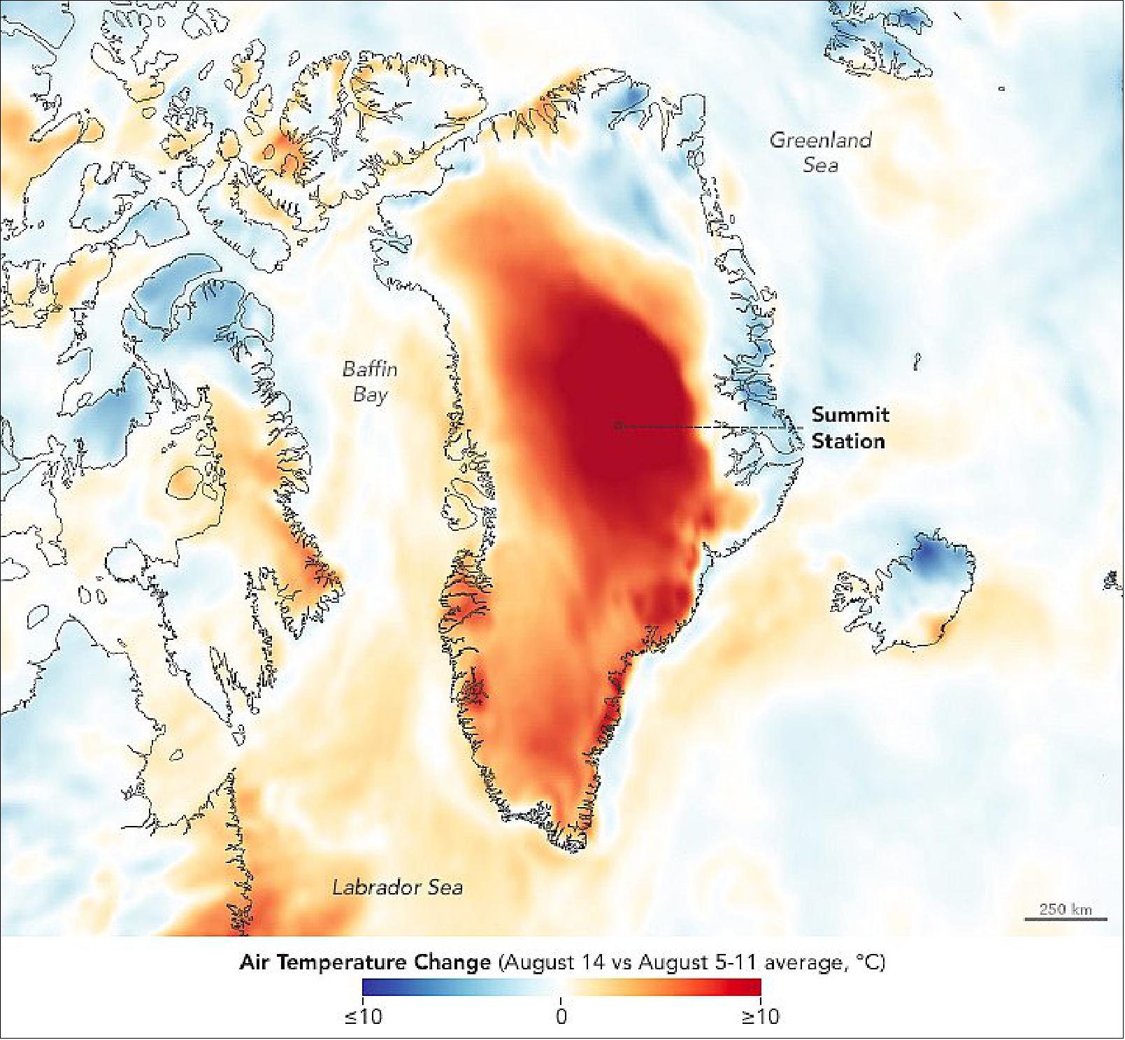
- Widespread rainfall in southern Greenland contributed to the melting. Rain was even observed by National Science Foundation personnel at Summit Station on August 14, 2021—the first time since the start of field observations there in the late 1980s, according to Von Walden of the Summit Station Science Coordination Office and Washington State University.
- Warm air temperatures alone, not rain, caused previous major melt events at Summit Station, including those in 2012 and 2019, according to Christopher Shuman, a University of Maryland, Baltimore County, glaciologist based at NASA’s Goddard Space Flight Center. Studies have shown that the amount of melting across Greenland caused by rain has increased over the recent past, in both summer and winter.
- Large melt events including those of the 2021 season are generally short-lived and contribute a relatively small amount to the total melting that occurs across a season. But they can have a lasting effect on the ice sheet. Melting can trigger processes that cause the ice surface to darken and modify the underlying snow and firn, which can exacerbate future melting and runoff, even under normal atmospheric conditions.
- “During melt events, these processes can occur over parts of the ice sheet that do not typically experience melt, making the impact more widespread,” Andrews said. “Positive feedbacks like these are starting to take their toll.”
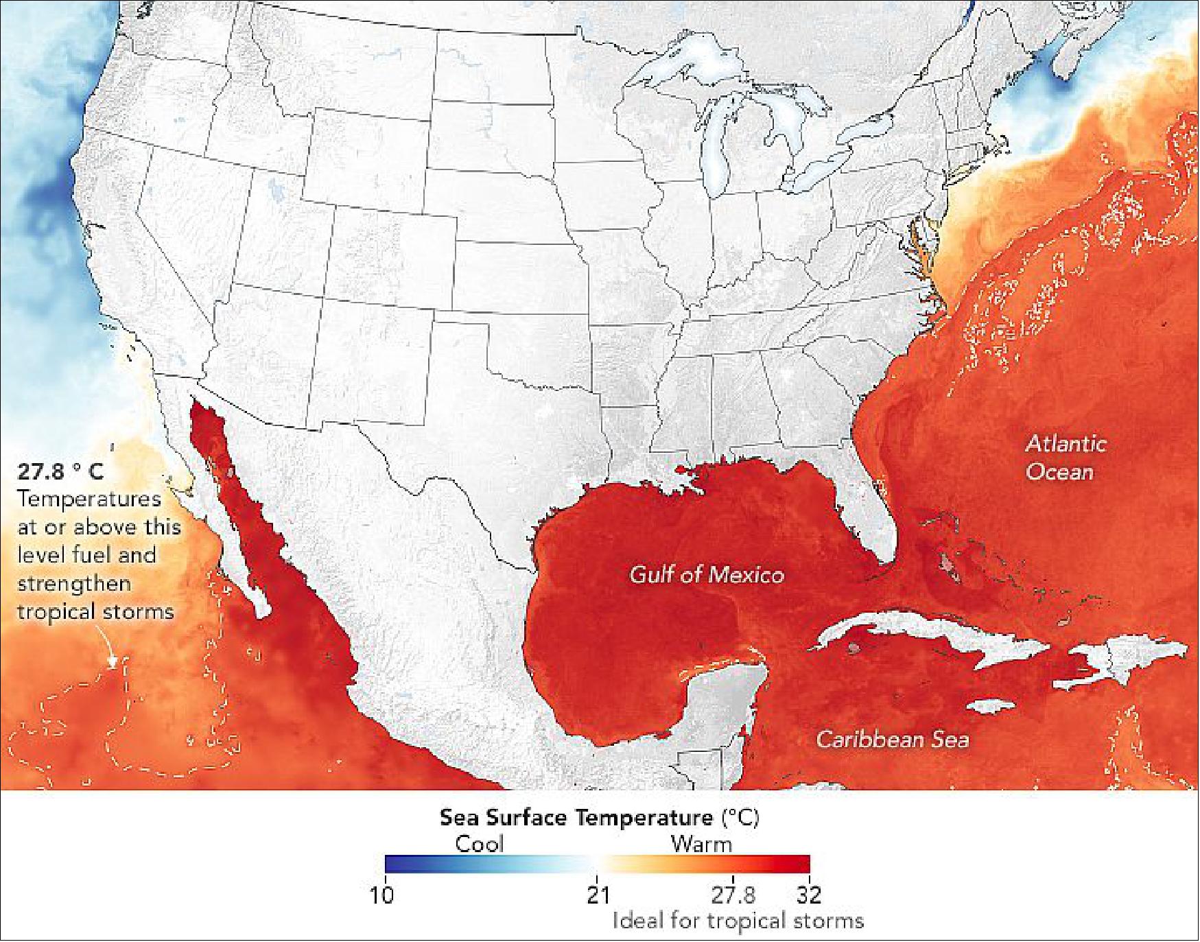
• August 13, 2021: Heading into the peak of hurricane season, the seas around North and Central America are primed to fuel storm development and intensification in the Atlantic and Eastern Pacific. While sea surface temperatures are just one factor influencing the development of hurricanes, they are a fair predictor of the readiness of the ocean to sustain them. 15)
- The data for the map of Figure 24 come from the Multiscale Ultrahigh Resolution (MUR) sea surface temperature analysis, produced at NASA’s Jet Propulsion Laboratory. It is based on observations from several satellite instruments, including the NASA Advanced Microwave Scanning Radiometer-EOS (AMSRE), the Moderate Resolution Imaging Spectroradiometer (MODIS) on the NASA Aqua and Terra platforms, the U.S. Navy microwave WindSat radiometer, the Advanced Very High Resolution Radiometer (AVHRR) on several NOAA satellites, and from in situ observations from NOAA.
- The 2021 hurricane season started quickly. In May, Tropical Storm Andres became the earliest named storm—winds of 39 miles per hour or greater—on record in the Eastern Pacific. To date, eleven tropical storms have developed in the basin, including four hurricanes.
- In the Atlantic, five named storms formed between May 19 and July 9, with Hurricane Elsa becoming the earliest fifth named storm on record. After Elsa, the Atlantic remained quiet until Tropical Storm Fred emerged on August 11. The storm lost some strength while passing near Haiti, the Dominican Republic, and Cuba, but it is forecasted to regain tropical storm force before making landfall in Florida over the weekend. Forecasters warned citizens about the potential for heavy rainfall.
- In its mid-season update on August 4, scientists from the NOAA Climate Prediction Center forecasted 15 to 21 named storms in the Atlantic in 2021, including 7 to 10 hurricanes, of which 3 to 5 could become major hurricanes. They noted: “Atlantic sea surface temperatures are not expected to be as warm as they were during the record-breaking 2020 season; however, reduced vertical wind shear and an enhanced west Africa monsoon all contribute to the current conditions that can increase seasonal hurricane activity.”
- NOAA and other federal and state agencies lead the forecasting of and response to hurricanes in the United States, with NASA playing a supporting role in developing experimental tools and providing key data to those agencies. NASA also works to streamline the flow of information to international science institutions, governments, and aid groups as they use and customize data products from freely available NASA data. “The NASA Disasters program contributes with high-value or unique products that complement actions of operational agencies and regional governments, support decision-making during crises, and aid in disaster risk reduction,” said Ricardo Quiroga, who coordinates with regional teams in Latin America through his role as co-lead of the AmeriGEO Disasters Working Group.
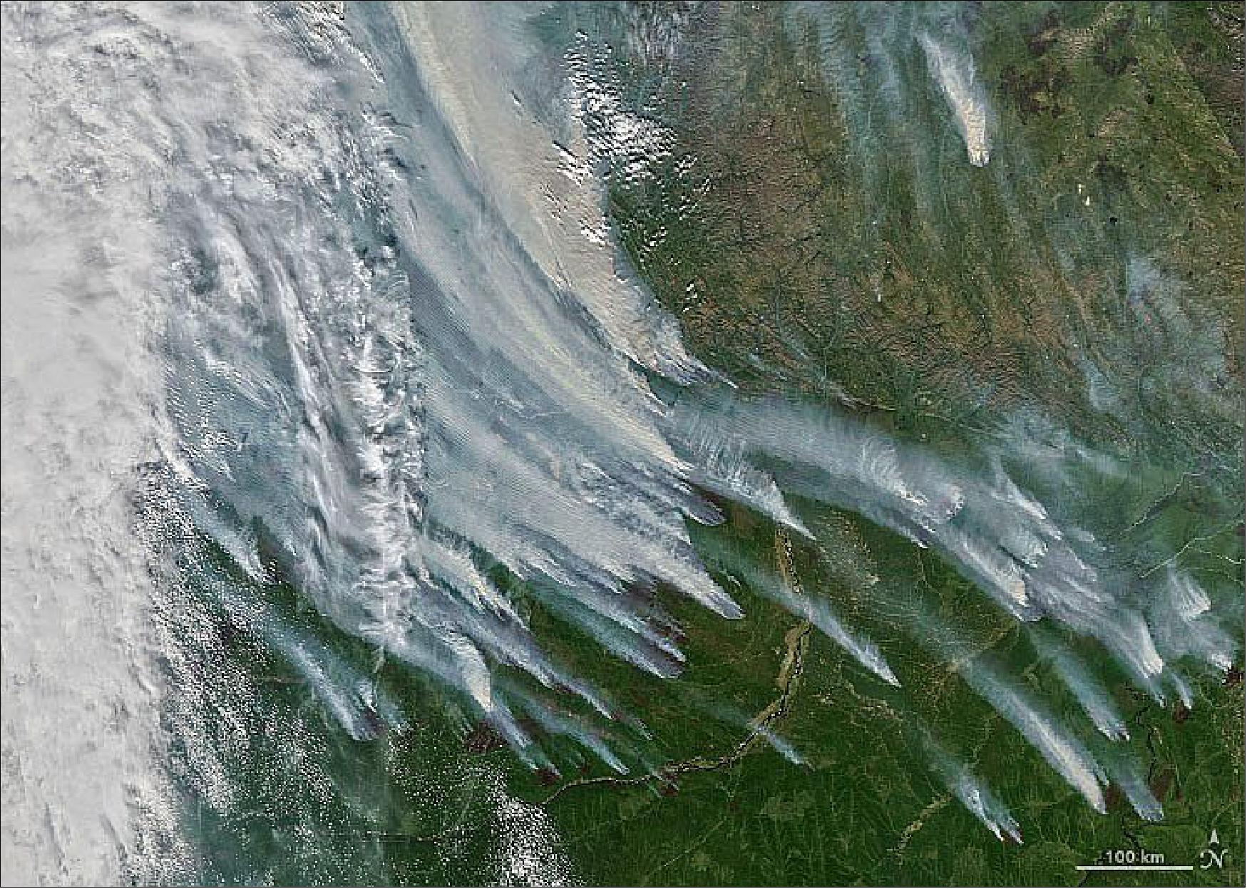
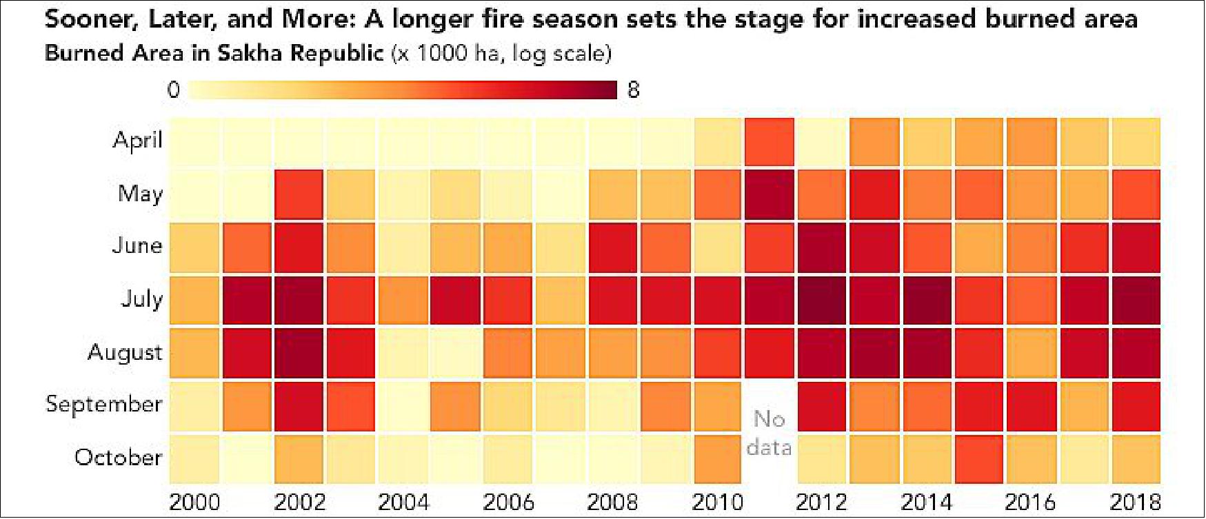
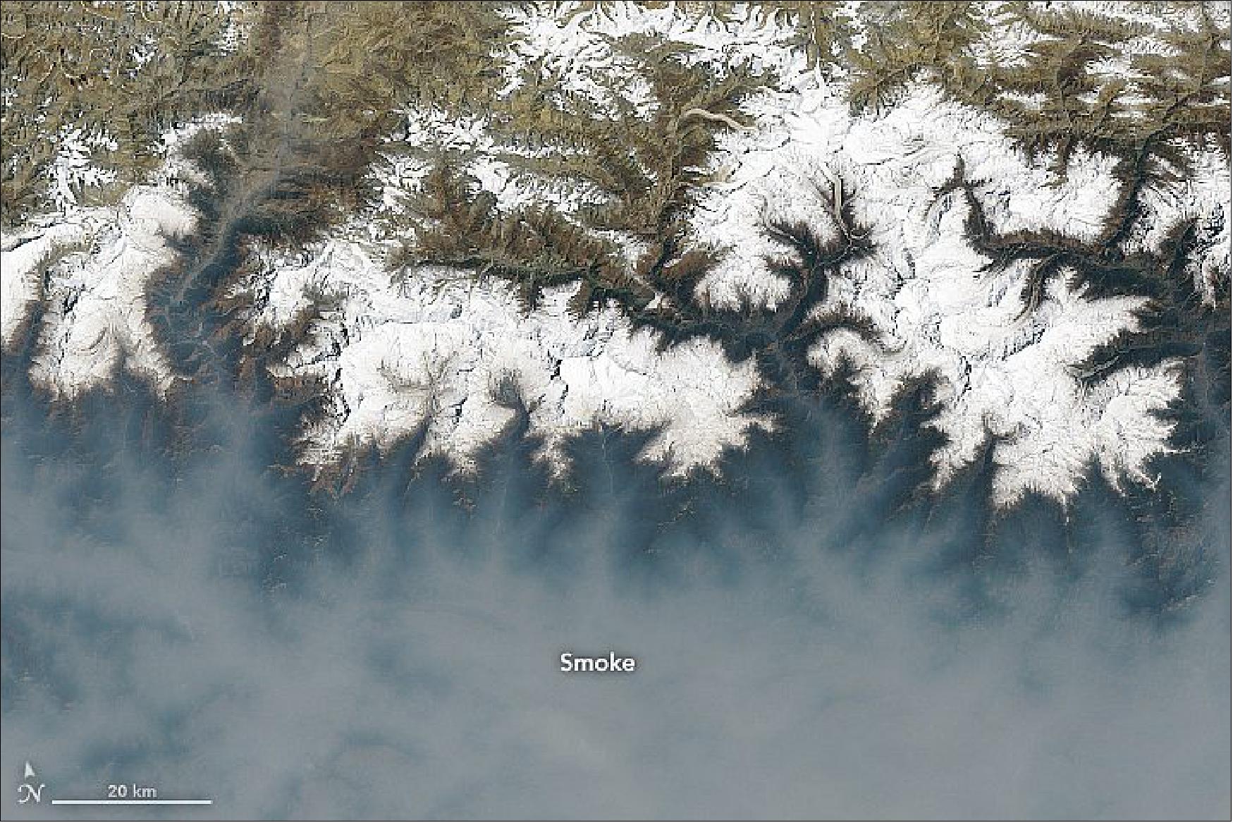
• August 10, 2021: As soon as the snow began melting in May 2021, fires broke out in the Republic of Sakha (Yakutia) in eastern Russia. Over the spring and summer, blazes have proliferated and intensified. By August, fires had consumed large swaths of the region’s larch forests. Plumes of smoke blanketed skies, turning day into night, closing airports, and prompting talk of an “airpocalypse” in the city of Yakutsk. 16)
- In an area as large and remote as Sakha, satellites offer one of the best options for monitoring wildfire activity and tracking the severity of seasonal fire outbreaks. According to Mark Parrington, a scientist with the European Centre for Medium-Range Weather Forecasts, the 2021 Sakha wildfires have set a record for estimated carbon emissions for the period from June 1 to August 1. Parrington monitors fires for the Copernicus Atmosphere Monitoring Service (CAMS) using a satellite-based data record that began in 2003.
- Counted together with major fires in North America, Africa, and Europe, the Sakha fires helped push global wildfires emissions to record levels in July 2021, according to CAMS data. CAMS estimates near-real-time wildfire emissions from its Global Fire Assimilation System (GFAS), which aggregates observations of fires acquired by NASA’s Aqua and Terra satellites.
- “Based on current official burned area reports, Sakha is on track to have an extreme year of fire, but it won’t surpass previous extreme years if the fires are extinguished by the end of August,” said earth scientist Jessica McCarty of Miami University (Ohio). “If large fire events continue into September and October, we could see burned area totals surpassing 2020.”
- Vast areas of Yakutia have burned in the past 20 years, according to one recent analysis. About half of the fires in the region are caused by lightning. One team of researchers estimated that people start about one-third of Sakha’s fires with discarded cigarettes, sparks from vehicles, negligence with campfires, and arson. Other common causes include power line failures, crop fires, and logging.
• August 6, 2021: Phytoplankton fuel ocean life by feeding other plankton, fish, and ultimately bigger creatures. Phytoplankton are among the smallest organisms in the ocean. Yet when they “bloom,” these tiny ocean drifters can cover thousands of square kilometers, which means these primary producers are often visible from space. Known as the “grass of the sea,” they are the first link in the ocean food chain. 17)
The following text is a transcript of the video. As we move around this global map of chlorophyll, we explore the diversity of phytoplankton in the oceans, and discover why these plant-like organisms play such a crucial role in life on Earth. - The remarkable organisms are also quite beautiful.
- North Sea: Phytoplankton are abundant here when spring melting and runoff freshen the salt water and add nutrients, just as sunlight is increasing. The milky blue waters are probably filled with coccolithophores. Greener areas may be diatoms. Both provide food for marine life.
- Baltic Sea: These green blooms likely contain cyanobacteria (blue-green algae). The proliferation of algae in the Baltic Sea has led to occasional oxygen-depleted “dead zones” in the basin.
- Barents Sea: Two major blooms occur here each year. Diatoms peak in May and June, then give way to coccolithophores as certain nutrients run out.
- Iceland: Phytoplankton support Iceland’s productive fisheries. Volcanic ash can fertilize ocean waters with iron, though the North Atlantic usually has enough nutrients to sustain blooms even without the ash.
- Greenland: Disko Bay has been important to the local economy for at least 1,000 years because of its rich marine resources. Phytoplankton blooms feed the copepods and other plankton and fish that become food for the bay’s shrimp, seals, whales, and walruses.
- Newfoundland: Underwater plateaus off Newfoundland help create circulation patterns that can enrich the waters with nutrients. The waters near the Grand Banks are incredibly productive, supporting catches of swordfish, haddock, lobster, cod, and scallops.
- Gulf of Alaska: Nutrient-rich water provides fertile conditions for phytoplankton blooms in the Gulf of Alaska. Most nutrients come from upwelling from the depths or river runoff. But dust storms also play a role in supplying iron to the Gulf of Alaska.
- Hokkaido: Fueled by the Oyashio current, the waters off northeastern Japan support a bounty of phytoplankton and fish.
- Arabian Sea: Abundant blooms of Noctiluca scintillans have been depleting the oxygen and crowding out other species. They are too large to be eaten by copepods; instead they are feeding a surge of jellyfish and salps.
- Australia: Storms can stir up the seafloor and bring nutrients to the surface, promoting blooms of phytoplankton. That’s likely what happened here after tropical cyclone Veronica made landfall. An important player in the ocean nitrogen cycle, Trichodesmium makes seasonal appearances off the northeast coast of Australia.
- Patagonia: At the Brazil-Malvinas confluence, blooms are stimulated by the ocean’s complex circulation patterns and abundant fronts. The continental shelf off Patagonia is biologically rich due to dust blowing out from the land and nutrients stirred up from the ocean. It is the site of one of the world’s best fisheries.
- South Africa: The Benguela current mixes water masses from the Atlantic and Indian oceans as they meet off the capes of South Africa. This dynamic wind and water action causes the ocean to teem with life, form plankton to fish to whales. Beyond serving as a primary food source for other ocean life, phytoplankton are critical to the global carbon cycle and key producers of the oxygen that makes the planet livable.
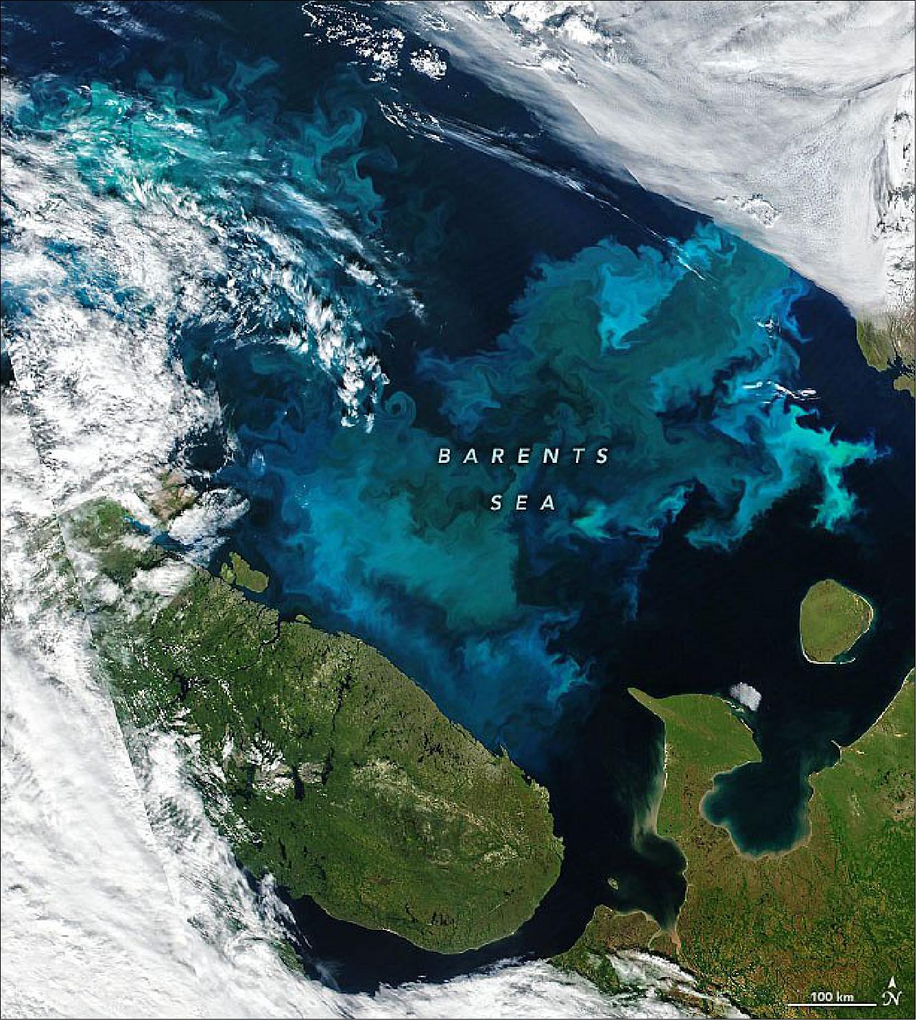
• July 25, 2021: During the spring and summer in the Barents Sea, north of Norway and Russia, phytoplankton show up in abundance. Clouds permitting, the showy displays of these blue and green “blooms” are visible in satellite images just about every year. Yet no two phytoplankton blooms are exactly alike. 18)
- From spring into early summer, the surface waters of the Barents Sea are well-mixed, and nutrients are plentiful. This is when blooms of diatoms tend to dominate. These microscopic phytoplankton, with their silica shells and ample chlorophyll, color the surface waters green.
- By late July and into autumn, waters become more stratified and contain fewer nutrients. The summertime changes benefit coccolithophores, typically Emiliania huxleyi. Blooms of this type of phytoplankton—armored with plates of highly reflective calcium carbonate—make surface waters appear milky turquoise blue.
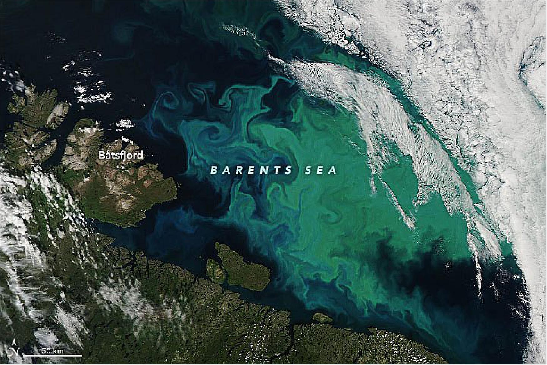
- There are a few possible reasons for the combination of colors. While it is impossible to verify the species without a direct water sample, this image might be showing the region during a period of transition, as coccolithophores replace diatoms.
- “It is possible this is a mixed bloom,” said Andrew Orkney, a doctoral candidate at University of Oxford who has used remote sensing to study phytoplankton in the Barents. “Mixed blooms of coccolithophores and another important bloom-forming group, the diatoms, have been observed off the Norwegian coast in previous years.”
- Alternatively, Orkney notes that the color could result from a coccolithophore bloom occurring in waters rich in colored dissolved organic matter (CDOM). CDOM can make typically blue seawater appear anywhere from green to yellow-green to brown depending on the concentration.
- Coccolithophore blooms now occupy more space in the Barents Sea compared to a few decades ago, according to recent research. Between 1998 and 2016, the summer blooms have expanded poleward and their surface area in the Barents Sea has doubled.
- Such changes could have implications for Arctic marine food webs and geochemical cycles. Coccolithophores and other type of phytoplankton are a primary food source for small zooplankton and fish. They are also critical to the global carbon cycle and key producers of the planet’s oxygen.
• July 15, 2021: Just weeks after the Pacific Northwest endured record-shattering temperatures, another heat wave scorched the U.S. Southwest. This heat wave, which started around July 7, tied or broke several all-time records in California, Nevada, northern Arizona, and southern Utah. 19)
- Two instruments – NASA’s Atmospheric Infrared Sounder (AIRS) aboard the Aqua satellite, and the agency’s ECOsystem Spaceborne Thermal Radiometer Experiment on Space Station (ECOSTRESS) – tracked the heat wave, providing visualizations of it.
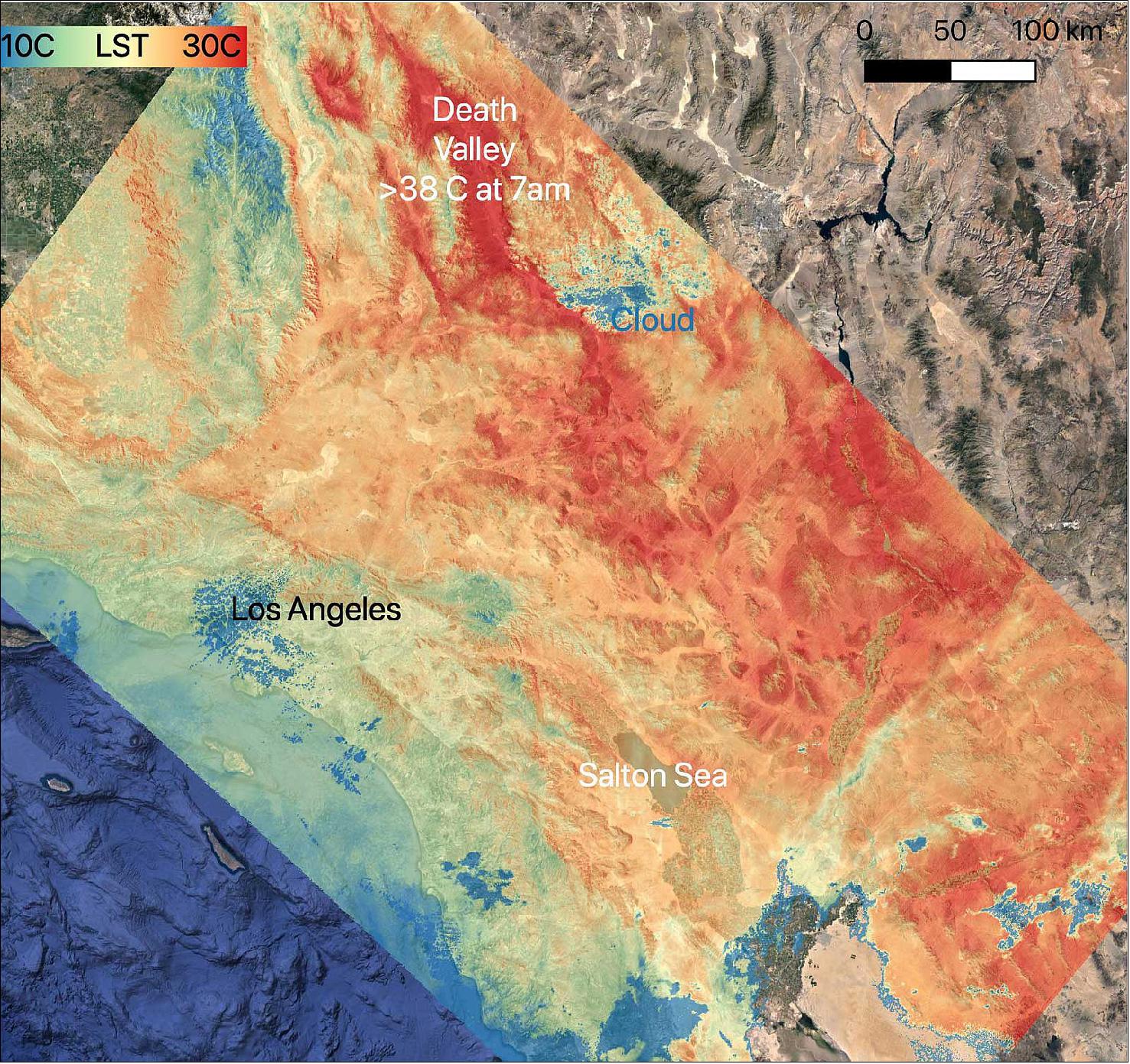
- On July 8, NASA’s ECOSTRESS instrument, attached to the International Space Station, captured ground surface temperature data over California. In the image (middle image), areas in red – including Death Valley – had surpassed 86 degrees Fahrenheit (30 degrees Celsius) by 7 a.m. local time, well above average ground surface temperatures for the area.
- On July 9, Death Valley recorded a high air temperature of 130 F, which fell just a few degrees short of the official all-time surface air temperature record of 134 F set in 1913. On July 11, Bishop, California, hit an all-time high of 111 F and Stovepipe Wells, California, set a new record for daily average temperature with 118 F. Numerous other daily, monthly, and all-time records were set throughout the inland areas of central and Southern California and northern Arizona.
• July 8, 2021: An unprecedented heat wave that started around June 26 smashed numerous all-time temperature records in the Pacific Northwest and western Canada. NASA’s Atmospheric Infrared Sounder (AIRS), aboard the Aqua satellite, captured the progression of this slow-moving heat dome across the region from June 21 to 30. An animation of some of the AIRS data show surface air temperature anomalies – values above or below long-term averages. Surface air temperature is something that people directly feel when they are outside. 20)
- In many cases, the highs exceeded previous temperature records by several degrees or more. On June 28, Quillayute, Washington, set an all-time high temperature record of 110 degrees Fahrenheit (43 degrees Celsius), shattering the old record of 99 degrees Fahrenheit (37 degrees Celsius). Numerous weather stations broke records on consecutive days, showing the unprecedented nature of this extreme heat, which is also being blamed for a number of fatalities. In British Columbia, the village of Lytton set a new all-time record for Canada at 119 degrees Fahrenheit (48 degrees Celsius) on June 29, only to break it the next day with a reading of 121 degrees Fahrenheit (49 degrees Celsius).
- The AIRS instrument recorded similar temperature anomalies at an altitude of about 10,000 feet (3,000 meters), showing that the extreme heat also affected mountainous regions. And temperature anomalies at roughly 18,000 feet (5,500 meters) demonstrated that the heat dome extended high into Earth’s troposphere, creating the conditions for intense heat at the planet’s surface that are normally found farther south.
- AIRS, in conjunction with the Advanced Microwave Sounding Unit (AMSU), senses emitted infrared and microwave radiation from Earth to provide a three-dimensional look at the planet’s weather and climate. Working in tandem, the two instruments make simultaneous observations down to Earth’s surface. With more than 2,000 channels sensing different regions of the atmosphere, the system creates a global, three-dimensional map of atmospheric temperature and humidity, cloud amounts and heights, greenhouse gas concentrations and many other atmospheric phenomena. Launched into Earth orbit in 2002 aboard NASA’s Aqua spacecraft, the AIRS and AMSU instruments are managed by NASA’s Jet Propulsion Laboratory in Southern California, under contract to NASA. JPL is a division of Caltech.
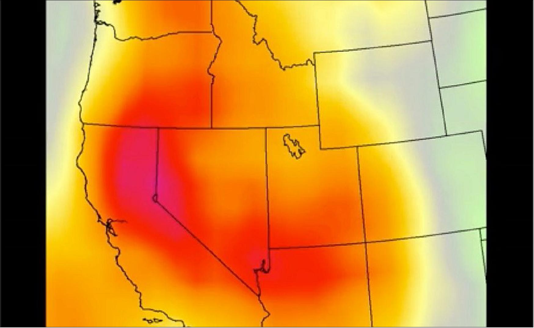
• July 1, 2021: While record-breaking heat scorched the Pacific Northwest in June 2021, parts of Europe and Siberia also saw early-summer temperatures climb. 21)
- The heatwaves are apparent in this map, which shows anomalies in air temperature at the surface from June 18-25, 2021. The anomalies indicate how much the daytime temperatures were above or below the average for the same period between 2003-2013. Red areas depict where the temperature was hotter than usual, and blue areas were cooler than usual. Data for the map are from the Atmospheric Infrared Sounder (AIRS) on NASA’s Aqua satellite.
![Figure 32: One of the hot spots parked over central and eastern Europe. On June 23, ground stations in Moscow measured an air temperature of 34.8°C (94.6°F)—the city’s hottest June temperature on record. Helsinki, Finland, also saw its hottest June day on record (31.7°C/89.1°F), and national records for the month were set in Belarus (35.7°C/96.3°F) and Estonia (34.6°C/94.3°F), [image credit: NASA Earth Observatory images by Joshua Stevens, using AIRS data from the Goddard Earth Sciences Data and Information Services Center (GES DISC) and data from the National Snow and Ice Data Center. Story by Kathryn Hansen]](https://eoportal.org/ftp/satellite-missions/a/Aqua2020-21_190422/Aqua2020-21_Auto3F.jpeg)
- According to Jennifer Francis, a scientist at Woodwell Climate Research Center, the heatwave is the result of a persistent northward bulge in the polar jet stream. “This is associated with a blocking pattern in the jet stream that has been prevalent over Scandinavia this year and contributed to unusually warm conditions there, especially in Finland,” Francis said.
- A second region of warm surface temperatures is visible toward the east, along the Arctic coast in Siberia. According to James Overland, of NOAA’s Pacific Marine Environmental Laboratory, a low-pressure zone just west of the hot spot produced strong, warm winds from the south that kept away the colder Arctic air.
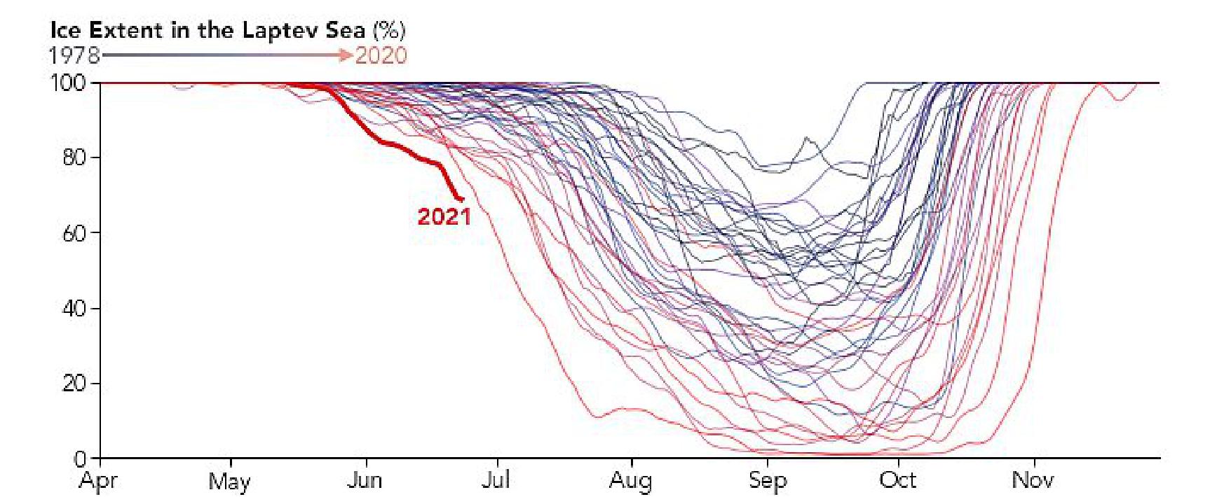
- So far, the record-low sea ice appears to be localized to the Laptev Sea. “I don’t think that the Arctic sea ice extent this summer will be as low as it was last summer,” said Judah Cohen a climatologist at Atmospheric and Environmental Research. Nor does the Siberian heatwave appear to be as widespread or anomalous as the 2020 heatwave.
- Still, scientists are paying attention. “Western North America and northeast Asia are the two fastest-warming spots in summer,” Cohen said. “I’m not sure we know why Siberia is one of the regions that is warming the fastest in summer, but we can observe it.”
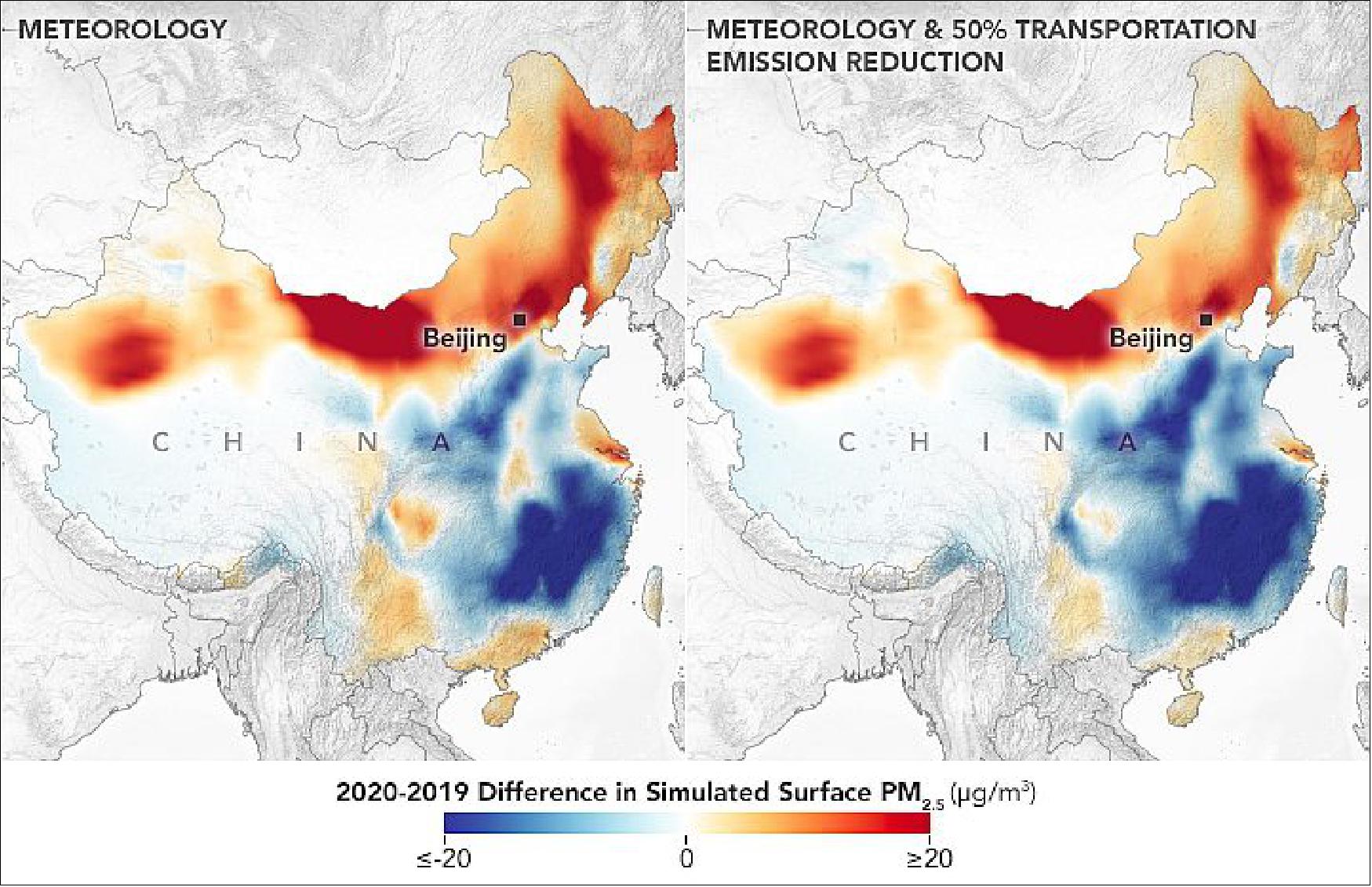
• June 28, 2021: Early in the COVID-19 pandemic, it became clear from satellite observations and human experience that the world’s air grew cleaner. But new research shows that not all pollutants were taken out of circulation during societal lockdowns. In particular, the concentration of tiny airborne pollution particles known as PM2.5 did not change that much because natural variability in weather patterns dominated and mostly obscured the reduction from human activity. 22)
- “Intuitively you would think that if there is a major lockdown situation, we would see dramatic changes, but we didn’t,” said Melanie Hammer, a visiting research associate at Washington University in St. Louis and leader of the study. “It was kind of a surprise that the effects on PM2.5 were modest.”
- PM2.5 describes particles, produced by both human activities and natural processes, that are smaller than 2.5 µm, or roughly 30 times smaller than the width of a human hair. PM2.5 is small enough to linger in the atmosphere and, when inhaled, is associated with increased risk of heart attack, cancer, asthma, and a host of other human health effects. “We were most interested in looking at changes in PM2.5 because it is the leading environmental risk factor for premature mortality globally,” Hammer said.
- By combining NASA spacecraft data with ground-based monitoring and an innovative computer modeling system, the scientists mapped PM2.5 levels across China, Europe, and North America during the early months of the pandemic. They found seasonal differences in PM2.5 between recent years were driven primarily by the natural variability of the meteorology, not by pandemic lockdowns. Some of the meteorological effects included changes in the sources and intensity of seasonal dust storms, the way pollutants reacted to sunlight in the atmosphere, the mixing and transfer of heat via weather fronts, and the removal of pollutants from the atmosphere by falling rain and snow.
- PM2.5 is among the most complicated pollutants to study because particle size, composition, and toxicity vary greatly depending on the source and the environmental conditions. For instance, some PM2.5 pollution is known to come from the reaction of another pollutant—nitrogen dioxide (NO2)—with other chemicals in the atmosphere. NO2 is a major byproduct of fossil fuel burning by motor vehicles and industrial activities. Early in 2020, NASA and other science agencies detected significant drops in NO2 pollution during COVID-19 lockdowns, and some people assumed it would mean dramatic decreases in all pollution.
- However, the two pollutants do not have a linear relationship. Half as much nitrogen dioxide in the atmosphere does not necessarily lead to half as much PM2.5 production. Hammer and colleagues decided to examine whether the lockdowns resulted in a decline of particulate pollution. “Tackling PM2.5 is a very complex issue,” Hammer said, “and you have to take into account its multiple sources, not just the fact that fewer people are on the road,”
- To ensure a comprehensive analysis, the team focused on regions with extensive ground monitoring systems in place and compared monthly estimates of PM2.5 from January through April in 2018, 2019, and 2020. When they compared PM2.5 concentrations during the lockdown months in North America or Europe, they did not find clear signals. The most significant lockdown-related differences were detected in China, particularly over the North China Plain, where pollution levels are typically high and the strictest lockdowns were concentrated. But even that signal was a bit muddled.
- To decipher whether the lockdown was responsible for the change in China and other small ones across Europe and North America, the team ran different “sensitivity simulations” using the GEOS-Chem chemical transport model. They simulated a scenario where anthropogenic emissions of nitrogen dioxide and other pollutants were held constant and meteorological variability was solely responsible for year-over-year differences. They also ran simulations in which they reduced emissions from motor vehicles and other anthropogenic sources, mirroring the lockdowns. They found that the simulation where both meteorology and transportation effects were included most closely mirrored the real-world situation, with natural effects accounting for most of the differences. One of those results in shown in the map above.
- Hammer suspects the change in PM2.5 levels over the North China Plain was more apparent because of the region’s higher pollution levels during non-COVID times. The new insights also highlight a relevant point that is not intuitive from the 2020 observations: Average PM2.5 levels have been dropping steadily for years in North America and Europe, and pollution concentrations that are already low are more difficult to change.
- “The big story here is actually the global characterization of air quality, especially in places where there aren’t surface monitors,” said Ralph Kahn, a co-author and an atmospheric scientist at NASA’s Goddard Space Flight Center. “The satellites provide an important piece of it, the models provide an important piece of it, and the ground-based measurements make an important contribution as well.”
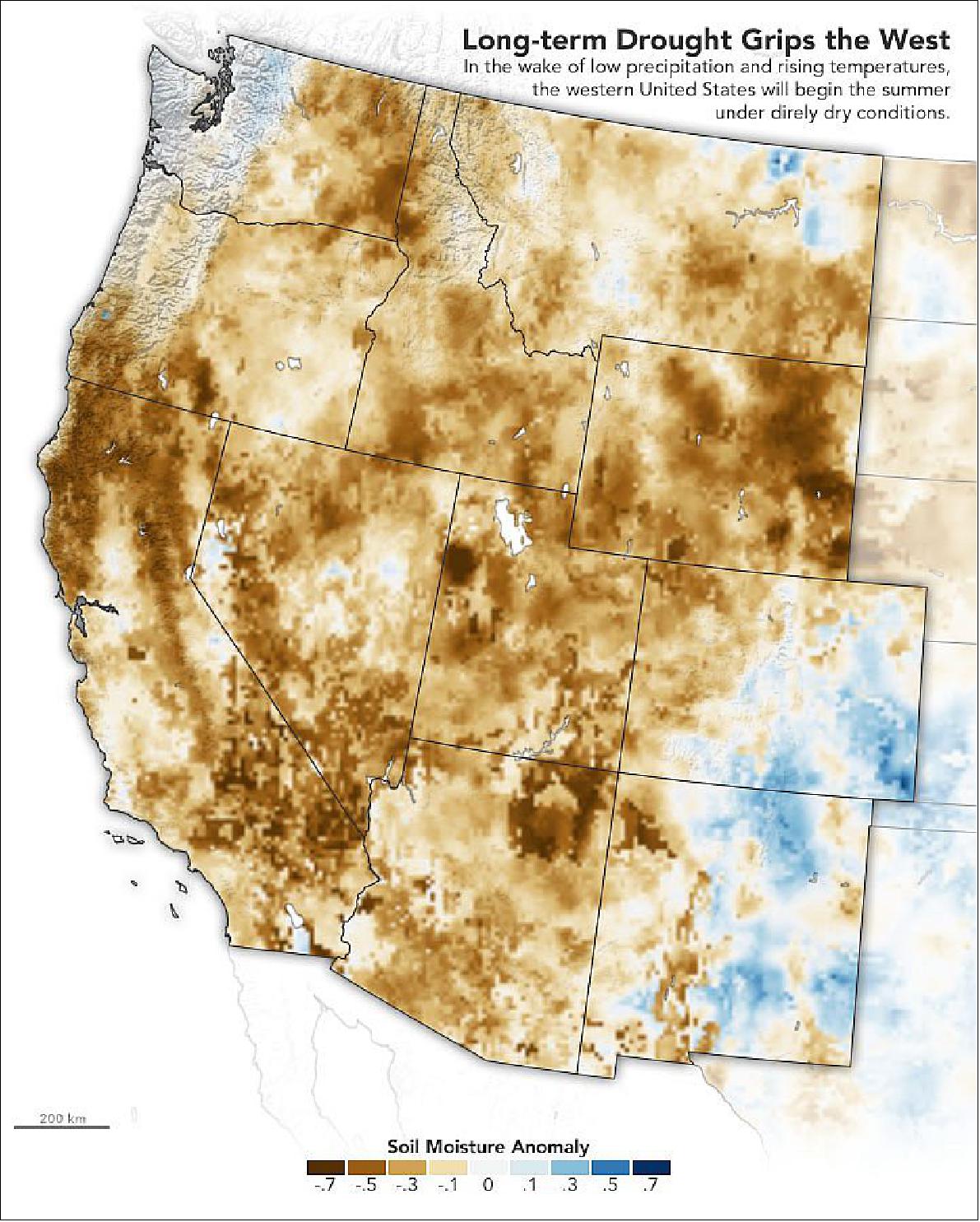
• June 14, 2021: For the second year in a row, drought has parched much of the United States from the Rocky Mountains to the Pacific Coast. Following one of the planet’s warmest years on record, and with precipitation this year well below average in the western U.S., scientists and government agencies are watching for diminished water resources and potentially severe fire seasons. 24)
- According to the June 10 report from the U.S. Drought Monitor, 88.5 percent of the land area in the West—defined as California, Nevada, Arizona, New Mexico, Utah, Idaho, Montana, Oregon, and Washington—is experiencing some level of drought, with 55 percent being classified as “extreme.” An estimated 90 percent of Utah is under extreme drought conditions, with 64 percent rated “exceptional” (the worst classification). Similar conditions are reported across Arizona (87 percent extreme), California (85 percent), and Nevada (76 percent). More than 58 million people are living with the dry conditions in the region.
- Released in April 2021, the Crop-CASMA portal offers soil moisture information more frequently (every 2 to 3 days) and on smaller scales (down to the level of towns and counties instead of states) than many other data products. Farmers and resource managers can use soil moisture data to help time crop planting and irrigation, to forecast yields, and to track droughts and floods. The product was developed by scientists at the U.S. Department of Agriculture (USDA), George Mason University, and NASA’s Goddard Space Flight Center and Jet Propulsion Laboratory. One of the primary users of the dataset is the USDA’s National Agricultural Statistics Service.
- Drought conditions in the West are likely to get worse in 2021. The most recent NOAA Climate Prediction Center forecast noted: “Short-term and long-term drought remains entrenched throughout a majority of the West... The Southwest is typically dry during June until monsoon rainfall begins later in July. Based on below-normal precipitation during the past 30 to 60 days, low soil moisture conditions, and elevated monthly and seasonal probabilities of near to below normal precipitation and above normal temperatures for June-July-August, drought is expected to persist over the south-central West and to expand northward across parts of the Pacific Northwest and northern Rockies.”
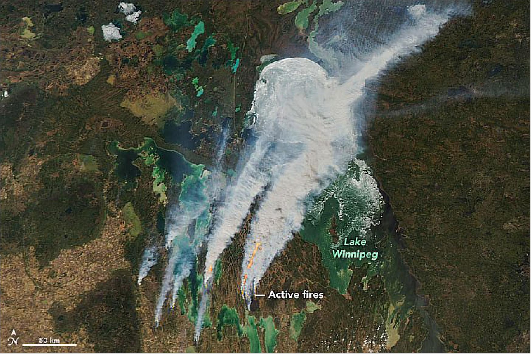
• May 23, 2021: On May 7 and May 14, 2021, winter ice still covered most of Lake Winnipeg and the smaller lakes nearby, and walleye were starting to show up on fishing hooks. By May 19, most of the ice was gone, temperatures hovered between 30° and 33° Celsius (86° to 91° Fahrenheit), and the parched landscape was blanketed with smoke and fire. It seemed like Canada’s Manitoba Province had jumped right from winter to summer. 25)
- Much of southern Manitoba and Saskatchewan had abnormally dry autumn, winter, and spring weather, so much of the region is now in severe to extreme drought. John Pomeroy, a water resources researcher at the University of Saskatchewan, told CBC News that soil moisture is about 40 percent of normal. The western United States and much of Mexico are enduring similar conditions.
- Following a record-breaking spring heatwave and several days of gusty winds, Environment Canada declared fire danger to be “extremely high” in southern and central Manitoba. Provincial and regional governments have banned campfires in parks and closed many hiking and biking trails. Leaders of the Misipawstik Cree and Lake St. Martin First Nations encouraged residents to evacuate some areas due to encroaching fires, and several homes were destroyed. Parts of highways 5, 6, and 307 in Manitoba were shut down due to smoke.
• May 14, 2021: In 2019-2020, eastern Africa experienced its worst desert locust invasion in more than 40 years. The United Nations and its partners treated more than 17,000 km2 (6,600 square miles) of locust infestations across ten countries with various eradication methods. Countless crops were still devoured by the insects, causing serious food insecurity in the region. 26)
- As the outbreaks grew and migrated, NASA-funded researchers worked to better forecast when and where the swarms would appear. In a recently published study, the team showed that by examining soil moisture and soil composition, they could predict optimal breeding sites 85 percent of the time.
- “We looked at soil moisture and texture because those are critical components to the locust life cycle,” said Lee Ellenburg, the food security and agriculture lead for NASA’s SERVIR program and the study’s lead author. “We are essentially identifying where the locusts are breeding.”
- The most effective time to eradicate desert locusts (Schistocerca gregaria) are when the insects are in the egg and hopper phases, a period when they are still developing wings and have limited mobility. Females tend to lay eggs in warm, wet, and sandy-clay soils at a depth of 10 to 15 cm (4 to 6 inches) below the surface.
- In roughly two to four months, the locusts mature and develop wings, at which point it becomes difficult to find and eradicate them. Adults can fly more than 150 km (90 miles) per day; swarms can even cross the Red Sea, as they did in 2019-2020. Just 1 km2 of a locust swarm can contain as many as 80 million adult locusts.
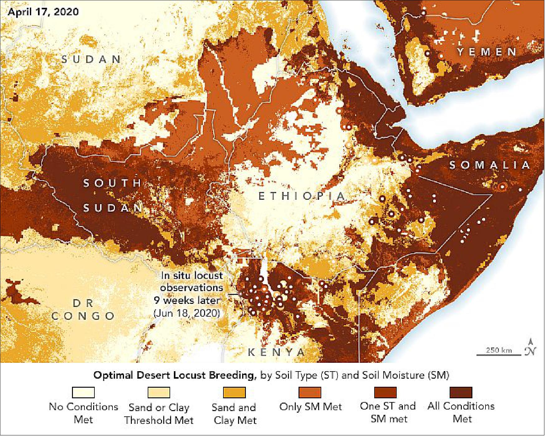
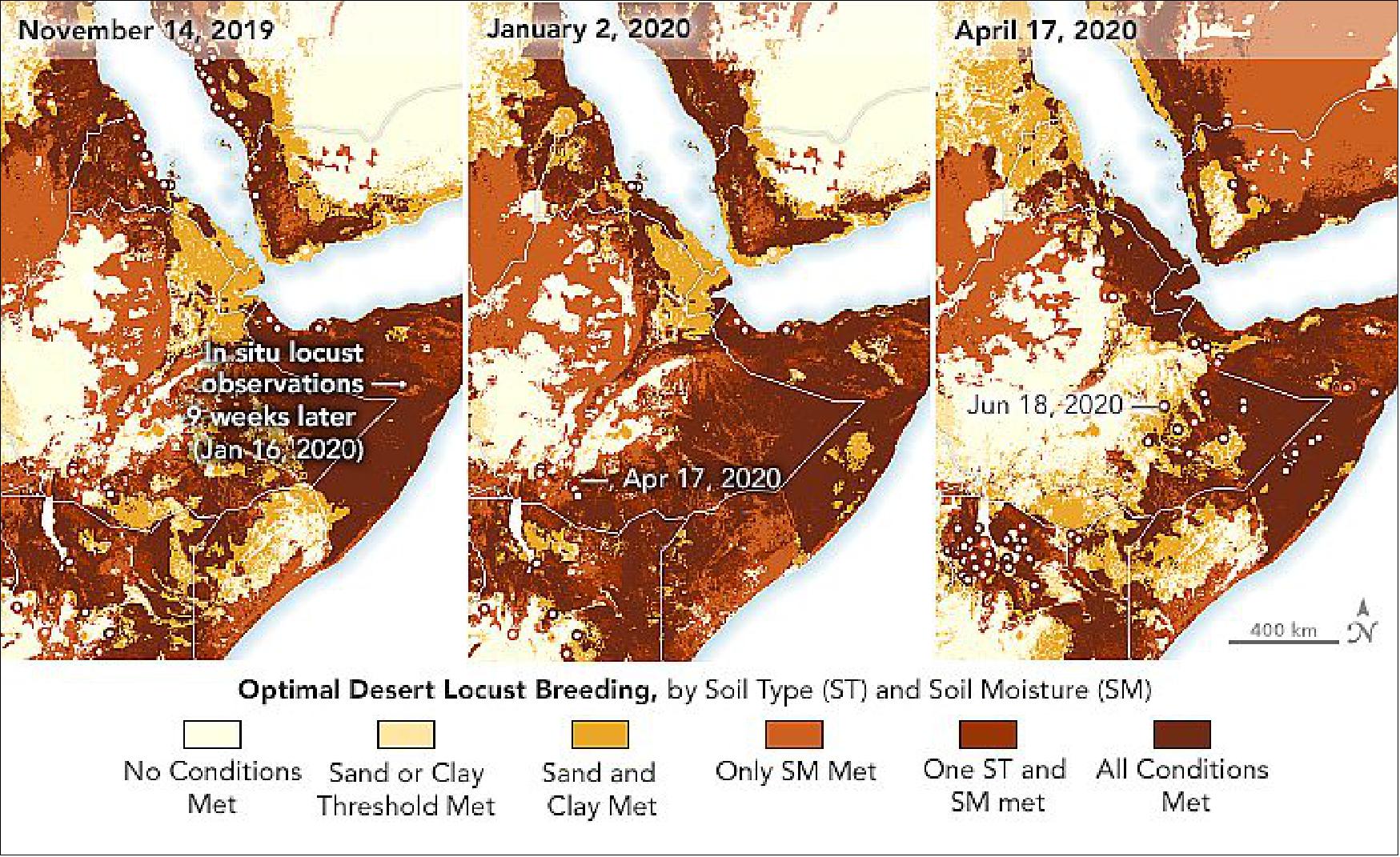
- During the outbreaks, the research team shared soil condition products with FAO and PlantVillage, which created a crowdsourcing application to allow government personnel and trained citizens to catalog locust sightings. PlantVillage used the soil moisture data to help prioritize areas for surveying.
- The SERVIR team is now working to integrate their soil condition products into the FAO locust support dashboard, which includes other relevant factors such as wind patterns, temperatures, and vegetation. The goal is to be better prepared for the next major locust invasion, said Catherine Nakalembe, a food security researcher with SERVIR and NASA Harvest. Once optimal breeding grounds are identified, officials can spray pesticides and administer insect growth regulators in the area to kill the eggs and hoppers.
- “If this were to happen again in two years, we don’t want to be scrambling for information,” said Nakalembe. “These satellite datasets and ground information help us with tracking, understanding, and providing necessary early warnings about how bad conditions may get.”
• April 15, 2021: Seasonal fires, lit to manage farmland and pastures, are common in Nepal in March and April. In 2021, the fires grew particularly extreme, as many spread and burned uncontrolled through forests. 27)
- Months of unusually dry weather has parched vegetation and turned it into tinder. Nepal received just a quarter of the rain it normally sees between January and April. Stretches of hot, windy weather have also exacerbated some fires, some of which burned in rugged terrain that made them hard to extinguish.
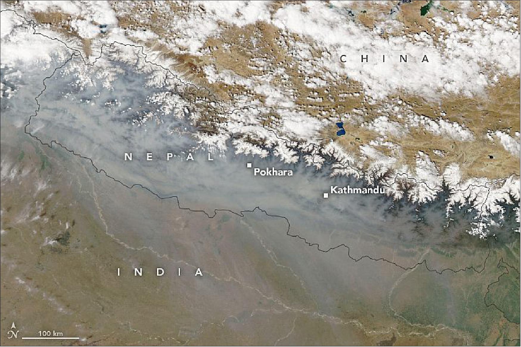
- One way that scientists can gauge the intensity of fire seasons is by analyzing thermal anomalies, or hotspots observed by satellites. In this case, the Visible Infrared Imaging Radiometer Suite (VIIRS) on the NOAA-NASA Suomi NPP satellite detected roughly 41,000 hotspots in Nepal between January 1 and April 7, 2021—the second most the sensor has observed for that time period, according to NASA atmospheric scientist Pawan Gupta. The satellite sensor detected even more fire hotspots during the same period in 2016.
- The MODIS instrument on Aqua makes similar observations of thermal anomalies but with less detail for small fires. It also showed 2021 as having the second-most fire hotspots through April 7 in a record that dates back to 2002.
- The smoke in the lower atmosphere has frequently elevated air pollution to unhealthy and occasionally hazardous levels in March and April 2021, according to data from a U.S. air quality sensor in Kathmandu. The fires and poor air have forced school closures, prompted evacuations, caused multiple deaths, and led to flight cancellations, according to news reports.
- “Every year during the fire season, air pollution levels across Nepal remain very high for many days and affect the region’s economy and people’s health,” said Gupta. “Due to limited ground-based monitoring of air quality in the area, the health impacts are challenging to assess, but satellite data can fill in some of the gaps.”
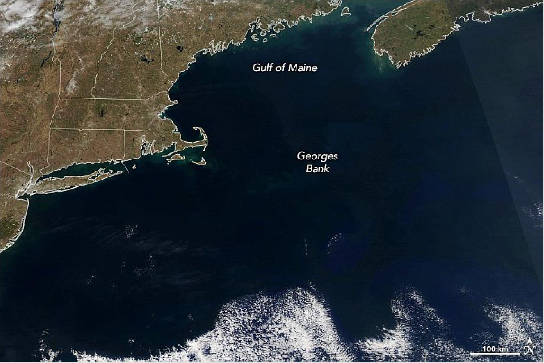
• April 12, 2021: Springtime blooms on land in North America are usually obvious: green vegetation sprouts and flower buds open in ways that bring bright color to the landscape. Springtime changes in the North Atlantic Ocean are less obvious to the human eye, as not all of the action takes place at the surface and much of the color is camouflaged by the dark greens, blues, and blacks of the deep sea. 28)
- Satellite sensors give us other ways to see blooms of phytoplankton, the plant-like primary producers of the ocean. The MODIS instrument on NASA’s Aqua satellite observes Earth in 36 different visible, infrared, and near-infrared wavelengths. Over the past three decades, scientists have tuned the sensors and the processing of those spectral data to identify areas with high concentrations of chlorophyll-a, the primary pigment used by phytoplankton to harvest sunlight for energy.
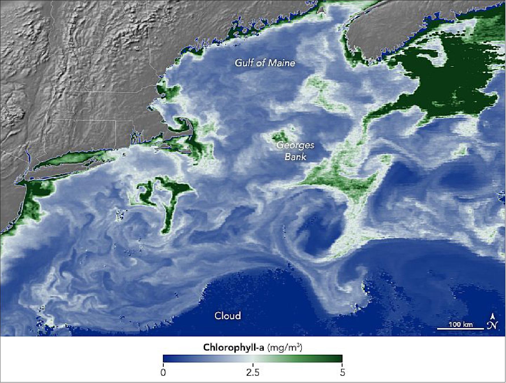
- Note how the phytoplankton wrap into swirls and rings in some places. They often trace the edges and fronts of ocean eddies and warm core rings that spin off from currents like the Gulf Stream. Some of the chlorophyll abundance also shows up around the region’s shoals and underwater banks—such the Le Have and Emerald banks off the south coast of Nova Scotia—where upwelling and nutrient mixing promotes phytoplankton growth. The most famous patch is Georges Bank, where currents meet the relatively shallow water and promote an abundant crop of phytoplankton that fuels other marine species. The Gulf of Maine and Georges Bank have historically been among the most productive fishing grounds on the planet.
- Phytoplankton account for nearly half of Earth’s primary production, turning carbon dioxide, sunlight, and nutrients into organic matter and providing the fundamental nourishment that fuels almost everything in the sea. The amount and location of phytoplankton affects the abundance and diversity of everything from finfish to shellfish and zooplankton to whales. Phytoplankton also affect the chemistry and climate of the planet. They produce about half of Earth’s oxygen and they draw carbon out of the atmosphere—locking it up for a time in their cells, in the animals that consume them, and in pellets of waste that drop to the seafloor.
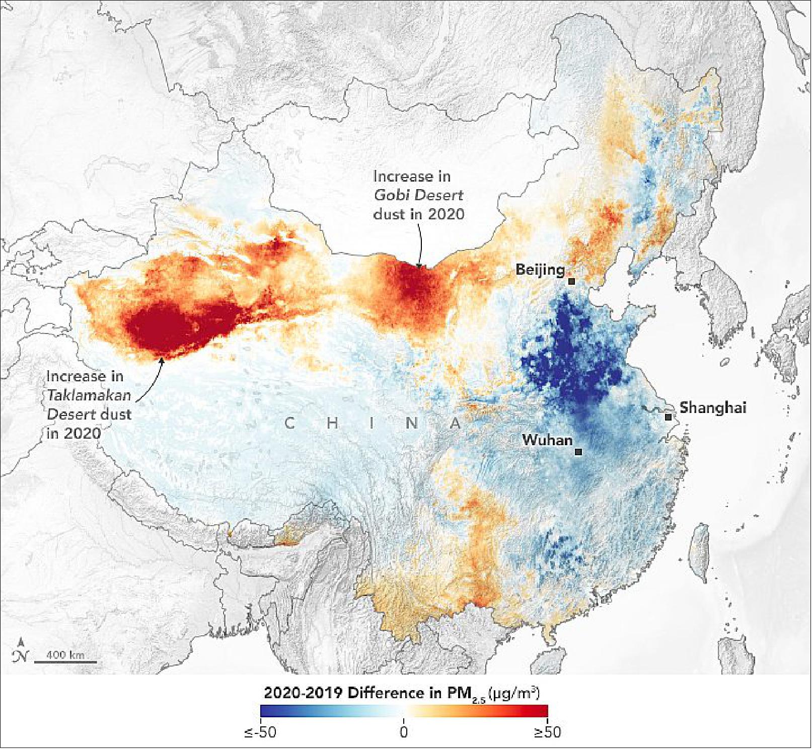
• March 16, 2021: Dust storms commonly occur across Asia in springtime. But meteorological spring is just getting underway, and already an enormous plume of sand and dust has blanketed northern China. It has been called the largest and strongest such storm to strike the region in a decade. 29)
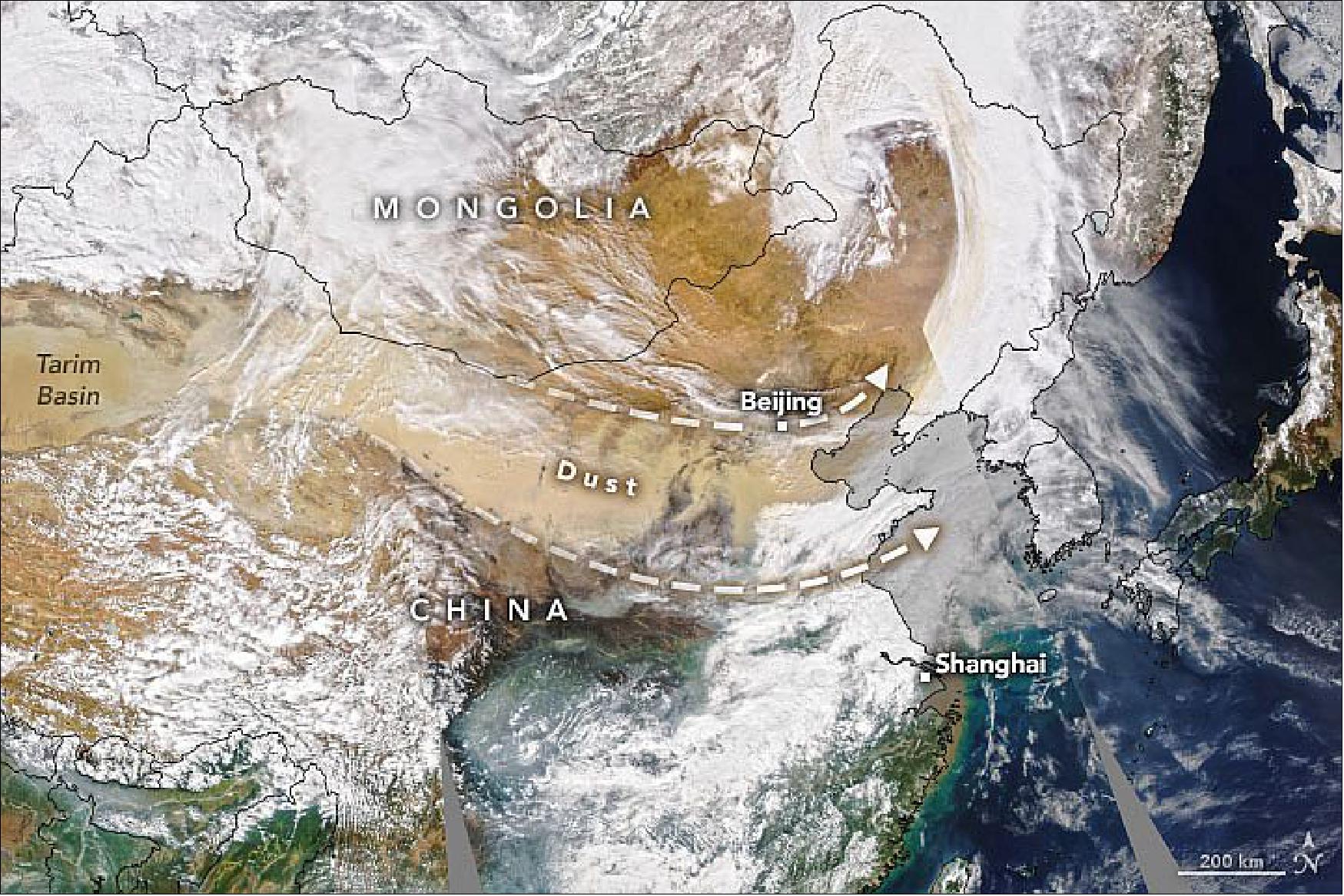
- The plume appears to originate from the Taklamakan Desert in northwest China. The dry, barren area is a major source of airborne dust that can travel especially high and far on the strong winds of spring. From the Taklamakan, the dust moved eastward for thousands of kilometers.
- “Using NASA’s satellite data, we’re able to track the dust’s pathways,” said Hiren Jethva, a Universities Space Research Association (USRA) scientist based at NASA’s Goddard Space Flight Center. In addition to natural-color imagery, Jethva tracks dust and smoke using satellite measurements of the UV aerosol index. Those data indicate that the dust moved along a west-to-east path. It then turned, following a cyclonic circulation in the atmosphere, and was lofted to an altitude above the cloud layer. Scientists have previously shown that aerosols above the clouds can have important consequences for the climate.
- In areas where the dust stays close to the ground, such storms can diminish air quality. That was the case in Beijing, where the high concentration of particles caused air quality to reach well into the “hazardous” level of the Air Quality Index. Dust tinted the sky orange, reducing visibility to less than 1000 meters (3,280 feet).
- In addition to the unusual magnitude and early season timing of the event, Jethva noted that it is uncommon for dust storms to grow so large so fast. Satellite images from March 14 show no signs of dust transport; one day later, the event had developed into a widespread, severe storm. News reports called for the dust storm to gradually weaken through the rest of the week.
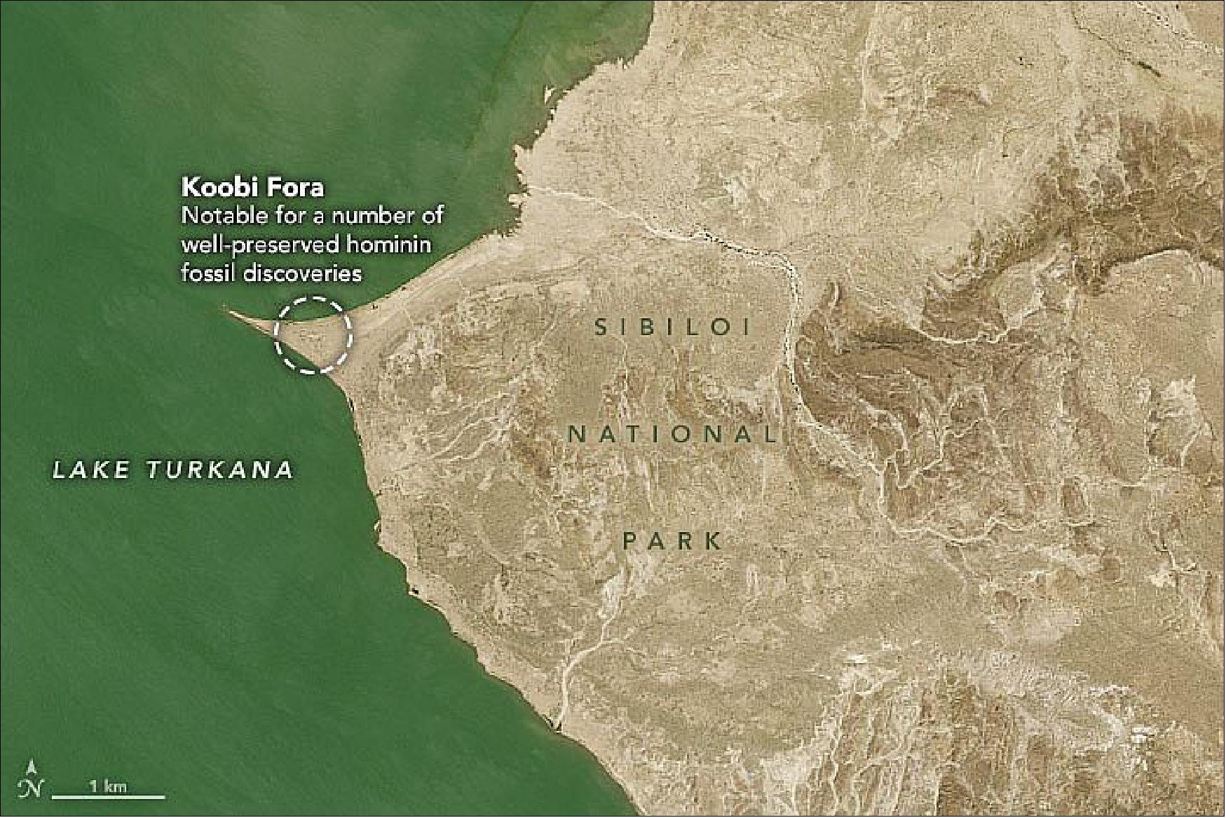
• February 2, 2021: Surrounded by arid and barren land in east Africa, Lake Turkana is the largest permanent desert lake in the world. It is sometimes referred to as the Jade Sea due to its green color, a result of abundant algae. The lake is also unique for the largely intact fossils found along its shores, which have contributed more to the understanding of human ancestry than any other place in the world. 30)
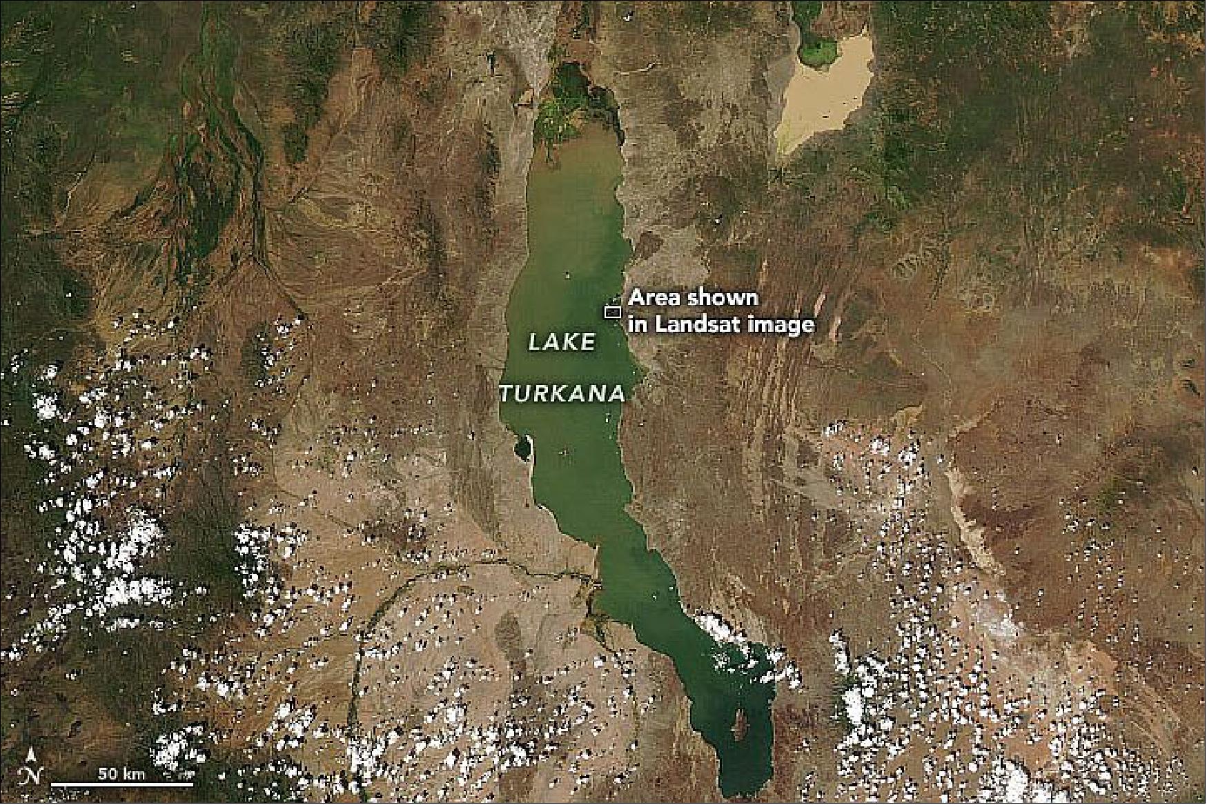
- Despite the unwelcoming environment for humans today, Lake Turkana was an ideal place for settlements about two million years ago, when conditions were wetter and greener. Nearby volcanoes helped preserve many human remains; researchers have found fossils embedded in hardened volcanic ash (known as tuff) and in various floodplains. Many intact fossils have been found on Lake Turkana’s eastern shore around Koobi Fora Ridge.
- In 1984, paleontologists Richard and Meave Leakey discovered at Koobi Fora an almost-complete fossilized skeleton of a young boy dating to about 1.5 million years ago. Known as “Turkana boy,” it is the most complete early human skeleton ever found. In 1995, Meave and her team also uncovered a fossil of a primate that appeared to walk on two legs much earlier than previously thought—at least 4.2 million years ago. Fossils representing more than 200 early humans, as well as other mammals and mollusks, have been found at Koobi Fora.
- Today, the area around Lake Turkana is sparsely populated by people due to its isolated location and inadequate fresh water. It is the most saline lake in East Africa, full of brackish water with high levels of fluoride that make it largely unsuitable for drinking. However, Lake Turkana and the three national parks nearby (Sibiloi, South Island, and Central Island national parks) serve as important stopovers for migrant water birds. They are also major breeding grounds for Nile crocodiles, hippopotamuses, and many venomous snakes, including carpet vipers and red spitting cobras.
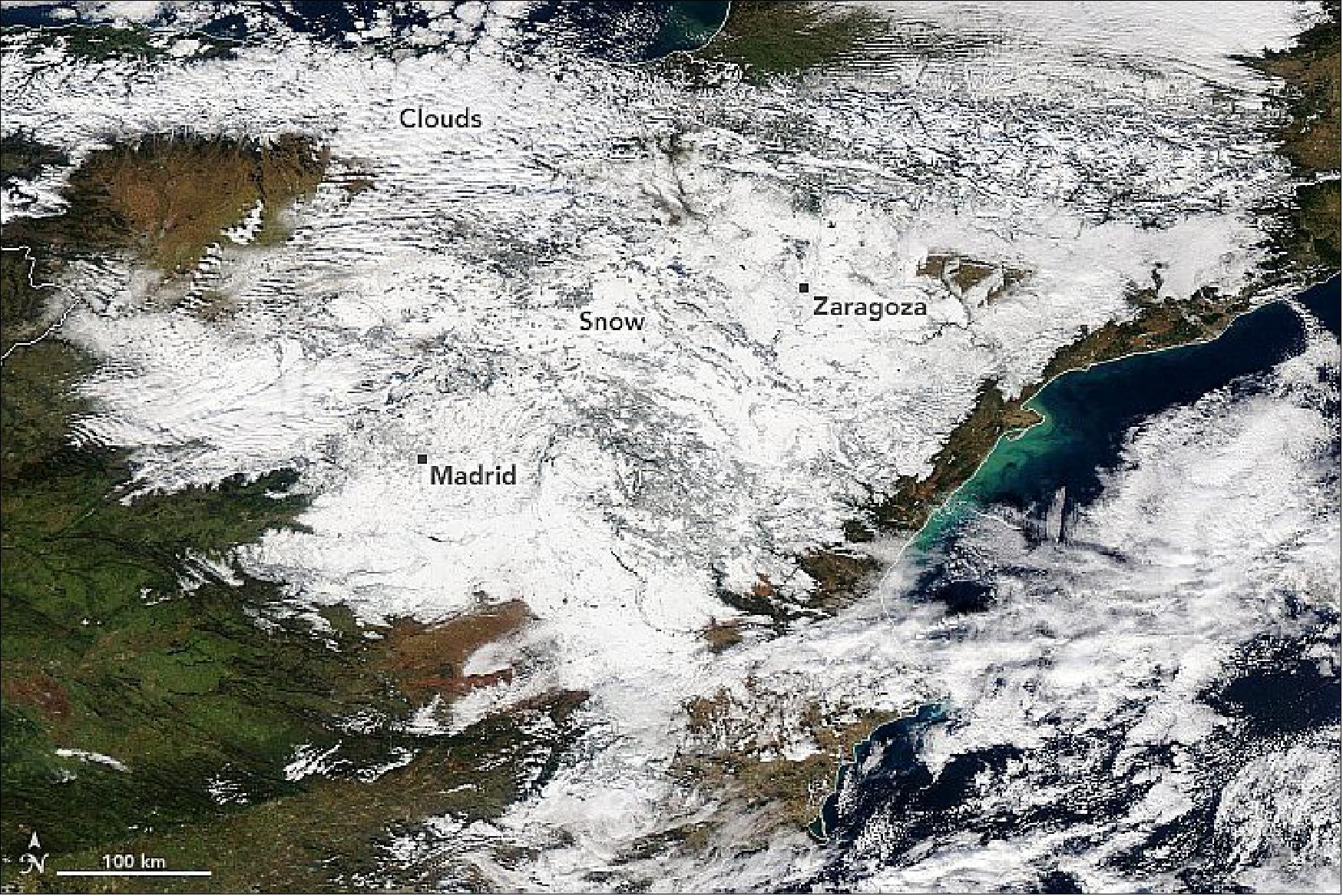
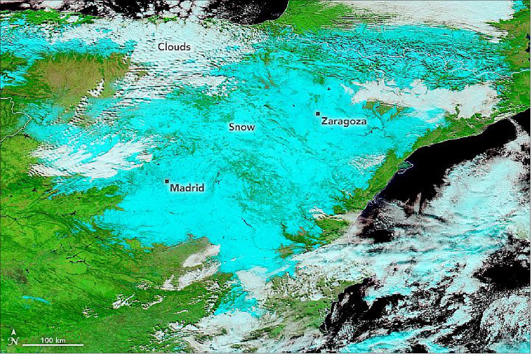
• January 12, 2021: Between January 7–9, 2021, a moist, low-pressure weather system over the ocean collided with a cold air mass sitting over western Europe. The result was the heaviest snowfall over Spain in fifty years. 31)
- After barely seeing significant snowfall for a decade, the capital city of Madrid was blanketed with widespread accumulations of 20 to 30 centimeters (8 to 12 inches). Some suburban and rural areas in central, northern, and eastern Spain were coated with up to 50 centimeters (20 inches) of snow. The country’s State Meteorological Agency (AEMET) declared it the largest snowfall in the region since 1971. In southern parts of the country, torrential rains led to flash floods.
- Nearly 700 streets and highways were rendered impassable by the snowstorm, and hundreds of people were stranded in cars for a night. All flights out of Madrid were canceled for nearly two days, as was most rail traffic. Government workers and soldiers were dispatched to clear roads in order to keep food supplies and COVID-19 vaccine supplies moving. Forecasters expected cold temperatures (-8 to -10 degrees Celsius) to linger until January 14, freezing some of the snow into ice.
• December 24, 2020: In early December 2020, the planet’s largest iceberg appeared headed straight for South Georgia Island in the southern Atlantic Ocean. Scientists and reporters wanted to know: Would iceberg A-68A continue its northward path and plow into the island’s underwater shelf? Or would it change course and stay far enough offshore to avoid becoming stuck, or “grounded”? 32)
- Josh Willis, an oceanographer at NASA’s Jet Propulsion Laboratory (JPL), started following A-68A recently, as it started to approach South Georgia Island. But he has been using satellites to study ocean currents for decades. “When I heard about how big the iceberg was and where it was—moving on the biggest current in the world—it was a no-brainer,” Willis said. “It’s got to be following ocean currents.”
- The current vectors shown on the map come from the Ocean Surface Current Analysis Real-time (OSCAR) model, which blends various measurements, such as wind and sea surface temperature. The most critical measurement in the model, however, is sea surface height. Ocean currents that last more than a few days will actually tilt the surface of the ocean. By measuring this tilt with a satellite radar altimeter, scientists can identify the location of currents and estimate how fast they are moving.
- “Satellites that can tell us about ocean currents are really important for knowing how things spread out and move around the sea,” Willis said. “That’s useful for things like containing oil spills, aiding in search and rescue, and predicting the path of huge icebergs like A-68A.”
- The altimetry technique currently works best with large-scale currents. And none are larger (or stronger) than the Antarctic Circumpolar Current. This current zips around the continent, squeezing through the passage between South America and the Antarctic Peninsula. That’s where it catches icebergs moving north along the Weddell Sea Gyre, and gives them a push to the east—in this case toward South Georgia Island.
- Currents that are large enough to be visible from space—50 to 100 kilometers (30 to 60 miles) wide—are about the right size to move an iceberg the size of A-68A. As of December 18, the berg measured 135 kilometers long and 44 kilometers wide (73 by 24 nautical miles). And the portion visible above the sea surface is literally just the tip of the iceberg; as much as 90 percent of any iceberg lies below the sea surface. “When something is that big, it’s going to feel the currents that are the same size as it,” Willis said.
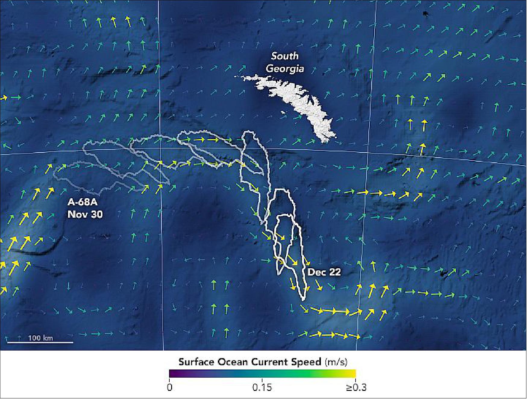
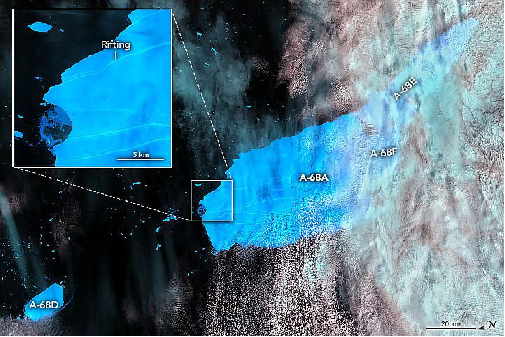
- Notice the bits of iceberg scattered across the ocean, which appear tiny compared with the named bergs. Some of these “small” pieces measure more than a kilometer long. Bergs like these are still at the mercy of currents, but winds and waves start to play a larger role in moving them around. Also notice the long rifts visible across the surface of A-68A, evidence of the stresses acting on the berg. Breakup of Antarctic icebergs is normal as they head north, where warmer water and air temperatures encourage melting.
- The smaller, newly named icebergs will continue to follow the ocean currents. “But they might do more wiggling around than we can explain with the current generation of sea level satellites,” Willis said. “In a few years, though, the upcoming NASA/CNES Surface Water and Ocean Topography (SWOT) mission might give us enough resolution to be able to predict the path of even these smaller bergs.”
• December 17, 2020: The South Pacific island nation of Fiji is bracing for the arrival of severe tropical cyclone Yasa. Citizens were told to evacuate low-lying areas in anticipation of a storm that will likely have category 4 or 5 strength when it arrives on December 17, 2020. Tropical cyclone warnings and flash flood alerts were issued for Vanua Levu, Viti Levu, the Yasawa and Mamanuca groups, and smaller surrounding islands. 33)
- Yasa emerged as a tropical storm on December 12 and organized into a cyclone by December 14. Over the next 36 hours, wind speeds increased by 130 kilometers (80 miles) per hour—well beyond the threshold increase of 55 kilometers (35 miles) per hour that meteorologists refer to as “rapid intensification.”
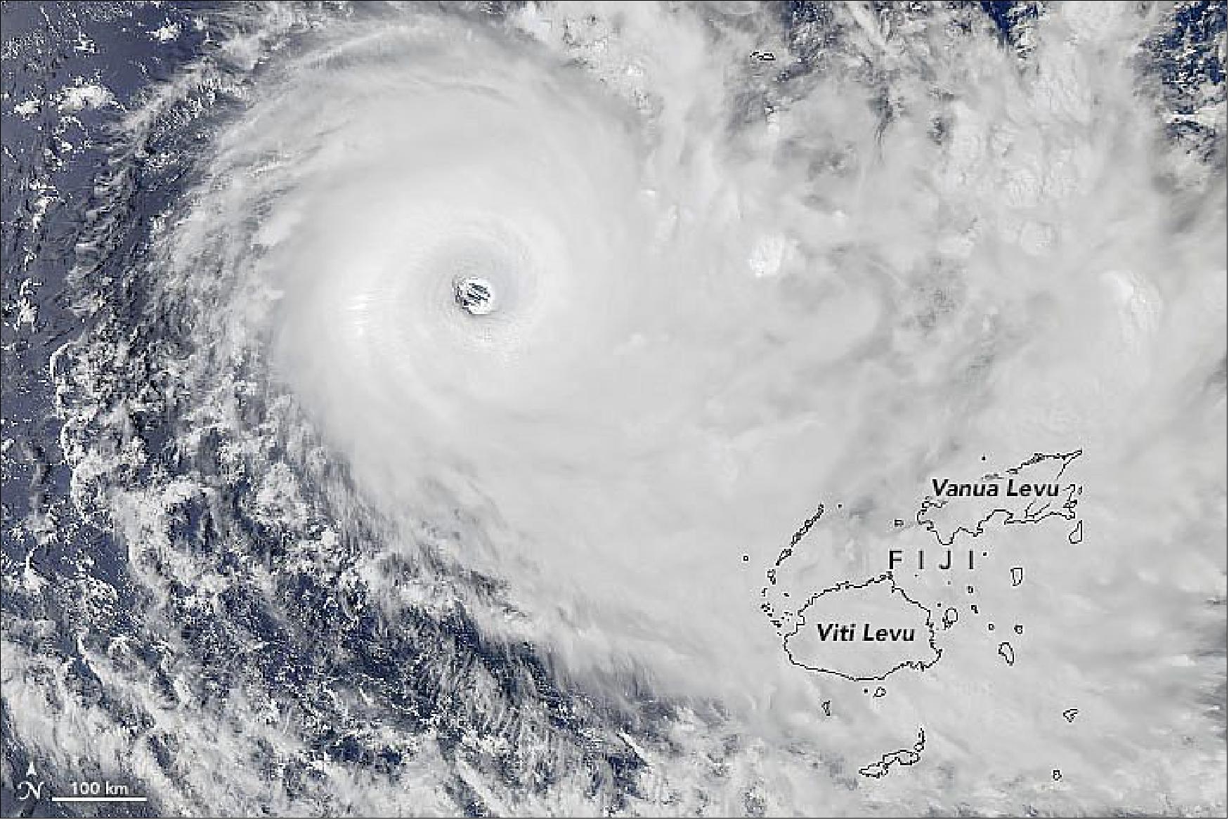
- Yasa is the fifth storm worldwide to reach category 5 strength in 2020 and the second to do so in the South Pacific. (Tropical Cyclone Harold hit Vanuatu in April.) Only one previous category 5 storm on record has made landfall in Fiji: Tropical Cyclone Winston in 2016.
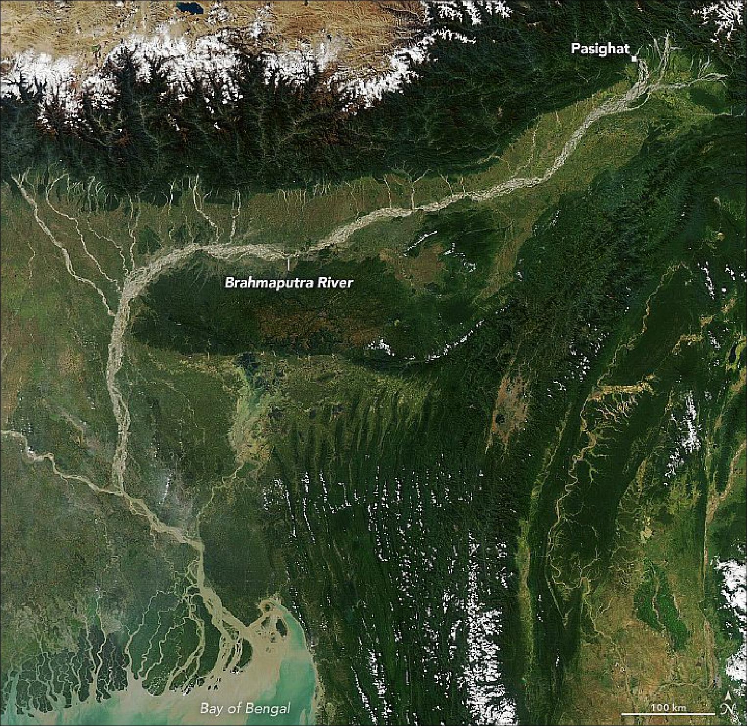
• November 29, 2020: The Brahmaputra is a river of many names. In its upper courses, where it winds through a maze of narrow gorges in Tibet, it is the Yarlung Tsangpo. After a hairpin turn near Namche Barwa, it becomes the Siang. As it cascades through the Himalayan foothills in the northeastern Indian state of Arundal Pradesh, it is called the Dihang. People start calling it the Brahamputra as it widens and flows through Assam. After crossing into Bangladesh and absorbing the flow of several tributaries, it becomes the Jamuna River, then the Padma, and finally the Meghna before pouring into the Bay of Bengal. 34)
- With dozens of sediment-rich streams flowing south from the Himalayan highlands into the Assam Valley and an area with very high erosion rates near Namche Barwa, the Brahmaputra has one of the highest sediment loads per square kilometer of any river in the world—second only to China’s Yellow River.
- In some ways, the sediment is a blessing. Annual floods spread mineral-rich silt across farmland adjacent to the river, replenishing the soil. In other ways, it poses challenges. There is so much of it that large boats are unable to navigate many parts of the river. In an attempt to limit how much the narrow, shallow channels erode land and flood, authorities have launched a number of large-scale dredging projects.
- The vast amount of sediment deposited each year in the Ganges-Brahmaputra delta has ramifications for sea level rise. According to one recent study, the increasing weight of sediment piling up in the delta causes the land surface to sag downward. The authors found sediment loading adds 2 to 3 millimeters of subsidence per year, an amount comparable to the rate of global mean sea level rise.
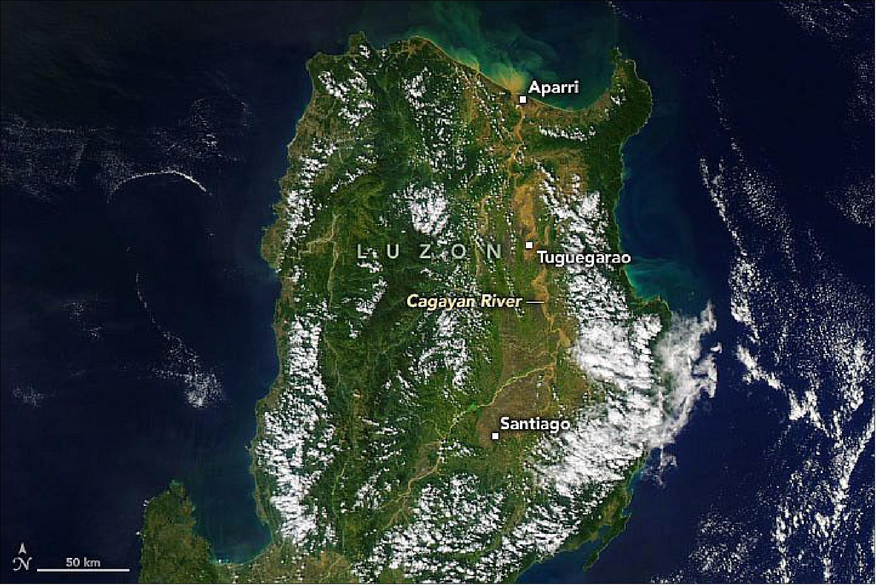
• November 20, 2020: In the days after Typhoon Vamco (Ulysses) passed through, the Philippines provinces of Cagayan and Isabela saw devastating flooding and landslides. Officials in Tuguegarao City, the provincial capital of Cagayan, called the flooding the worst they had endured in at least four decades. 35)
- According to UN Office for the Coordination of Humanitarian Affairs, more than 3.6 million people have been affected by the floods, with nearly 280,000 displaced and at least 73 deaths. Though flood waters are now receding, more than 67,000 homes have been damaged or destroyed, and power and communications are still cut off in many areas.
- Three typhoons have hit the Philippines in the past four weeks, and while none of them made direct landfall in northern Luzon, each dropped abundant rainfall in the region. Typhoon Molave (Quinta) first passed through in late October, and Super Typhoon Goni (Rolly) blasted southern Luzon on November 1. By the time Typhoon Vamco arrived, the Cagayan River and its tributaries were already swollen. The cumulative effect of the storms plus the monsoon season overwhelmed the region’s waterways.
- Flowing mostly north for 500 km (300 miles), the Cagayan has wide channels and flood plains, with sizable sections deforested and covered by farmland. The main stem receives water from many streams and smaller rivers. Just a year ago, the flood-prone river valley was devastated by what was then called a “100-year flood.” When the trio of storms soaked the area in late 2020, regional water managers opened the floodgates on Magat Dam, one of the largest in the country, to keep water from over-topping the dam. That added volume to the swollen waterways downstream.
- According to news reports, flood waters reportedly rose as much as 5 meters in some areas along the valley. The European Space Agency’s Sentinel-2 satellite got a closeup, natural-color view of flooding around Tuguegarao City, while Sentinel-1 acquired a radar view of the flooded valley.
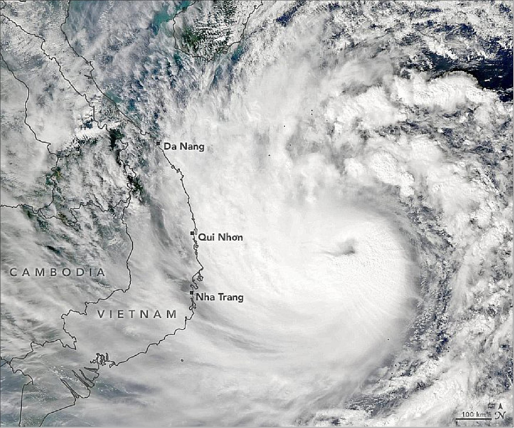
• October 28, 2020: Vietnam has been pummeled by three deadly storms this October, causing the worst flooding in decades. Now, another powerful typhoon is headed toward the country. 36)
- Typhoon Molave was forecasted to make landfall in southern Vietnam on the morning of October 28, 2020. Meteorologists predicted that the storm would bring 100 to 200 millimeters (4 to 8 inches) of rain near landfall and could potentially trigger landslides in mountainous areas. Officials in Vietnam have ordered evacuations for more than a million residents. The storm may also bring rainfall to Thailand and the island of Hainan, China.
- Molave passed through the Philippines on October 26 and 27 (locally known as Quinta) displacing thousands of residents, flooding villages, and causing several deaths. The storm has since intensified and is likely to maintain its strength as it crosses warm waters and an area with low wind shear. The storm is expected to make landfall with sustained winds of 135 to 180 kilometers (85 to 115 miles) per hour.
- Vietnam is already reeling from weeks of intense flooding caused by three tropical storms since October 11. Although October is part of rainy season for the country, the weather has been exacerbated by a La Niña event. La Niña is characterized by usually cold temperatures in the eastern equatorial Pacific Ocean and warmer water in the western Pacific, which leads to wetter-than-normal conditions to Southeast Asia.
• October 16, 2020: Small, controlled fires have long been a seasonal occurrence in Bolivia. They are routinely used as a tool to maintain pastures, burn off spent crops, clear brush and forest, fertilize soil, and burn trash. But the fires in 2020 — like those in 2019 — have been anything but routine. They have prompted the government to declare a state of emergency. 37)
- Rather than remaining small and burning for short periods, fires this year have escaped and burned unchecked in several ecosystems, including the Pantanal wetlands in the eastern part of the country; the dry Chiquitano forest in the southeast; and Beni savanna and Amazon rainforest areas in the north. Satellites have observed fires burning throughout August, September, and October, charring large areas and emitting a pall of smoke that has often darkened skies over the region.
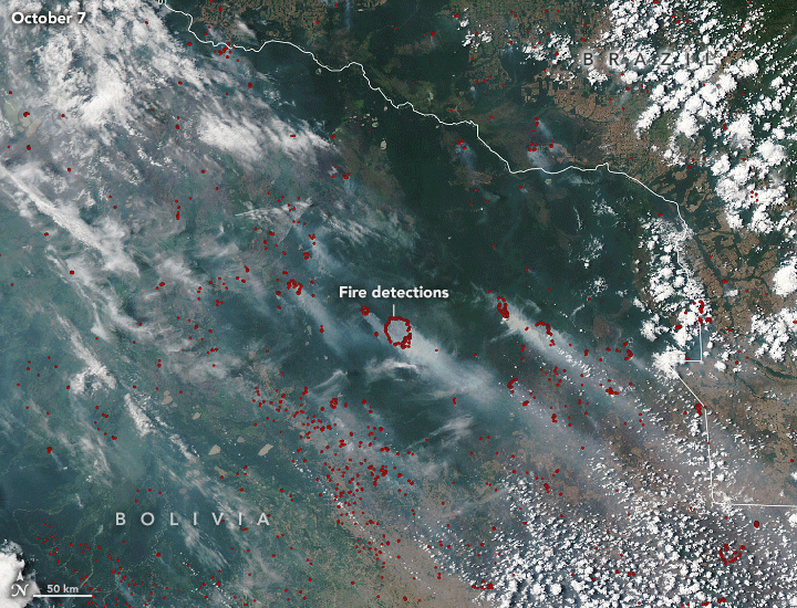
- Scientists attribute the extreme fire behavior in Bolivia to a particularly intense and prolonged drought and a recent heat wave that have both turned vegetation into tinder. Warm ocean temperatures in the tropical Atlantic Ocean may be at least partly responsible for the drought; the warmer water tends to shift weather patterns in a way that diverts moisture away from South America into the Northern Hemisphere.
- “In the 2000s, severe droughts linked to the warm phase of the Atlantic Multi-decadal Oscillation created conditions where forest fires could burn for months, even in dense Amazon rainforest,” explained Douglas Morton, chief of the Biospheric Sciences Laboratory at NASA’s Goddard Space Flight Center. “This year fits that pattern. As warmer Atlantic sea surface temperatures shifted rainfall to the north, central South America has suffered drought conditions that have put multiple areas at greater risk of wildfires.”
- Drought conditions first sparked widespread fire activity in the Parana delta in Argentina in June. That was followed by unprecedented burning in the Pantanal wetlands along the borders of Brazil, Bolivia, and Paraguay in August. Most recently, these fires have flared up in the dry forests of northeastern Bolivia in September and October.
- The consequences of the fires have been severe in Bolivia. The government reports that fires have charred more than 1.3 million acres, burning dangerously close to several towns and causing widespread damage to crops and grazing lands. In Santa Cruz and Chuquisaca, fires have collectively destroyed more than 45,000 hectares of crops, 27,000 hectares of grazing land, and 800 head of cattle. According to one analysis of high-resolution commercial satellite imagery by the Monitoring of the Andean Amazon Project (MAAP), 25 percent of the large fires in Bolivia have burned in protected areas, including Noel Kempff Mercado National Park and Copaibo Municipal Protected Area. Relief is not likely to come anytime soon, as weather forecasts predict high temperatures, winds, and little rain in the next few weeks.
- Scientists have been tracking the fires in the region and sharing the data with the public via NASA’s Amazon dashboard tool. It shows pronounced increases in the number of savanna and grassland fires in El Beni starting in mid-August. It also detected deforestation and small clearing fires in September in the Amazon rainforest areas of northern Bolivia.
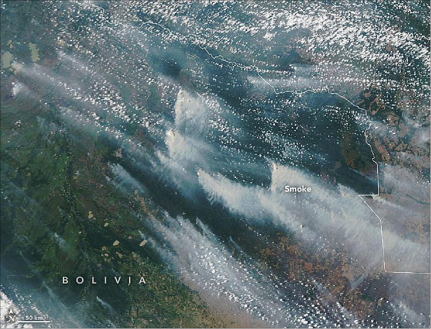
• October 13, 2020: Months before Arctic sea ice reached its annual minimum extent for 2020, the floating blanket of ice had already pulled away from the Siberian coast. The seasonal ice will eventually return, but in mid-September, inland fresh water continued to flow unimpeded into the Laptev Sea. 38)
- Some of the brown and green color is the result of organic matter—debris from leaves, branches, and peat—dissolved in the river water and carried out to sea. The rivers also carry suspended sediments, adding to the colorful palette. The detailed patterns in the Laptev Sea are real, but certain shades and tones in the data have been separated and filtered to make the sediments and dissolved organic matter stand out.
- Phytoplankton might also be present amid the color. Samples collected during a 2015 field study showed that diatoms were abundant in early September in the upper layers of the sea, particularly in areas where seawater had been freshened by discharge from the Lena River. Researchers also found species of dinoflagellates and green algae in the water.
- The Lena, Ob, and Yenisei rivers together account for about half of the fresh water supplied to the Arctic Ocean each year. Fresh water from rivers and other sources is important to the ecosystem and to sea ice formation, but it also has the potential to affect ocean circulation patterns and climate.
- Scientists have been investigating how freshwater plumes move around the Arctic Ocean and mix with seawater. They are also studying the effect of changes occurring inland. The erosion of permafrost deposits releases large amounts of carbon and nitrogen into the Lena River and the Arctic Ocean, affecting ecosystems and adding greenhouse gases into the atmosphere.
• October 10, 2020: William Dampier was not a typical pirate. Between pillages, the curious English sailor took detailed notes about local wildlife and even collected plants—some of which are still preserved today—on his voyages around the world. His travel logs provided valuable information for future scientists such as Charles Darwin and even inspired Jonathan Swift’s Gulliver’s Travels. 39)
- On a trip to the most westerly tip of Australia in 1699, he came across a basin with an abundance of sharks. Named by Dampier, Shark Bay is home to 28 different species, from the notorious tiger shark to the timid nervous shark. Little did Dampier know that the area would become world-renowned, but not because of its sharks. Shark Bay contains the largest and richest beds of seagrasses in the world and is also home to some of the oldest lifeforms on Earth.
- Spanning 4,800 km2, these underwater meadows include 12 of the world’s 60 known seagrass species. They grow in waters close to shore, where they are protected from strong ocean currents and receive lots of light for growth. Scientists estimate that around eight million tons of leaf material grow each year in the meadows. The Wooramel seagrass bank, the largest in the world, covers 1,000 km2 and stretches 130 km along Shark Bay’s eastern coastline.
- The lush seagrass meadows help feed and sustain a large variety of animals. Of note, Shark Bay supports more than 10,000 dugongs—described by Dampier as a shark with a hippopotamus in its mouth—around 10 percent of the world’s population. The bay is also home to endangered green and loggerhead turtles.
- Perhaps the most interesting life around the area is the oldest and smallest. The shores around Shark Bay contain numerous stromatolite deposits—layered rocks that are created when microbes trap particles and create sediments. The stromatolites found here are some of the most diverse in the world, and researchers study their sediments to learn what marine ecosystems looked like three billion years ago.
- The majority of Shark Bay’s stromatolites are located in the shallows of Hamelin Pool, on the basin’s eastern shore. The shallow pool is ideal for stromatolites because it is about twice as salty as the ocean. The hypersaline environment is the result of a combination of factors. The sand and seagrass banks make it difficult for water to flow through the area, trapping it in the pool. And low rainfall and high evaporation rates draw off moisture and make an ever-saltier basin. Since few animals and plants can survive in such conditions, nearby microbial communities have less competition for resources and fewer predators, allowing them to thrive and create the abundance of stromatolites.
• September 14, 2020: NASA's Atmospheric Infrared Sounder (AIRS), aboard the Aqua satellite, captured carbon monoxide plumes coming from California wildfires last week. There were 28 major wildfires burning across the state as of Sept. 14. This includes the August Complex Fire, which started on Aug. 17 and has since burned over 471,000 acres, making it the largest fire on record in California. 40)

- The animation shows three-day averages of carbon monoxide concentrations around 3 miles (5 km) up in the atmosphere between Sept. 6 and Sept. 14. The red and orange areas indicate regions with extremely high carbon monoxide concentrations of greater than 350 parts per billion by volume (ppbv). The more normal, background concentrations of carbon monoxide show up as yellow and green, with amounts between 30 and 50 ppbv.
- Released by the fires along with smoke and ash, carbon monoxide is a pollutant that can persist in the atmosphere for about a month and can be transported great distances. At the high altitude mapped in these images, the gas has little effect on the air we breathe; however, strong winds can carry it downwards to where it can significantly impact air quality. Carbon monoxide plays a role in both air pollution and climate change.
- The intense heat from the wildfires lofted the carbon monoxide high into the atmosphere, enabling detection by the AIRS instrument. The jet stream then blew the carbon monoxide plume eastward across the U.S. and over the Atlantic Ocean.
- AIRS, in conjunction with the Advanced Microwave Sounding Unit (AMSU), senses emitted infrared and microwave radiation from Earth to provide a three-dimensional look at Earth's weather and climate. Working in tandem, the two instruments make simultaneous observations down to Earth's surface. With more than 2,000 channels sensing different regions of the atmosphere, the system creates a global, three-dimensional map of atmospheric temperature and humidity, cloud amounts and heights, greenhouse gas concentrations and many other atmospheric phenomena. Launched into Earth orbit in 2002, the AIRS and AMSU instruments fly onboard NASA's Aqua spacecraft and are managed by NASA's Jet Propulsion Laboratory in Pasadena, California, under contract to NASA. JPL is a division of Caltech.
• September 7, 2020: Intense heat, winds, and drought have fueled smoky infernos in the western United States. 41)
- Though serious fires burned in California and other western states for much of August 2020, many new fires were ignited and others surged in intensity over Labor Day weekend. Cold air from Canada spilled into the Great Basin and helped trigger powerful wind storms in the Pacific Northwest.
- With record-breaking heat and extreme drought conditions already gripping much of the region, the addition of high winds further energized the fires, prompting many to spread rapidly and loft vast columns of smoke high into the air.
- The fires have created destroyed homes and triggered evacuations in many communities. In California, hundreds of hikers trapped at a wilderness resort near Fresno had to be rescued by helicopter. In Washington, the Babbs Road fire overran most of the town of Malden. In Oregon, flames destroyed large numbers of buildings in Blue River. In Colorado, people faced mandatory evacuations due to the Cameron Peak fire. They also endured weather whiplash: Just a day after record temperatures helped fuel fires, air temperatures plummeted nearly 60°F (33°C) and snow fell.
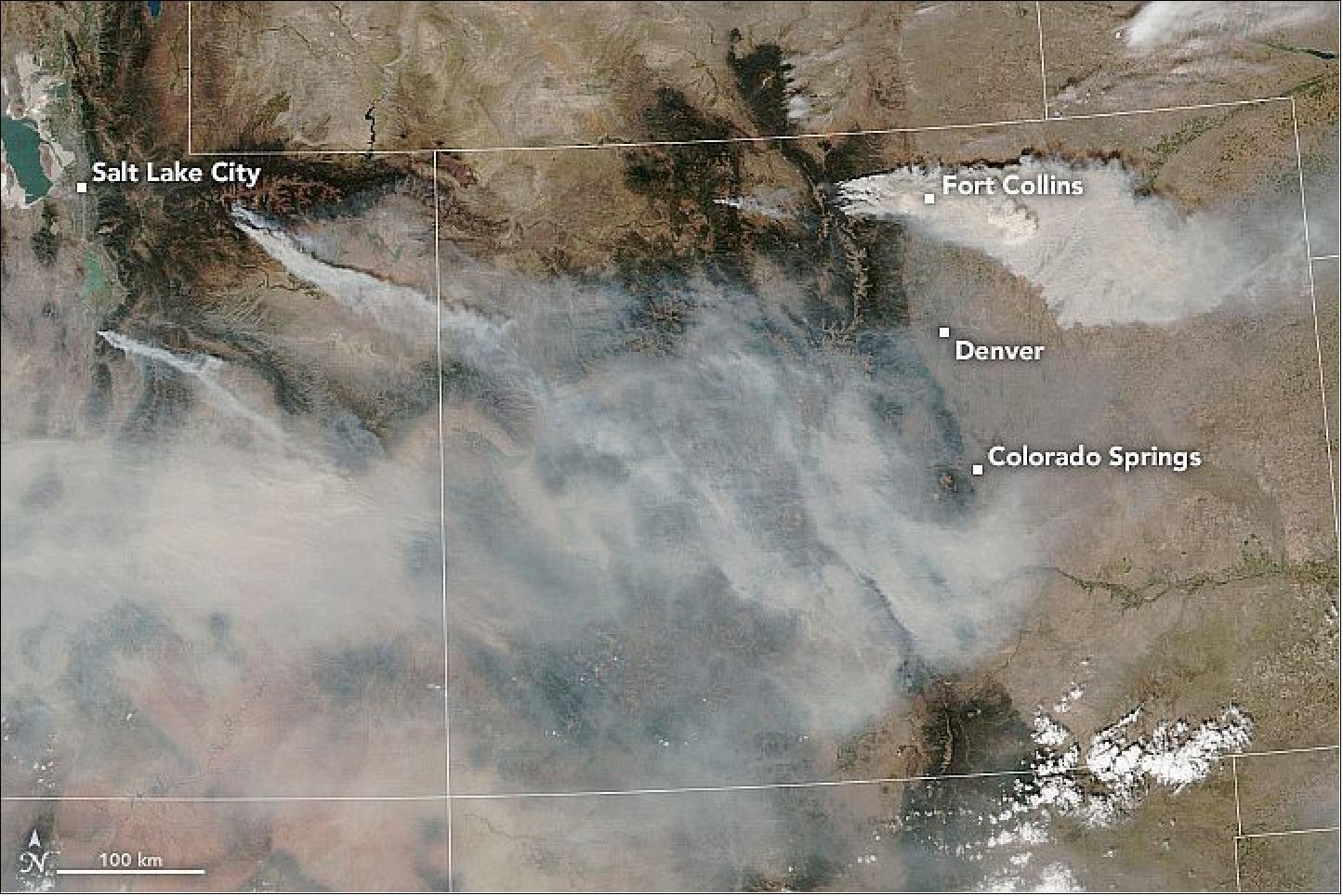
• July 31, 2020: Each summer, parts of the Arctic Ocean and peripheral seas lose their ice cover and bathe in ample sunlight. In this window of time, some of these open-water areas come to life with phytoplankton blooms so large and vivid they can be seen from space. 42)
- The summer of 2020 has been one of those summers. Phytoplankton—the floating plant-like organisms that, like plants on land, need sunlight and nutrients to thrive—have exploded in numbers, or "bloomed," across ice-free northern latitudes.
- In the Barents Sea, blooms that show up in spring and early summer are typically composed of diatoms—a microscopic form of algae with silica shells and ample chlorophyll, which makes them appear green in satellite images. By late July and into autumn, waters become warmer and more stratified. This change promotes blooms of coccolithopohres, a type of phytoplankton that turns the water milky white-green in satellite imagery due to their calcium carbonate shells. Sometimes, as is likely the case here, both types of phytoplankton show up to at once.
- While blooms around the Arctic are somewhat common, new research has shown that phytoplankton biomass is continuing to increase in the Arctic Ocean. In a recent paper published in Science, researchers from Stanford University found that the rate of growth of phytoplankton biomass across the Arctic Ocean increased by 57 percent between 1998 and 2018. 43)
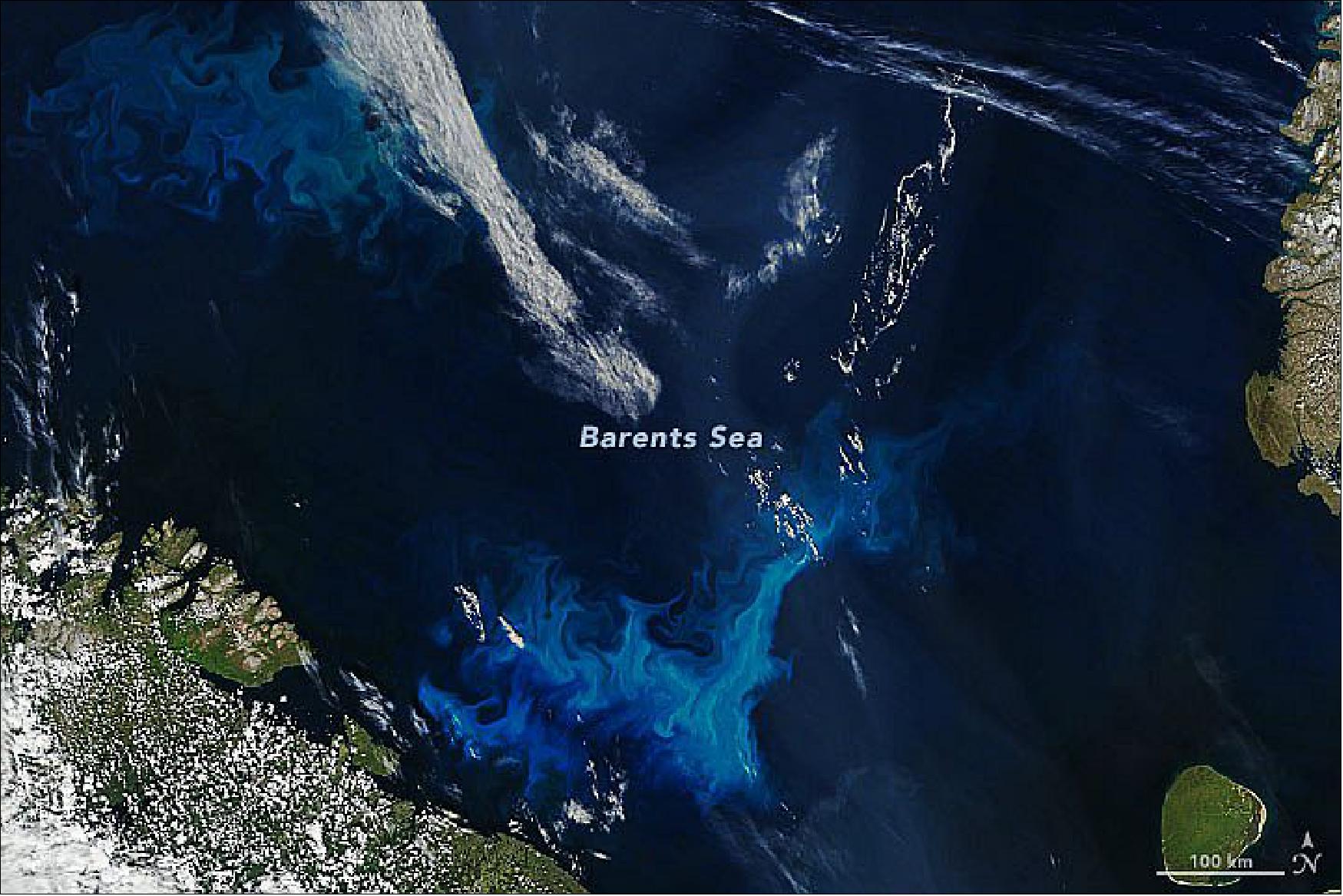
- The success of phytoplankton in this increasingly ice-free environment is apparent in the map above. It shows changes in the amount of chlorophyll a—the pigment used by phytoplankton to harness sunlight for making food—during the past two decades across the Arctic Ocean. The map was produced using a regional algorithm that incorporates satellite data from NASA's SeaWiFS and MODIS instruments. Notice that most of the increase is in the Chukchi and Barents seas.

- "We were certainly surprised to see that phytoplankton biomass has begun to increase in the Arctic," said Stanford biological oceanographer Kevin Arrigo, whose doctoral student Kate Lewis led the study. "Many people have been saying that with increased melt, nutrient inventories would decline, but that is not what we saw."
- Not all areas saw increases; the waters east of Greenland stand out. Arrigo speculated that the decline there could be related to higher nutrient consumption "upstream" in waters that have become more productive. "But we would have to go there and look to know for sure," he said.
- It remains unclear how phytoplankton biomass will change in the future as Arctic sea ice cover continues to shrink. "The Arctic Ocean is changing in an alarming rate and soon may lose a lot of its uniquely polar characteristics," Arrigo said. "There will always be winter ice, but for the rest of the year, it's starting to look a lot like our temperate oceans."
• July 21, 2020: Arctic sea ice is subject to some serious travel restrictions. Penned in by major land masses, most ice that forms in the Arctic Ocean stays there for the duration of its existence—typically one to four years before melting. Some ice, however, escapes the Arctic Ocean through a handful of passages and then drifts south. 44)
- "The pack-ice you see in the image is remnant ice that exited the Arctic through Fram Strait," wrote Robert Pickart, a high-latitude oceanographer at Woods Hole Oceanographic Institution. "It is in the process of melting out as it is carried southward by the East Greenland Current."
- The Fram Strait is the primary route for sea ice exiting the Arctic Ocean. This 450 km (280 mile) wide passage between Greenland and Svalbard connects the Arctic Ocean with the Greenland Sea. The East Greenland Current originates north of the Fram Strait and moves seawater, along with some sea ice, southward toward the southern tip of Greenland.
- Pickart, who was sailing on the R/V Armstrong near the southern tip of Greenland at the time of this interview, noted that the current is unstable and tends to meander. The instability causes vortices of water, or "eddies," to propagate offshore, which can deform the seaward edge of the sea ice.
- "This is a graphic example of how fresh water—both liquid and frozen—originating from the Arctic gets transferred to the interior of the Nordic seas, which modulates the wintertime transformation of the interior water," Pickart said. "If this changes in the future, it has implications for the global overturning circulation that helps regulate our climate."
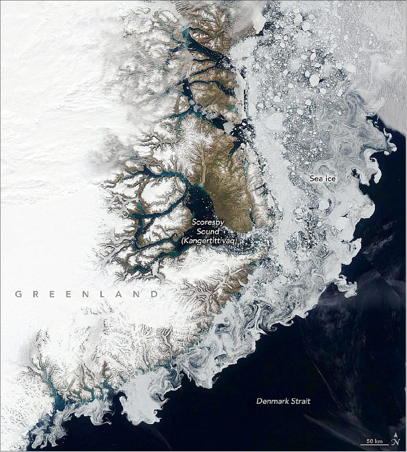
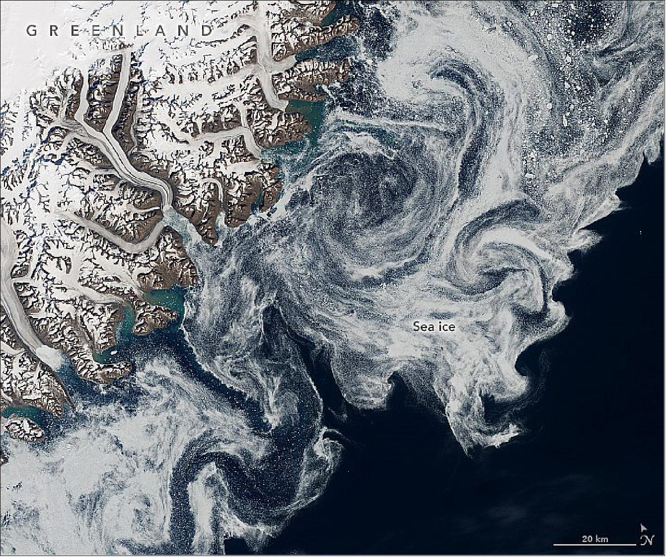
• July 20, 2020: Less than two months into the hurricane season, the Atlantic basin has already produced six named storms, delivering some of the earliest activity in the past fifty years. None of the storms reached hurricane intensity, but the sheer number of them fit with forecasts of a busy season. 45)
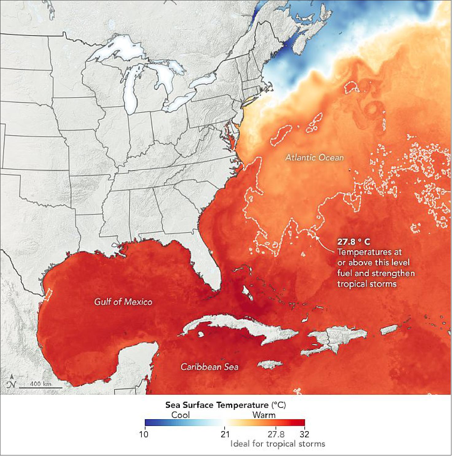
- Forecasters at NOAA's Climate Prediction Center predicted in May that 2020 would likely be an above-average hurricane season. A typical year brings 12 named storms (winds of at least 63 kilometers/39 miles per hour), of which 6 become hurricanes (winds of at least 120 km/74 miles per hour). This year, forecasters predicted 13 to 19 named storms, of which 6 to 10 would become hurricanes. Storm formation and intensification depend on a number of complex variables and conditions, and several are lining up in favor of robust activity in 2020.
- "Early season storm activity does not necessarily correlate with later hurricane activity," said Jim Kossin, an atmospheric scientist with NOAA. "But if we're in a season where the environment is conducive to storm formation early on, then those underlying favorable conditions often persist throughout the season."
- Sea surface temperatures in the Atlantic Ocean have been abnormally warm so far in 2020, which could help fuel storms. Warm ocean water evaporates and provides moisture and energy for the lower atmosphere. As water vapor rises and condenses, it releases heat that warms the surrounding air and can promote the growth of storms. Ocean waters typically need to be above 27°C (80°F) for storms to develop. In early July, parts of the Atlantic basin (which includes the Gulf of Mexico and Caribbean) hit temperatures of 30°C (86°F).
- Instruments: Aqua — AMSR-E and MODIS; NOAA-15 POES — AVHRR, NOAA-18 POES - AVHRR, NOAA-19 POES — AVHRR and Terra — MODIS.
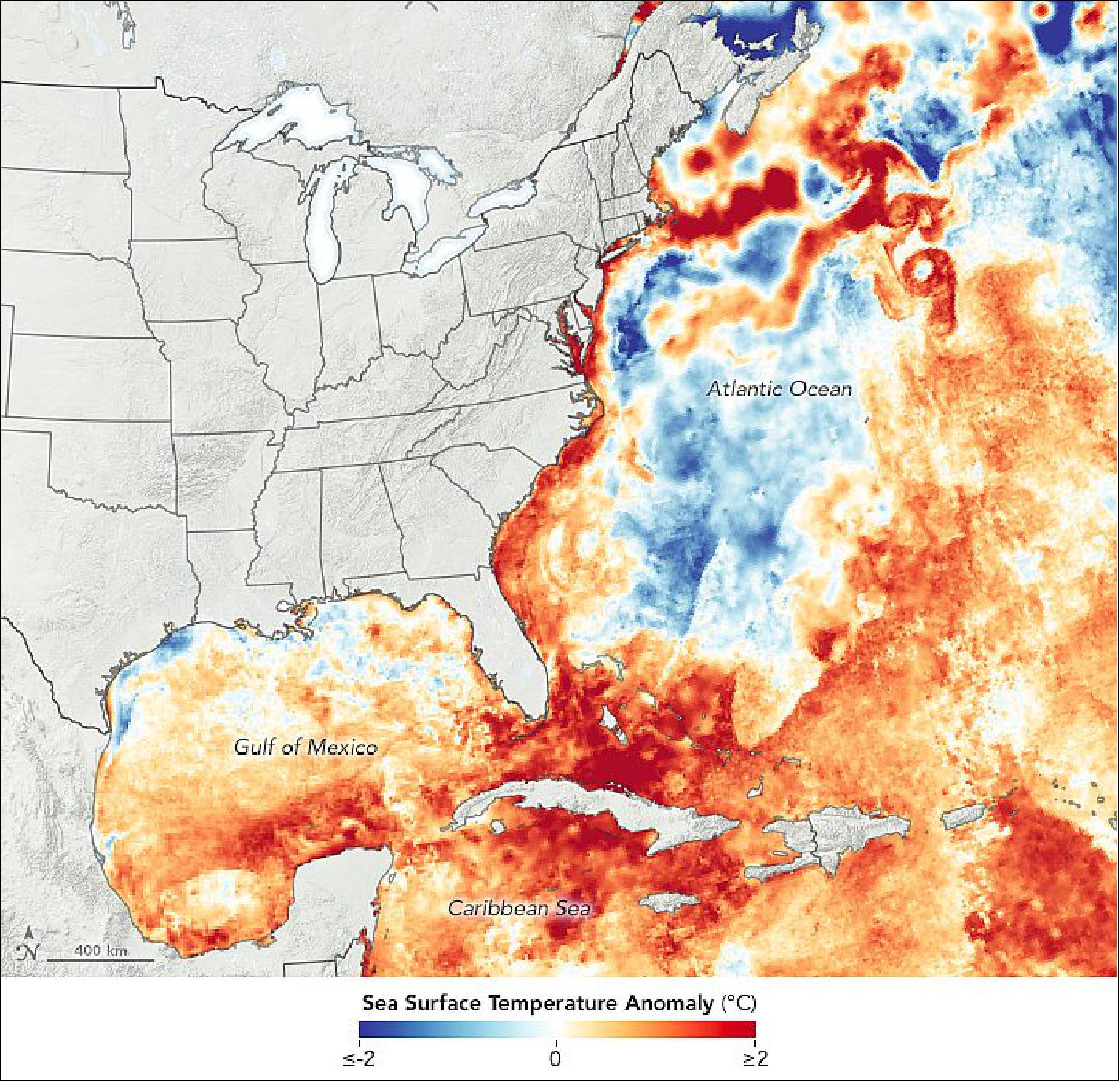
- "If it's warmer than average for several months, it's reasonable to say that it will still be warmer than average later on in the season," said Tim Hall, a hurricane researcher at NASA's Goddard Institute for Space Studies. "Ocean temperatures do not change rapidly."
- Hall compiled the data for the chart below, which shows how this season compares so far to the past 50 years. The brown line represents the average number of tropical cyclones from 1970-2017 for that day, calculated from the National Hurricane Center's HURDAT2 database. Day 120 is April 30 (except in Leap Years), one month before the official start of the season. The crest and trough of the shading represent the highest and lowest accumulated tropical cyclone count on that day. The season with the overall highest count was 2005, when there were 30 named storms and four category 5 hurricanes (Emily, Katrina, Rita, and Wilma).
- Beyond a warm ocean, a combination of factors also need to line up in order to create strong storms. Kossin noted that storms need low vertical wind shear and moist air in order to form, intensify, and persist. Vertical wind shear arises from changes in wind speed or direction between Earth's surface and the top of the troposphere (10 km/6 miles above sea level). Strong vertical wind shear can impede storm formation by removing heat and moisture from the atmosphere. It can also up-end the shape of a hurricane by blowing its top away from its bottom.
- Forecasters have noted the development of one phenomenon that may affect wind shear in 2020: La Niña. Characterized by unusually cold ocean surface temperatures in the eastern equatorial Pacific, La Niña weakens westerly winds high in the atmosphere. This leads to low vertical wind shear in areas around the Americas, including the Atlantic basin, allowing hurricanes to form.
- On the other hand, bursts of dry air from the Sahara can suppress storm formation. Since June 2020, Saharan dust storms have carried dry air across the Atlantic Ocean and stunted storm development.
- "Even when the oceans are very warm and favorable for storm formation, dry air intrusions and dusty air from the Sahara can keep hurricanes from forming," said Kossin. Saharan air layers create strong wind shear and bring dry air to the mid-levels of the atmosphere, where it can affect the structure and development of tropical cyclones.
- But unlike ocean temperatures, atmospheric conditions like wind shear and dry air can change rapidly. "We had events that suppressed further intensification of the tropical storms so far, but that doesn't mean those events will still be around in August and September," said Hall. "The warmer-than-average ocean temperatures will likely persist until the fall so the table is set for an active season if these other key factors also line up."
• July 13, 2020: In southern South America, clouds often rule the skies. But in June 2020, just the right weather patterns were in place to provide a rare, clear view of Patagonia in winter. 46)
- According to René Darío Garreaud, a professor at the University of Chile, it's unusual to see such a widespread cloud-free area over Patagonia. "The last time that I saw a completely clear image was in February 2019," he said. At that time, during the Southern Hemisphere's summer, the warm seasonal temperatures meant snow and ice were mostly limited to the spine of the Andes and the Patagonian icefields.
- The region is typically cloudy in satellite imagery due to the year-round passage of storms. The southern tip of the continent dips into a belt of prevailing westerly winds, along which high- and low-pressure systems constantly drift eastward. The terrain also enhances the region's cloudiness: when winds encounter the Andes, moist air blowing in from the Pacific Ocean is forced upward, where it cools and condenses into clouds.
- In June, the usual weather pattern came to a halt. A system of high pressure settled in over the Drake Passage—the waterway just south of the continent—and brought clear skies to the wider region. The weather system stayed put for nearly a week. The phenomenon is known as a "blocking high," aptly named because it blocks the typical movement of air masses. In this case, westerly winds were forced to take a detour.
- As a result of the blocking high, unusually cold temperatures stretched from Patagonia all the way to Paraguay and Bolivia. Cloud-free skies mean that heat near the land surface can more easily escape to space, resulting in cooler temperatures. In addition, the diverted westerly winds brought cold air from Antarctica and funneled it right into southern Patagonia.
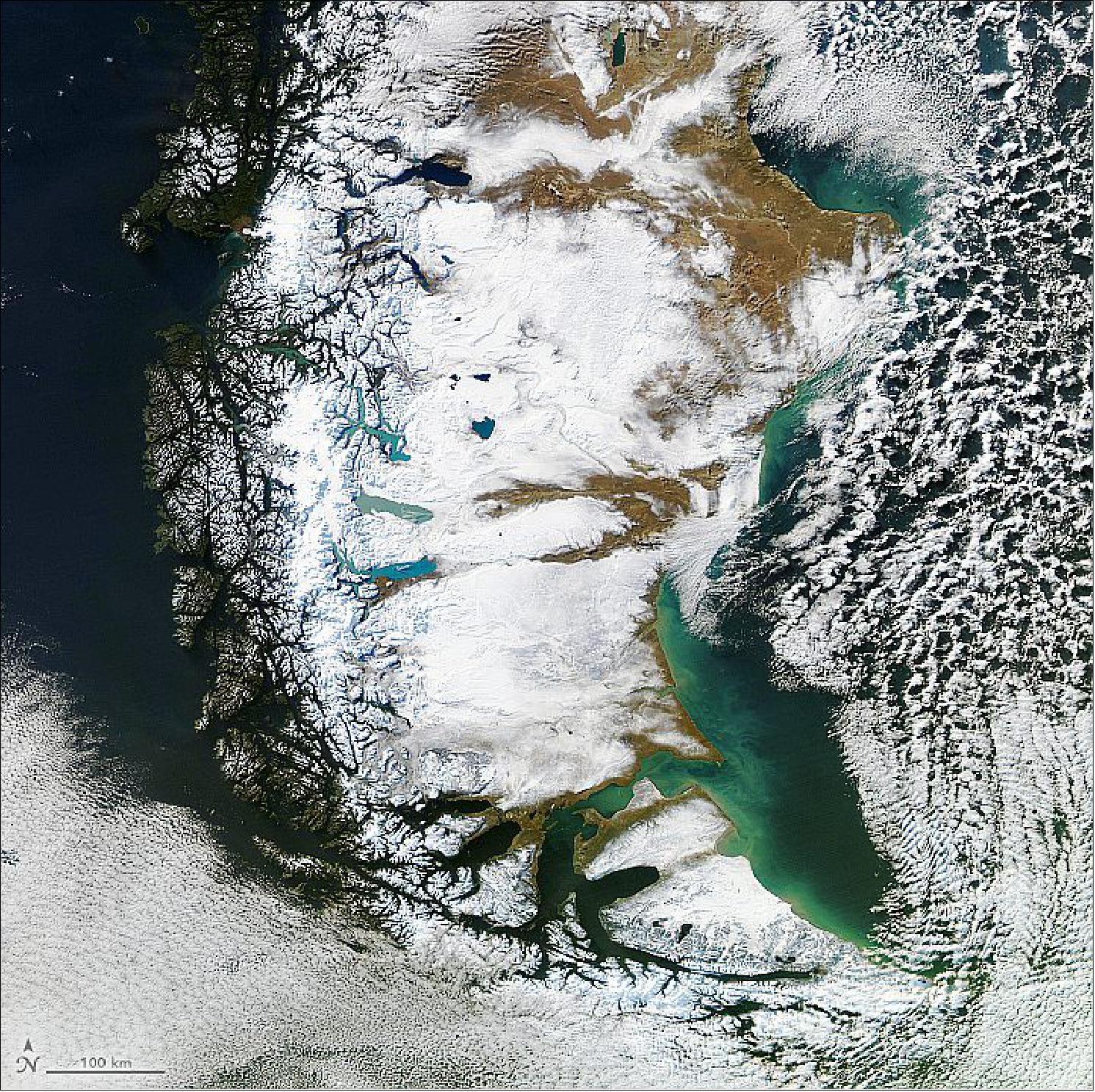
- Those cold temperatures kept the Patagonian plateau in Argentina blanketed under snow that fell during a major storm on June 23-24. Parts of the southern Andes receive abundant precipitation each year, measuring more than 500 cm (200 inches). It's less common, however, to see snowfall so far east on an arid part of the continent that receives less than 30 cm (12 inches) of precipitation each year.
- The bout of frigid air, however, was not enough to freeze the deep lakes east of the icefield (detailed image of Figure 72). "Even in winter, surface air temperatures are generally above 0 ºC," Garreaud said. "So the cold event was intense, but not long enough to freeze these lakes." Left unfrozen, the lakes' turquoise color—a result of "glacial flour"—contrasts even more with the surrounding white snow.
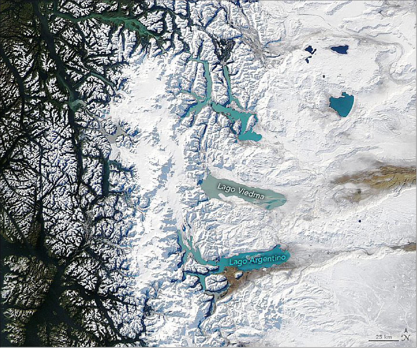
• June 24, 2020: Eastern Siberia is famous for some of the coldest wintertime temperatures in the Northern Hemisphere. But in 2020, it has been the region's wildly high temperatures and wildfires that have wowed meteorologists. 47)
- After several months of warm weather, the Russian town of Verkhoyansk reported a daytime temperature of 38°C (100.4°F) on June 20—likely a record high for the town. (The previous high was 37.3°C, recorded on July 25, 1988.) If verified, this will be the northernmost temperature reading above 100°F ever observed and the highest temperature on record in the Arctic, according to the Capital Weather Gang.
- "This event seems very anomalous in the last hundred years or so," said NASA Goddard Institute for Space Studies Director Gavin Schmidt. "The background trends in temperature in this region are about 3 degrees Celsius since the 19th century, so the probabilities of breaking records there are increasing fast."
- Note that the map depicts land surface temperatures (LSTs), not air temperatures. LSTs reflect how hot the surface of the Earth would feel to the touch and can sometimes be significantly hotter or cooler than air temperatures. — To learn more about land surface temperatures and air temperatures, read: Where is the Hottest Place on Earth?
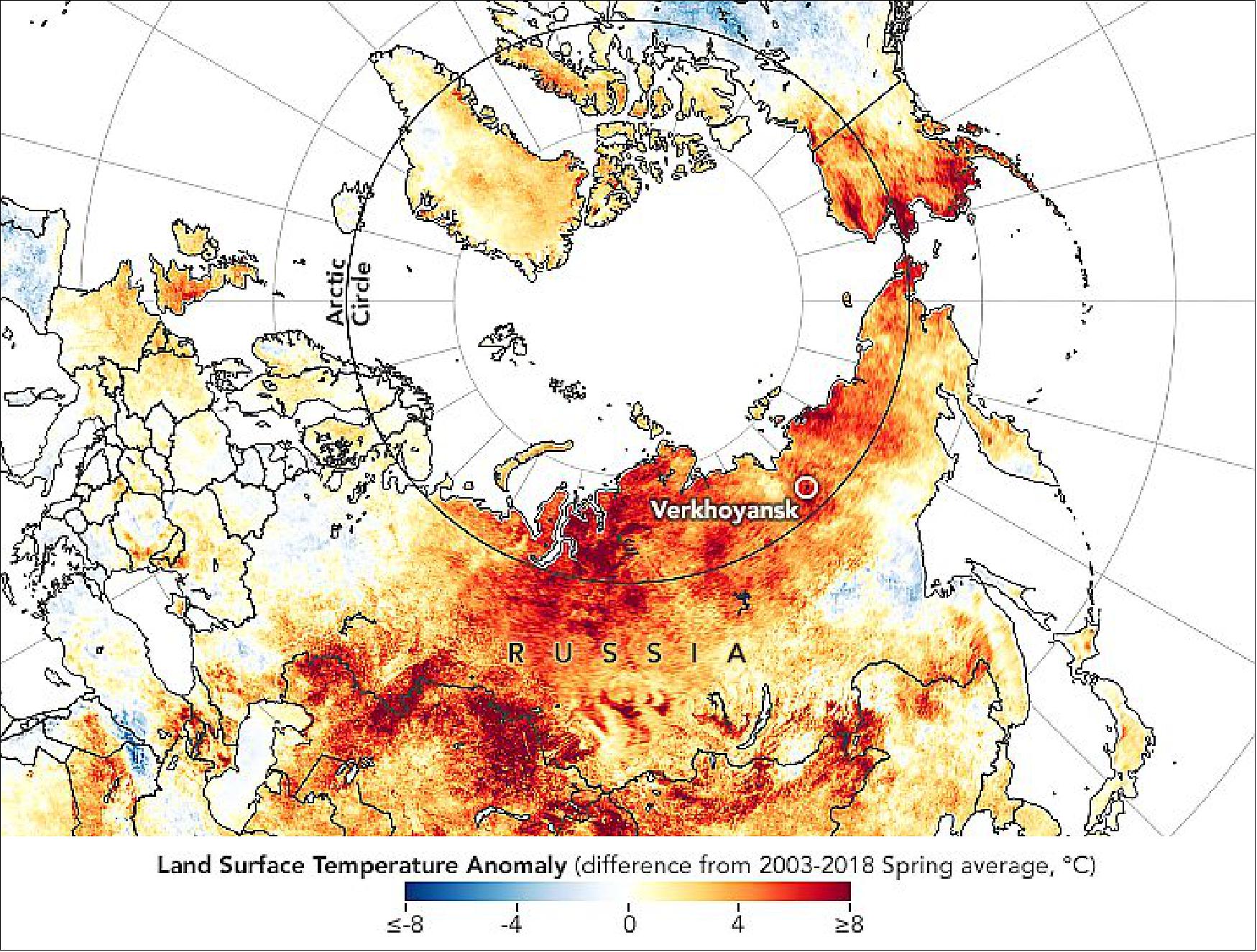
- In a report about the remarkably warm temperatures in Siberia, European scientists examined historical temperature data in their global ERA5 reanalysis, finding that temperatures have been unusually warm in the region since January 2020. Since the ERA5 data begins in 1979, the European team also looked to GISTEMP, a NASA temperature record with data through 1880. They could not find any other examples in either dataset of such an intense heat wave in this part of Siberia persisting for such an extended period.
- The persistent high-pressure atmospheric pattern that brought the extreme heat has exacerbated wildfires, prompting dozens to burn in the region's forest and shrub ecosystems. Some of those ecosystems grow on top of carbon-rich layers of peat and permafrost. The natural-color image below shows smoke streaming from several active wildfires in Russia's Sakha region.
- "Most of Earth's terrestrial carbon is stored in the upper latitudes of the northern hemisphere," explained Amber Soja, a NASA scientist who has conducted field research in the region. Soja noted that many forests in the region are dominated by a coniferous tree—Dahurian larch—that drops its needles each winter. "But because the winters are so cold, there are few decomposers around to break the needles down. Over time, you end up with lots of buried fuel that has built up over centuries, even millennia, and stores huge quantities of carbon in peat and soils."
- Intense heat waves can thaw the permafrost layer and make long-frozen deposits susceptible to fires, which move carbon from the ground to the atmosphere and contribute to global concentrations of greenhouse gases. "In this part of Siberia, the signs of climate change are already here. It's not some distant future. It's now," she said. "The heat and fires this year are just adding more evidence to the climate change signal that we have seen in these forests for years."
- Though it is still early in the fire season, satellite observations of active fires by NASA and NOAA's MODIS and VIIRS sensors show the number of fire detections to be among the highest observed in any year since 2003. "Over the Russian Far East, there has been about the same amount of fire as last year, another very active year," said NASA and Columbia University scientist Robert Field. "Both 2020 and 2019 were about twice the 2003–2020 average, and about half as much as 2011, the most active year."
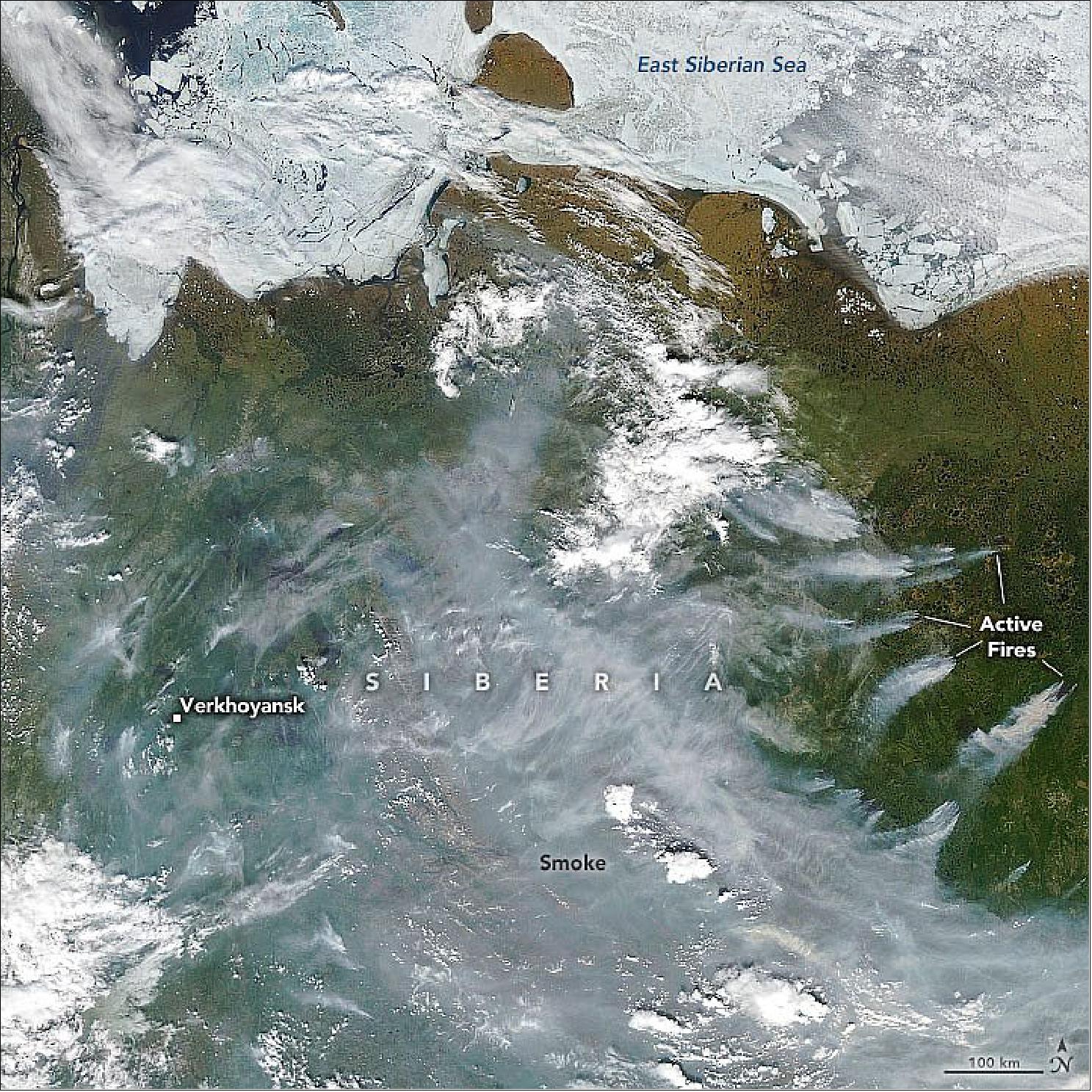
• June 9, 2020: As ships cruise across the ocean, they emit a large number of small airborne particles—aerosols—into the lower atmosphere. Under the right conditions, these exhaust particles cause long, thin cloud patterns referred to as "ship tracks." For decades, scientists have theorized that these cloud changes might alter climate by affecting the amount of sunlight reaching Earth's surface. 48)
- Now, for the first time, researchers have measured exactly how ship emissions affect clouds at a regional scale. University of Washington scientist Michael Diamond and colleagues examined more than a decade of cloud patterns over a busy shipping lane in the southeast Atlantic that connects Europe to southern Africa and Asia.
- The team measured the cloud properties inside the shipping corridor using satellite data and compared them to what they estimated the values would be without shipping activity. The scientists found that the shipping activity increased the number of cloud droplets over the shipping lane. They further showed that those clouds prevented about 2 Watts of solar energy from reaching each square meter of ocean surface along the shipping lane. The team's results agreed with previous computer modeling studies that predicted a sizeable cooling effect due to shipping.
- "If you look at a satellite image of a high-traffic shipping area, when the weather conditions are right, you can clearly see bright lines of clouds right along where those ships are traveling and emitting aerosols," said Diamond, an atmospheric scientist. "Ship tracks are a prime example of how tiny particles of pollution in the atmosphere can influence cloud properties. The clearly visible ship tracks are only the tip of the iceberg, however, so our study looked at how shipping could affect cloud properties on average over a long time period."
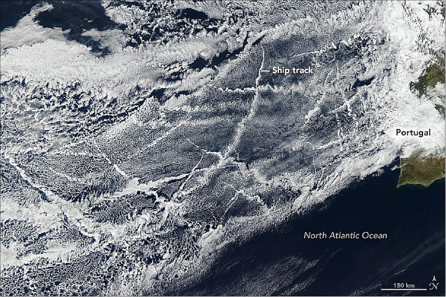
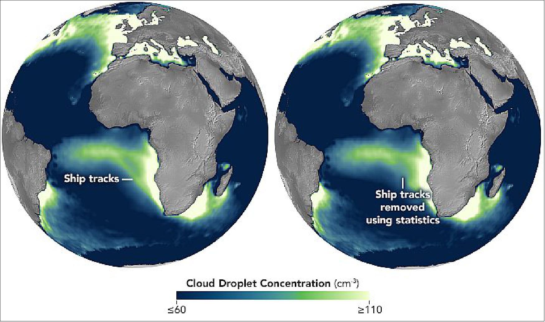
- Diamond explained that the aerosols from the ships create "seeds" in the atmosphere that water vapor can latch onto and condense into small cloud droplets. These smaller droplets make clouds brighter so that they reflect more sunlight, which creates a local cooling effect at the planet's surface.
- That change is small on a regional scale, but it could be enough to affect global temperatures if the same phenomenon occurs worldwide, according to study co-author Hannah Director of the University of Washington. When the team scaled their findings across the planet, they found that changes in low-lying clouds from all industrial pollution sources could block about 1 Watt of energy per square meter globally. For context, greenhouse gases from industrial activities have trapped roughly 3 Watts per square meter so far.
- "Cloud changes caused by industrial pollution have produced a global cooling effect that is about one-third as strong as the warming from increased greenhouse gases," said Diamond.
- Diamond explains that even though these ship emissions have a short-term cooling effect, they create other issues. Pollutants from ship exhaust have detrimental effects on human health, while also adding carbon dioxide to the atmosphere.
- The algorithms developed for this study could be applied to study other anthropogenic sources of pollution around the world. "We can use a similar methodology to determine the effects of other human sources of aerosols like power plants," said Diamond. "We could model the world with and without various human activities and better understand our impact on Earth's climate."
• May 28,2020: Spend time on China's Hainan Island, and chances are good that you will witness a lightning storm. Hainan and neighboring Guangdong province have the highest density of cloud-to-ground flashes and the most lightning related casualties in the country. 49)
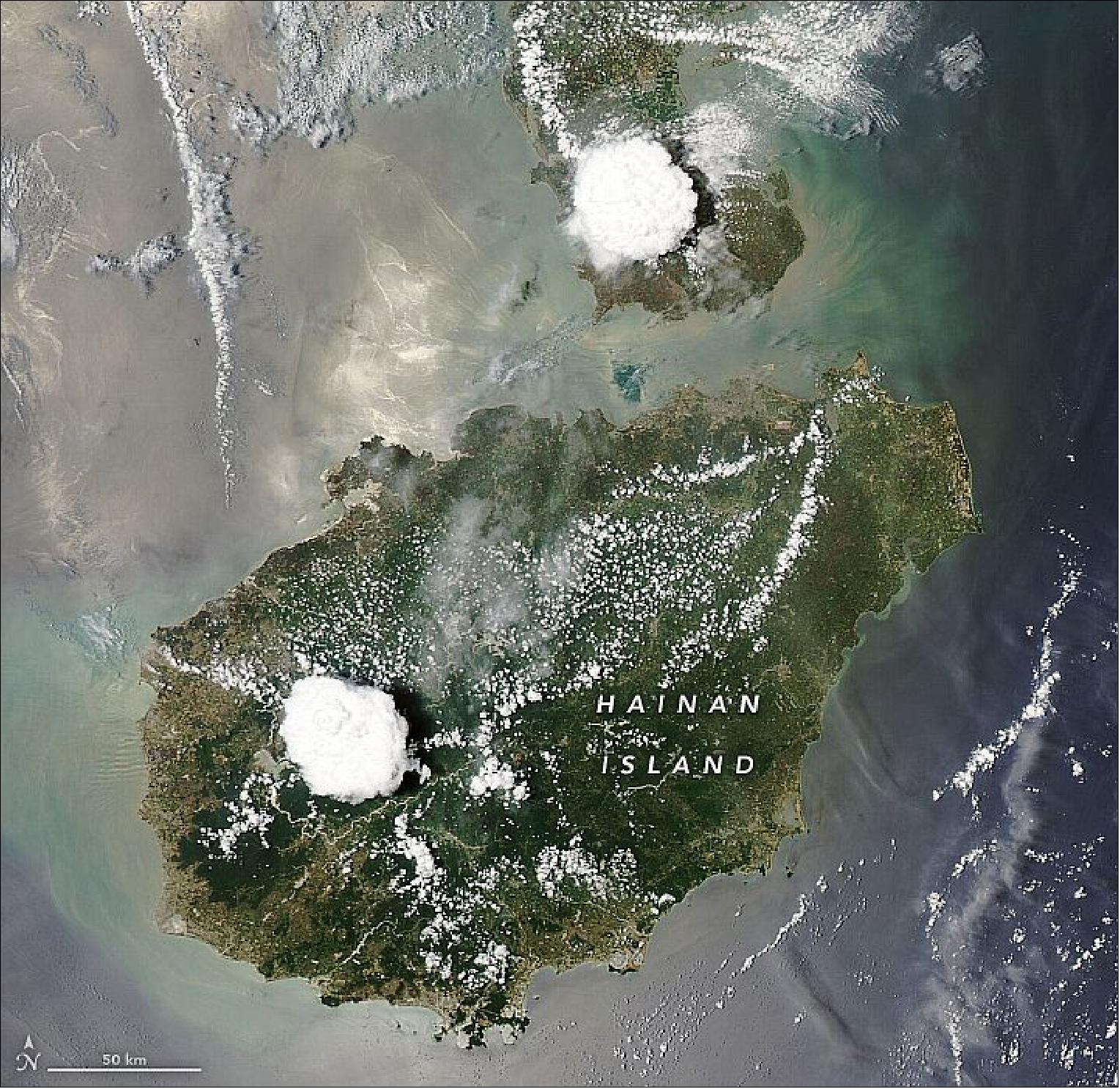

- "It's definitely a cumulonimbus cloud," said Paul Markowski, a professor of meteorology at Pennsylvania State University. "And it's sitting over the highest terrain in the center of the island."
- The south-central part of the island is mountainous, with elevations of more than 1800 m (5,900 feet) surrounded by plains extending to the island's northeast. The rugged topography creates orographic lift: when air moves across the plains and encounters the mountains, it is forced upward. So, when moist ocean air moves from low to high elevations, it cools and condenses into clouds.
- The terrain enhances the convection. But even if the island were completely flat, cumulonimbus could still develop, as the collision of air masses also forces air upward. Starting in the morning, the Sun quickly heats up the land and warms the air above it. The warm air rises it leaves behind a pocket of low pressure. Air within high pressure areas over the ocean moves in to fill the void, producing an onshore wind known as a "sea breeze."
- As the cool, moist air from over the South China Sea moves toward the island's interior, it can collide with warm air along the sea breeze front. The cool air forces the less dense warm air to rapidly rise, producing the vertical towers of clouds. Convection can be particularly intense in areas where sea breezes from opposite sides of the island ultimately collide.
- The whole process takes time, which explains why the storm clouds tend to develop in the afternoon. For example, similar clouds show up in the afternoon of May 10. In contrast, images from the mornings of May 10 and May 11 show cumulus-free skies.
• May 09, 2020: Almost like clockwork, the right conditions develop in different parts of the world and vibrant blooms of phytoplankton color the oceans. Spring and summer, for example, are common times to see blooms in places like the North Sea or off the Alaskan coast. In a bay off the coast of northwest Africa, however, conditions are almost always just right. 50)
- The color of Figure 79 is due to a combination of phytoplankton and sediments. Physical samples collected in recent decades off Mauritania have turned up large numbers of diatoms, a type of microscopic algae with silica shells and plenty of chlorophyll. They are one of the most common types of phytoplankton in the ocean.
- Diatoms tend to thrive in waters that are rich in nutrients. They often show up after strong storms mix the ocean layers and bring up nutrients from the depths. (In contrast, a type of phytoplankton called coccolithophores can flourish in the more layered, or "stratified" waters common during summer and autumn.)
- But the waters off Mauritania don't need storms to mix. Trade winds constantly displace the surface water—blowing it west and away from the African coast—which is then replaced by cold, nutrient-rich waters from below (a process known as "upwelling"). The sediments here are especially rich with iron from Saharan dust.
- While the upwelling off Mauritania is constant, it is strongest in March and October. It is part of the Canary Upwelling System, one of the main upwelling systems that occur along the eastern edges of the planet's ocean basins. Other such systems show up off of southern Africa (Benguela), Chile and Peru (Humboldt), and the United States (California). These areas are known to be among the most biologically productive regions of the planet's oceans.
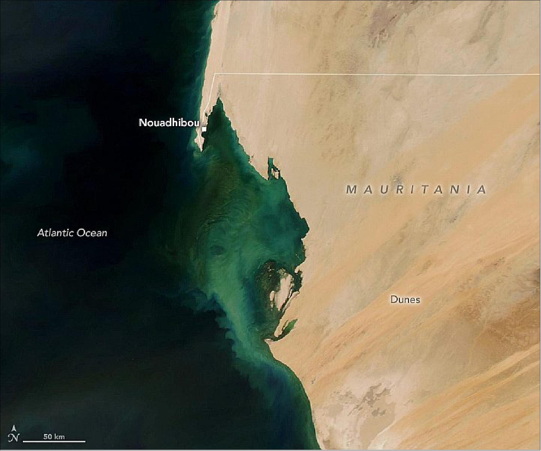
• April 29, 2020: For much of March and April 2020, satellites have detected signatures of heat and smoke from fires burning in northwestern Venezuela. Some of them burned in and near Ciénagas del Catatumbo National Park, a flat swampy area west of Lake Maracaibo known for its rainforests full of unusual plant and animal life. 51)
- Throughout March, satellites detected short-lived fires in the northwestern state of Zulia—likely crop or other small-scale fires. But in mid-March a larger, smokier, and more sustained fire cluster emerged in the park in a forested area west of the lake.
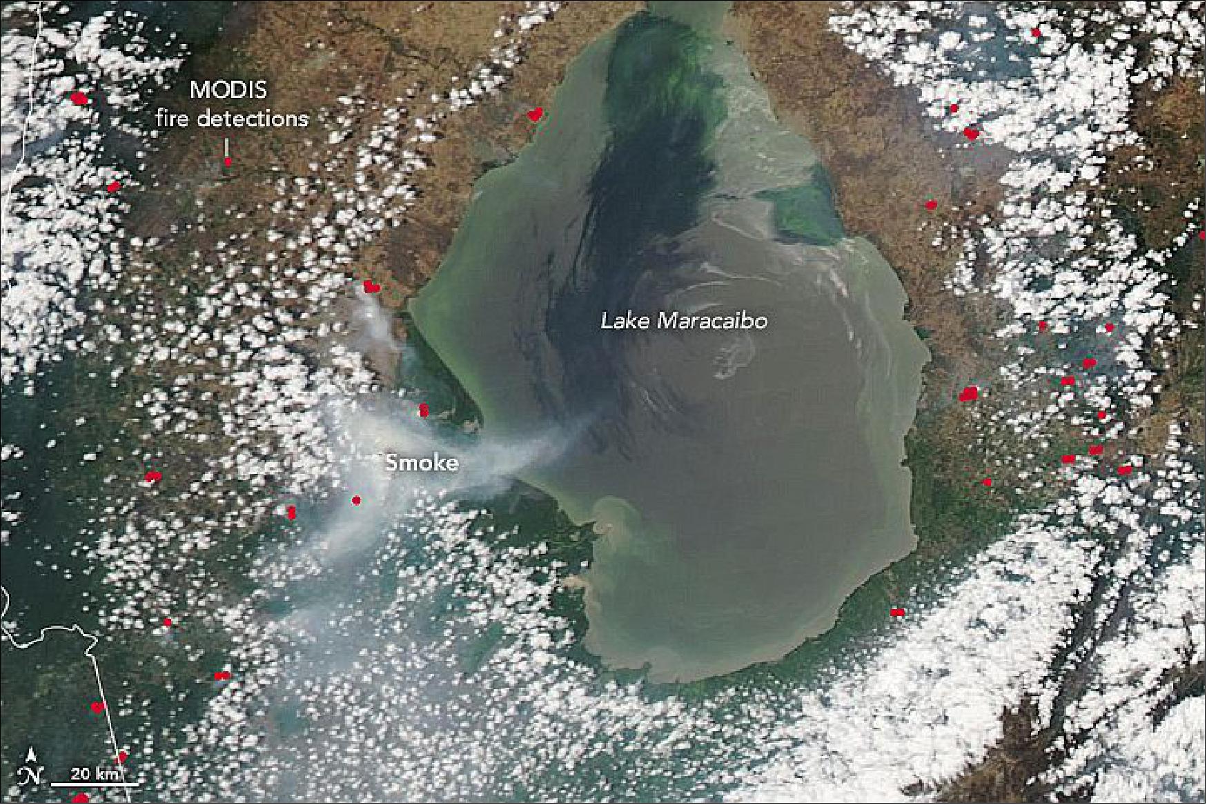
- It is not clear what triggered the fire, but Venezuela is in the midst of an ongoing drought. Recent observations from the Gravity Recovery and Climate Experiment Follow On (GRACE-FO) satellites show stark deficits in soil moisture and shallow groundwater in Zulia. The dry weather may be exacerbating Zulia's normal fire season, which typically runs from January to April in MODIS records of active fire data.
- The state's 2020 fire season is registering as one of the most active in the MODIS record since 2003, according to data analyzed by Robert Field, a scientist at Columbia University and NASA's Goddard Institute for Space Studies. Satellites observations also show that nearby mountain ranges have been channeling smoke southwest toward the city of Cucuta, noted Jean-Paul Vernier of NASA's Earth applied sciences disasters program.
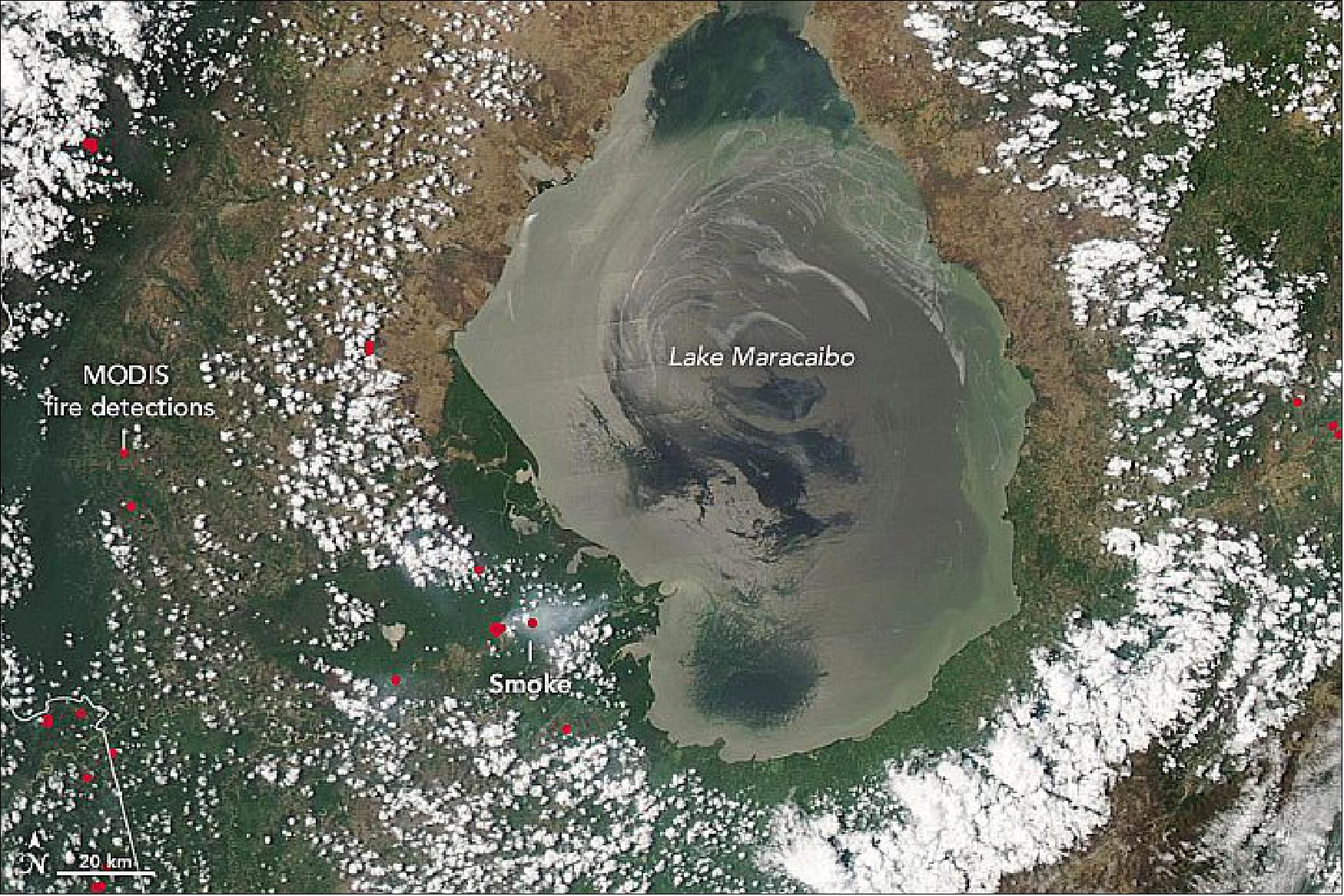
• April 16, 2020: Severe storms with high winds ripped through much of the southern and eastern United States in mid-April, with tornado warnings stretching from Florida to Virginia. More than a dozen tornadoes were confirmed in Mississippi, including one on April 12, 2020, that scarred the landscape to such a degree that it could be seen from space. 52)
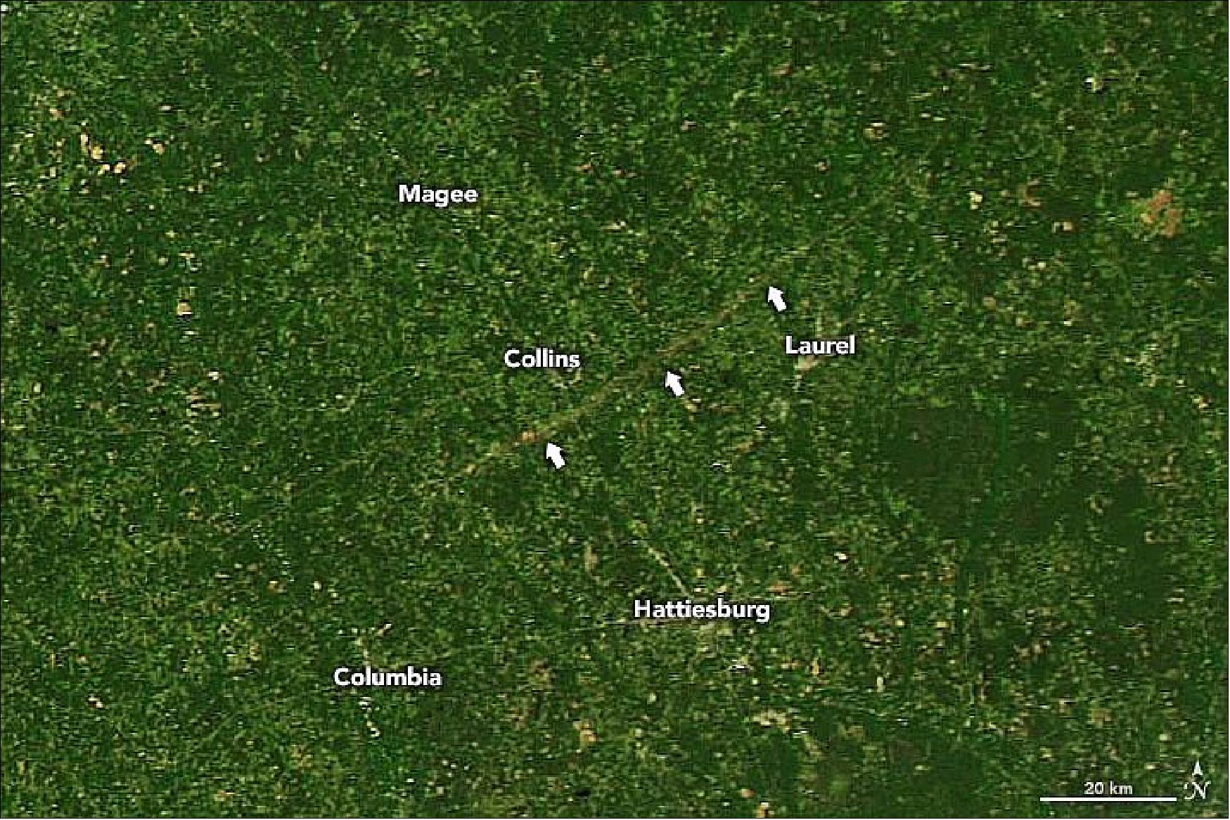
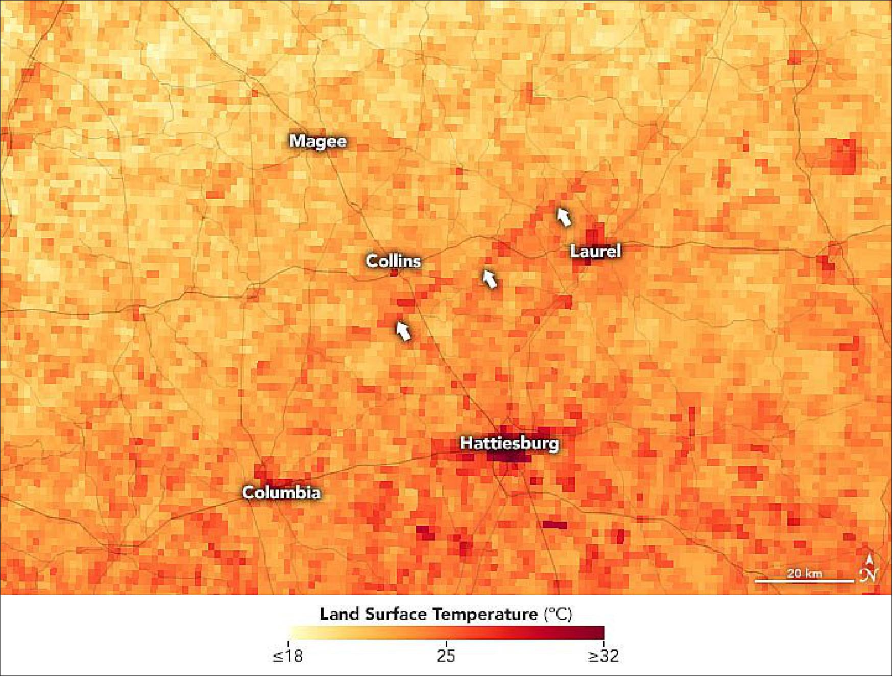
- Other tornados also marked the landscape in the area, although the scars appear more subtle in satellite images. For example, an EF3 tornado tracked for nearly 83 miles from Lawrence to Jasper counties in southeast Mississippi. According to news reports, the deadly outbreak of storms left tens of thousands of people in the state without power and destroyed hundreds of homes.
• April 9, 2020: In early April 2020, satellites observed several wildfires in northern Ukraine around the Chernobyl Exclusion Zone. Hundreds of firefighters and at least eight airborne units were working to extinguish fires in the Denysovets, Kotovsky, and Korogodsky forests. 53)
- Officials have been fighting fires in the exclusion zone since April 4, 2020. As of April 9, police evacuated residents from the village of Poliske, which is located within the zone.
- The soils and forests of the exclusion zone, which spans about 2,600 km2 (1,000 square miles), were contaminated in 1986 by radioactive fallout from the Chernobyl nuclear accident. Fires in the exclusion zone are not uncommon, but the severity and intensity of the fires has grown over the years as more forests and grasslands have recovered. Research has also shown that fires in heavily contaminated areas can resuspend radioactive elements in smoke plumes that then get carried across long distances.
- On April 5, officials tested the air in Kiev and nearby suburbs for radioactivity, but they did not report finding any man-made contamination. As of April 9, the State Emergency Service of Ukraine reported that background radiation levels continue to be within the normal range around Kiev. Additionally, no spikes in radiation have been reported in Belarus.
• March 26, 2020: Spring has arrived in Central Asia. And over the Aral Sea, that means there is dust in the air. The shrinking of this once-vast inland lake means winds more frequently pick up dust from the exposed lakebed. 54)
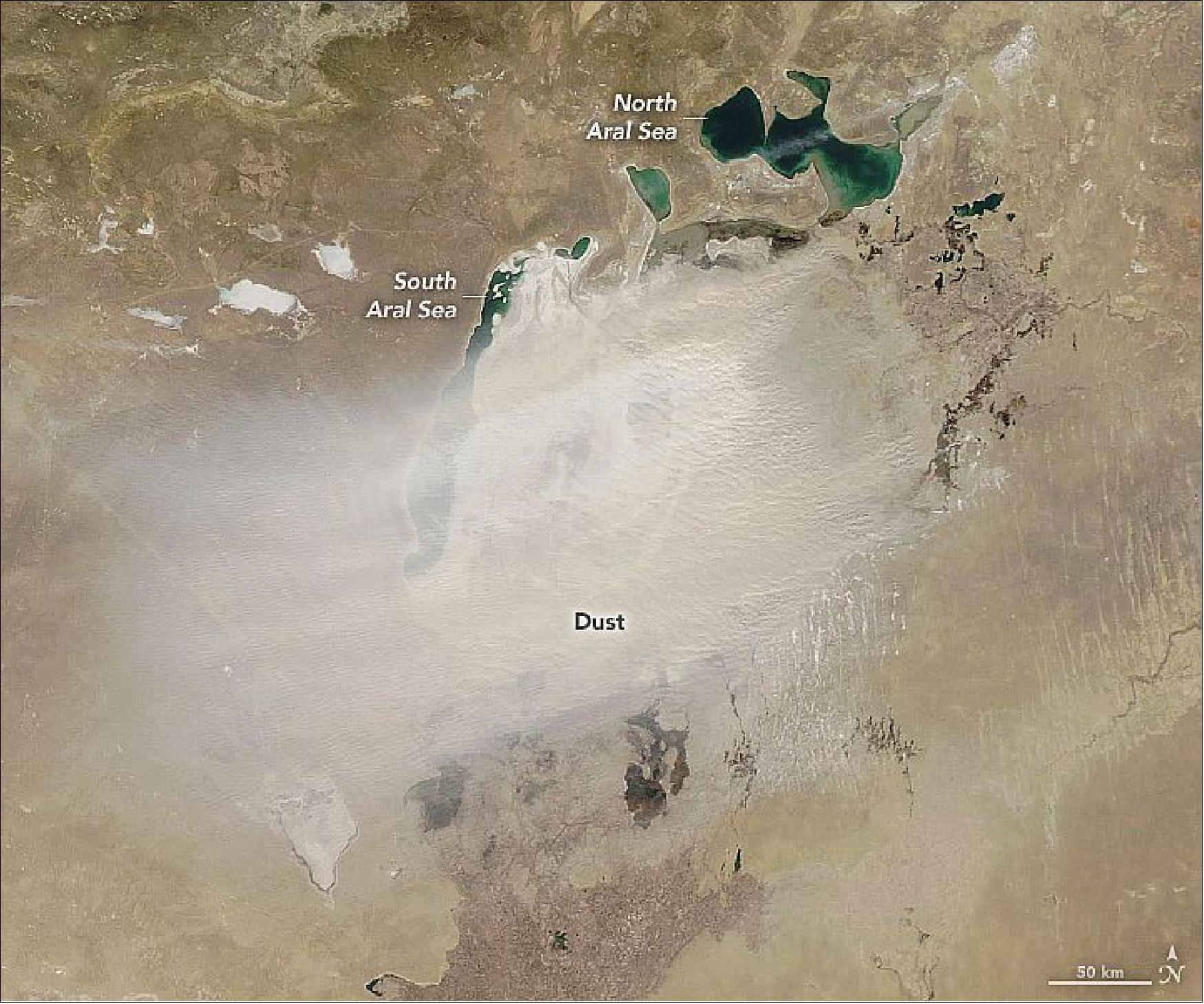
- Scientists use satellites to track when and where winds transport the most dust. One analysis of nearly a decade of data from the NASA's Aura satellite found that dust transport from the Aral Sea peaks in the spring (March-May) and early winter (November-January). In the spring, northeasterly and southwesterly winds often prevail, with 42 percent of dust plumes blowing to the north, 32 percent to the south, and 26 percent to the west.
• March 18, 2020: As observed during previous years in Southeast Asia, large numbers of seasonal agricultural fires and wildfires are creating clouds of smoke over northern Thailand and Burma (Myanmar). The Moderate Resolution Imaging Spectroradiometer (MODIS) on NASA's Aqua satellite acquired this natural-color image (Figure 87) on March 18, 2020. 55)
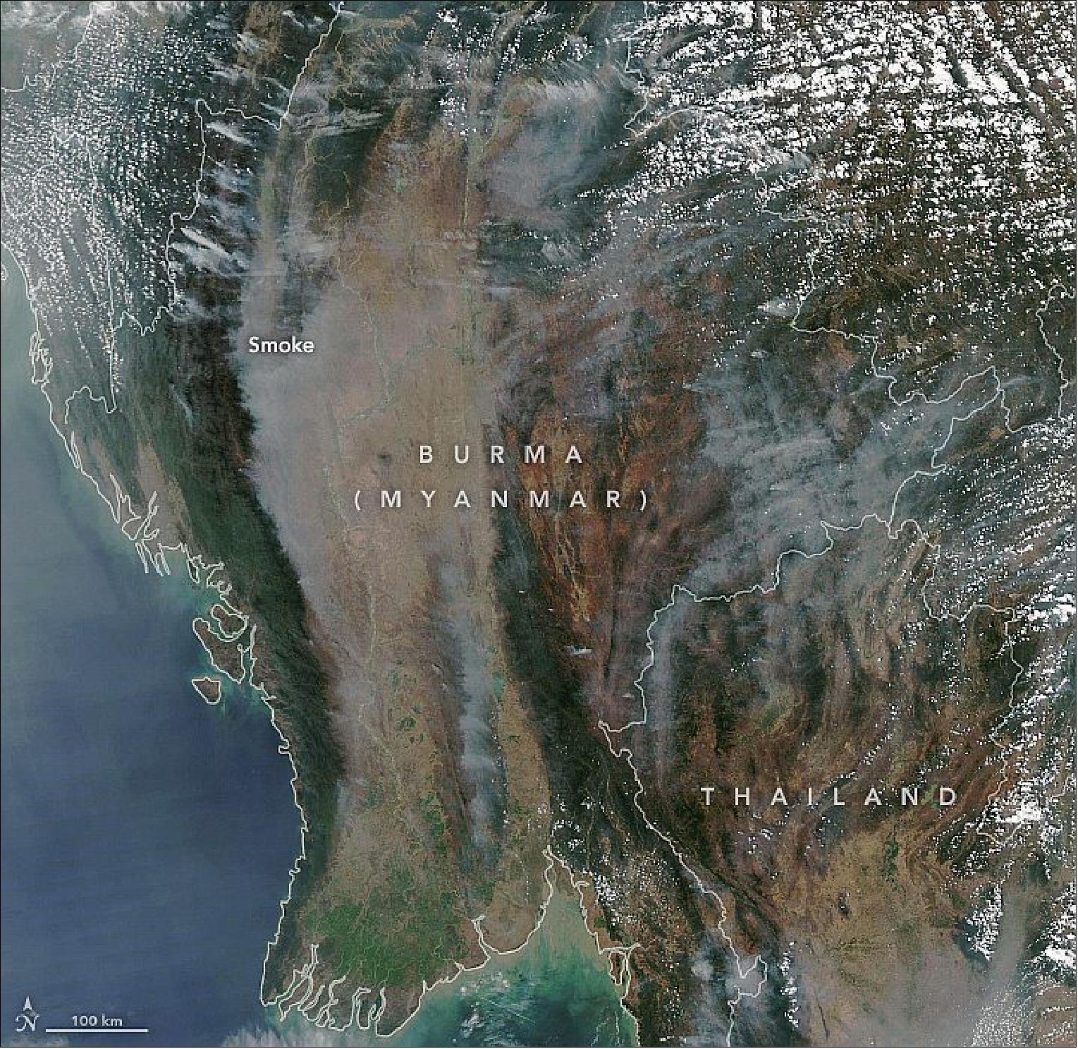
• March 12, 2020: Over the past few decades, the bison population in Yellowstone National Park has grown substantially. Some of that is due to longstanding conservation efforts, but some of it is also due to a greater abundance of food for the animals to graze on. A new study by a NASA scientist has found a link between the effects of climate change, the productivity of grasslands, and the proliferation of bison in Yellowstone. 56)
- Using 20 years of data from NASA's Aqua and Terra satellites, earth scientist Christopher Potter examined the length of the growing season in Yellowstone—from snowmelt in springtime to the first snowfall in autumn—and the health and abundance of vegetation during that time. He found that the annual period of vegetation growth has been getting longer, likely due to the decreasing severity of winters and warming average temperatures (year-round) as a result of climate change.
- The National Park Service first approached NASA about ten years ago for insight into patterns of growth across Yellowstone's grasslands. They thought tracking such growth could provide wildlife managers with clues about where bison and other animals might move. Potter became part of that effort.
- As the new research shows, the grass-growing season is getting longer and bison have more opportunities to feed, likely fueling their population growth. But as they follow the development of new and better grazing spots, they become more likely to leave the protected areas of the park. This creates challenges for the Park Service because bison can carry brucellosis, a bacterial disease that can spread among other wild species and domesticated livestock. Getting regular updates on grassland growth patterns can help wildlife managers better predict the movements of the bison herds.
- Scientists also see national parks as natural laboratories for climate research because land use is restricted, so the fingerprints of climate change are easier to detect than in settled areas. A decade ago, there was enough satellite data to make some projections about vegetation growth and animal movements, but not enough to draw conclusions about climate effects. Now the 20-year record allows for deeper insights about Yellowstone.
- MODIS instruments acquire images across nearly the entire surface of Earth every day. For his study, Potter compiled cloud-free images of Yellowstone across 20 years and also developed tools to make maps of vegetation and snow cover. Wildlife managers can check such maps to anticipate where and when confrontations between bison and human communities are likely to happen and to prepare appropriate conservation actions at the park boundaries.
- "By compiling daily satellite data, we created a near-real-time online tool that resource managers can consult much like a weather map," said Potter, who is based at NASA's Ames Research Center. "MODIS is the silver bullet for these large-scale wilderness situations, where daily updates make all the difference in planning a response."
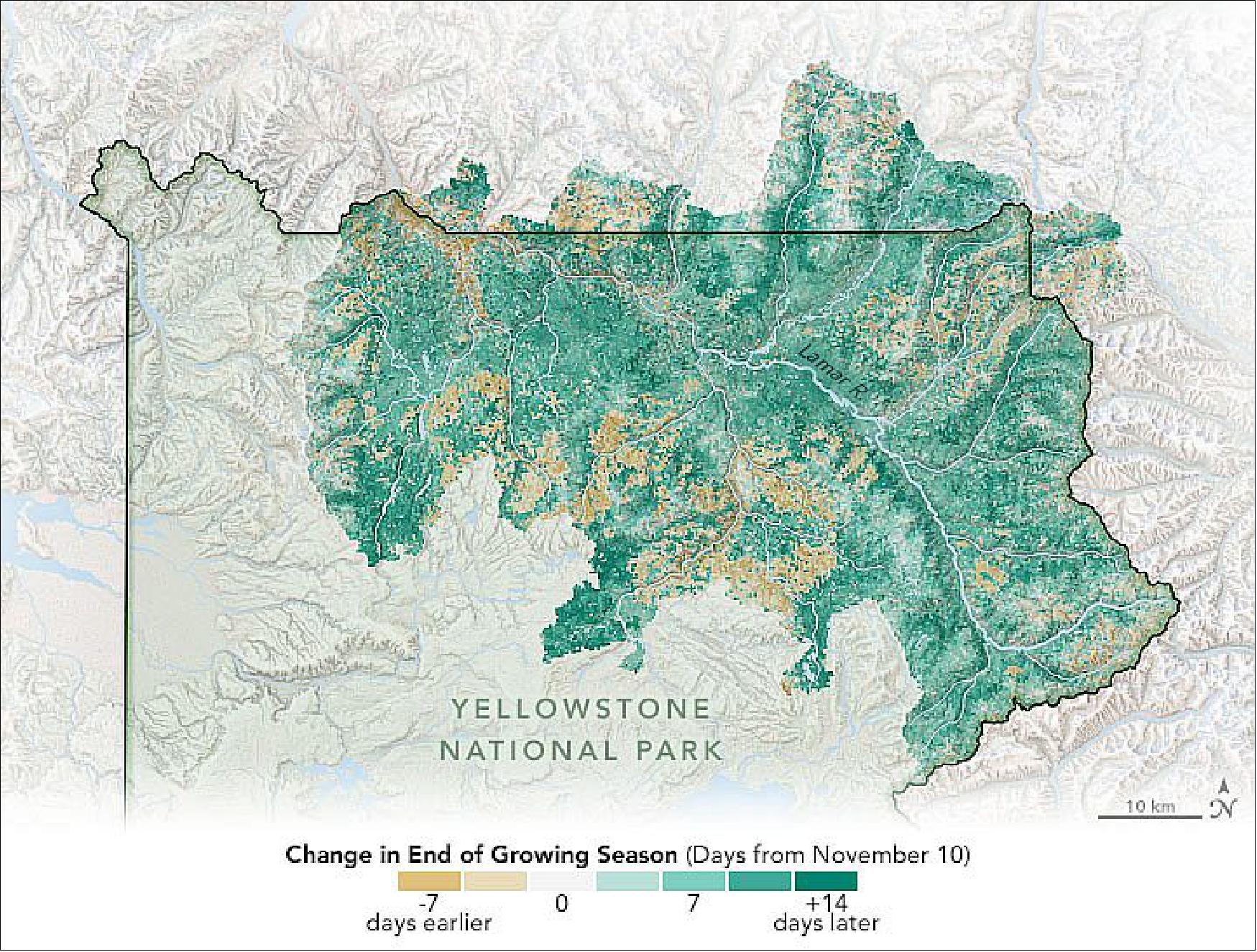
• March 9, 2020: It is not every day that a textbook high-pressure system, cold front, and warm front all reveal themselves on the same natural-color satellite image. But that is exactly what NASA research meteorologist Galina Wind recently noticed over the Eastern United States as she was browsing old satellite imagery. 57)
- On weather maps, the center of a high is generally marked with a blue H. "But in natural-color satellite images, you usually see clear skies because the downward movement of the air is strong enough to prevent any convective clouds from rising up as the Sun heats the surface," explained Wind. "In this case, the descending air was weak enough that some fair-weather cumulus clouds were able to bubble up anyway."
- The cold front, marked with blue triangles on a weather map, is visible here as a curving line of clouds with intense convection running through Minnesota, Iowa, Missouri, Kansas, and Oklahoma. While highs generally lead to sunny, calm conditions, cold fronts often produce turbulent, unsettled skies.
- "If you have ever seen a snowplow going at full speed, you will have a sense of how cold fronts work," said Wind. "Cold air is heavier than warm air, so it literally shoves warm air up in front and over it." As the displaced, warmer air rises and cools, water vapor condenses, yielding clouds, rain, and often thunderstorms.
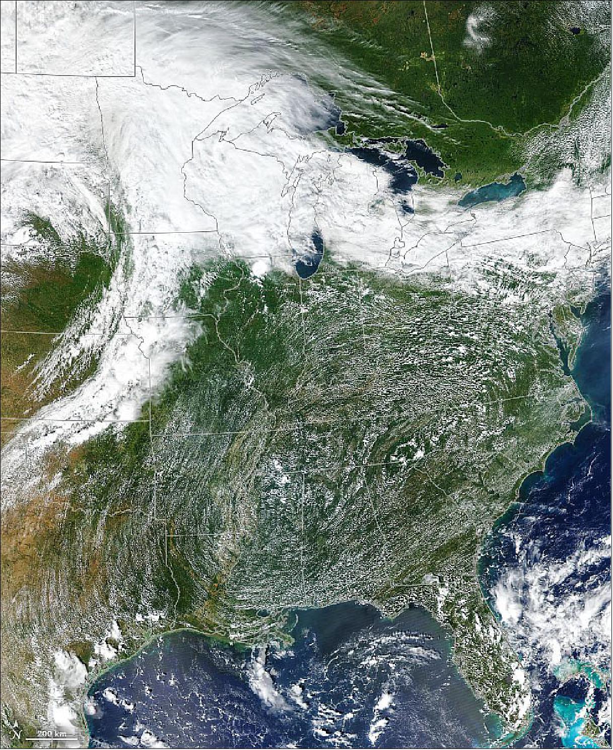
- As storm clouds bubbled up around the cold front, clouds swirled in a counter-clockwise direction around an area of low-pressure centered on South Dakota. East of the cold front, notice how the winds circulating around the high-pressure area flowed in the opposite direction. Though clouds in the high were generally small, look for the larger, deeper clouds that developed as air was forced upward by the Appalachian Mountains.
- "Conditions can become quite fierce along cold fronts," said Wind, noting that false-color imagery of the cold front does a particularly good job of highlighting the deep convection and thunderstorms that developed along it. (For instance, the pinks in this false-color view of the cold front show clouds that have grown tall enough for water droplets to turn into ice particles.)
- The warm front, normally shown with red half circles on a weather map, is marked here by the wide band of clouds through Minnesota, Wisconsin, and Michigan. "Warm front events are much calmer. They are basically just layers and layers of clouds," said Wind. "Sometimes warm fronts can produce drizzle, but they generally come and go as gently as a lamb."
- However, the leading wave of clouds that precedes a warm front can often indicate that more serious weather may be on the way. "If it is a clear, sunny day and you suddenly notice the arrival of large numbers of thin, feathery cirrus clouds, that is a clue that the weather could be changing soon," said Wind.
• February 18, 2020: Scientists previously established that the world is greener than it was in the early 1980s. Updated maps show that the trend has continued, and researchers say reduced global warming is among the consequences. 58)
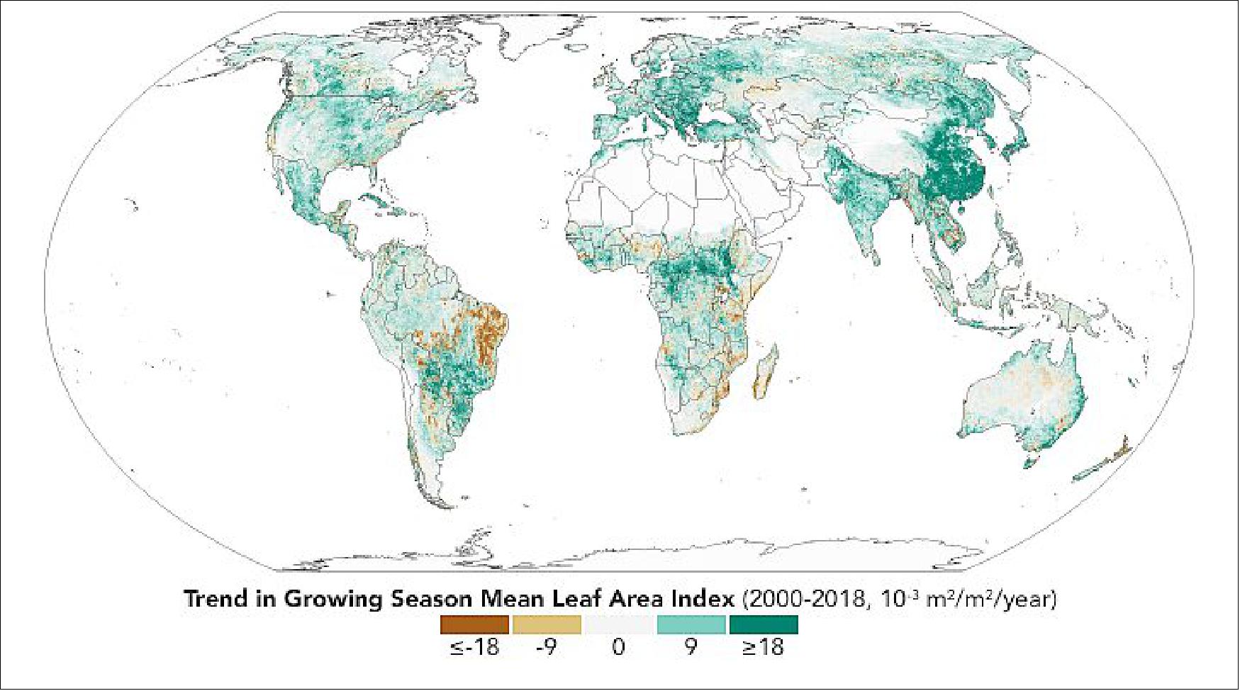
- Note that the map does not show overall greenness, which is why it does not exactly match heavily forested areas like the Amazon or the Congo Basin. Instead, the map shows how greenness has changed —a phenomenon most obvious in places like China and India where agriculture has intensified and governments have made efforts to conserve and expand forests.
- There is a clear greening trend in boreal and Arctic regions, a result of rising temperatures. For example, Svalbard in the high-Arctic has seen a 30 percent increase in greenness, according to Rama Nemani of NASA's Ames Research Center, a co-author of the review paper in Nature Reviews Earth & Environment. The greening was concurrent with an increase in mean summer temperature from 2.9° to 4.7° Celsius (37.2° to 40.5° Fahrenheit) between 1986 and 2015.
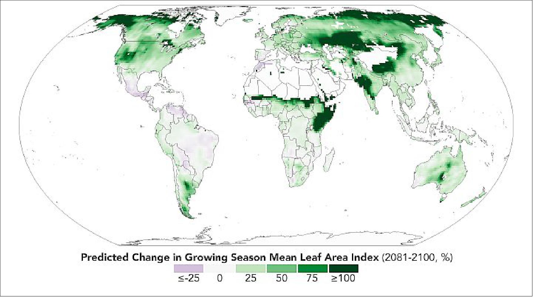
- The paper's authors reviewed more than 250 published articles that have used satellite data, modeling, and field observations, to understand the causes and consequences of global greening. Among the key results, the authors noted that on a global scale greening can be attributed to the increase of carbon dioxide in the atmosphere. Rising levels of carbon dioxide increase the rate of photosynthesis and growth in plants.
- There is an interesting consequence of this global green up: as vegetation consumes some of the heat-trapping carbon dioxide it also performs evapotranspiration—a function similar to human sweating—which can have a cooling effect on the air. Scientists say that global greening since the early 1980s may have reduced global warming by as much as 0.2° to 0.25° Celsius (0.36° to 0.45° Fahrenheit). In other words, the world would be even warmer than it is if not for the surge in plant growth.
- "It is ironic that the very same carbon emissions responsible for harmful changes to climate are also fertilizing plant growth," said co-author Jarle Bjerke of the Norwegian Institute for Nature Research, "which in turn is somewhat moderating global warming."
- According to climate models, the future looks even greener. The map of Figure 92 shows what the green-up might look like in the future based on the Coupled Model Intercomparison Project (CMIP5) climate model, under a scenario in which increases in greenhouse gases lead to almost 5° Celsius (9° Fahrenheit) of warming by the end of the 21st century. Specifically, it shows the predicted change in the growing season's "leaf area index" from 2081-2100 relative to 1981-2000.
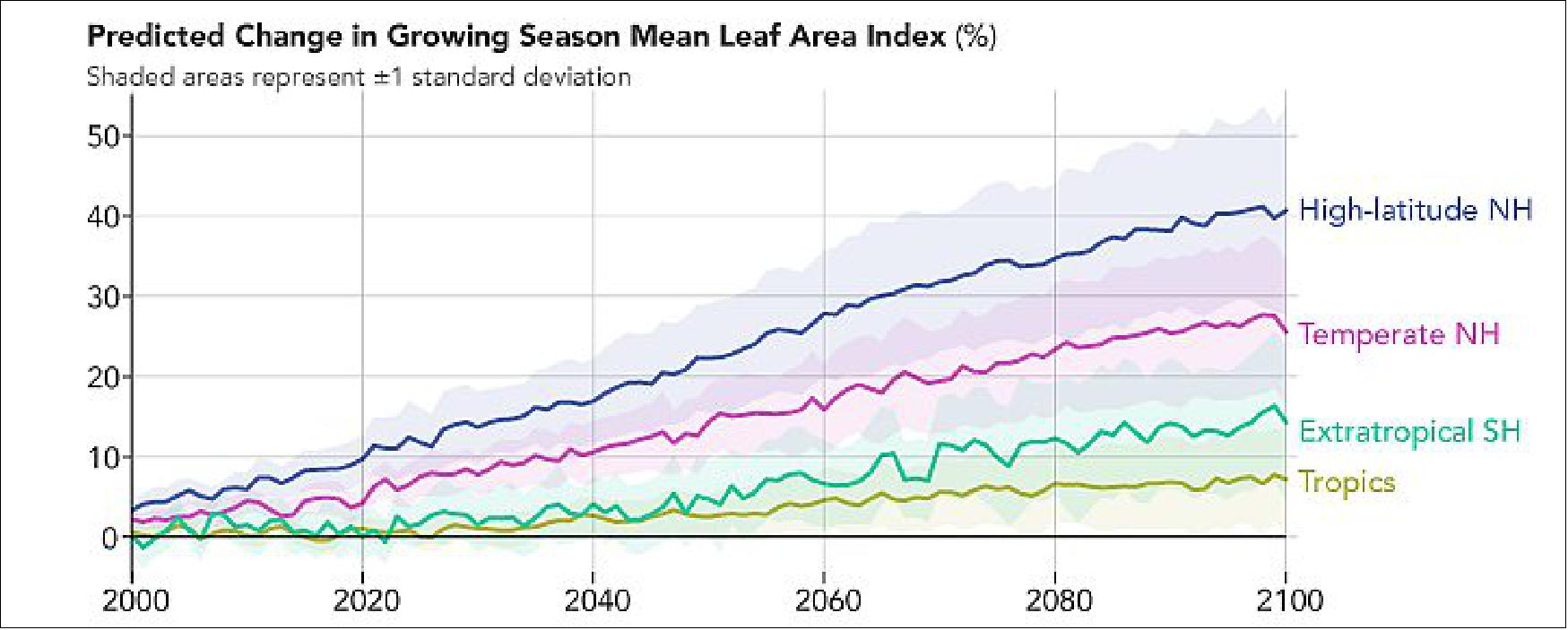
• January 29, 2020: There is plenty of plant-like life around Antarctica; you just have to know when and where to look. During the austral spring and summer, coastal waters sometimes swirl with vibrant green color—the surface expression of a huge phytoplankton bloom. 59)
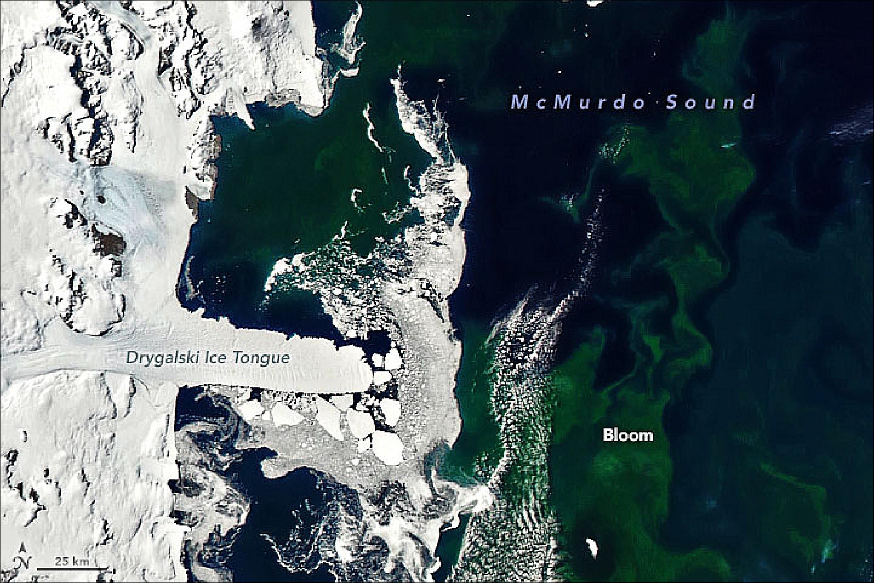
- "It is definitely a phytoplankton bloom," said Kevin Arrigo, a biological oceanographer at Stanford University. "They tend to form every year in Terra Nova Bay around January." Robert Dunbar, a fellow researcher at Stanford, agrees that the color is a phytoplankton bloom. "These kinds of features are common in Antarctica's coastal polynyas in summer and late summer."
- Polynyas are areas where winds sustain a persistent opening in the sea ice. Sunlight and near-surface nutrients are plentiful in these areas, making them havens for phytoplankton. Blooms can even occur in polynyas in late summer when the water is covered by thin, new frazil crystals and pancake ice. Research by Dunbar and colleagues has shown that late summer blooms can accumulate in this ice and turn it green. The phenomenon—most widespread in February and March—is visible in the photograph of Figure 95, shot by Dunbar in 2018.
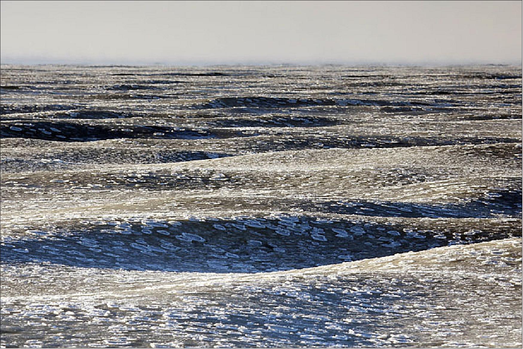
• January 21,2020: Among the most useful and longest-lived dust-monitoring sensors in space today is the Moderate Resolution Imaging Spectroradiometer (MODIS) on NASA's Terra and Aqua satellites. Terra MODIS has collected more than 20 years of dust data; Aqua MODIS has observed for 18 years. 60)
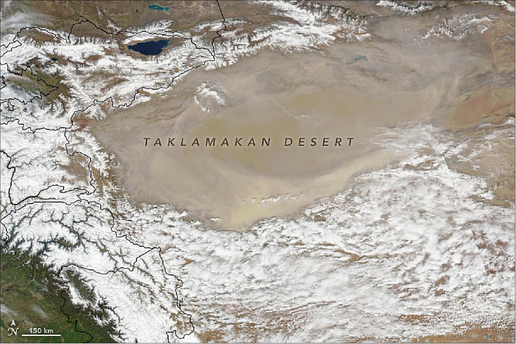
- "Two decades is long enough to look for meaningful trends in atmospheric dust," said NASA atmospheric scientist Hongbin Yu. In a new study in Atmospheric Chemistry and Physics, Yu and colleagues detailed their efforts to do just that. "We looked at the world's six major dust outflow regions. We found lots of year-to-year variability, but in most areas we did not see obvious increases or decreases in dust. The one exception was the area we defined as the northwestern Pacific. In other words, the dust that blows east from deserts in western China and Mongolia, such as the Taklamakan and Gobi deserts." 61)
- In this area, dust activity has declined since the early 2000s. Over the course of the MODIS record, the researchers found a 1.5 percent decrease in the atmospheric dust detected by the sensor each year. "More detailed analysis showed that the trend was due to changes in the spring—March, April, and May," said Yu. "Trends were negligible in other seasons."
- Scientists using other sensors and analysis techniques have noted the same pattern. Ground-based lidars in Japan detected a 4.3 percent decrease in spring dust. A team of Chinese scientists analyzed data from ground-based weather stations and an atmospheric model and concluded that spring dust storm frequency in arid and semiarid regions of China had decreased by 15 storms per year on average over a period of 25 years.
- Several research teams have addressed the obvious question: why? "There are three main factors that people have looked at: changes in winds, changes in vegetation cover, and changes in soil moisture," said Yu. Changes in wind speeds, as well as wind shear, can affect how much dust winds can pick up. The presence of vegetation reduces how much dust winds can lift. And winds more easily lift dust from drier surfaces than wetter ones.
- "I haven't personally tested which of these is the most important," said Yu. "Based on what I have seen in the scientific literature, it is likely that a combination of all three is contributing to the decline."
- For instance, some research shows a weakening in the polar vortex over the past few decades, a change that would limit the number of cold fronts (which elevate dust) and reduce maximum wind speeds of storm systems. Several studies also show increases in green vegetation and forests, likely due to global warming, reforestation projects, and efforts to prevent overgrazing.
• January 17, 2020: Afternoon storms are a typical phenomenon during summertime in Australia. They are a reminder that everyday natural events can be strikingly beautiful. 62)
- According to Bastiaan Van Diedenhoven, a researcher for Columbia University and NASA's Goddard Institute for Space Studies, the cloud is a cumulonimbus—a type capable of producing thunderstorms and heavy rain.
- "Afternoon storms form often in the Austral summer as the land heats up, leading the air to rise and condense into clouds," Van Diedenhoven said. "The storm looks very round from the top probably because there's not much wind shear. When the top reaches its highest point near the tropopause, its top will expand horizontally."
- While clouds like this are normal, they don't turn up too often in MODIS or VIIRS imagery. The clouds usually grow large later in the afternoon, after the satellites have passed over and acquired their once-a-day imagery. Satellites with a geostationary orbit—giving a constant view of an area—can more easily capture full weather events. Watch the cumulonimbus evolve in this animation of images from Japan's Himawari-8 satellite.
- Earlier in the week, thunderstorms had developed as a result Tropical Cyclone Claudia, which spun off the coast of Western Australia. And to the east, areas that previously saw thunderstorms triggered by the bush fires are now seeing the more typical type of thunderstorms, providing much-needed rain to the area.
- The cumulonimbus of Figure 98, however, was likely just a typical summer storm. Van Diedenhoven noted: "The cyclone or the fires should have nothing to do with it."
• January 9, 2020: Satellite observations show how far winds normally spread North African dust particles before rain and gravity pull them down to the ocean. — Individual particles of dust are small and easy to ignore, but on a grand scale, atmospheric dust directly affects all of us, and the planet, in many ways. 63)
- Particles of dust are typically comprised of metal oxides, clays, and carbonates. They most often accumulate in low-lying desert basins, often dried rivers or lakes. When winds lift particles up, they can spread across thousands of miles, circling the planet and fertilizing key parts of oceans and rainforests with critical nutrients, notably iron. They also can spread diseases, trigger asthma and other respiratory health problems, and darken skies so much that they cause traffic accidents and problems for pilots.
- One of the most difficult to study—but far reaching—effects of dust is its influence on weather and climate. Dust particles can change air temperatures by blocking light, influence where clouds form and how they behave, and affect whether hurricanes or other types of storms break out. By fertilizing the sea, dust also helps influence the size and frequency of blooms of carbon dioxide-consuming phytoplankton, which could play a role in dialing global temperatures up or down.
- North Africa is the largest source of atmospheric dust in the world by far. "It has the key ingredients: plenty of strong winds, sediment piled up in basins, dry weather, and little vegetation," explained NASA atmospheric scientist Hongbin Yu, noting the El Djouf region in Mauritania and Mali and the Bodélé Depression in northern Chad are the sources of much of the dust.
- Notice the seasonality in the distribution of dust. In December and January, strong northeasterly winds—the Harmattan—from West Africa carry dust southwestward, putting the highest concentrations over the Gulf of Guinea, and extending dust plumes west toward South America. Over the course of the year, as wind patterns and the location of the Intertropical Convergence Zone (ITCZ) shift, the most concentrated dust band moves north. From June through August, particles stream from West Africa toward the Caribbean.
- "Measuring the distribution of atmospheric dust is just the first piece of our research," said Yu, who has been using satellites and other tools to study dust and other aerosol particles for two decades. "In order to understand the effect African dust has on the ocean, we have to determine how much dust gets removed from the atmosphere by rainfall." That is where other NASA satellite sensors, like the Multi-angle Imaging SpectroRadiometer (MISR) on Terra and the lidar on the CALIPSO satellite, play a critical role. The CALIPSO lidar makes it possible to observe the height of different parts of dust plumes, which is key for estimating where dust drops into the sea. MISR excels at observing particle shapes in order to distinguish dust from other airborne material.
- By analyzing observations from all three sensors—as well as the European Infrared Atmospheric Sounding Interferometer (IASI)—Yu and colleagues have created maps showing how much dust gets deposited in the ocean and where. The most efficient removal of dust occurs in winter, when the dust is following the more southerly trajectory. The researchers found that it tends to be at low altitudes then and gets intercepted by rains along the ITCZ.
- "One of the most important things that comes out of this line of research is that we've realized that leading atmospheric circulation models like the Goddard Earth Observing System (GEOS) overestimate how fast dust is falling into the Atlantic ocean by 2 to 5 times," Yu said. "Since in situ measurements [from ships or sensors on islands] of dust over the Atlantic Ocean are quite limited, satellites help fill data gaps, but models are still incredibly important for assessing the overall effects of dust."
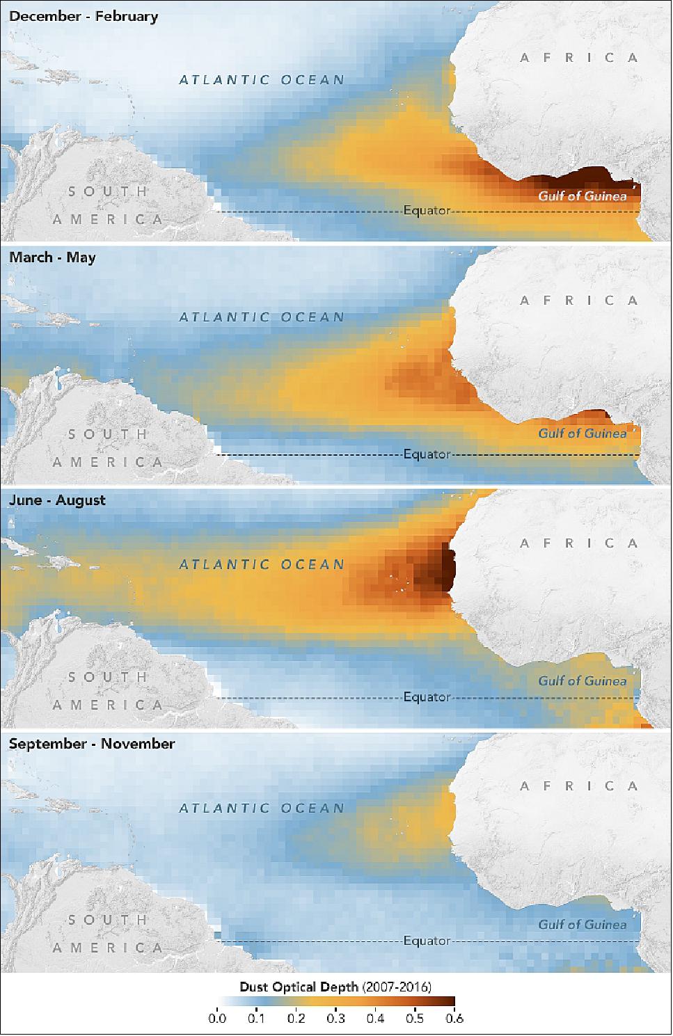
• January 6, 2020: Forecasters predicted extreme fire conditions in southeastern Australia for the weekend of January 4–5, 2020, and they were correct in their assessment. The natural-color image of Figure 100 was acquired on January 4, 2020, by the Moderate Resolution Imaging Spectroradiometer (MODIS) on NASA's Aqua satellite. Smoke has a tan color, while clouds are bright white. It is likely that some of the white patches above the smoke are pyrocumulonimbus clouds—clouds created by the convection and heat rising from a fire. 64)
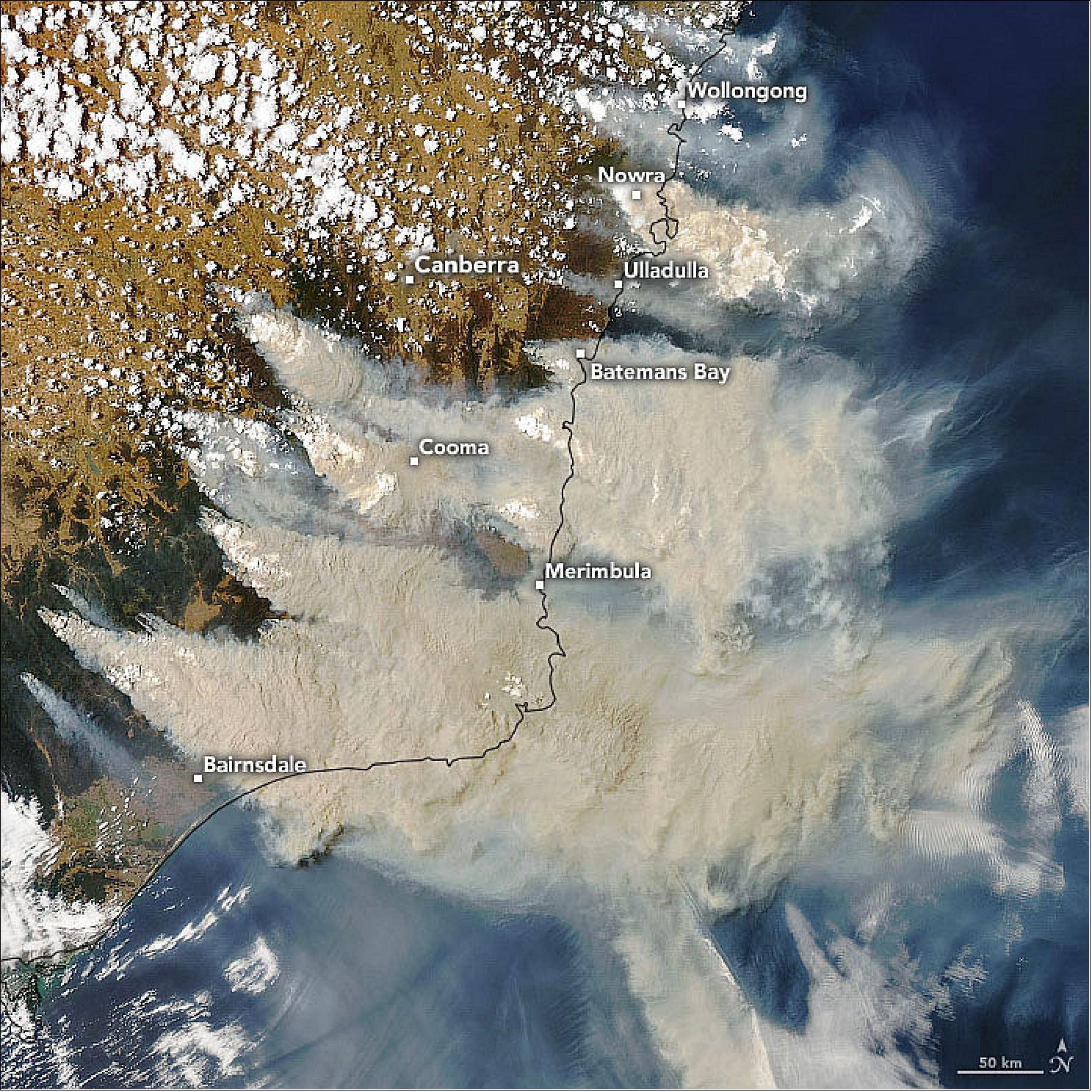
1) "A Seasonal Emerald in the Sahel," NASA Earth Observatory, Image of the Day for 28 November 2021, URL: https://earthobservatory.nasa.gov/images/149117/a-seasonal-emerald-in-the-sahel
2) "A Shot of Smoke for Delhi," NASA Earth Observatory, Image of the Day for 18 November 2021, URL: https://earthobservatory.nasa.gov/images/149086/a-shot-of-smoke-for-delhi
3) "Study Traces Ammonia Pollution in Africa," NASA Earth Observatory, Image of the Day for 17 November 2021, URL: https://earthobservatory.nasa.gov/images/149089/study-traces-ammonia-pollution-in-africa
4) Jonathan E. Hickman, Niels Andela, Enrico Dammers, Lieven Clarisse, Pierre-François Coheur, Martin Van Damme, Courtney A. Di Vittorio, Money Ossohou, Corinne Galy-Lacaux, Kostas Tsigaridis and Susanne E. Bauer, "Changes in biomass burning, wetland extent, or agriculture drive atmospheric NH3 trends in select African regions," Atmospheric Chemistry and Physics, Volume 21, pp: 16277–16291, Published: 16 Nov 2021, https://doi.org/10.5194/acp-21-16277-2021
5) "The Caspian's Shallow North," NASA Earth Observatory, Image of the Day for 6 November 2021, URL: https://earthobservatory.nasa.gov/images/149054/the-caspians-shallow-north
6) "Dust Storms in Greenland," NASA Earth Observatory, Image of the Day for 27 October 2021, URL: https://earthobservatory.nasa.gov/images/148995/dust-storms-in-greenland
7) Jenine McCutcheon, Stefanie Lutz, Christopher Williamson, Joseph M. Cook, Andrew J. Tedstone, Aubry Vanderstraeten, Siobhan A. Wilson, Anthony Stockdale, Steeve Bonneville, Alexandre M. Anesio, Marian L. Yallop, James B. McQuaid, Martyn Tranter & Liane G. Benning, "Mineral phosphorus drives glacier algal blooms on the Greenland Ice Sheet," Nature Communications, Vol. 12, Article No 570, Published: 25 January 2021, https://doi.org/10.1038/s41467-020-20627-w
8) "Autumn in Sault Ste. Marie," NASA Earth Observatory, Image of the Day for 11 October 2021, URL: https://earthobservatory.nasa.gov/images/148937/autumn-in-sault-ste-marie
9) "Troubled Waters," NASA Earth Observatory, Image of the Day for 4 October 2021, URL: https://earthobservatory.nasa.gov/images/148894/troubled-waters
10) "Research Shows More People Living in Floodplains," NASA Earth Observatory, Image of the Day for27 September 2021, URL: https://earthobservatory.nasa.gov/images/148866/research-shows-more-people-living-in-floodplains
11) B. Tellman, J. A. Sullivan, C. Kuhn, A. J. Kettner, C. S. Doyle, G. R. Brakenridge, T. A. Erickson & D. A. Slayback, "Satellite imaging reveals increased proportion of population exposed to floods," Nature, Volume 86, pp: 80-86, Published: 4 August 2021, https://doi.org/10.1038/s41586-021-03695-w
12) "Arc of Fires in the U.S. West," NASA Earth Observatory, Image of the Day for 1 September 2021, URL: https://earthobservatory.nasa.gov/images/148772/arc-of-fires-in-the-us-west
13) "Summer Color in Northern Seas," NASA Earth Observatory, Image of the Day for 24 August 2021, URL: https://earthobservatory.nasa.gov/images/148705/summer-color-in-northern-seas
14) "Rain and Warmth Trigger More Melting in Greenland," NASA Earth Observatory, Image of the Day for 20 August 2021, URL: https://earthobservatory.nasa.gov/images/148720/rain-and-warmth-trigger-more-melting-in-greenland
15) "Oceans Primed for Peak of Hurricane Season;"NASA Earth Observatory, Image of the Day for 13 August 2021, URL: https://earthobservatory.nasa.gov/images/148689/oceans-primed-for-peak-of-hurricane-season
16) "An Unusually Smoky Fire Season in Sakha," NASA Earth Observatory, Image of the Day for 10 August 2021, URL: https://earthobservatory.nasa.gov/images/148678/an-unusually-smoky-fire-season-in-sakha
17) "Feeding the Sea," NASA Earth Observatory, Image of the Day for August 6, 2021, URL: https://earthobservatory.nasa.gov/images/148661/feeding-the-sea
18) "Beauty in the Barents," NASA Earth Observatory, Image of the Day for 25 July 2021, URL: https://earthobservatory.nasa.gov/images/148585/beauty-in-the-barents
19) "NASA Tracks Heat Wave Over US Southwest," NASA News, 15 July 2021, URL: https://www.jpl.nasa.gov/news/nasa-tracks-heat-wave-over-us-southwest?utm_source=iContact&utm_medium=email&utm_campaign=nasajpl&utm_content=earth20210715-1
20) Jane J. Lee, Ian J. O'Neill, "NASA's AIRS Tracks Record-Breaking Heat Wave in Pacific Northwest," NASA Feature, 8 July 2021, URL: https://www.nasa.gov/feature/jpl/nasa-s-airs-tracks-record-breaking-heat-wave-in-pacific-northwest
21) "A Scorcher in Siberia and Europe," NASA Earth Observatory, Image of the Day for 1 July 2021, URL: https://earthobservatory.nasa.gov/images/148525/a-scorcher-in-siberia-and-europe
22) "COVID-19 Lockdowns Cut Pollution, But Not All of It," NASA Earth Observatory, Image of the Day for 28 June 2021, URL: https://earthobservatory.nasa.gov/images/148477/covid-19-lockdowns-cut-pollution-but-not-all-of-it
23) Melanie S. Hammer, Aaron van Donkelaar, Randall V. Martin, Erin E. McDuffie, Alexei Lyapustin, Andrew M. Sayer, N. Christina Hsu, Robert C. Levy, Michael J. Garay, Olga V. Kalashnikova and Ralph A. Kahn "Effects of COVID-19 lockdowns on fine particulate matter concentrations," Science Advances, Published: 23 June 2021,Vol. 7, No. 26, eabg7670, https://doi.org/10.1126/sciadv.abg7670
24) "Western Soils and Plants are Parched," NASA Earth Observatory, Image of the Day for 14 June 2021, URL: https://earthobservatory.nasa.gov/images/148419/western-soils-and-plants-are-parched
25) "Smoke Replaces Ice at Lake Winnipeg," NASA Earth Observatory, Image of the Day for 23 May 2021, URL: https://earthobservatory.nasa.gov/images/148340/smoke-replaces-ice-at-lake-winnipeg
26) "Soil Data Aids Prediction of Locust Swarms," NASA Earth Observatory, Image of the Day for 14 May 2021, URL: https://earthobservatory.nasa.gov/images/148314/soil-data-aids-prediction-of-locust-swarms
27) "A Fierce Fire Season in Nepal," NASA Earth Observatory, Image of the Day for 15 April 2021, URL: https://earthobservatory.nasa.gov/images/148185/a-fierce-fire-season-in-nepal
28) "Hiding in Plain Sight," NASA Earth Observatory, Image of the Day for 12 April 2021, URL: https://earthobservatory.nasa.gov/images/148172/hiding-in-plain-sight
29) "Early Season Dust Storm Hits Beijing," NASA Earth Observatory, Image of the Day for 16 March 2021, URL: https://earthobservatory.nasa.gov/images/148052/early-season-dust-storm-hits-beijing
30) "A Remote Lake with a Rich History," NASA Earth Observatory, Image of the Day for 2 February 2021, URL: https://earthobservatory.nasa.gov/images/147862/a-remote-lake-with-a-rich-history
31) "Heavy Snowfall Blankets Spain," NASA Earth Observatory, Image of the Day for 12 January 2021, URL: https://earthobservatory.nasa.gov/images/147768/heavy-snowfall-blankets-spain?src=eoa-iotd
32) "Iceberg Goes With the Flow," NASA Earth Observatory, Image of the Day for 24 December 2020, URL: https://earthobservatory.nasa.gov/images/147715/iceberg-goes-with-the-flow
33) "Cyclone Yasa Bearing Down on Fiji," NASA Earth Observatory, Image of the Day for 17 December 2020, URL: https://earthobservatory.nasa.gov/images/147672/cyclone-yasa-bearing-down-on-fiji
34) "The Braided Brahmaputra," NASA Earth Observatory, 28 November 2020, URL: https://earthobservatory.nasa.gov/images/147591/the-braided-brahmaputra
35) "Flooding in Northern Luzon," NASA Earth Observatory, Image of the Day for 20 November 2020, URL: https://earthobservatory.nasa.gov/images/147554/flooding-in-northern-luzon
36) "Molave Heads Toward Vietnam," NASA Earth Observatory, Image of the Day for 28 October 2020, URL: https://earthobservatory.nasa.gov/images/147456/molave-heads-toward-vietnam
37) "Fierce Fires in Bolivia," NASA Earth Observatory, Image of the Day for 16 October 2020, URL: https://earthobservatory.nasa.gov/images/147408/fierce-fires-in-bolivia
38) "A Lush Laptev Palette," NASA Earth Observatory, Image of the Day for 13 October 2020, URL: https://earthobservatory.nasa.gov/images/147388/a-lush-laptev-palette
39) "Sharks, Seagrass, and Stromatolites," NASA Earth Observatory, Image of the Day for 10 October 2020, URL: https://earthobservatory.nasa.gov/images/147395/sharks-seagrass-and-stromatolites
40) "NASA Monitors Carbon Monoxide From California Wildfires," NASA/JPL News, 14 September 2020, URL: https://www.jpl.nasa.gov/news/news.php?release=2020-175
41) "A Smoky Inferno," NASA Earth Observatory, Image of the Day for 9 September 2020, URL: https://earthobservatory.nasa.gov/images/147250/a-smoky-inferno
42) "Phytoplankton Surge in Arctic Waters," NASA Earth Observatory, Image of the Day for 31 July 2020, URL: https://earthobservatory.nasa.gov/images/147049/phytoplankton-surge-in-arctic-waters
43) K. M. Lewis, G. L. van Dijken, K. R. Arrigo, "Changes in phytoplankton concentration now drive increased Arctic Ocean primary production," Science, Vol. 369, Issue 6500, pp. 198-202, Published: 10 July 2020, https://doi.org/10.1126/science.aay8380
44) "Sea Ice in Denmark Strait," NASA Earth Observatory, 21 July 2020, URL: https://earthobservatory.nasa.gov/images/146974/sea-ice-in-denmark-strait
45) "Gearing Up for an Active 2020 Hurricane Season," NASA Earth Observatory, Image of the Day for 20 July 2020, URL: https://earthobservatory.nasa.gov/images/146991/gearing-up-for-an-active-2020-hurricane-season
46) "Rare Peek at Patagonia in Winter," NASA Earth Observatory, Image of the Day for 13 July 2020, URL: https://earthobservatory.nasa.gov/images/146946/rare-peek-at-patagonia-in-winter
47) "Heat and Fire Scorches Siberia," NASA Earth Observatory, 24 June 2020, URL: https://earthobservatory.nasa.gov/images/146879/heat-and-fire-scorches-siberia
48) "Cloud Changes in Busy Ship Corridors," NASA Earth Observatory, Image of the Day for 9 June 2020, URL: https://earthobservatory.nasa.gov/images/146830/cloud-changes-in-busy-ship-corridors
49) "Cloud Building Over Hainan," NASA Earth Observatory, Image of the Day for 28 May 2020, URL: https://earthobservatory.nasa.gov/images/146761/cloud-building-over-hainan
50) "Perma-Blooms off Mauritania," NASA Earth Observatory, Image of the Day for 9 May 2020, URL: https://earthobservatory.nasa.gov/images/146684/perma-blooms-off-mauritania
51) "A Fiery Month in Zulia," NASA Earth Observatory, Image of the Day for 29 April 2020, URL: https://earthobservatory.nasa.gov/images/146639/a-fiery-month-in-zulia
52) "Tornado Sweeps Through Mississippi," NASA Earth Observatory, Image of the Day for 16 April 16 2020, URL: https://earthobservatory.nasa.gov/images/146584/tornado-sweeps-through-mississippi
53) "Fires Burn in Northern Ukraine," NASA Earth Observatory, Image of the Day for 10 April 2020, URL: https://earthobservatory.nasa.gov/images/146561/fires-burn-in-northern-ukraine
54) "A Dusty Day Over the Aral Sea," NASA Earth Observatory,Image of the Day for 26 March 2020, URL: https://earthobservatory.nasa.gov/images/146487/a-dusty-day-over-the-aral-sea
55) "Smoke Blankets Thailand and Burma (Myanmar)," NASA Earth Observatory, 18 March 2020, URL: https://earthobservatory.nasa.gov/images/146460/smoke-blankets-thailand-and-burma-myanmar
56) "Satellite Observations Aid Bison Management," NASA Earth Observatory, Image of the Day for 12 March 2020, URL: https://earthobservatory.nasa.gov/images/146389/satellite-observations-aid-bison-management
57) "A Textbook Weather Front," NASA Earth Observatory, Image of the Day for 9 March 2020, URL: https://earthobservatory.nasa.gov/images/146392/a-textbook-weather-front
58) "Global Green Up Slows Warming," NASA Earth Observatory, Image of the Day for 18 February 2020, URL: https://earthobservatory.nasa.gov/images/146296/global-green-up-slows-warming
59) "Bloom in McMurdo Sound," NASA Earth Observatory, Image of the Day for 29 January 2020, URL: https://earthobservatory.nasa.gov/images/146213/bloom-in-mcmurdo-sound
60) "A Decline in Asian Dust," NASA Earth Observatory, Image of the Day for 21 January 2020, URL: https://earthobservatory.nasa.gov/images/146175/a-decline-in-asian-dust
61) Hongbin Yu, Yang Yang, Hailong Wang, Qian Tan, Mian Chin, Robert C. Levy, Lorraine A. Remer, Steven J. Smith, Tianle Yuan, and Yingxi Shi,"Interannual variability and trends of combustion aerosol and dust in major continental outflows revealed by MODIS retrievals and CAM5 simulations during 2003–2017," Atmospheric Chemistry and Physics, Volume 20, pp: 139-161, Published: 3 January 2020, https://doi.org/10.5194/acp-20-139-2020, URL: https://www.atmos-chem-phys.net/20/139/2020/acp-20-139-2020.pdf
62) "Growth of a Summer Storm," NASA Earth Observatory, Image of the Day for 17 January 2020, URL: https://earthobservatory.nasa.gov/images/146158/growth-of-a-summer-storm
63) "A Dusty Journey," NASA Earth Observatory, Image of the Day for 9 January 2020, URL: https://earthobservatory.nasa.gov/images/146122/a-dusty-journey
64) "Fires and Smoke Engulf Southeastern Australia," NASA Earth Observatory, 6 January 2020, URL: https://earthobservatory.nasa.gov/images/146110/fires-and-smoke-engulf-southeastern-australia
The information compiled and edited in this article was provided by Herbert J. Kramer from his documentation of: "Observation of the Earth and Its Environment: Survey of Missions and Sensors" (Springer Verlag) as well as many other sources after the publication of the 4th edition in 2002. - Comments and corrections to this article are always welcome for further updates (eoportal@symbios.space).
References Back to top