Suomi NPP 2020-2019
SuomiNPP mission status and some imagery in the period 2020-2019
• On November 22, 2020, Cyclone Gati became the strongest storm to hit Somalia since satellite records began five decades ago. Gati made landfall with maximum sustained winds of 170 kilometers (105 miles) per hour, a category 2 storm on the Saffir-Simpson scale. The storm brought more than a year’s worth of rain to the region in two days. Local authorities report at least eight people were killed and thousands have been displaced. 1)
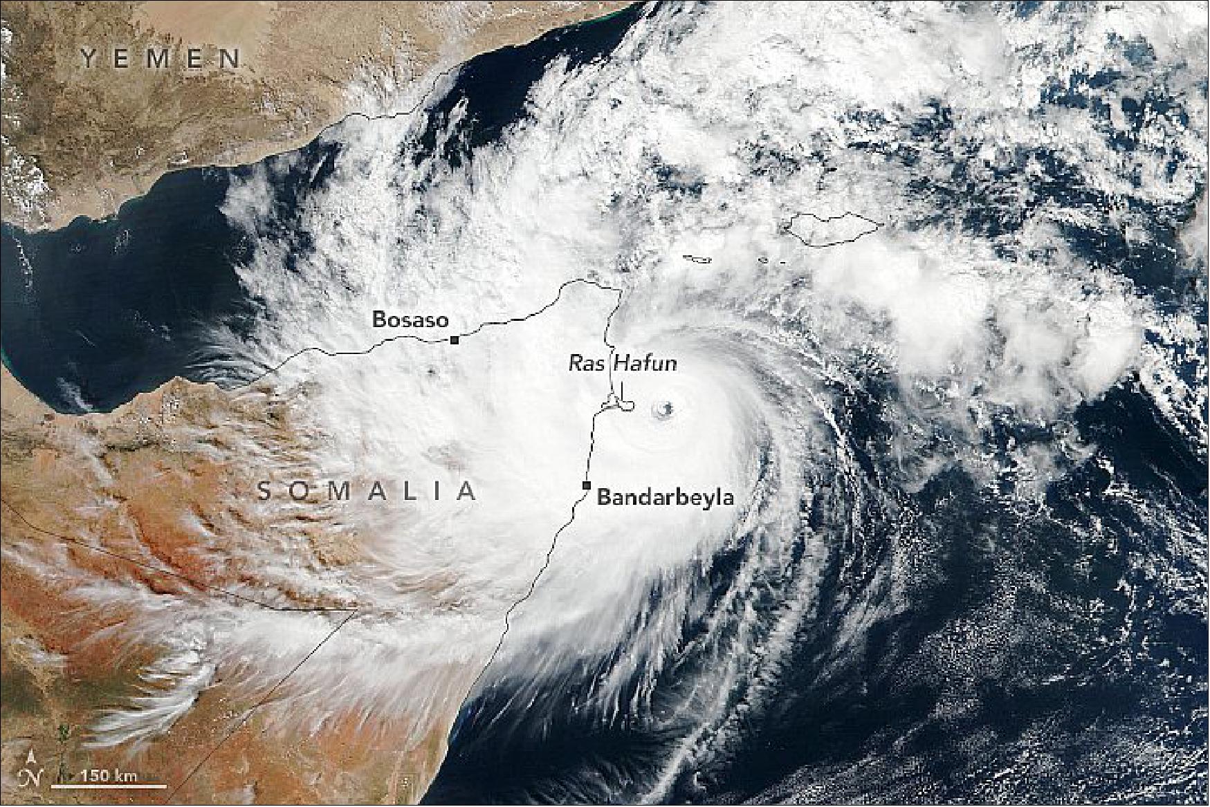
- In 12 hours, Gati’s winds intensified from 65 kilometers (40 miles) to 185 kilometers (115 miles) per hour—the largest 12-hour increase for any tropical storm ever recorded in the Indian Ocean. The storm rapidly intensified due to its small size, warm Indian Ocean waters, and low wind shear. Although the storm slightly weakened before landfall, Gati brought exceptional amounts of rain to northern Somalia.
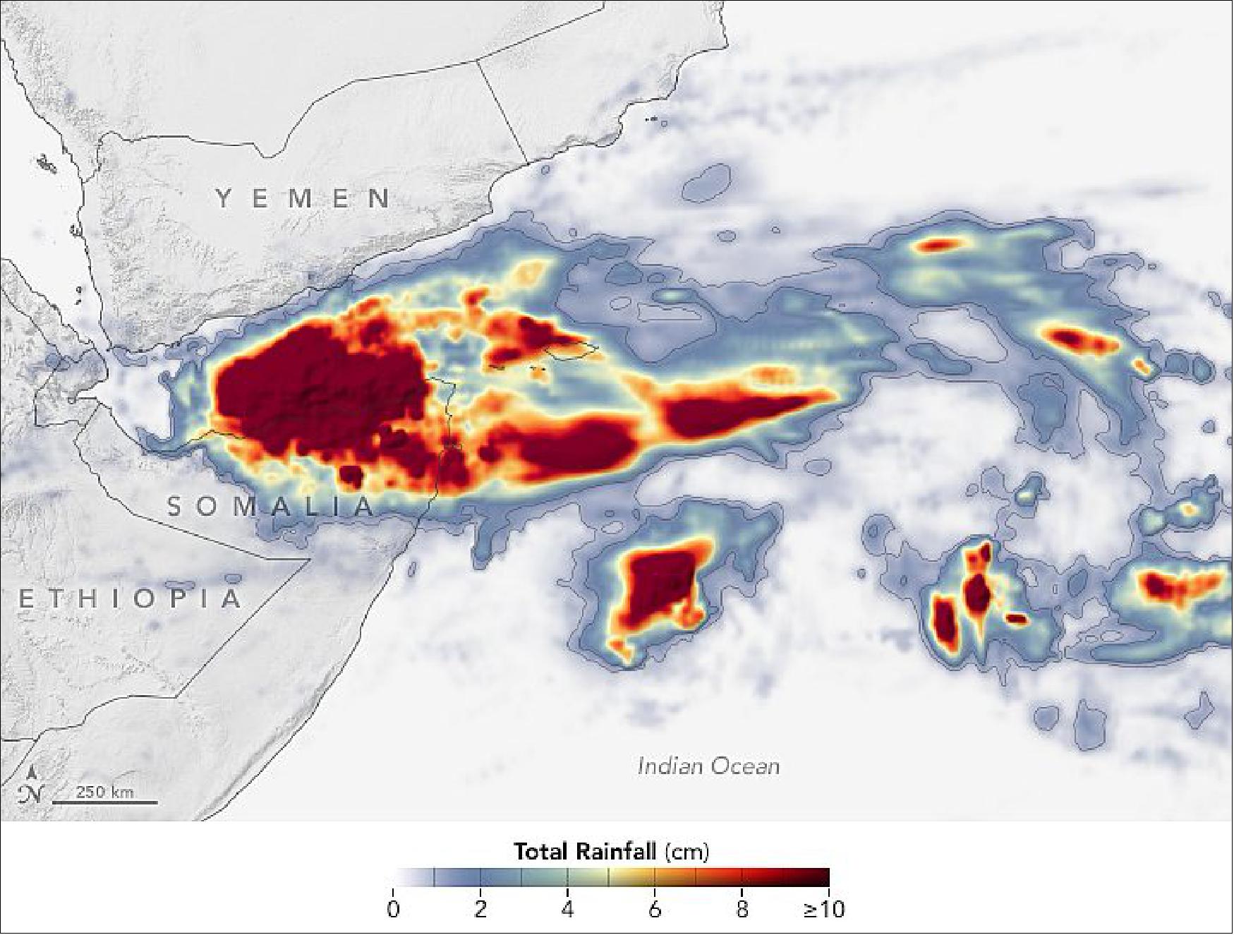
- Much of northern Somalia, which typically receives about 10 cm (four inches) of rain in an entire year, received at least that much in two days. The city of Bosaso reported 12.8 cm (5 inches) in 24 hours. Heavy rains and strong winds caused flash floods along coastal and inland areas and destroyed buildings. Villages in the Iskushuban district, which includes Ras Hafun, were hit hardest. Gati has since weakened and moved into the Gulf of Aden.
• November 18, 2020: A thick blanket of smoke has darkened skies again over northern India. Every year, farmers light large numbers of small fires between September and December—after the monsoon season—to burn off rice stalks and straw leftover after harvest, a practice known as stubble or paddy burning. 2)
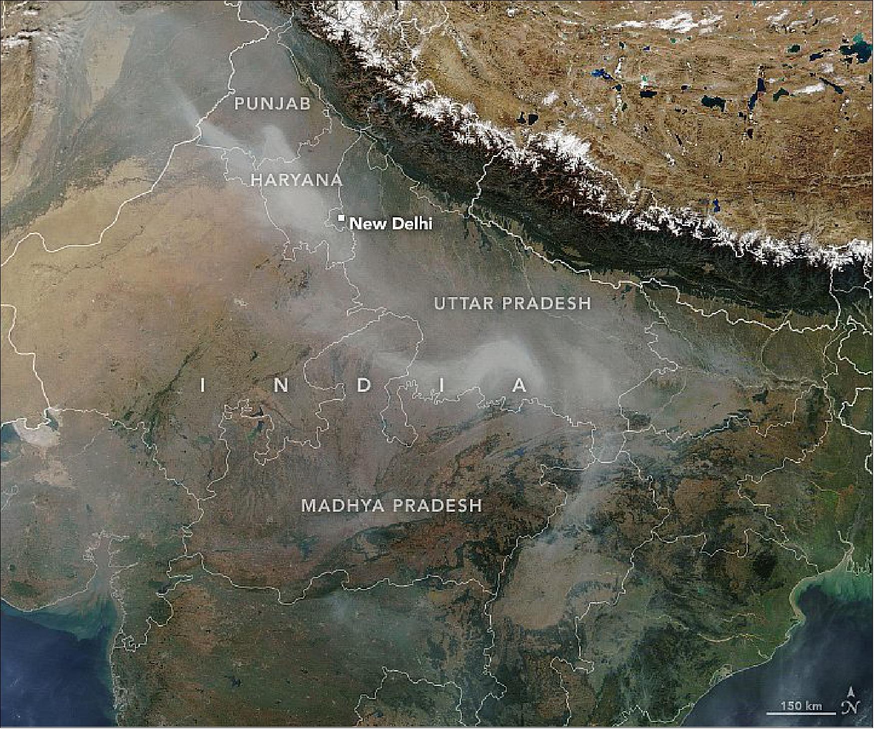
- Hiren Jethva, a Universities Space Research Association (USRA) scientist based at NASA’s Goddard Space Flight Center, uses satellites to track fire activity in the region. “We predicted in early October that this would end up being one of the most active years for fires on the VIIRS record, and that is exactly what has happened so far,” said Jethva, who forecasted fire activity by analyzing the greenness, or Normalized Difference Vegetation Index (NDVI) values, of the rice crop as measured by satellites in September. “The number of fires that happen is directly related to the area planted and to the yield.” According to news reports, good monsoon rains and an increase in the price of rice incentivized farmers to plant more than usual in 2020.
- The timing of the 2020 fires was somewhat unusual. “Because of labor shortages related to the spread of COVID-19, farmers had to do more direct sowing of seed rather than transplanting seedlings from nurseries. This moved the whole season earlier by about a week to ten days, and translated into record fire activity in the Punjab early in the season and a longer burning season than usual,” explained Pawan Gupta, a USRA scientist at NASA’s Marshall Space Flight Center.
- Scientists carefully watch the timing of planting because there is a relationship between planting, water usage, and air quality. Historically, rice has been planted in May, before monsoon rains come, which requires that farmers use a lot of groundwater. Starting in 2009, authorities prohibited May planting in an effort to protect the region’s dwindling aquifers. However, there is a tradeoff between preserving groundwater and keeping the air clean. Later planting and harvests leave farmers little time to clear crop debris before the next planting, making them more likely to burn stubble rather than disposing of it in other ways. It also pushes the burning season into mid- and late-November, when weather patterns typically make it more likely that smoke will stagnate over the Indo-Gangetic Plain.
- The long and active burning season has led to plenty of bad air days in the Indo-Gangetic Plain in 2020. For instance, on November 9, New Delhi saw levels of particulate matter soar to 950 micrograms per cubic meter, 38 times more than what is considered safe by the World Health Organization guidelines. The Moderate Resolution Imaging Spectroradiometer (MODIS) on NASA’s Terra satellite captured the image at the top of the page showing a river of smoke from crop fires spreading over the city. Emissions from vehicles, factories, cookstoves, fireworks, and other local sources contribute to the haze as well. While outbreaks of dangerous air are common at this time of year, there is particular concern in 2020 because India is facing a surge in coronavirus cases at the same time.
- One positive trend that showed up in the satellite data this year was a reduction in fire activity in Haryana and Uttar Pradesh. The two states have seen fire counts drop every year since 2016, likely because of increased enforcement of bans on paddy burning. In fact, VIIRS detected fewer fires in 2020 in these two states during the post-monsoon season than during any year since 2012. In contrast, Madhya Pradesh saw record numbers of fires during the same period in 2020, with most fires in the northern part of the state.
- To improve public understanding of paddy fires and dispel confusion about how satellite observations of fires and air quality work, Gupta has organized a community outreach forum that is open to government officials, journalists, researchers, and the public. “Over the years, we have noticed that there is a great deal of interest in this topic, but also a fair amount of confusion about which sensors and satellites produce the most meaningful data for tracking paddy fires," explained Gupta. “We’re trying to address this by doing some of the analysis out in the open this year, building technical skills, and educating people on the details of sensors like MODIS and VIIRS.”
• On November 13, 2020 Typhoon Vamco thrashed the Philippines with sustained winds of 150 kilometers (90 miles) per hour—the equivalent of a category 2 hurricane. The typhoon (known as Ulysses in the Philippines) cut power to millions, caused more than 100,000 evacuations, and killed at least six people. 3)
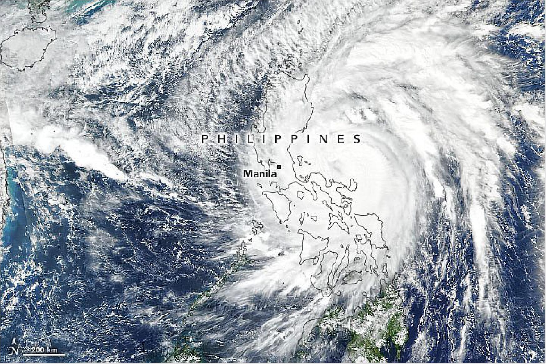
- The storm first made landfall in Patnanungan, Quezon, around 10:30 p.m. and then continued west to hit the island of Luzon, where Manila saw its worst flooding in years. A river in Marikina, located in the Manila metropolitan area, was reported to have risen a meter (3 feet) in less than three hours. As of November 12, several dams were in danger of overflowing due to the heavy rains.
- The typhoon is now crossing the South China Sea, but the agency still warned of flash floods, rain-induced landslides, and sediment-laden streams in areas in the Philippines. The country has been hit directly or partially by eight different storms since the start of October 2020. Vamco comes less than two weeks after Super Typhoon Goni brought heavy rain and winds upward of 310 kilometers (195 miles) to the same regions.
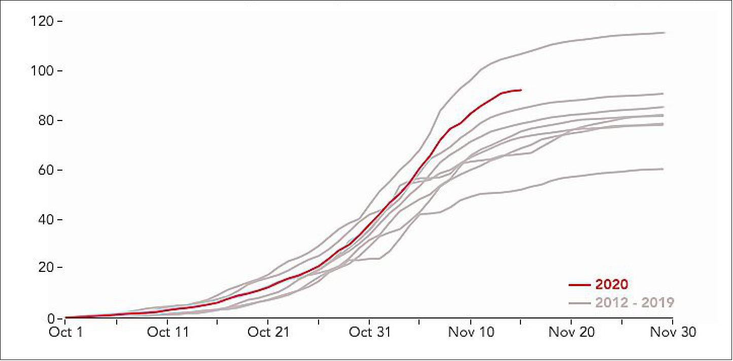
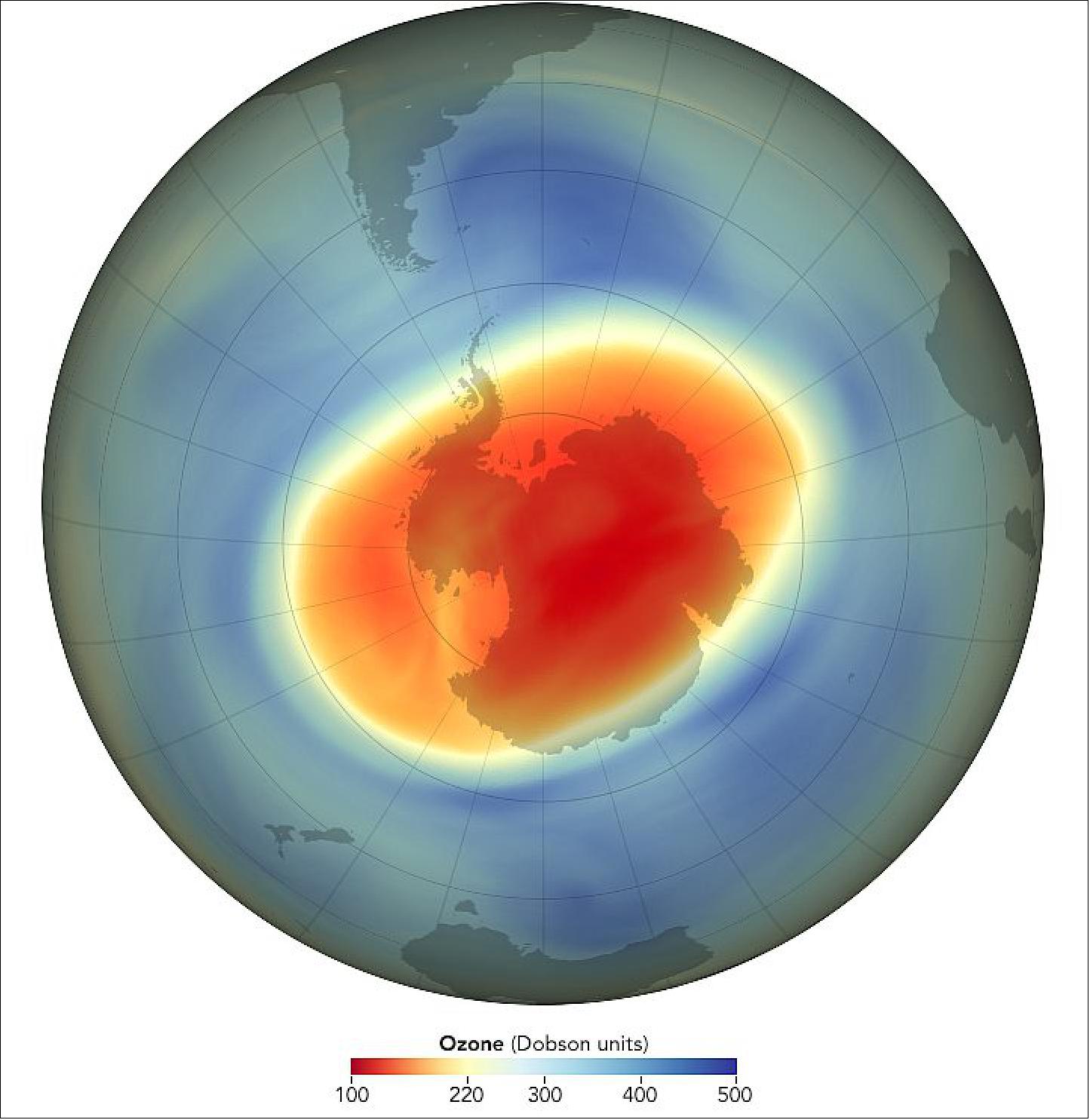
• November 2, 2020: Persistent cold temperatures and strong circumpolar winds supported the formation of a large and deep Antarctic ozone hole in 2020, and it is likely to persist into November, NOAA and NASA scientists reported. 4)
- On September 20, 2020, the annual ozone hole reached its peak area at 24.8 million km2 (9.6 million square miles), roughly three times the size of the continental United States. Scientists also detected the near-complete elimination of ozone for several weeks in a 6-kilometer (4-mile) high column of the stratosphere near the geographic South Pole.
- This year brought the 12th-largest ozone hole (by area) in 40 years of satellite records, with the 14th-lowest ozone readings in 33 years of balloon-borne instrumental measurements. However, scientists noted that ongoing declines in the atmospheric concentration of ozone-depleting chemicals (which are controlled by the Montreal Protocol) prevented the hole from being as large as it might have been under the same weather conditions 20 years ago.
- “From the year 2000 peak, Antarctic stratosphere chlorine and bromine levels have fallen about 16 percent towards the natural level,” said Paul Newman, an ozone layer expert and the chief Earth scientist at NASA’s Goddard Space Flight Center. “We have a long way to go, but that improvement made a big difference this year. The hole would have been about a million square miles larger if there was still as much chlorine in the stratosphere as there was in 2000.”
- This year represented a dramatic turnabout from 2019, when warm temperatures in the stratosphere and a weak polar vortex hampered the formation of polar stratospheric clouds (PSCs). The particles in PSCs activate forms of chlorine and bromine compounds that destroy ozone. Last year’s ozone hole was the smallest since the early 1980s, growing to 16.4 million km2 (6.3 million square miles) in early September.
- “This clear contrast between last year and this year shows how meteorology affects the size of the ozone hole,” said Susan Strahan, a scientist with NASA Goddard and Universities Space Research Association (USRA). “It also complicates detection of long-term trends.”
- Atmospheric levels of ozone-depleting substances increased up to the year 2000. Since then, they have slowly declined but remain high enough to produce significant seasonal ozone losses. During recent years with normal weather conditions, the ozone hole has typically grown to a maximum of 20 million km2 (8 million square miles).
- In addition to the area of the ozone hole, scientists also track the average amount of ozone depletion—how little is left inside the hole. On October 1, 2020, weather balloons launched from NOAA’s South Pole atmospheric observatory recorded a low value of 104 Dobson units of atmospheric ozone. NASA’s Ozone Watch reported a lowest daily value at 94 Dobson Units on October 6. Prior to the emergence of the Antarctic ozone hole in the 1970s, the average amount of ozone above the South Pole in September and October ranged from 250 to 350 Dobson units.
- The amount of ozone between 13 to 21 km (8 to 13 miles) in altitude, as measured over the South Pole, has been close to record lows at several points this year. “It’s about as close to zero as we can measure,” said Bryan Johnson, a scientist with NOAA’s Global Monitoring Laboratory. Still, the rate at which ozone declined in September was slower compared with 20 years ago, which is consistent with there being less chlorine in the atmosphere.
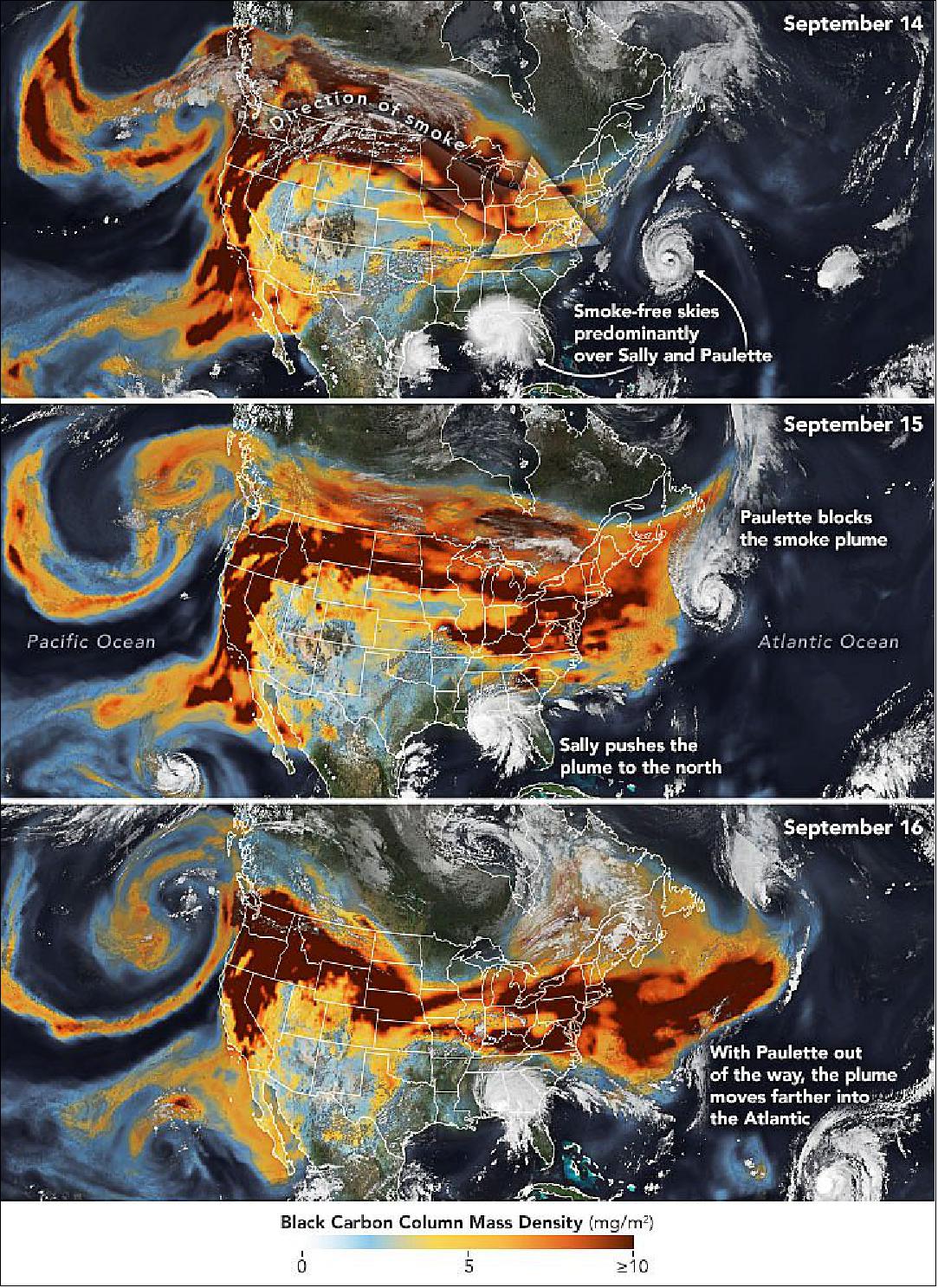
• In September 2020, historic wildfires on the U.S. West Coast lofted plumes of smoke high into the atmosphere. Pushed by prevailing winds that sweep air from west to east, satellites tracked the smoke as it spread widely across much of the continental United States. A second hazard—tropical cyclones—also helped steer the high-flying smoke plumes as they streamed over the Midwest and Northeast between September 14-16, 2020. 5)
- The series of images of Figure7 shows the abundance and distribution of black carbon, a type of aerosol found in wildfire smoke, as it rode jet stream winds across the United States. The black carbon data comes from the GEOS forward processing (GEOS-FP) model, which assimilates information from satellite, aircraft, and ground-based observing systems. The VIIRS (Visible Infrared Imaging Radiometer Suite ) on the NOAA-NASA Suomi NPP satellite acquired the images of the storms.
- While satellite maps like this show smoke spanning the entire United States, that does not mean the smoke had equally strong effects on air quality at ground level everywhere. While people living in communities near the fires in California and Oregon faced very unhealthy and hazardous air quality between September 14-16, surface air quality in the eastern U.S. remained mostly good. That is because the smoke was traveling high in the atmosphere, explained Santiago Gassó, an atmospheric scientist at NASA’s Goddard Space Flight Center.
- Data from a ground-based lidar sensors that are part of NASA’s Micro-Pulse Lidar Network (MPLNET) measured smoke over Greenbelt, Maryland, at a height of 7 to 9 kilometers (4 to 5 miles) on September 14. According to Ryan Stauffer, another atmospheric scientist at Goddard, the smoke layer sank closer to 3 kilometers (2 miles) a few days later as it traveled around a long area of relatively high atmospheric pressure, a meteorological feature known as a ridge.
- While layers of smoke can cause atmospheric cooling and have important effects on clouds in some circumstances, meteorologists do not think the smoke had much of an impact on Hurricane Paulette. Hurricanes derive most of their energy from the sea and the lower atmosphere, but in Paulette’s case the smoke layer was likely too high to influence the storm’s energy source much.
- “We can’t completely rule out an impact, but given the extratropical transition of Paulette that was also happening, any impact from the smoke would have been quite small,” said Scott Braun, a research meteorologist at Goddard. “If the smoke had been at low levels, there probably would have been an impact—possibly a weakening of the storm,” he said.
• September 15, 2020: The 2020 Atlantic hurricane season has broken many records so far, and the season is barely half done. More named storms have occurred earlier than ever before in the satellite era. As of September 14, the National Hurricane Center had named twenty storms in just over three months; an average season produces twelve storms in six months. 6)
- Five tropical storm systems were swirling in the Atlantic Ocean on September 14, tying the record for the most tropical cyclones observed in the basin at one time. Hurricane season typically peaks from mid-August to late October.
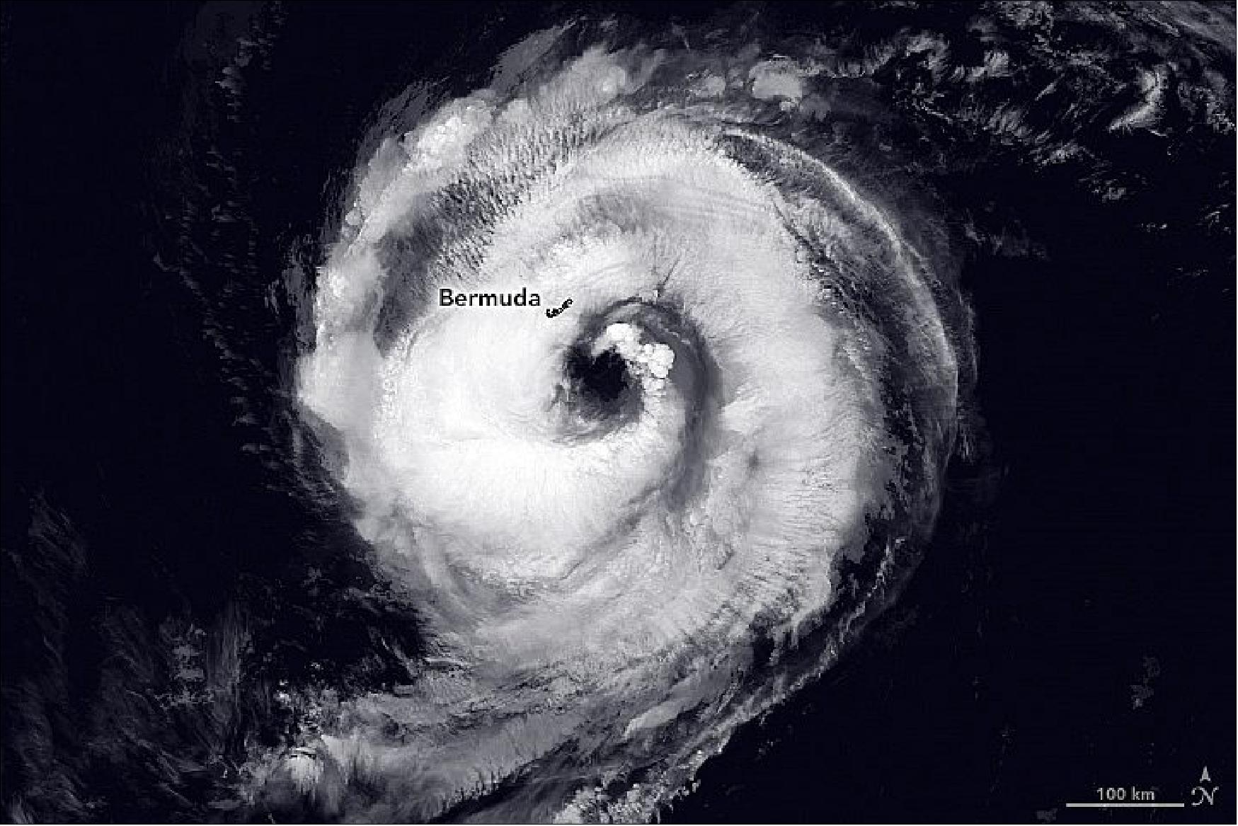
- Paulette was expected to bring 7 to 15 cm (3-6 inches) of rain, cause coastal flooding, and produce life-threatening rip current and surf condition. The hurricane was predicted to strengthen through September 15 and then gradually weaken as it moves north.
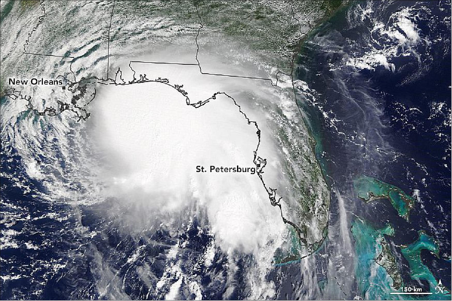
- Forecasters are unsure of where Sally will make landfall due to uncertainties about when the hurricane will turn north. However, the storm is expected to produce dangerous storm surges, flooding, and strong winds early this week. Hurricane warnings were issued from southeastern Louisiana to the Alabama-Florida border. Sally is also expected to slow down offshore through September 15, which will prolong the storm’s impacts on the Gulf Coast.
- With more than two months of Atlantic hurricane season left, forecasters say the basin will likely see more activity. The National Oceanic and Atmospheric Administration (NOAA) reported a La Niña climate pattern has developed in the equatorial Pacific. La Niña is marked by unusually cold ocean surface temperatures that weaken westerly winds high in the atmosphere. This weakening leads to low vertical wind shear over the Caribbean Sea and Atlantic Basin, enabling storms to develop and strengthen. In August, NOAA’s Climate Prediction Center updated its hurricane forecast to predict as many as 25 named storms could occur this season; as many as six of those could be major hurricanes.
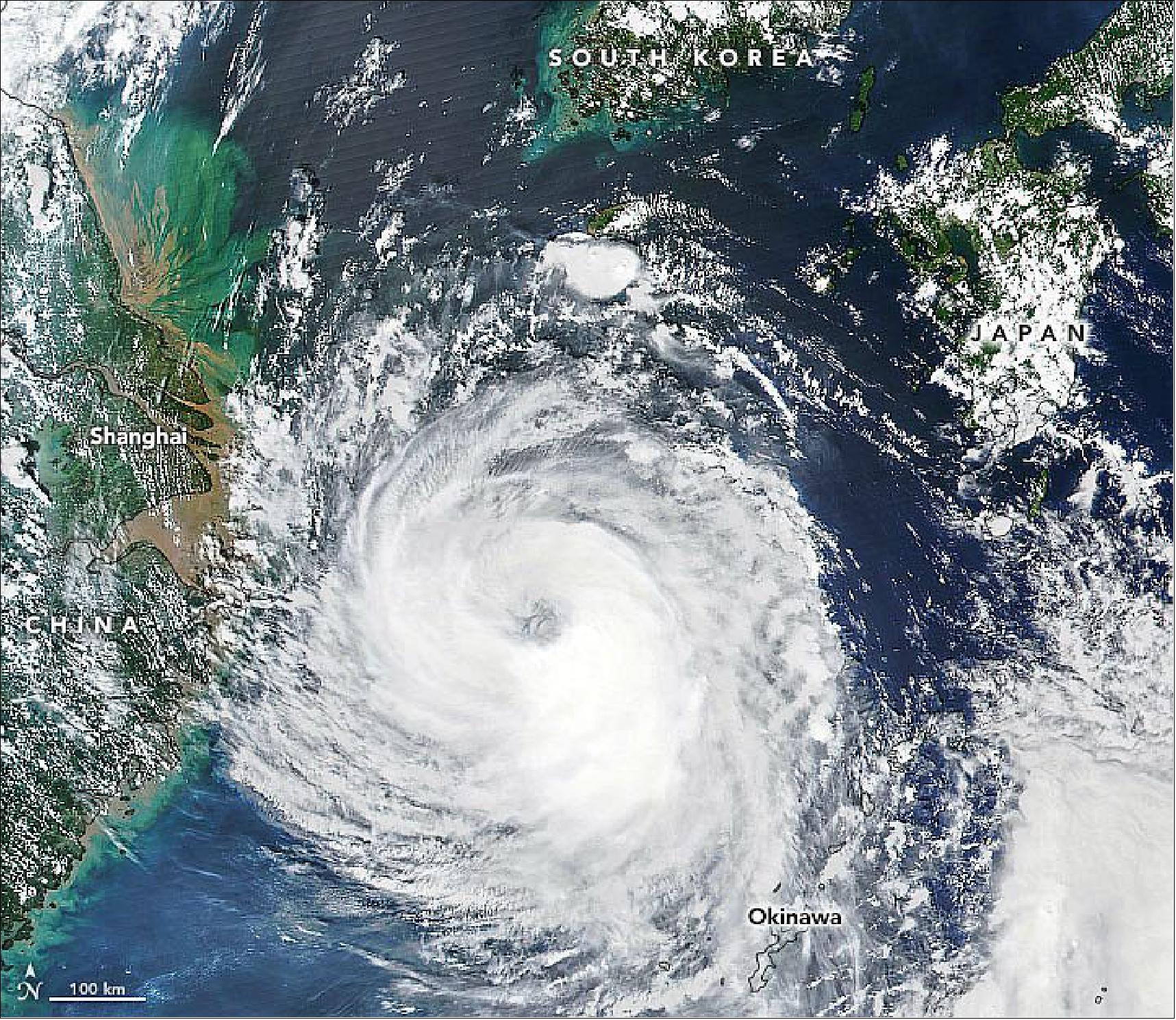
• August 26, 2020: A typhoon that emerged off the east coast of Taiwan last week is now tracking northward toward the Korean Peninsula. 7)
- With warm sea surface temperatures and favorable wind conditions over the Yellow Sea, forecasters expect Typhoon Bavi to intensify before grazing the South Korean island of Jeju and dropping between 100 and 300 mm (4 and 12 inches) of rain. It is expected to weaken somewhat before making landfall in North Korea with wind speeds as high as 140 kilometers (90 miles) per hour, the equivalent of a category 1 hurricane.
- Typhoon Bavi is the eighth tropical storm of the 2020 Pacific typhoon season, which has been quiet so far. The Korean Peninsula typically sees one landfalling storm per year.
• August 17, 2020: Australian meteorologists took note recently when not one—but two—vast bands of clouds stretched from the eastern Indian Ocean to Australia, channeling streams of moisture that delivered intense rains to both sides of the continent. 8)
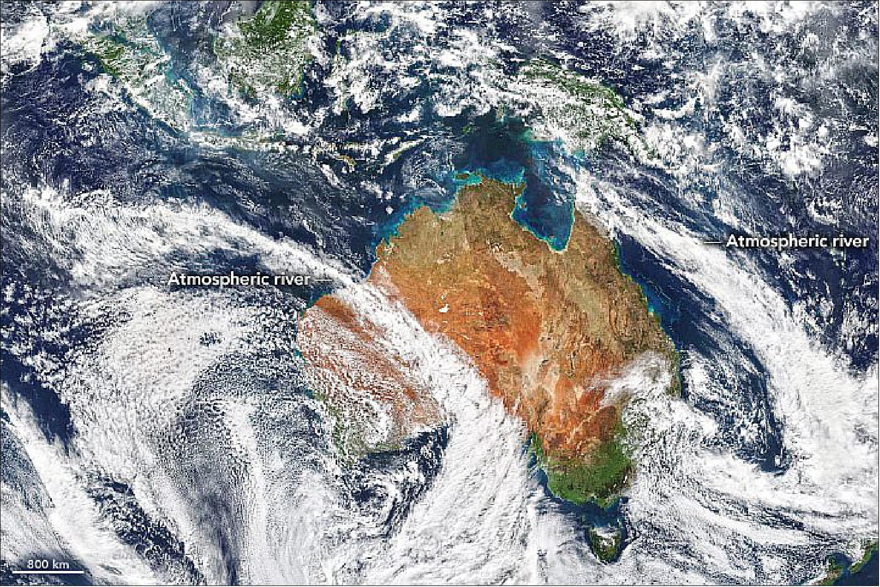
- Moisture-transporting atmospheric rivers occur all over the world and regularly hit Australia, but it is rare for two of the rainmakers to hit at once, according to Australia’s Bureau of Meteorology. One of them delivered more than 150 millimeters (6 inches) of rain in less than 24 hours to Western Australia’s Nullabar Coast, a dry area that typically receives 24 mm of rain in the whole of August. The second system dropped large volumes of rain on New South Wales.
- Atmospheric rivers are often called Northwest Cloud Bands in Australia. The same type of event in the United States is colloquially called the Pineapple Express, because it brings moisture from the tropical Pacific near Hawaii to the U.S. West Coast.
- There are some indications that the frequency of atmospheric rivers could be increasing as global climate changes. After searching through 30 years of satellite data (1984-2014) for Northwest Cloud Bands affecting Australia, a team of University of Melbourne researchers concluded that the number of cloud band days had increased by nearly one day per year over the study period.
• August 10, 2020: Shallow and surrounded by land—yet considered a sea of the Arctic Ocean—Hudson Bay freezes over completely in the winter and thaws for a period in the summer. Usually all of the sea ice melts between June and August, and the bay begins to freeze over again in October or November. 9)
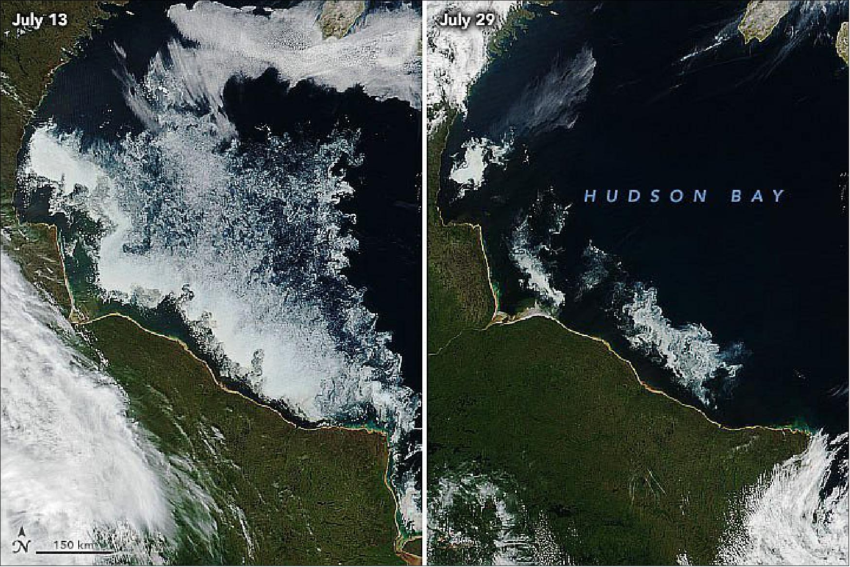
- The distribution and rhythms of the sea ice plays a central role in the lives of the animals of Hudson Bay, especially polar bears. When the bay is topped with ice, polar bears head out to hunt for ringed seals and other prey. When the ice melts in the summer, the bears retreat to shore, where they fast until the ice returns.
- For bears, this year was a bit of a throwback. “The dates ashore for the bears this year were much closer to what we saw in the 1980s and 1990s,” said University of Alberta scientist Andrew Derocher. He is part of a research group that monitors Hudson Bay polar bear populations by tracking bears with GPS satellite collars. He noted that several bears were still on the ice in late July, despite how little ice was left. “It was actually surprising how long they stayed offshore. We could be witnessing a shift in their behavior.”
- The bears of western Hudson Bay have been under environmental pressure for decades, with the population dropping from 1200 in the 1980s to about 800 now because of declining summer sea ice. The extra hunting time on this ice this summer 2020 may have allowed bears to gain some extra weight, said Derocher. “But one ‘normal’ year doesn’t alter the trends, and it won’t make up for the string of poor ice years these bears have faced in the past few decades.”
• August 7, 2020: Abnormally warm temperatures have spawned an intense fire season in eastern Siberia this summer. Satellite data show that fires have been more abundant, more widespread, and produced more carbon emissions than recent seasons. 10)
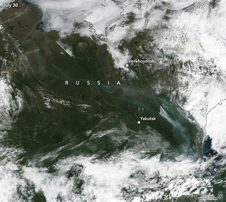
- “After the Arctic fires in 2019, the activity in 2020 was not so surprising through June,” said Mark Parrington, a senior scientist at the Copernicus Atmosphere Monitoring Service (CAMS) of the European Centre for Medium-Range Weather Forecasts. “What has been surprising is the rapid increase in the scale and intensity of the fires through July, largely driven by a large cluster of active fires in the northern Sakha Republic.”
- Estimates show that around half of the fires in Arctic Russia this year are burning through areas with peat soil—decomposed organic matter that is a large natural carbon source. Warm temperatures (such as the record-breaking heatwave in June) can thaw and dry frozen peatlands, making them highly flammable. Peat fires can burn longer than forest fires and release vast amounts of carbon into the atmosphere.
- Parrington noted that fires in Arctic Russia released more carbon dioxide (CO2) in June and July 2020 alone than in any complete fire season since 2003 (when data collection began). That estimate is based on data compiled by CAMS, which incorporates data from NASA’s MODIS active fire products.
- “The destruction of peat by fire is troubling for so many reasons,” said Dorothy Peteet of NASA’s Goddard Institute for Space Studies. “As the fires burn off the top layers of peat, the permafrost depth may deepen, further oxidizing the underlying peat.” Peteet and colleagues recently reported that the amount of carbon stored in northern peatlands is double the previous estimates.
- Fires in these regions are not just releasing recent surface peat carbon, but stores that have taken 15,000 years to the accumulate, said Peteet. They also release methane, which is a more potent greenhouse gas than carbon dioxide.
- “If fire seasons continue to increase in severity, and possibly in seasonal extent, more peatlands will burn,” said Peteet. “This source of more carbon dioxide and methane to our atmosphere increases the greenhouse gas problem for us, making the planet even warmer.”
• July 25, 2020: In July 2020, the Eastern Pacific experienced its first major hurricane of the year. After intensifying to category 4 strength on July 23, Douglas rapidly moved across the central Pacific and is predicted to make landfall in the eastern Hawaiian Islands by July 26. 11)
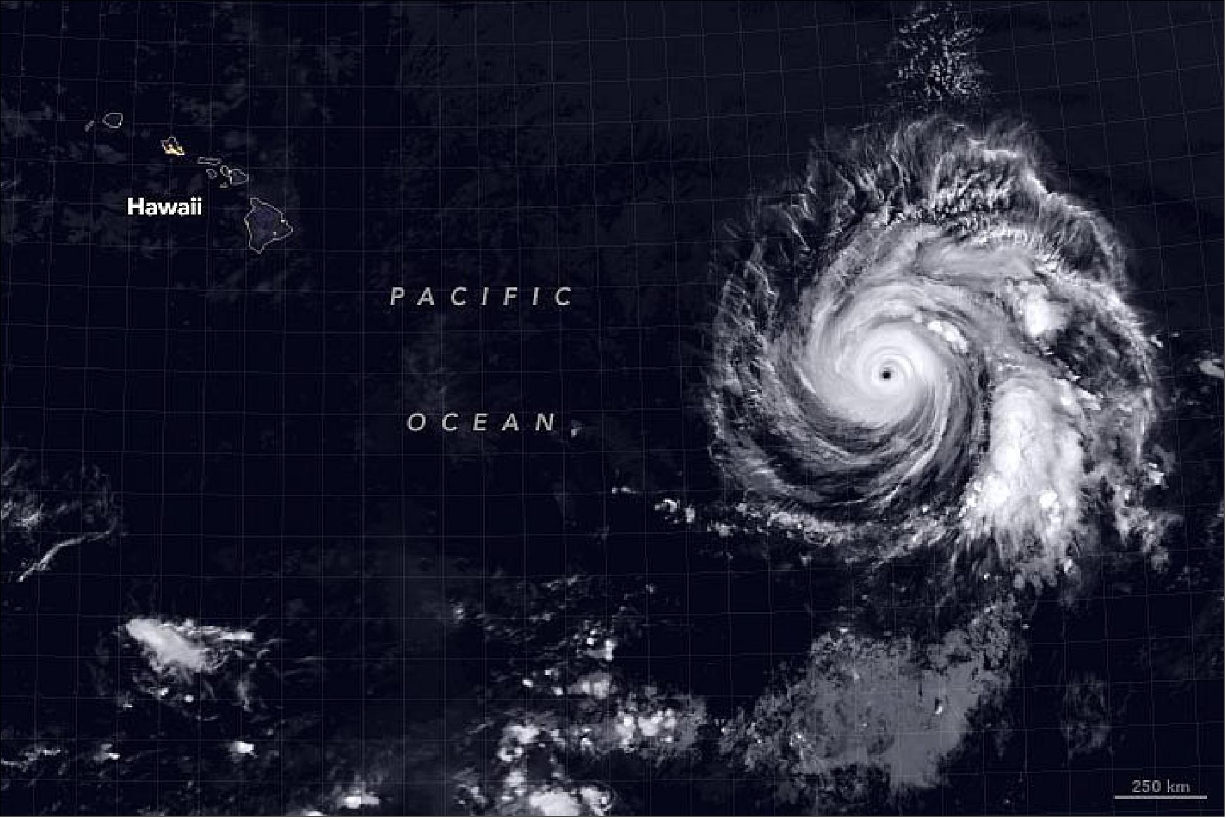
- Douglas has moved over slightly cooler water and is slowly weakening as it encounters drier air. According to the Central Pacific Hurricane Center (CPHC), Douglas will likely downgrade to a category 1 hurricane or strong tropical storm as it approaches the Hawaiian Islands.
- However, heavy rains and strong winds associated with the storm may result in flash flooding, landslides, and life-threatening surf and rip current conditions. Officials are organizing shelters on the “Big Island” of Hawaii and urging residents to stock up on food. Depending on how fast the storm degrades, the storm’s track could affect one or several islands.
- As Douglas churns in the Pacific, the Atlantic basin is also stirring with two storms. Tropical storm Gonzalo is forecasted to bring heavy rain and potentially life-threatening flash flooding to the southern Windward Islands on July 25. Hurricane and tropical storm warnings are in effect for some of them. Tropical storm Hanna is moving across the Gulf of Mexico and is expected to bring heavy rain to parts of southern Texas on July 25.
• June 19, 2020: NASA-NOAA’s Suomi NPP satellite observed a huge Saharan dust plume streaming over the North Atlantic Ocean, beginning on June 13. Satellite data showed the dust had spread over 2,000 miles. 12)
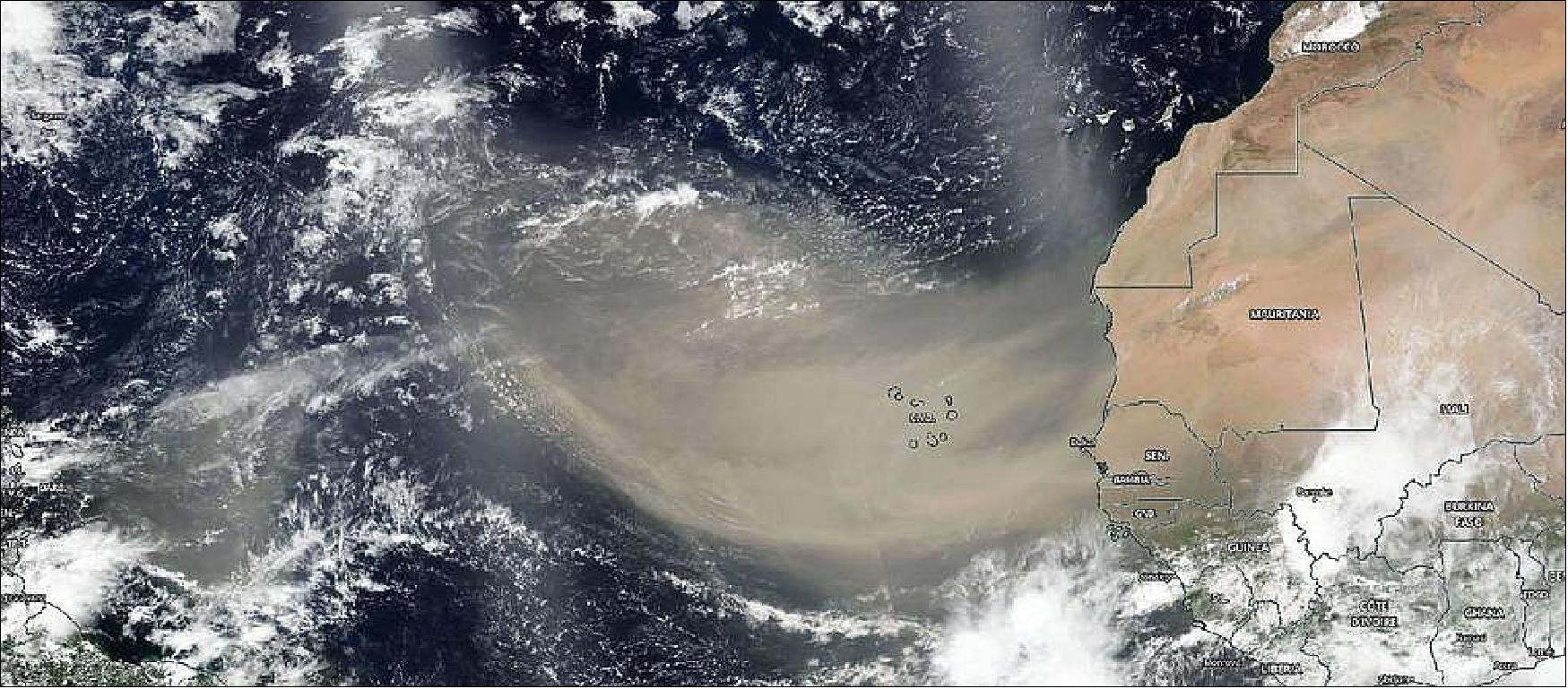
- At NASA’s Goddard Space Flight Center in Greenbelt, Maryland, Colin Seftor, an atmospheric scientist, created an animation of the dust and aerosols from the plume using data from instruments that fly aboard the Suomi NPP satellite.
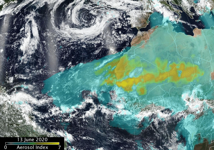
- “The animation runs from June 13 to 18 and shows a massive Saharan dust cloud that formed from strong atmospheric updrafts that was then picked up by the prevailing westward winds and is now being blown across the Atlantic and, eventually over North and South America,” Seftor said. “The dust is being detected by the aerosol index measurements from the Suomi NPP satellite’ s Ozone Mapping and Profiler Suite (OMPS) data overlaid over visible imagery from the Visible Infrared Imaging Radiometer Suite (VIIRS).”
- On June 18, 2020, the VIIRS instrument aboard NASA-NOAA’s Suomi NPP satellite captured a visible image of the large light brown plume of Saharan dust over the North Atlantic Ocean. The image showed that the dust from Africa’s west coast extended almost to the Lesser Antilles in the eastern North Atlantic Ocean. The image showed that the dust had spread over 2,000 miles across the Atlantic.
- Normally, hundreds of millions of tons of dust are picked up from the deserts of Africa and blown across the Atlantic Ocean each year. That dust helps build beaches in the Caribbean and fertilizes soils in the Amazon. It can also affect air quality in North and South America.
- NASA continues to study the role of African dust in tropical cyclone formation. In 2013, one of the purposes of NASA’s HS3 field mission addressed the controversial role of the hot, dry and dusty Saharan Air Layer in tropical storm formation and intensification and the extent to which deep convection in the inner-core region of storms is a key driver of intensity change.
- Suomi PP represents a critical first step in building the next-generation Earth-observing satellite system that will collect data on long-term climate change and short-term weather conditions. Suomi NPP is the result of a partnership between NASA, the National Oceanic and Atmospheric Administration, and the Department of Defense.
- For more than five decades, NASA has used the vantage point of space to understand and explore our home planet, improve lives and safeguard our future. NASA brings together technology, science, and unique global Earth observations to provide societal benefits and strengthen our nation. Advancing knowledge of our home planet contributes directly to America’s leadership in space and scientific exploration.
• May 16, 2020: On the night of May 10, 2020, a layer of marine stratocumulus clouds hung low over the South Atlantic Ocean off the west coast of Africa, as is the case many nights. The cloud type commonly forms here because cool water at the ocean surface chills the air immediately above the water, causing water vapor to condense and form clouds. But the clouds that night, made visible in satellite images by reflected moonlight, displayed some particularly complex and beautiful wave patterns. 13)
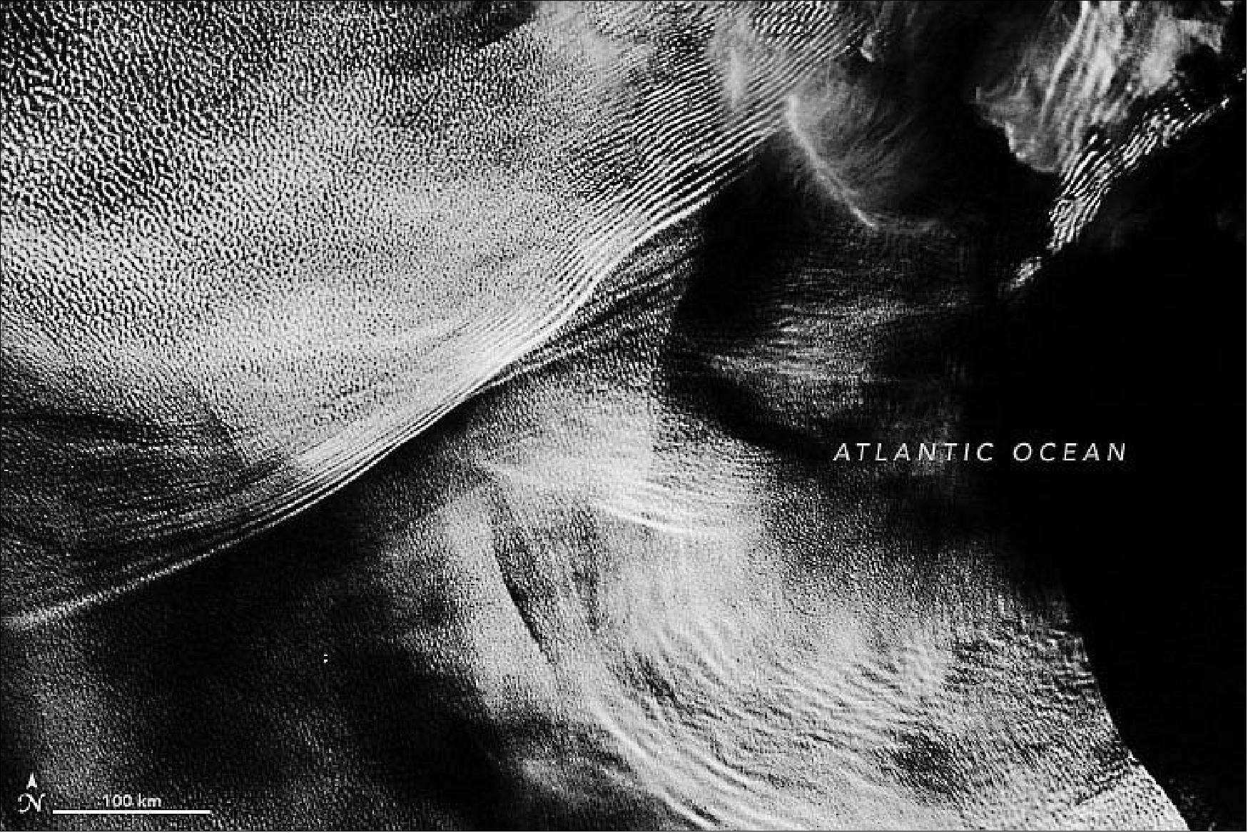
- The phenomenon has similarities to waves moving through an ocean or lake. Waves form when water is disturbed—pushed upward by things like wind or a boat—and then pulled downward again by gravity. Waves also form in the atmosphere when air is disturbed—pushed up by things like mountains or islands, storms, or interacting air masses—and then gravity causes the air to fall again. Clouds can form at the crests of these waves, occasionally making the structures visible to human eyes. But given that the systems can span thousands of kilometers, they are perhaps best viewed from space.
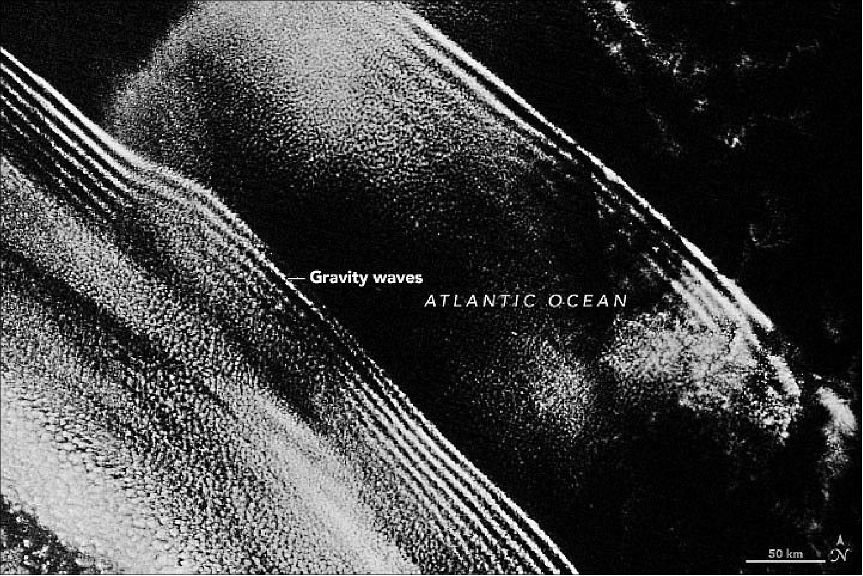
- Based on the images alone, it is not possible to know exactly what caused the waves that night. “There are multiple known sources of gravity waves in low-altitude marine clouds,” said Sandra Yuter, a scientist at North Carolina State University who has studied the phenomenon. She notes that gravity waves off the west coast of Africa are often triggered by large and tall thunderstorms, and by the interaction of offshore winds with a stable layer of air over the water. In this image, the gravity wave clouds near South Africa might have been provoked by storms farther south.
- The complex wave clouds near Angola suggest that there could be a variety of sources. Note the particularly abrupt edge between clouds and clear sky to the lower right. According to Yuter, that feature is likely due to “cloud erosion.” Marine layer clouds are thin and sit low in the sky—just a few hundred meters thick and topping out at about 2 kilometers in altitude. If gravity waves can mix enough dry air from above the cloud layer into this thin cloud layer, the relative humidity drops and the cloud layer dissipates.
- One satellite snapshot in time makes it difficult to tell if cloud erosion is taking place here. Yuter has studied sequences of images, however, showing that these sharp transitions can be thousands of kilometers long. Moving westward at 8-12 m/s, they can clear out the clouds more than 1000 kilometers from the coast of Africa.
• May 04, 2020: University of Colorado (CU) Boulder researchers have developed a method that could enable scientists to accurately forecast ocean acidity up to five years in advance. This would enable fisheries and communities that depend on seafood negatively affected by ocean acidification to adapt to changing conditions in real time, improving economic and food security in the next few decades. 14)
- Previous studies have shown the ability to predict ocean acidity a few months out, but this is the first study to prove it is possible to predict variability in ocean acidity multiple years in advance. The new method, described in Nature Communications, offers potential to forecast the acceleration or slowdown of ocean acidification. 15)
- "We've taken a climate model and run it like you would have a weather forecast, essentially—and the model included ocean chemistry, which is extremely novel," said Riley Brady, lead author of the study, and a doctoral candidate in the Department of Atmospheric and Oceanic Sciences.
- For this study the researchers focused on the California Current System, one of four major coastal upwelling systems in the world, which runs from the tip of Baja California in Mexico all the way up into parts of Canada. The system supports a billion-dollar fisheries industry crucial to the US economy.
- "Here, you've got physics, chemistry, and biology all connecting to create extremely profitable fisheries, from crabs all the way up to big fish," said Brady, who is also a graduate student at the Institute of Arctic and Alpine Research (INSTAAR). "Making predictions of future environmental conditions one, two, or even three years out is remarkable, because this is the kind of information that fisheries managers could utilize."
- The California Current System is particularly vulnerable to ocean acidification due to the upwelling of naturally acidic waters to the surface.
- "The ocean has been doing us a huge favor," said study co-author Nicole Lovenduski, associate professor in atmospheric and oceanic sciences and head of the Ocean Biogeochemistry Research Group at INSTAAR.
- The ocean absorbs a large fraction of the excess carbon dioxide in the Earth's atmosphere derived from human activity. Unfortunately, as a result of absorbing this extra man-made carbon dioxide—24 million tons every single day—the oceans have become more acidic.
- "Ocean acidification is proceeding at a rate 10 times faster today than any time in the last 55 million years," said Lovenduski.
- Within decades, scientists are expecting parts of the ocean to become completely corrosive for certain organisms, which means they cannot form or maintain their shells.
- "We expect people in communities who rely on the ocean ecosystem for fisheries, for tourism and for food security to be affected by ocean acidification," said Lovenduski.
- "We expect people in communities who rely on the ocean ecosystem for fisheries, for tourism and for food security to be affected by ocean acidification," said Lovenduski.
The fortune and frustration of forecasting
- People can easily confirm the accuracy of a weather forecast within a few days. The forecast says rain in your city? You can look out the window.
- But it's a lot more difficult to get real-time measurements of ocean acidity and figure out if your predictions were correct.
- But this time, CU Boulder researchers were able to capitalize on historical forecasts from a climate model developed at NCAR (National Center for Atmospheric Research). Instead of looking to the future, they generated forecasts of the past using the climate model to see how well their forecast system performed. They found that the climate model forecasts did an excellent job at making predictions of ocean acidity in the real world.
- However, these types of climate model forecasts require an enormous amount of computational power, manpower, and time. The potential is there, but the forecasts are not yet ready to be fully operational like weather forecasts.
- And while the study focuses on acidification in one region of the global ocean, it has much larger implications.
- States and smaller regions often do their own forecasts of ocean chemistry on a finer scale, with higher resolution, focused on the coastline where fisheries operate. But while these more local forecasts cannot factor in global climate variables like El Niño, this new global prediction model can.
- This means that this larger model can help inform the boundaries of the smaller models, which will significantly improve their accuracy and extend their forecasts. This would allow fisheries and communities to better plan for where and when to harvest seafood, and to predict potential losses in advance.
- "In the last decade, people have already found evidence of ocean acidification in the California current," said Brady. "It's here right now, and it's going to be here and ever present in the next couple of decades."
• On April 6, 2020, residents of Vanuatu woke up to devastating winds and heavy rains as Tropical Cyclone Harold made landfall on the Pacific island nation. By midday, Harold was a category 5 storm with sustained winds of approximately 215 kilometers (135 miles) per hour near its center, making it one of the strongest storms ever to hit the nation. Harold ripped roofs off of buildings, caused heavy flooding, and cut communication lines on the country’s largest two islands. 16)
- In the days before reaching Vanuatu, the cyclone caused several deaths as it passed south of the Solomon Islands and overthrew a ferry with almost 30 people on it. The storm is expected to reach Fiji by Wednesday (8 April).
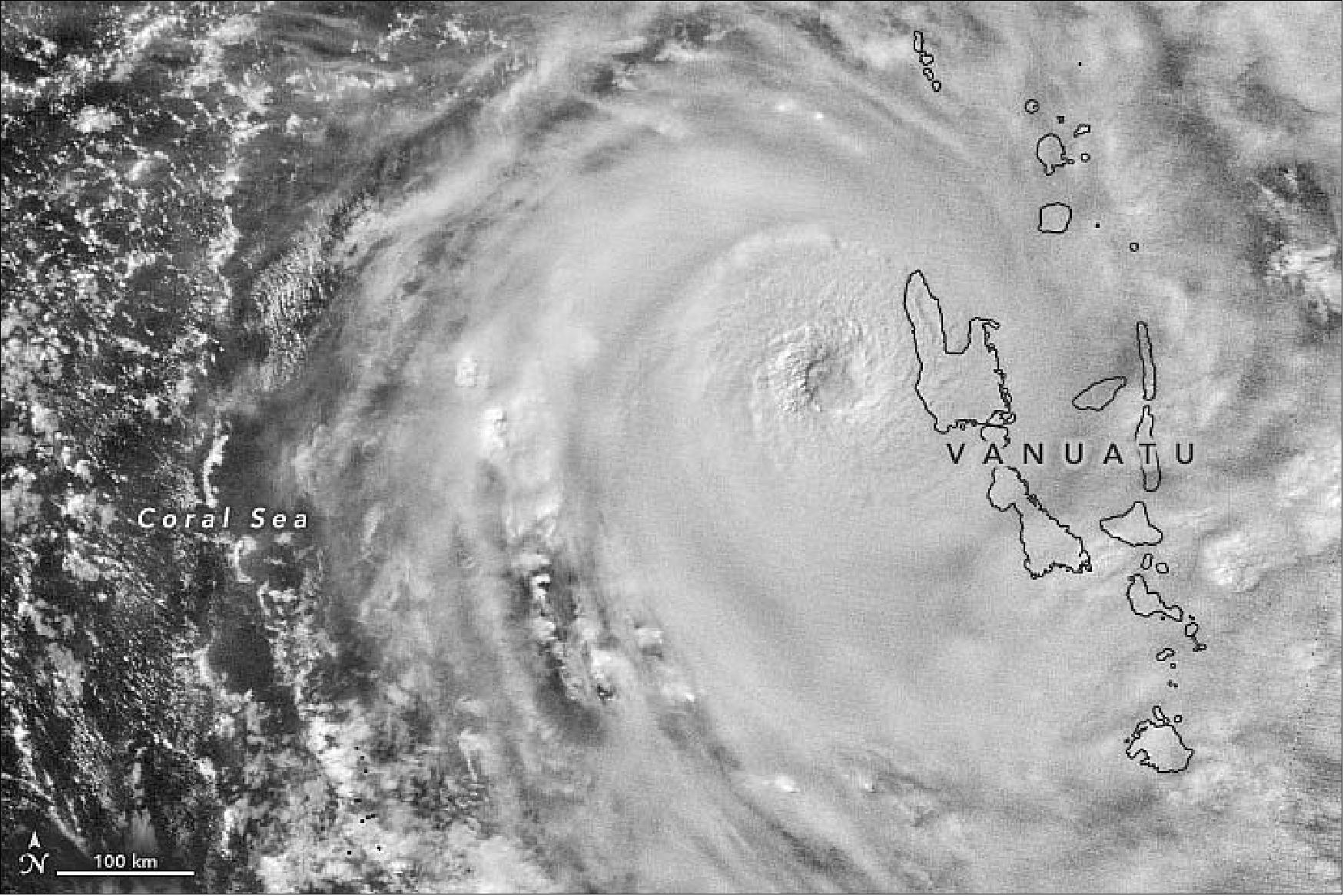
- The storm is expected to move east of Vanuatu by April 7. Until then, forecasters at the Vanuatu Meteorology and Geohazards Department warned of destructive storm force winds with heavy rainfall and flash flooding near river banks and low-lying areas.
- The country, which was already under a state of emergency due to the Covid-19 pandemic, has lifted its social-distancing practices and removed restrictions on public gatherings to help people move to safe shelters and evacuation centers. However, humanitarian aid efforts have been slowed down by restrictions on international travel.
- The last category 5 storm to hit Vanuatu was Cyclone Pam in 2015. The storm caused widespread damages and losses equivalent to nearly two-thirds of the country’s gross domestic product.
• March 5, 2020: Cold winds blowing over the sea helped form rows of cumulus clouds. Cloud streets form when columns of heated air—thermals—rise through the atmosphere and carry heat away from the sea surface. The moist air rises until it hits a warmer air layer (a temperature inversion) that acts like a lid. The inversion causes the rising thermals to roll over on themselves, forming parallel cylinders of rotating air. On the upward side of the cylinders (rising air), water vapor condenses and forms clouds. Along the downward side (descending air), skies remain clear. 17)
- With this combination of visible and infrared light (bands M11-I2-I1), snow and ice appear light blue, and clouds are white. The orientation of the cloud streets indicate that strong, cold winds were blowing from north to south. As the cold air moved over the comparatively warm ocean water, the air warmed and picked up the moisture needed to form cumulus clouds.
- Arctic ice normally reaches its annual maximum extent in mid or late March. Sea ice extent this winter has been below average, according to tracking charts published by the National Snow & Ice Data Center.
- The Advanced Baseline Imager (ABI) on NOAA’s GOES-16 (GOES-East) geostationary satellite also acquired imagery (below) of the cloud streets on March 2, 2020.
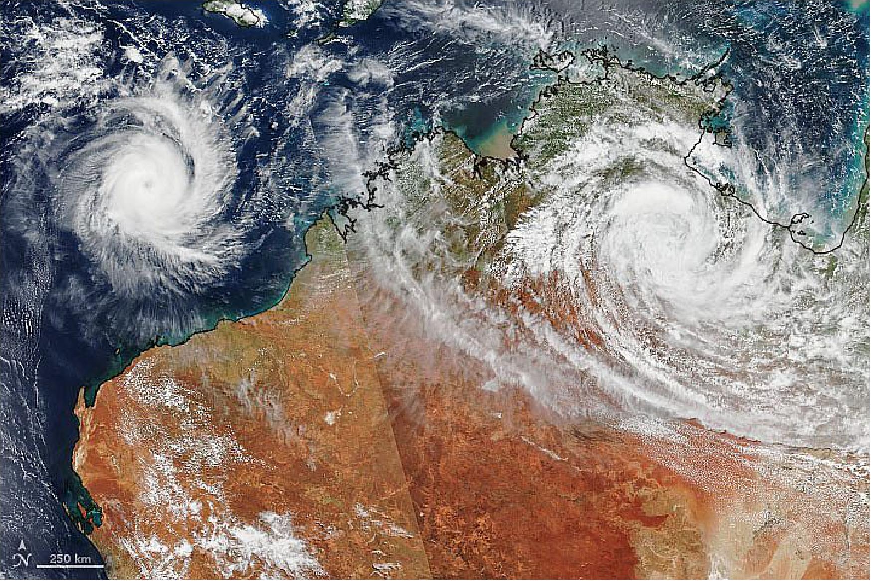
• February 25, 2020: Late summer cyclones Ferdinand and Esther passed over and near northern Australia. Esther made landfall on February 24 along the Carpentaria Coast between Queensland and Northern Territory. Though downgraded to a tropical depression, the storm system is expected to continue dumping heavy rain on Northern Territory and Western Australia. Cyclone Ferdinand formed on February 23 between Australia and Indonesia and has intensified to a category 2 storm. However, it is expected to continue tracking westward over the Indian Ocean and is not likely to make landfall. 18)
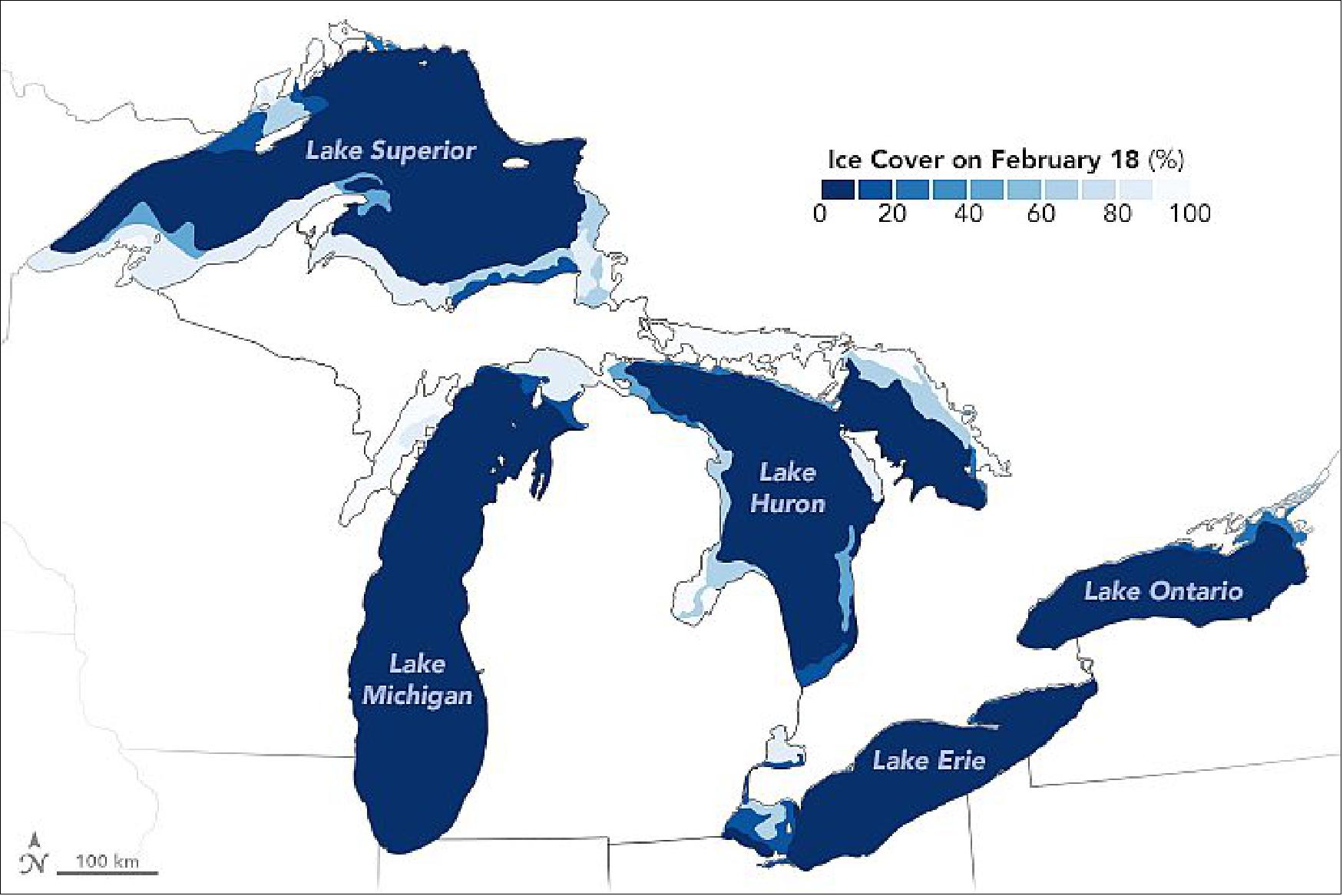
• February 20, 2020: Each winter, at least part of North America’s Great Lakes freeze. But whether it’s a boom or a bust year for ice cover comes down to air temperatures. This season, warmth has prevailed. 19)
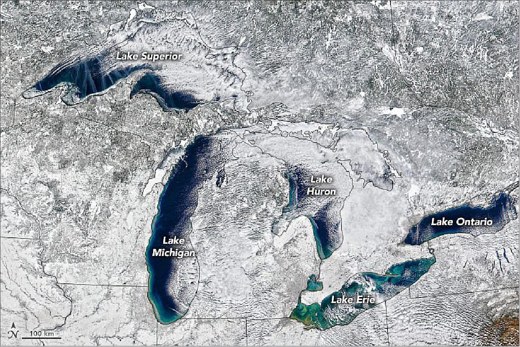
- Ice that day spanned just 17 percent of all of the Great Lakes surface area combined. For context, ice usually spans 41 percent of the Great Lakes on an average February 14; it can be much higher or lower depending on the year. For example, early and persistent cold air temperatures during the winter of 2013-2014 brought record-high ice cover to most of the Great Lakes, reaching 88 percent coverage. The opposite scenario has played out in winter 2019-2020.
- According to Jia Wang, an ice climatologist at NOAA’s Great Lakes Environmental Research Laboratory, four patterns of climate variability drive the warming or cooling effects on air temperature over the Great Lakes. So far this season, the North Atlantic Oscillation, the Atlantic Multidecadal Oscillation, and the Pacific Decadal Oscillation, have contributed to warm or very warm air over the Great Lakes. The El Niño-Southern Oscillation has been neutral (contributing cool air).
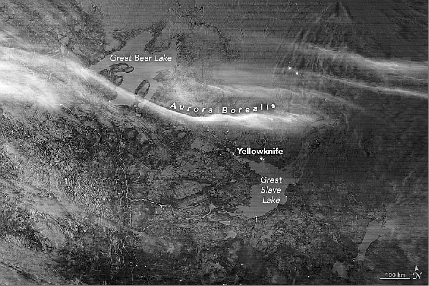
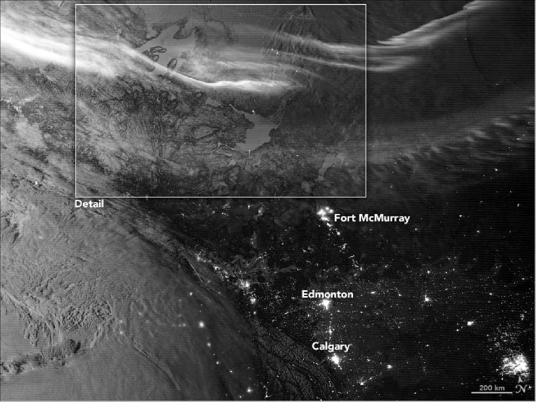
• February 4, 2020: Canada Lit by Aurora and Moonlight. The Visible Infrared Imaging Radiometer Suite (VIIRS) on the Suomi NPP satellite acquired this image of the northern lights over northwestern Canada. The combination of light from the waxing gibbous Moon (between the first quarter and full) and snow and ice on the mountains and lakes give the landscape extra visual definition for a nighttime shot. 20)
• January 14, 2020: In January 2020, the Taal Volcano awoke from 43 years of quiet and spewed lava and ash, filling streets and skies of the Philippine island of Luzon with fine ash fall and volcanic gases. The eruption caused tens of thousands of people to evacuate their homes and forced the closure of several key roads, businesses, and an airport. 21)
- The volcano first unleashed a steam-driven explosion (known as a phreatic eruption) on January 12. In the early morning of January 13, eruptive activity increased and the volcano emitted a fountain of lava for about an hour and a half. According to the Philippine Seismic Network, 144 volcanic earthquakes have been recorded since January 12, suggesting continuous magmatic activity underneath Taal and potentially more eruptive activity.
- According to news reports, the eruption of Taal lofted ash up to 14 km (9 miles) into the air. The eruption was accompanied by intense thunder and lightning above the summit. Winds carried volcanic ash north across Luzon.

![Figure 29: This map shows stratospheric sulfur dioxide concentrations on January 13, 2020, as detected by the Ozone Mapping Profiler Suite (OMPS) on the NOAA-NASA Suomi-NPP satellite [image credit: NASA Earth Observatory, image by Lauren Dauphin, using OMPS data from the Goddard Earth Sciences Data and Information Services Center (GES DISC). Story by Kasha Patel]](https://eoportal.org/ftp/satellite-missions/s/SuomiNPP2020-19/SuomiNPP2020-19_Auto1D.jpeg)
- Taal is the second-most active volcano near Manila, which is located approximately 60 kilometers (40 miles) north of the volcano. In total, ten cities and municipalities surround Taal. The Philippine Institute of Volcanology and Seismology (PHIVOLCS) has ordered a “total evacuation” for people in high-risk areas within a 14-kilometer radius from the main crater, affecting around half a million people.
• January 9, 2020: The fires in Australia are not just causing devastation locally. The unprecedented conditions that include searing heat combined with historic dryness, have led to the formation of an unusually large number of pyrocumulonimbus (pyroCbs) events. PyroCbs are essentially fire-induced thunderstorms. They are triggered by the uplift of ash, smoke, and burning material via super-heated updrafts. As these materials cool, clouds are formed that behave like traditional thunderstorms but without the accompanying precipitation. 22)
- PyroCb events provide a pathway for smoke to reach the stratosphere more than16 km in altitude. Once in the stratosphere, the smoke can travel thousands of miles from its source, affecting atmospheric conditions globally. The effects of those events — whether the smoke provides a net atmospheric cooling or warming, what happens to underlying clouds, etc.) — is currently the subject of intense study.
- NASA is tracking the movement of smoke from the Australian fires lofted, via pyroCbs events, more than 15 km high. The smoke is having a dramatic impact on New Zealand, causing severe air quality issues across the county and visibly darkening mountaintop snow.
- Two instruments aboard NASA-NOAA’s Suomi NPP satellite — VIIRS and OMPS-NM — provide unique information to characterize and track this smoke cloud. The VIIRS instruments provided a “true-color” view of the smoke with visible imagery. The OMPS series of instruments comprise the next generation of back-scattered UltraViolet (BUV) radiation sensors. OMPS-NM provides unique detection capabilities in cloudy conditions (very common in the South Pacific) that VIIRS does not, so together both instruments track the event globally.
- At NASA Goddard, satellite data from the OMPS-NM instrument is used to create an ultraviolet aerosol index to track the aerosols and smoke. The UV index is a qualitative product that can easily detect smoke (and dust) over all types of land surfaces. To enhance and more easily identify the smoke and aerosols, scientists combine the UV aerosol index with RGB information.
- Colin Seftor, research scientist at Goddard said, “The UV index has a characteristic that is particularly well suited for identifying and tracking smoke from pyroCb events: the higher the smoke plume, the larger the aerosol index value. Values over 10 are often associated with such events. The aerosol index values produced by some of the Australian pyroCb events have rivaled that largest values ever recorded.”
- Beyond New Zealand, by Jan. 8, the smoke had travelled halfway around Earth, crossing South America, turning the skies hazy and causing colorful sunrises and sunsets. — The smoke is expected to make at least one full circuit around the globe, returning once again to the skies over Australia.
- NASA’s satellite instruments are often the first to detect wildfires burning in remote regions, and the locations of new fires are sent directly to land managers worldwide within hours of the satellite overpass. Together, NASA instruments detect actively burning fires, track the transport of smoke from fires, provide information for fire management, and map the extent of changes to ecosystems, based on the extent and severity of burn scars. NASA has a fleet of Earth-observing instruments, many of which contribute to our understanding of fire in the Earth system. Satellites in orbit around the poles provide observations of the entire planet several times per day, whereas satellites in a geostationary orbit provide coarse-resolution imagery of fires, smoke and clouds every five to 15 minutes.
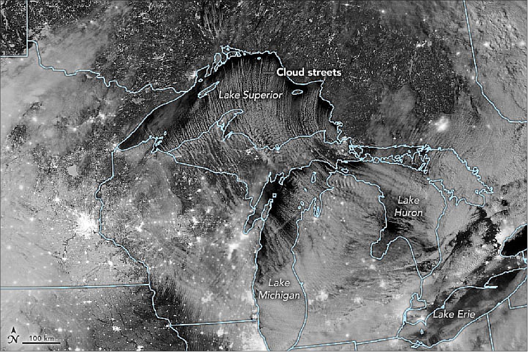
• December 10, 2019: A blast of frigid air from Canada is fueling lake-effect snow in several states downwind of the Great Lakes. The Visible Infrared Imaging Radiometer Suite (VIIRS) on the Suomi NPP satellite captured this image of cloud streets streaming over Lake Superior, Lake Michigan, and Lake Huron on December 10, 2019, using its day-night band. The rows of clouds are created by cold, dry air blowing over warmer lake water in a way that produces parallel cylinders of rotating air that often yield heavy bands of snow. 23)
• November 9, 2019: The bushfire season in New South Wales, Australia, typically runs from October through March. Just one month into the 2019 season, news reports say the amount of burned area has already surpassed that of the past two years combined. 24)
- Three hours after the image of Figure 34 was acquired, the New South Wales Rural Fire Service reported 96 fires burning across the state with 57 that remained uncontained. Seventeen were emergency-level fires—he highest alert level for a bushfire. According to news reports, that’s the highest number of emergency-level fires the state has seen burning at one time.
- Amid the burning, citizens of coastal cities watched their skies turn orange-red and air quality was degraded. In Port Macquarie, the air quality index (a scale that indicates pollution levels) was well into the hazardous category. That’s the level at which everyone is at risk for the pollution to affect their health.
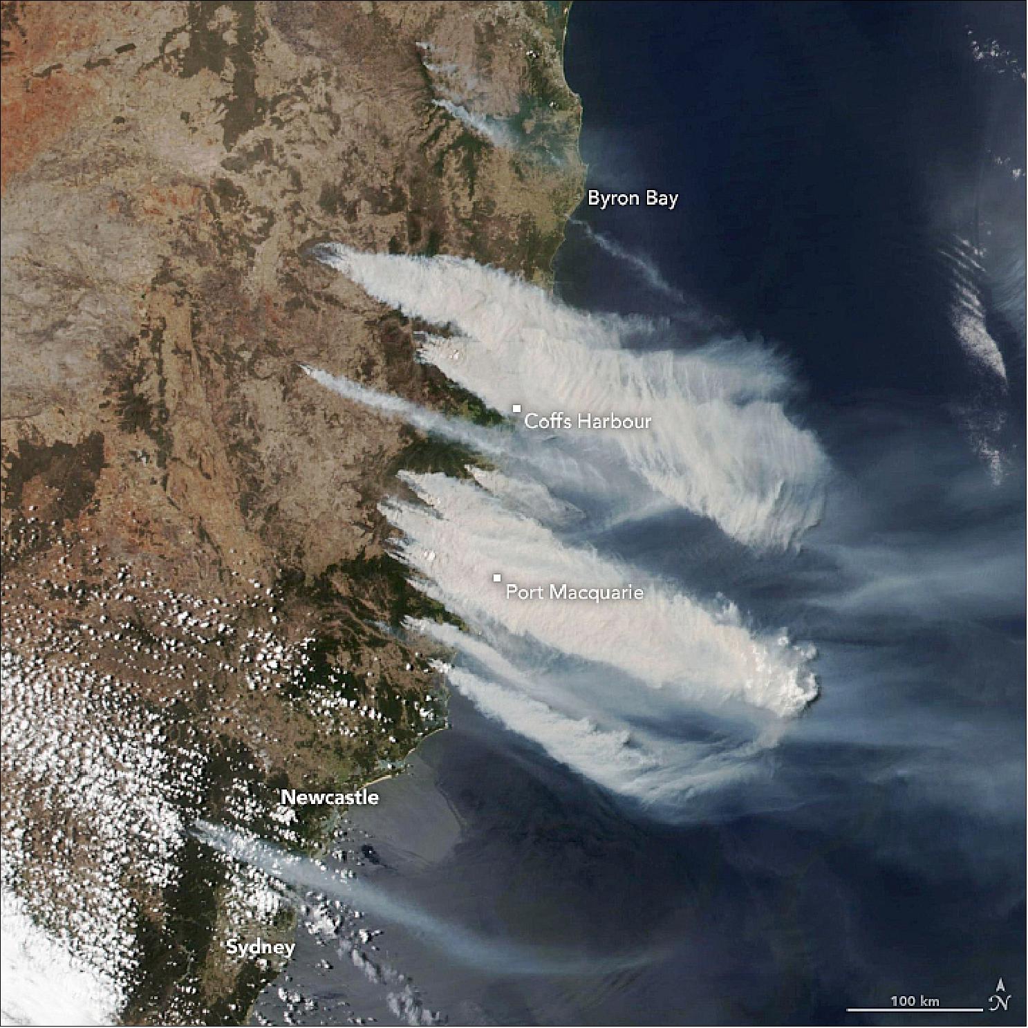
- Burning bans have been put in place in some areas amid forecasts for continued severe fire weather—warm temperatures paired with strong winds. The region also has been drier than usual; the lack of rainfall in New South Wales led to one of five driest January-October periods on record.
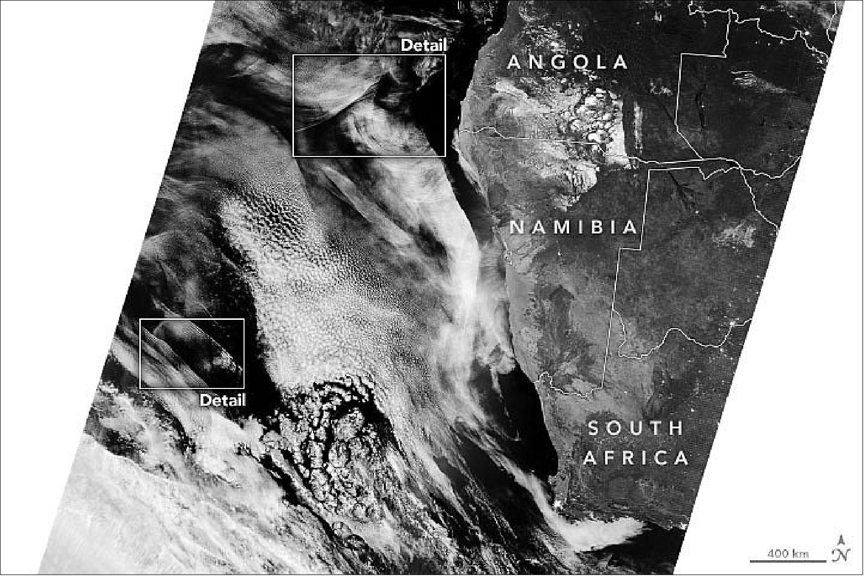
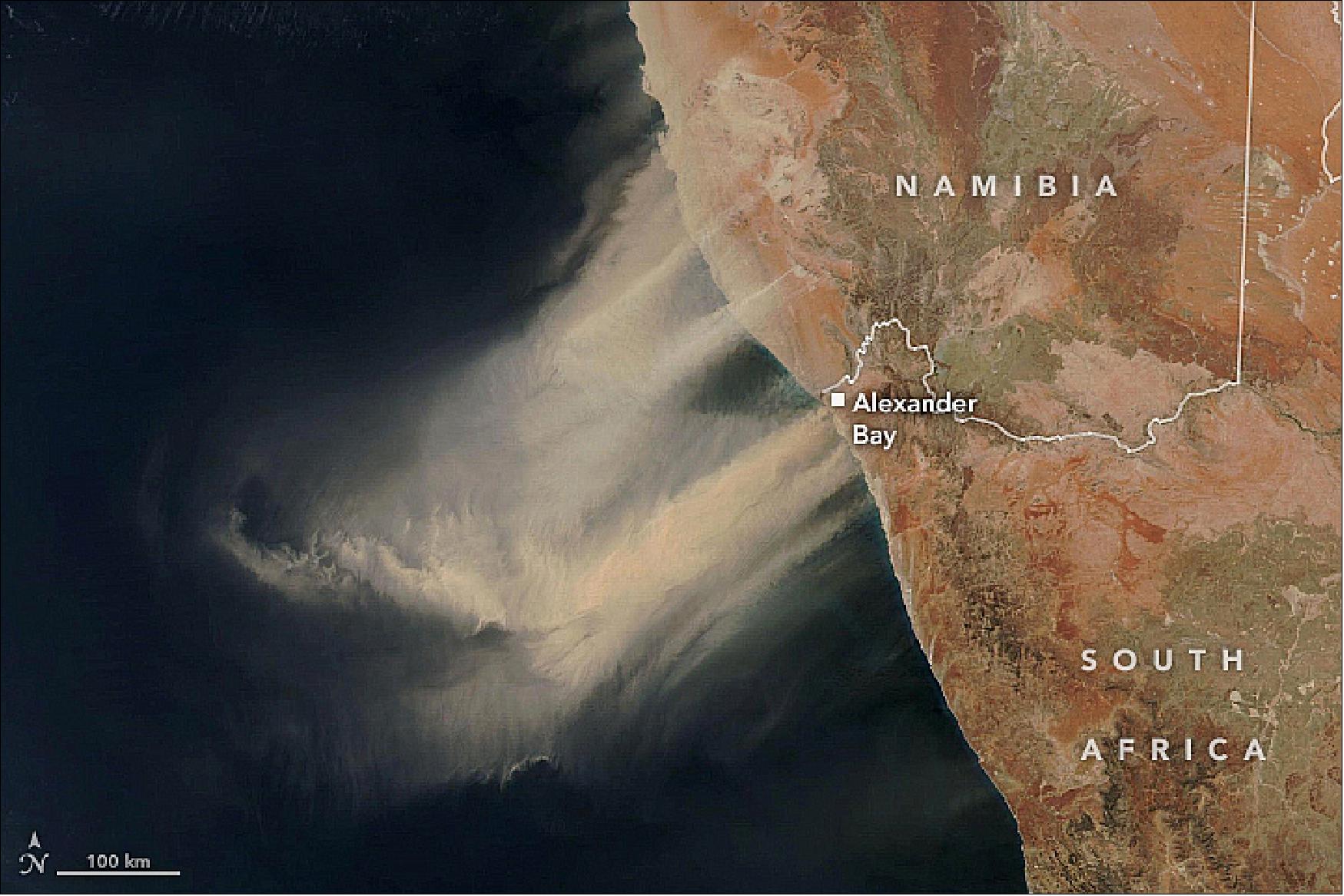
• September 26, 2019: People in coastal towns along the west coast of southern Africa watched skies turn red on September 25, 2019. Fierce wind picked up and carried huge plumes of sand and dust westward toward the Atlantic Ocean. 25)
- The South African Weather Service reported that the winds lofted enough particles into the air to produce moderate to poor visibility. Indeed, photographs from people in Alexander Bay show dark, hazy skies and streets that are barely visible. According to news reports, aircraft were unable to land at nearby airports.
- The amount of dust lofted from land in the Southern Hemisphere is negligible compared to that of the Northern Hemisphere. Africa’s Sahara Desert, for example, is one of the world’s major dust sources. Still, when winds blow over dry areas of the Southern Hemisphere, dust storms can be fierce. A similar scene unfolded in October 2018, when a thick, narrow plume streamed from the same area.
• September 13, 2019: Wherever fires are burning around the world NASA-NOAA’s Suomi-NPP satellite’s OMPS (Ozone Mapping and Profiler Suite) can track the smoke and aerosols. On Sept. 13, 2019, data from OMPS revealed aerosols and smoke from fires over both South America and North America. 26)
- Suomi-NPP’s OMPS tracks the health of the ozone layer and measures the concentration of ozone in the Earth's atmosphere and can detect aerosols. Ozone is an important molecule in the atmosphere because it partially blocks harmful ultra-violet radiation from the sun. OMPS data help scientists monitor the health of this vital protective layer.
- OMPS also can be used to measure concentrations of atmospheric aerosols from dust storms and similar events as well as sulfur dioxide (SO2) from volcanic eruptions. One aerosol-related OMPS product is a value known as the “AI (Aerosol Index). The AI value is related to both the thickness and height of the atmospheric aerosol layer. For most atmospheric events involving aerosols, the AI ranges from 0.0 to 5.0, with 5.0 indicating heavy concentrations of aerosols that could reduce visibilities and/or impact health.
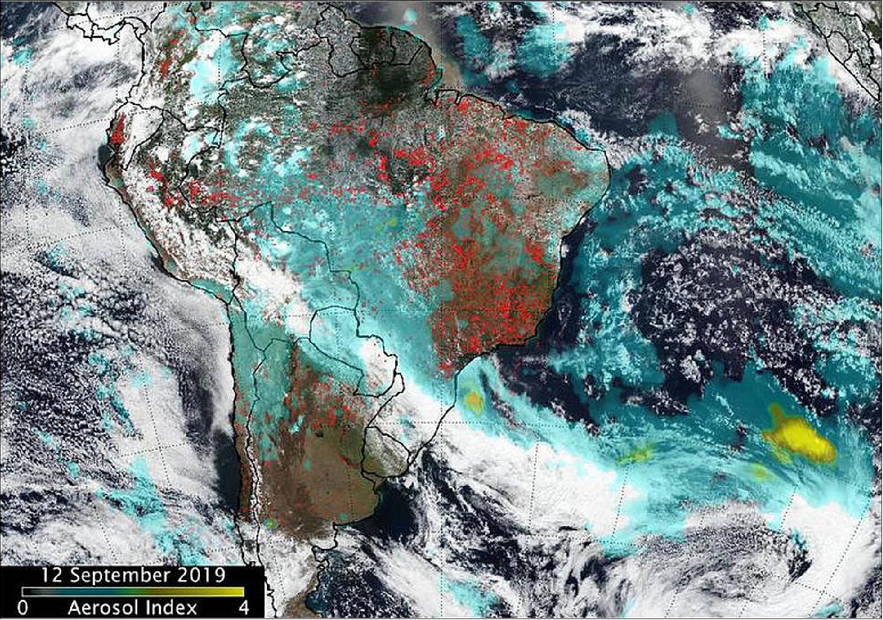
- An aerosol is a suspension of fine solid particles or liquid droplets, in air or another gas. Aerosols can be natural or anthropogenic (manmade). Examples of natural aerosols are fog, dust and geyser steam. Examples of manmade aerosols include haze (suspended particles in the lower atmosphere), particulate air pollutants and smoke.
- High aerosol concentrations not only can affect climate and reduce visibility, they also can impact breathing, reproduction, the cardiovascular system, and the central nervous system, according to the U.S. Environmental Protection Agency. Since aerosols are able to remain suspended in the atmosphere and be carried along prevailing high-altitude wind streams, they can travel great distances away from their source and their effects can linger.
- Fires in South America generated smoke that continues to create a long plume east into the Atlantic Ocean. Fires over western Brazil were generating aerosols at a level 2.0 on the index. Higher aerosol concentrations, as high as 4.0 were seen off the southeastern coast of Brazil as a result of the fires in the region.
- In North America, Suomi-NPP’s OMPS detected smoke and aerosols from fires over Canada’s Yukon Territories. Aerosol concentrations were very high over the Yukon fires due to a pyrocumulus event that occurred on September 11.
- Pyrocumulus clouds—sometimes called “fire clouds”—are tall, cauliflower-shaped, and appear as opaque white patches hovering over darker smoke in satellite imagery. Pyrocumulus clouds are similar to cumulus clouds, but the heat that forces the air to rise (which leads to cooling and condensation of water vapor) comes from fire instead of sun-warmed ground. Under certain circumstances, pyrocumulus clouds can produce full-fledged thunderstorms, making them pyrocumulonimbus clouds.
- Scientists monitor pyrocumulus clouds closely because they can inject smoke and pollutants high into the atmosphere. As pollutants are dispersed by wind, they can affect air quality over a broad area.
- The image also contains a light brown area of smoke that looks like a letter “C” on its side and a low pressure system (the area of spiraled clouds) off the coast of western Canada.
- Both images were created at the NASA Goddard Space Flight Center in Greenbelt, Md.
• September 9, 2019: A team of engineers, scientists, and satellite operators recently restored a damaged satellite instrument that is used to measure temperature and water vapor in the Earth’s atmosphere. After the CrIS (Cross-track Infrared Sounder) instrument was damaged by radiation as it flew on the Suomi-NPP satellite, the team made a successful switch to the sensor’s electronic B-side, returning the instrument to full capability. 27)
- Meanwhile, to fill the data gap created by the event, scientists from the JPSS (Joint Polar Satellite System) fast-tracked similar data from Suomi-NPP’s cousin, the NOAA-20 satellite, to the National Weather Service (NWS).
- The CrIS instrument probes the sky vertically for details on temperature and water vapor — using a process is known as sounding. These observations provide important information on our planet’s atmospheric chemistry and composition, which inform weather forecast centers, environmental data records and field campaign experiments. CrIS can also quantify the distributions of trace gases in the atmosphere, such as carbon dioxide and methane.
- CrIS observes in three spectral bands within the infrared part of the spectrum: shortwave, midwave and longwave. Analysts first detected the anomaly in the midwave data on Saturday, March 23. By Monday, things weren’t looking good, said Flavio Iturbide-Sanchez, the CrIS instrument’s calibration validation lead.
- The midwave band, which includes channels sensitive to water vapor, had stopped reading properly. The next day, measurements from that band had disappeared completely.
- “Midwave is particularly focused on moisture,” said Clayton Buttles, the CrIS chief engineer for L3Harris Technologies, the instrument’s contractor. “Losing that creates a hole in the data products used to generate weather forecast predictions. Ideally, you want to combine all three bands into a comprehensive unit that allows for better forecast and prediction.”
- An algorithm called the NUCAPS (NOAA Unique Combined Atmospheric Processing System), provides the only satellite soundings available to National Weather Service’s weather forecast offices, said Bill Sjoberg, a senior systems engineer with NOAA and JPSS. NUCAPS combines infrared and microwave observations to produce atmospheric profiles of temperature and water vapor, and it relies on CrIS data. Without the CrIS soundings, forecasters would have risked losing the ability to derive an important set of measurements during afternoon hours when severe convection is most common.
- But NOAA-20, which flies 50 minutes ahead, has its own identical CrIS instrument.
- Accelerating access to NOAA-20 satellite soundings for the National Weather Service “helped reestablish the ability to track changes in severe weather conditions,” Sjoberg said.
- Meanwhile, after months of analyzing what went wrong in March, the team determined that the problem with the instrument was likely caused by radiation damage to its midwave infrared signal processor, said David Johnson, NASA’s CrIS instrument scientist. Raw data from the detectors goes through the signal processor, where the data rate gets greatly reduced in size so that it can be efficiently delivered to the ground stations.
- Fortunately, like all of the JPSS instruments and much of the spacecraft, CrIS has redundant parts. It was designed with this threat in mind. It contains a “Side 2,” a fully functional backup set of electronics, which the team hoped had not been damaged. “But we wouldn’t know without making the switch,” Iturbide-Sanchez said.
- For three months, the team studied the instrument. They ran a “reliability analysis.” They weighed the risks. They “located and verified all configuration files for Side 2,” Johnson said.
- On June 21, the team made the official decision to switch to Side 2, and three days later, they executed the switch. The turn-on process involved tuning the instrument and checking settings. But Iturbide-Sanchez knew almost immediately that the three bands were working.
- The plan was to complete the turn-on in two weeks. They did it in five days, a result of working long hours and frequent communication with ground station command. And by early July, satellite soundings had been recovered and the product was good enough to be used in weather models.
- It was very much a team effort, Iturbide-Sanchez and Johnson both said: The Cooperative Institute for Meteorological Satellite Studies at the University of Wisconsin and the Joint Center for Earth System’s Technology at the University of Maryland, Baltimore County, worked with the team during both phases, contributing to the preparation of a configuration file before the side switch, and evaluating data quality after.
- “NOAA invests in redundant systems to maximize the useful life of the instruments,” said Jim Gleason, NASA project scientist for JPSS. “This is a story of the system working as designed.”
- Making the successful switch from Side 1 to Side 2 also allows for National Weather Service products that provide early warnings for events like hurricanes, Buttles said: “We would all be worse off if we didn’t have that data.”

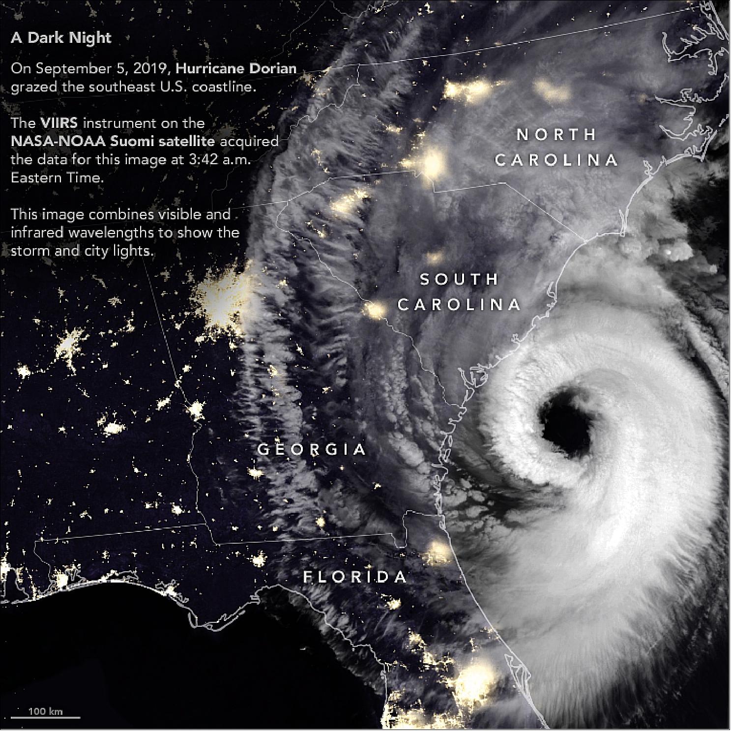
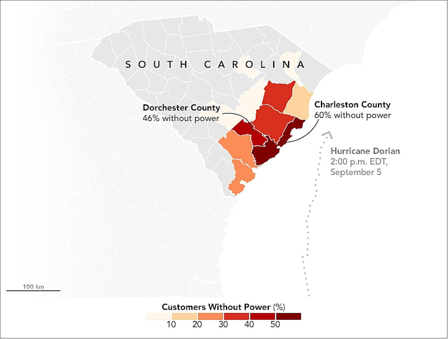
• September 6, 2019: After devastating the Bahamas and grazing Florida and Georgia, Hurricane Dorian rebounded and raked the coast of South Carolina with strong winds, heavy rains, and a storm surge. Wind, falling trees, and flooding damaged power infrastructure in coastal areas of the southeast U.S. 28)
- The VIIRS sensor observed thick cloud bands circulating around Dorian’s large eye, the part of the storm with mostly calm weather and the lowest atmospheric pressure. Hurricane eyes average about 20 miles (32 kilometers); the National Hurricane Center reported Dorian’s eye had a diameter of 50 miles (80 kilometers) around the time this image was acquired. Thinner clouds—part of the storm’s higher-level outflow—extended well inland across Georgia, South Carolina, and North Carolina.
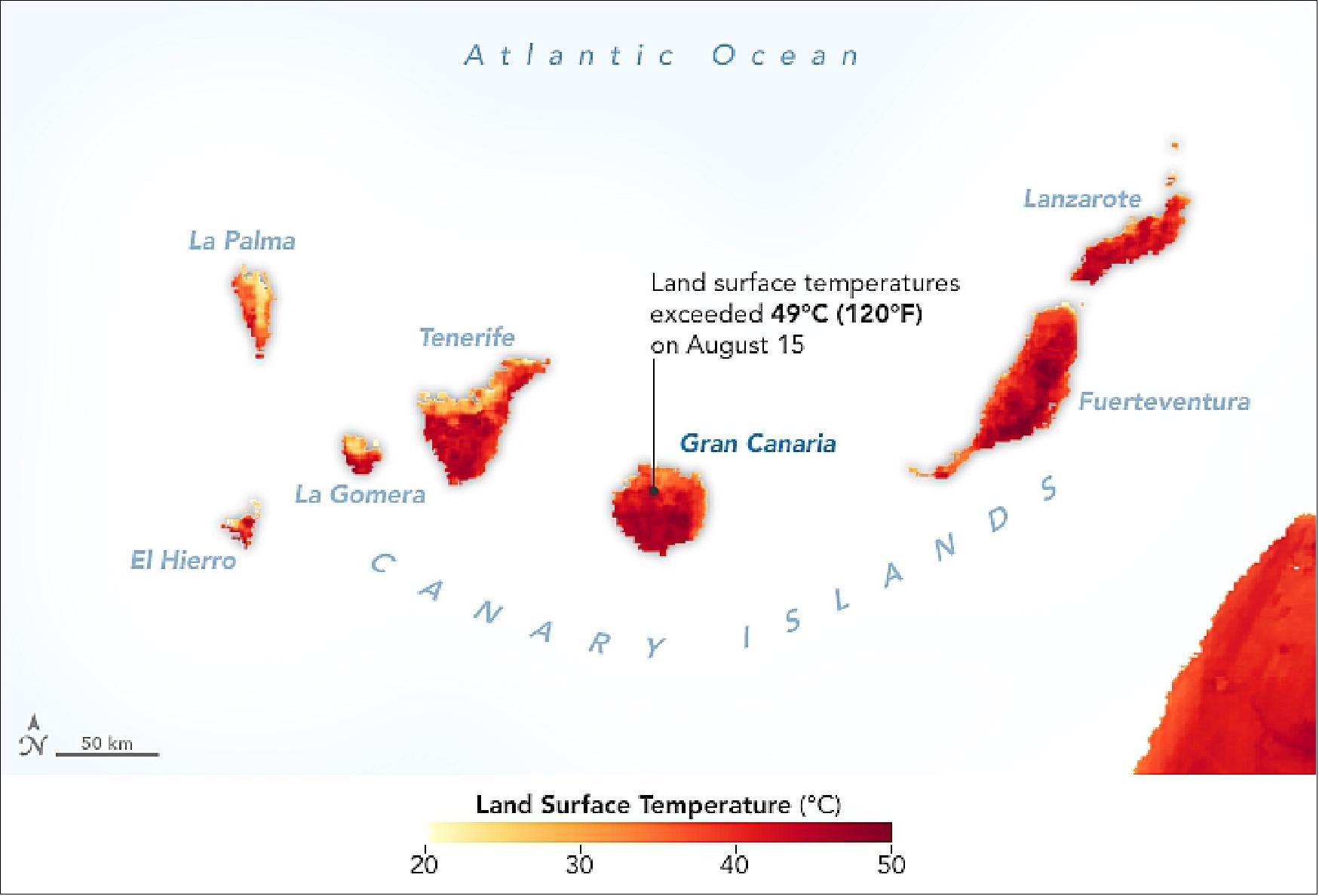
• August 20, 2019: Beginning on August 10, 2019, NASA satellites have observed waves of fire sweeping through forests on Gran Canaria, the second most populous of the Canary Islands. Though the fire has not yet struck major residential and tourist areas, authorities have issued evacuation orders for 9,000 people living in 50 nearby towns and villages. 29)
- The fire is tearing through pine forests in mountainous terrain on the second most populous of the Canary Islands.
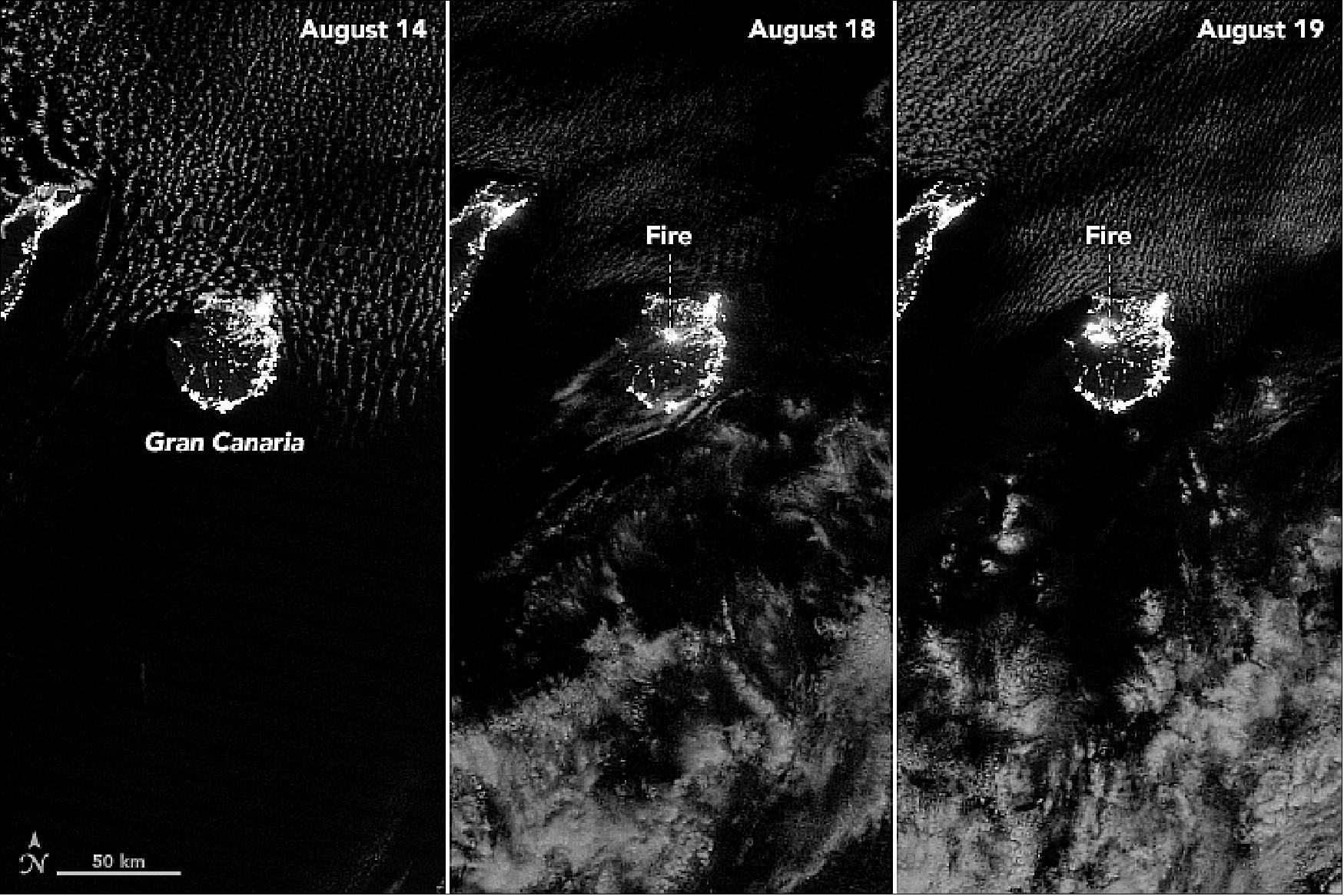
- The fire initially flared up near Tejeda, in the mountainous central part of the island, and then spread rapidly toward the northwest into Tamadaba Natural Park in unusually warm, dry, and windy conditions.
- The fire is burning forests of Canary pine (Pinus canariensis), which is among the most fire-tolerant pine species in the world. The trees have several adaptations that allow them to survive and thrive after fires: thick bark that prevents heat damage, trunks that easily sprout new branches; and serotinous cones that depend on high heat to release seeds.
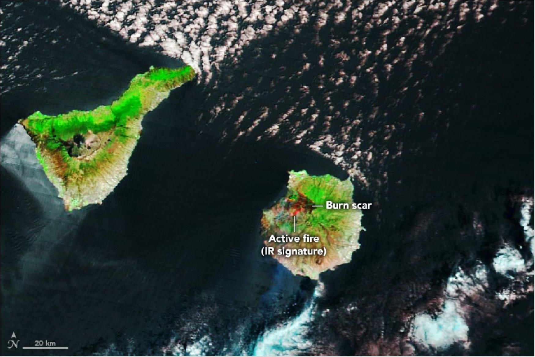
- Scientists who monitor fire activity in the Canary Islands have observed clear trends in the past half-century. Most notably, the number of fires has decreased even as the number of hectares burned by each fire has increased significantly. On net, fires burn roughly the same average area each year, but they do it in a much more dramatic fashion because they are larger and more intense.
- While increasing temperatures may have contributed to this trend, University of La Laguna scientist José Ramón Arévalo attributes much of the change to more active and effective firefighting efforts that now suppress most fires and lead to a build-up of flammable material in forests. Increased development and tourism also contribute by requiring that firefighters aggressively suppress fires over a wider area.
• August 19, 2019: Our atmosphere behaves like a fluid, changing its flow and direction when it runs into an obstacle. Sometimes we can see (and feel) these movements on a small scale, as winds blow trees and water. Satellites, however, can observe these twists and bends on a broad scale as they create interesting shapes in the sky. 30)
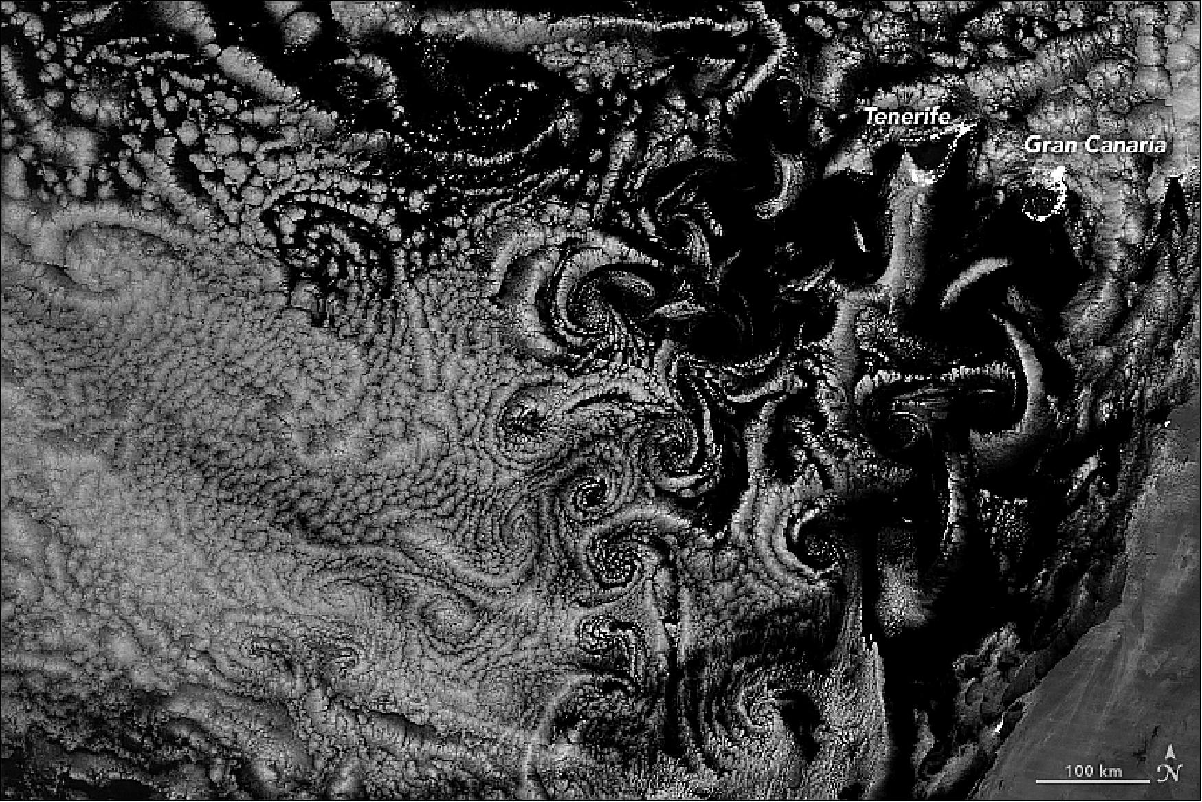
- “The basic idea is that flow over, and around, a mountainous island slows down,” said George Young, professor of meteorology at Penn State University. This creates a vertical wall of whirling air—with faster wind flowing past slower wind below. These sheets can wrap themselves into vortices and shed alternately off the two sides of the island. They can subsequently travel downwind from the island to create “vortex streets,” as seen in this image. The pattern of the spirals depends on the intensity of the wind.
- “This is a spectacular satellite image,” said Paul Beggs, an associate professor at Macquarie University. “I don’t recall having seen an image of von Kármán vortices at nighttime previously, so I would consider it rare.” Atmospheric vortices are commonly observed by satellites, and Earth Observatory has shown them many times. But we have rarely noted them in nighttime imagery.
- Young notes that nighttime von Kármán vortices are not necessarily infrequent occurrences; new sensor technology has just made it much easier to capture these scenes. Satellites now carry shortwave infrared channels and image filters that achieve the spatial resolution and faint light detection to allow researchers to see vortices at night.
- This image was acquired with the “day-night band” of the VIIRS instrument on the Suomi NPP satellite. VIIRS detects light in a range of wavelengths from green to near-infrared and uses filtering techniques to observe dim signals such as city lights, gas flares, auroras, wildfires, and reflected moonlight.
- “I’m not the least surprised to see them at night because the two factors they primarily depend on (wind speed in the boundary layer and a strong stable layer at the top of the boundary layer) vary little between day and night at sea,” said Young. These von Karman vortices also appeared in daylight.
• August 10, 2019: Twin typhoons continued to churn across the Western Pacific Ocean late this week, threatening East Asian countries with destructive winds and rain. When this image was acquired on August 9, 2019, Typhoon Lekima (left) was skirting north of Taiwan and aiming for eastern China. 31)
- Although Taiwan avoided a direct hit from Typhoon Lekima, the storm’s outer bands still delivered strong rains and wind, causing flooding and power outages. According to China’s Central Weather Bureau, parts of the country’s northern mountains received as much as 390 mm (15 inches) of rain from 8-10 August. The rainfall increased the risk of landslides after a magnitude 6.0 earthquake rattled Taiwan on 8 August.
- Lekima next aimed for China’s Zhejiang Province. According to the Joint Typhoon Warning Center, the typhoon is expected to make landfall early on 10 August, about 325 km (200 miles) south of Shanghai. Forecasters expect it will then track northward. The cities labeled on the image all have populations of more than 1.5 million people.
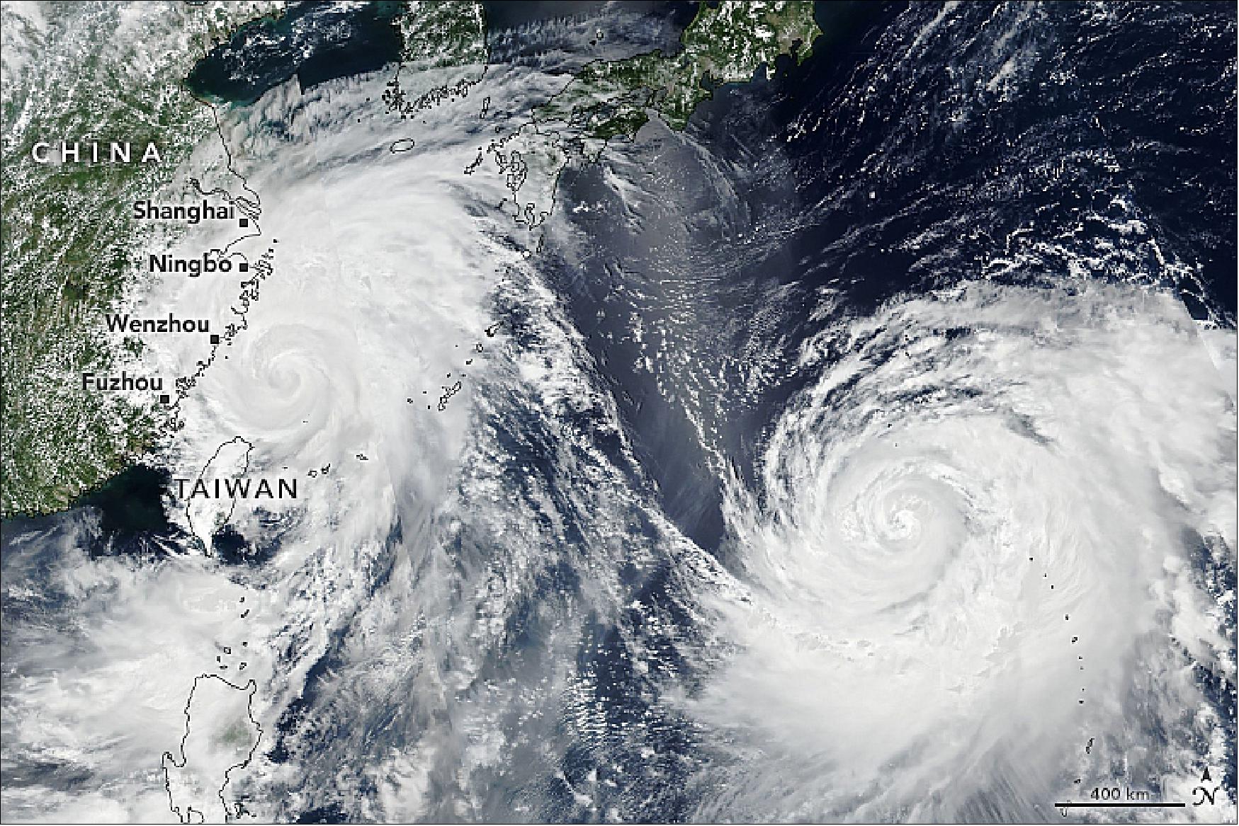
- Officials in China have issued a red alert, the highest of four levels on the country’s typhoon warning system. According to news reports, thousands of people in Shanghai were asked to prepare to evacuate. Transportation authorities have canceled large numbers of flights, halted trains, a rerouted cruise ships.
- Meanwhile, Typhoon Krosa (right) had maximum sustained winds of 85 knots (100 miles/155 km/hr), making it a category 2 storm when the image was acquired. Krosa continues to follow a more northerly path toward Japan, but the track forecasted for this storm remains uncertain.
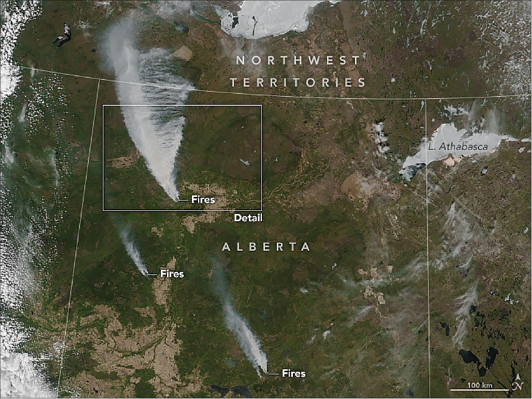
• May 22, 2019: Some residents of the town of High Level, Canada, were told on May 20 to evacuate in the face of a large and out-of-control wildfire that has started advancing toward the town. 32)
- The Chuckegg Creek wildfire started on May 12, 2019, and mostly burned northwest and away from populated areas. On May 18, residents told news media about thick clouds of black smoke, an ominous sign but still a distant threat. By May 19, the fire had charred at least 25,000 hectares (60,000 acres), according to statistics from provincial officials at Alberta Wildfire.
- On May 20, the fire took a turn and advanced within 5 km of High Level (population 3,000). It had spread across an estimated 69,000 hectares, leading the Alberta Emergency Management Agency to issue a mandatory evacuation order for residents south and southeast of the town. A state of emergency was declared for Mackenzie County.
- Electric power outages were reported in High Level, First Nation reserves, and across parts of Mackenzie County. Fire managers warned of extreme fire danger due to warm air temperatures, low humidity, gusty winds, and no precipitation in the near-term forecast. Alberta Wildfire deployed more than 60 firefighters along with heavy equipment, helicopters, and air tankers to contain this fire, while requesting more resources from the province.
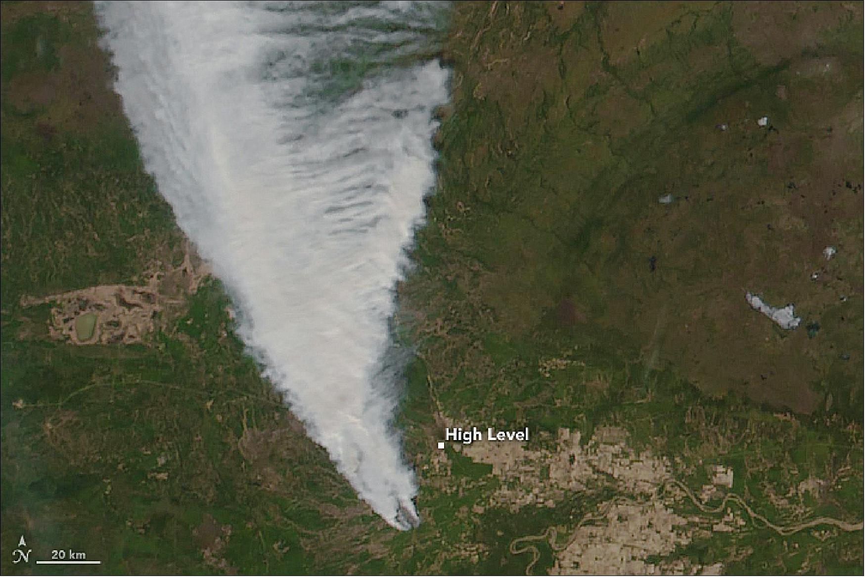
- The Chuckegg Creek wildfire was one of six burning out of control in northern and central Alberta Province as of May 20, 2019. The provincial government recorded 11 other fires as being under control and three as “being held” (not likely to grow past expected boundaries). Fire bans and off-road vehicle restrictions were in place in much of the northern tier of Alberta.
- The fires have sprung up in a time that ecologists refer to as the “spring dip.” Scientists have noted for years that forests in Canada and around the Great Lakes in the United States are especially susceptible to fire in the late spring because trees and grasses reach a point of extremely low moisture content (a dip) between the end of winter and the start of new seasonal growth. The effect is not yet well understood, as it also involves subtle changes in plant chemistry.
• May 07, 2019: It is not even summertime, but already the United Kingdom has seen a significant number of wildfires. The map above shows cumulative fire detections across the United Kingdom from January 1 through April 30, 2019. The data come from the Visible Infrared Imaging Radiometer Suite (VIIRS) on the Suomi NPP satellite. 33)
- Each red dot depicts one fire detection from the VIIRS 375-meter active fire data product. A “fire detection” is a pixel in which the sensor and an algorithm indicated there was active fire on any given day. Many fire detections can be generated by a single burning fire.
- Notable fires this year include blazes in February and April in England’s Ashdown Forest—the setting that inspired the Hundred Acre Wood in A.A. Milne’s Winnie the Pooh stories. In late February, following the United Kingdom’s warmest winter day on record, the Marsden Moor fire burned in West Yorkshire, England. Scotland has seen burning too, including a major wildfire that burned near a wind farm in Moray.
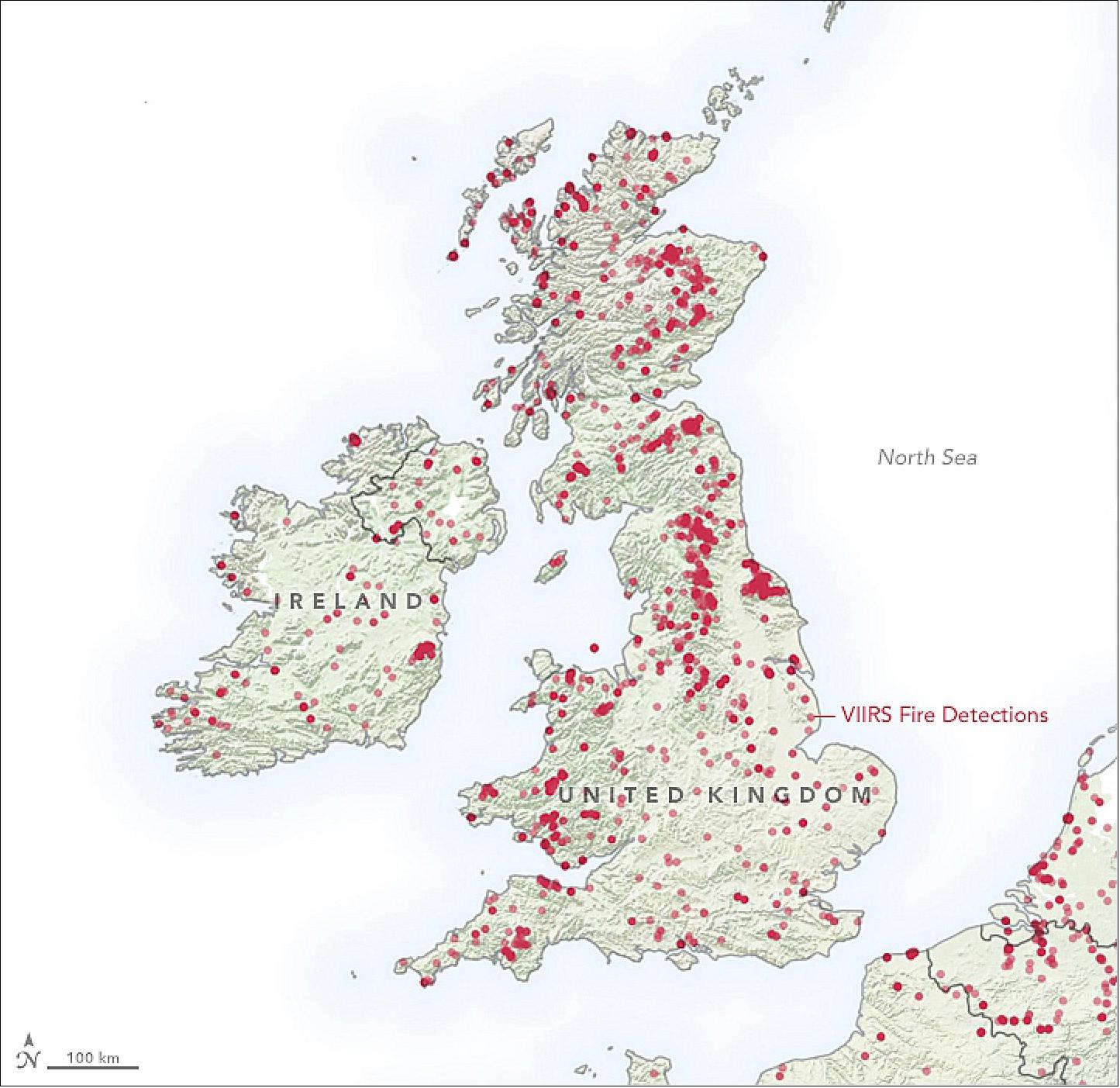
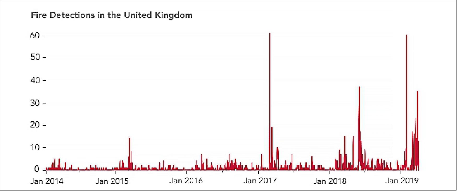
- Notice that there have been more fire detections since 2017 compared with previous years. According to the annual report on forest fires by the European Commission’s Joint Research Center, warm, dry weather was responsible for the rise in wildfire numbers across the United Kingdom in 2017. A similar situation played out in 2018.
- “Drier-than-normal conditions can boost fire detections in two ways,” said Wilfrid Schroeder, a scientist at the University of Maryland and principal investigator for the VIIRS active fire product. He noted that dry conditions favor the ignition and spread of fire. There also tends to be less cloud coverage, making fires more likely to be detected from space.
- High fire counts and warm, dry weather have been a continuing trend. By the end of April 2019, the United Kingdom had already seen more fires through this point in the year than in the record-breaking year of 2018.
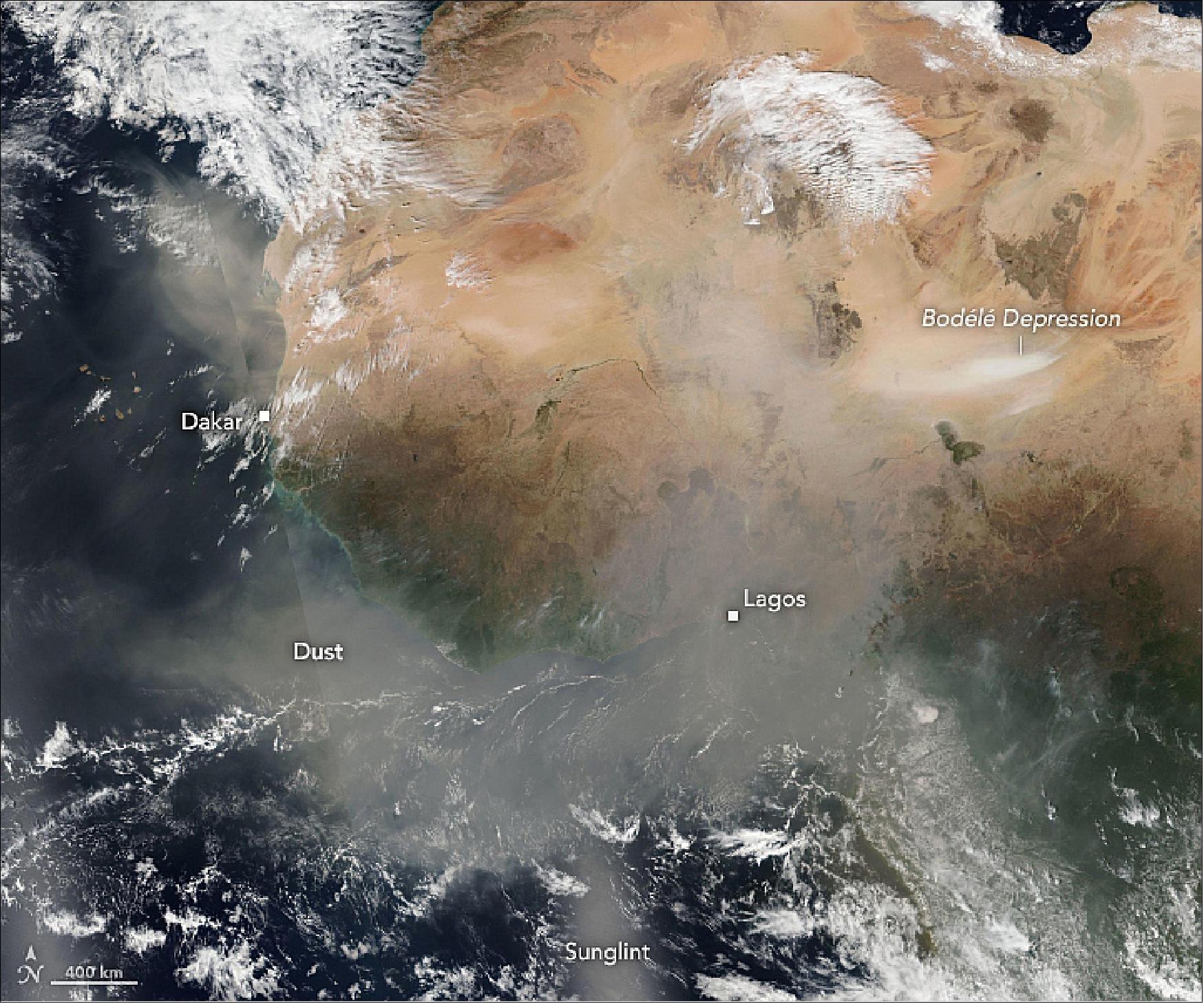
• May 01, 2019: Between November and April, Harmattan trade winds carry vast amounts of mineral dust from the Sahara Desert across West African skies toward the Gulf of Guinea. The pall of dust that hangs over the region is known as the Harmattan haze—which, fittingly, means “tears your breath apart” in Twi, a common West African language. 34)
- West Africans have long known the haze season to be one of dry skin and chapped lips, but a recent study led by Susanne Bauer of NASA’s Goddard Institute for Space Studies suggests that dusty skies are more than a nuisance. Her analysis indicates that they are deadly for hundreds of thousands of people each year.
- Bauer became focused on the health impacts of dust somewhat indirectly. After completing a study in 2015 that found fertilizer use on farms was a surprisingly large source of air pollution, she wondered if there were other unexpected ways that food production was affecting air quality.
- This prompted her to look closely at fires in Africa. Every year, satellites detect thousands of manmade fires that come and go in sync with the seasons. Most of these fires are ignited to clear or fertilize crops, kill pests, and manage grasslands.
- Agricultural fires generate so much smoke that Bauer guessed they were one of the biggest sources of fine aerosol particles (PM2.5)—the particle size that causes the most serious health problems. (Fine particles can penetrate more easily into the human respiratory and circulatory system than larger particles.)
- Bauer and colleagues tried to confirm her suspicion by running a computer simulation of how smoke, desert dust, industrial haze, and other airborne particles (aerosols) moved and evolved in African skies with changing weather and environmental conditions. The model simulated conditions in 2016, a year when researchers had ample data from satellites and from field campaigns.
- To Bauer’s surprise, the analysis showed that the smoke had a smaller effect on people’s health than dust. “What we have is one of the most prolific sources of dust in the world—the Sahara Desert—regularly blowing large amounts of dust into densely populated countries in West Africa,” she explained. “When all of the dust mixes with air pollution from vehicles and factories in cities, the air becomes extremely unhealthy.” In contrast, smoke from crop fires tends to be concentrated in rural areas with relatively few people.
- By combining the results of several simulations with information about the health effects of breathing fine particles, Bauer and colleagues concluded that air pollution in Africa likely caused the premature deaths of about 780,000 people in 2016, more than the number killed by HIV/AIDS. They attributed about 70 percent of these deaths to dust, 25 percent to industrial pollution, and just 5 percent to smoke from fires. The effects of dust were especially pronounced in West African nations including Nigeria and Ghana.
- “Air pollution is of overwhelming importance to public health in Africa, yet it is hardly on the radar in most countries,” said Bauer. “Except in South Africa, there are virtually no routine measurements of PM2.5; few people understand that too much exposure to air pollution can shorten lives.”
• April 17, 2019: Don’t blink or you might miss some of Earth’s most spectacular transitions. As spring tightens its grip on the Northern Hemisphere, natural events like rainfed wildflower blooms, wind-stirred sediment swirls, and melting lake ice can fade as fast as they formed. 35)
- How long will it take Lake Balkash to become entirely ice free? In the past, the full transition has happened in a matter of weeks; check out this image pair from April 11 and 18, 2003. Water and air temperatures at this time of year are climbing, and the region is commonly windy, which can help break up lake ice.
- Notice that in areas where ice has already released its grip, the water appears in brilliant turquoise. That’s in part because the lake is extremely shallow—averaging 4.3 meters deep on the western side—which makes it easier for winds to stir up sediments from the bottom.
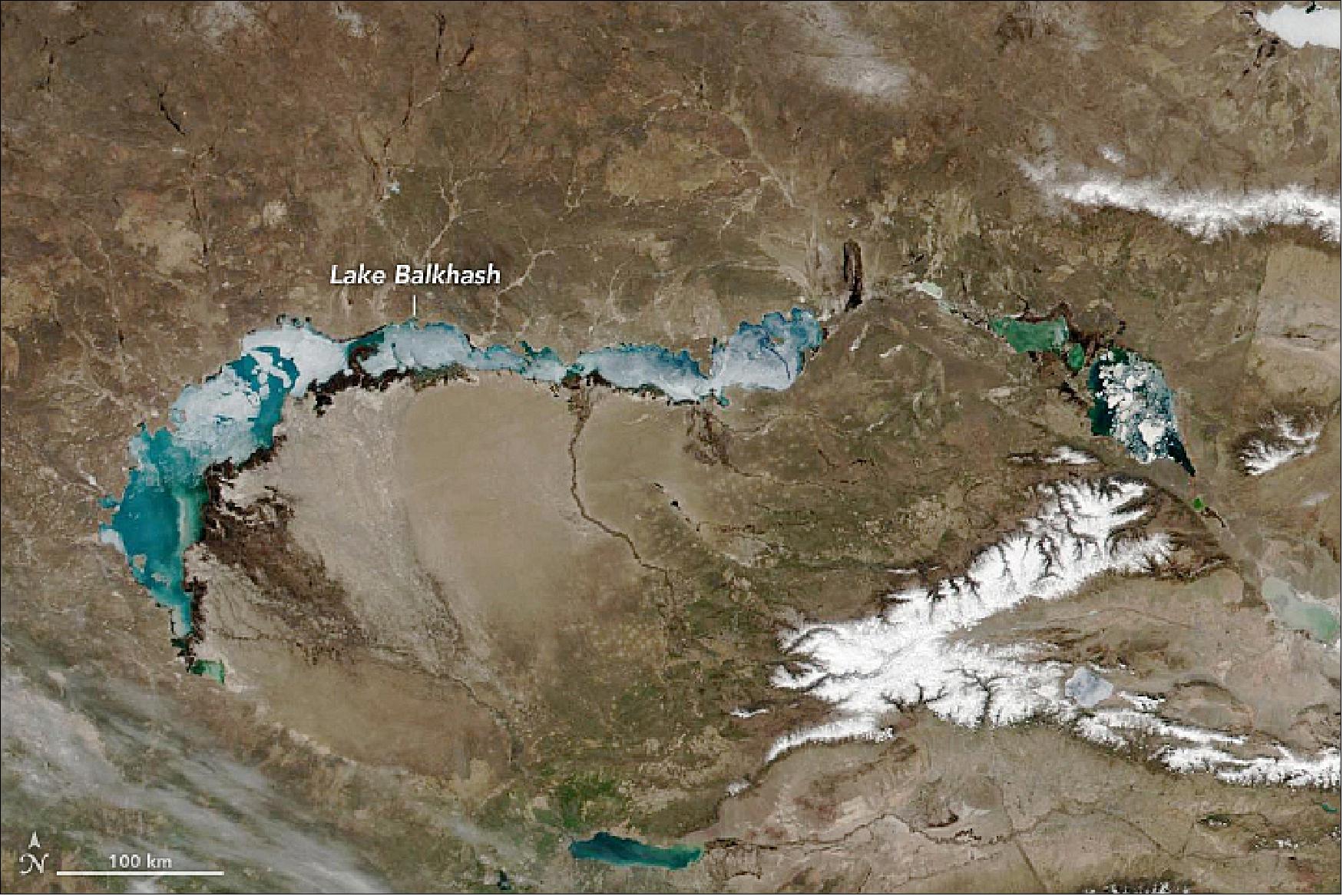
- Most of the water feeding the western portion of the lake comes from the Ili River, which is fed by meltwater runoff originating in the Tien Shan Mountains. (Part of that mountain chain, the Borohoro Range, is pictured with caps of snow and ice.) Research has found that degrading glaciers and melting snow in the Tien Shan have led to increases in the water level of Lake Balkash in recent decades. However, the authors note that if glacier degradation and melt continue, water level increases could quickly shift to decreases.
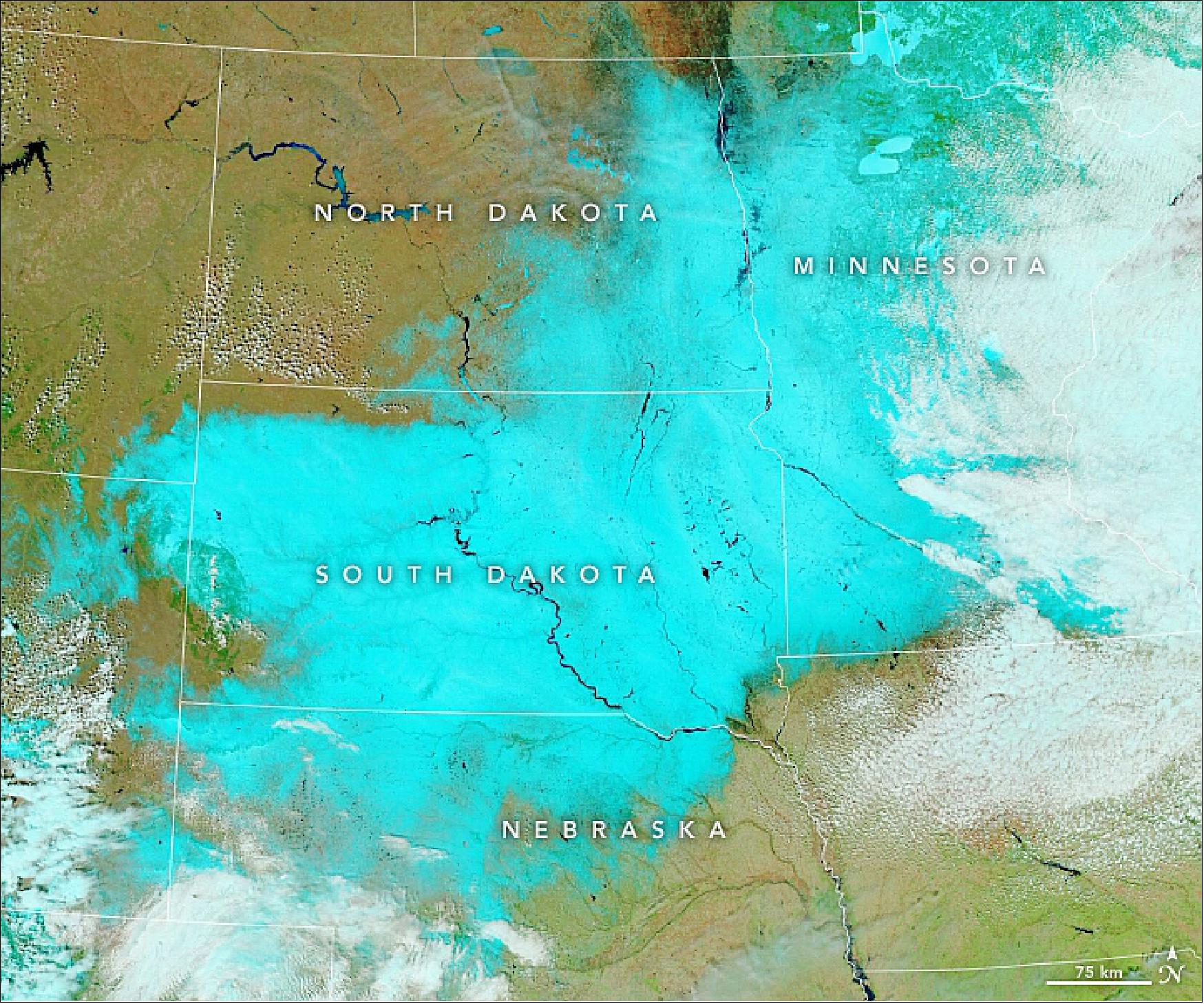
• April 16, 2019: For the second time in a month, an intense spring “bomb cyclone” plastered the Upper Midwest of the United States with snow and wind. While the April storm was not quite as strong as the blizzard in March, several states were hit with more than 12 inches (30 cm) of snow and by wind gusts exceeding 50 miles (80 km) per hour. 36)
- On April 10-12, 2019, whiteout conditions clogged roadways, caused tens of thousands of homes to lose power, and grounded hundreds of flights, according to news reports. South Dakota was one of the hardest hit states, with more than 24 inches (60 cm) of snow falling across much of the state.
- Many rivers in the region were already swollen with water (dark blue) before the storm arrived. Forecasters are wary that the influx of new snow could trigger new floods in the coming weeks; at a minimum, rivers will be high in the coming days. A few rivers in South Dakota—most notably the James and Big Sioux—were well above flood stage on April 15.
- The storm’s reach extended well beyond the Upper Midwest. As it pushed across the middle of the continent, it pulled in warm, dry air from the Southwest. Several meteorologists noted that it carried enough dust from Texas to color the snow in South Dakota and Minnesota in shades of yellow, brown, and orange.
• April 9, 2019: In late March 2019, tropical cyclone Veronica made landfall along the Pilbara coast in Western Australia. Dropping more than 46 cm (18 inches) of rain in some areas within 72 hours, the storm caused major flooding and spurred several home evacuations. The destructive winds and the rainfall runoff also stirred up offshore waters, with lingering effects. 37)
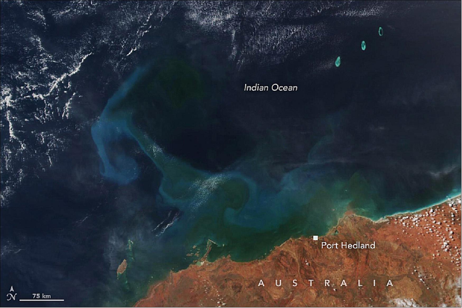
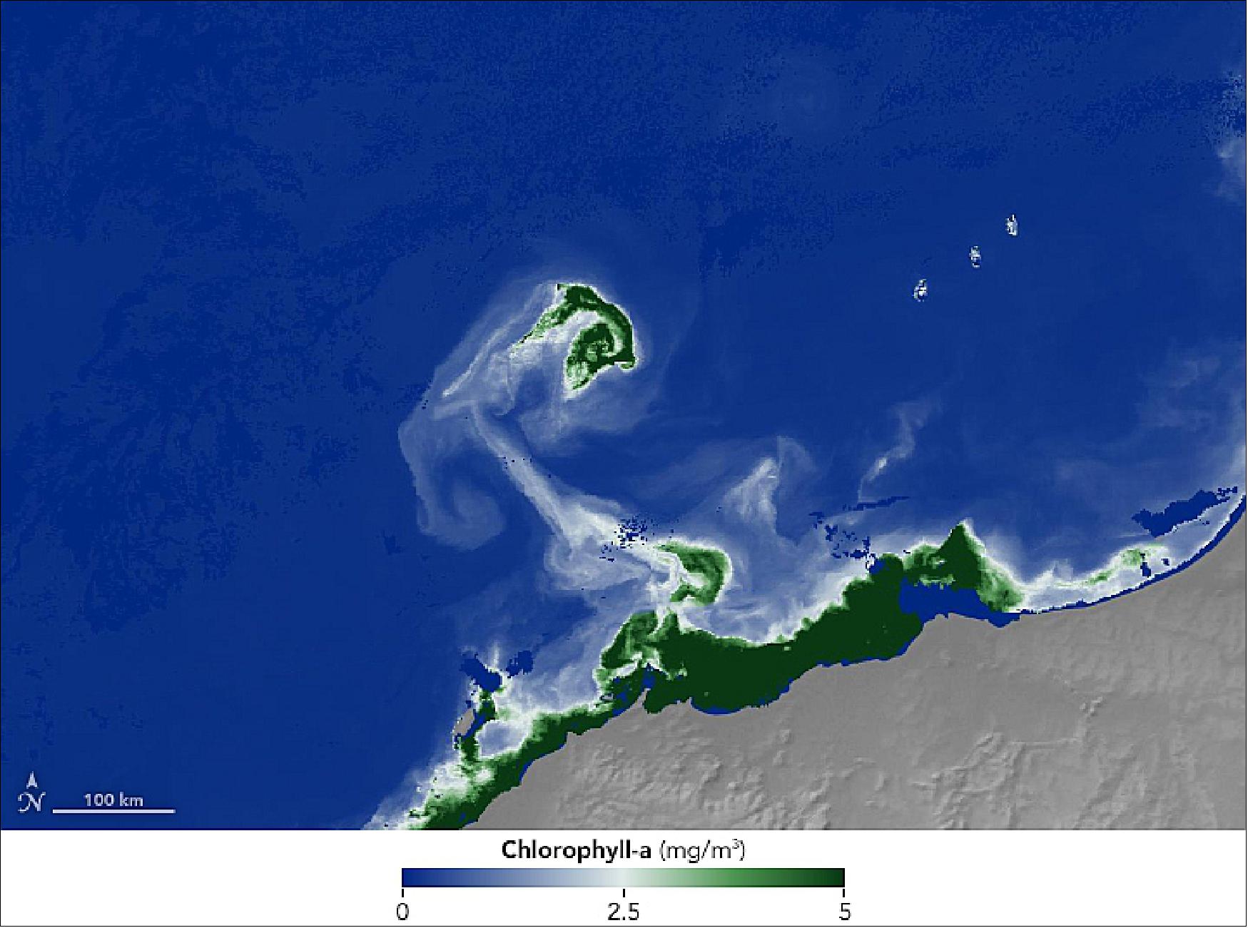
- Past studies have shown that cyclonic winds can stir up ocean waters and bring nutrients to the surface, promoting blooms of phytoplankton. In coastal waters, nutrients often come from the resuspension of seafloor sediments and from river runoff.
- “Sometimes you can see a bloom last for many days over the open ocean after a tropical cyclone has passed,” said Sen Chiao, meteorologist at San Jose State University and director of the NASA-funded Center for Applied Atmospheric Research and Education. Chiao added that Veronica seems to have pulled cooler water up from the ocean depths to the surface (upwelling), which provided more nutrients.
- A similar bloom also followed a tropical cyclone a few years ago in the same region of Western Australia.
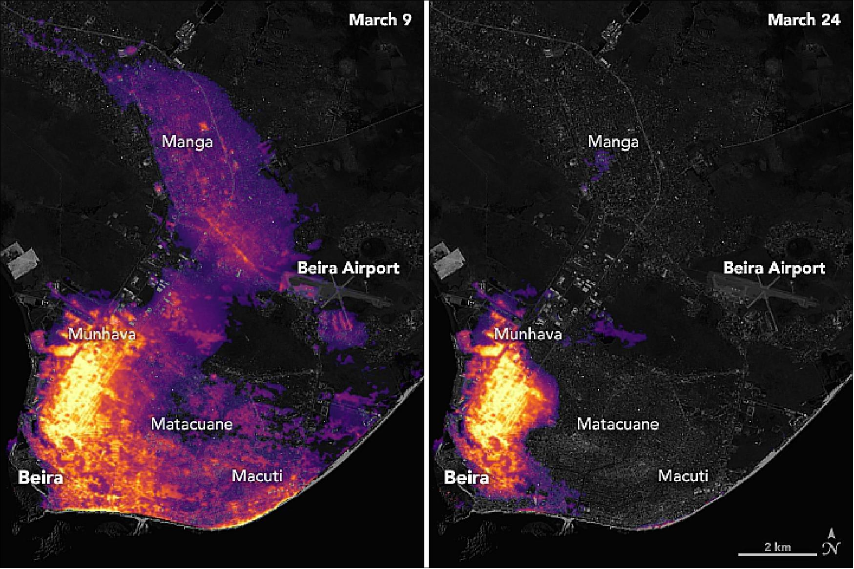
• March 26, 2019: On March 15, 2019, Tropical Cyclone Idai pummeled through eastern Africa causing catastrophic flooding, landslides, and large numbers of causalities across Mozambique, Malawi, and Zimbabwe. More than half a million people in Mozambique were affected, with the port city of Beira experiencing the most damage.38)
- The nighttime images of Beira’s nighttime lights (Figure 56) are based on data captured by the Suomi NPP satellite. The data were acquired by the VIIRS (Visible Infrared Imaging Radiometer Suite) “day-night band,” which detects light in a range of wavelengths from green to near-infrared, including reflected moonlight, light from fires and oil wells, lightning, and emissions from cities or other human activity. The base map makes use of data collected by the Landsat satellite.
- Note that these maps are not showing raw imagery of light. A team of scientists from NASA’s Goddard Space Flight Center and Marshall Space Flight Center processed and corrected the raw VIIRS data to filter out stray light from the Moon, fires, airglow, and any other sources that are not electric lights. Their processing techniques also removed as much other atmospheric interference—such as dust, haze, and thin clouds—as possible.
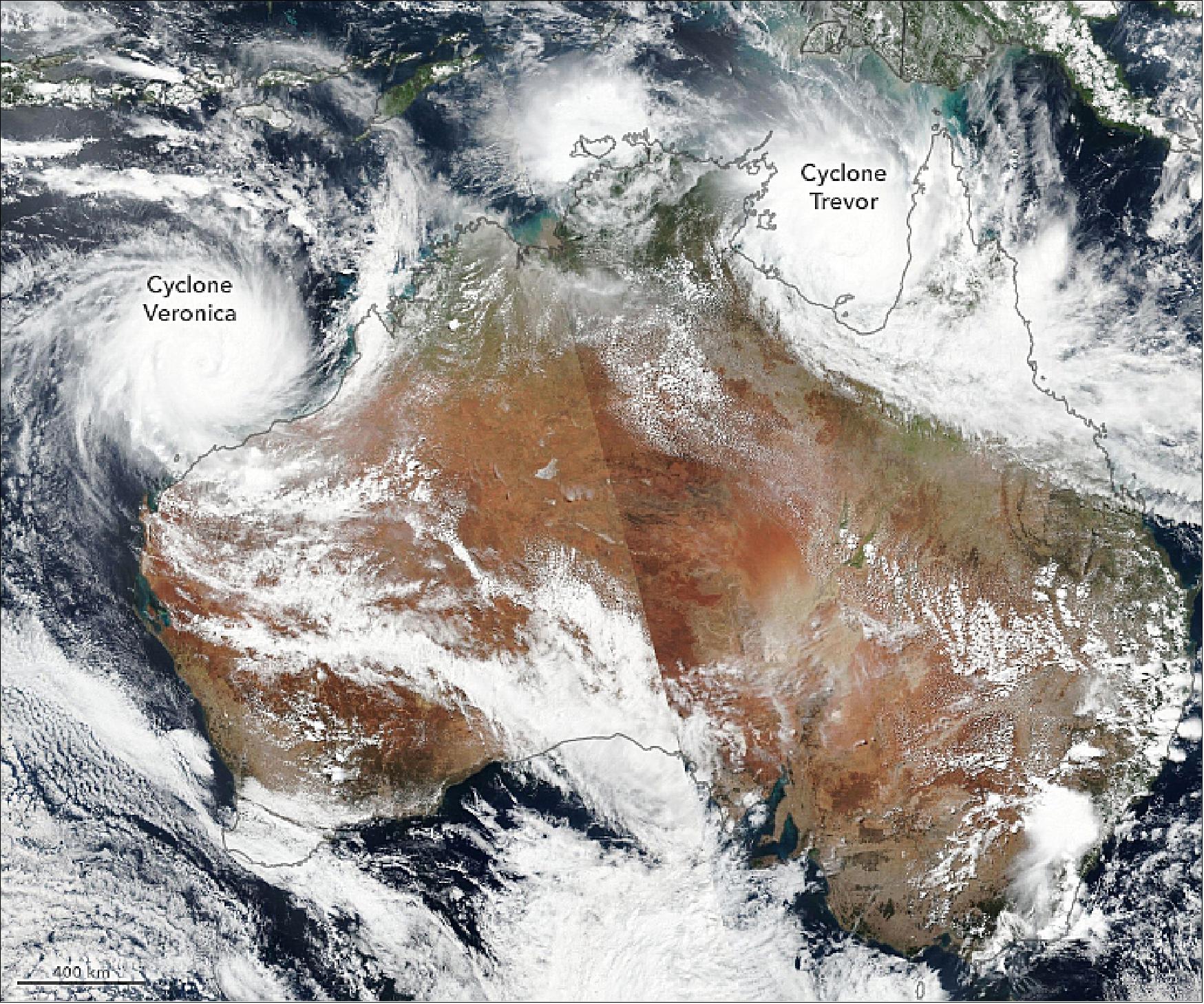
• March 23, 2019: Two severe tropical cyclones bore down on northern Australia at the start of autumn 2019. Cyclone season in the region stretches from November to April, peaking in February and March. 39)
- Cyclone Trevor first made landfall on the Cape York Peninsula as a category 3 storm on March 20. The storm weakened and meandered over land before intensifying again to a category 4 storm over the warm waters of the Gulf of Carpentaria (about 31 degrees Celsius). The government of the Northern Territory declared a state of emergency and launched the largest evacuation in the state since 1974.
- Trevor is predicted to make landfall again on March 23, bringing intense winds, a storm surge, and widespread rainfall of 100 to 200 mm (4 to 8 inches), with some areas seeing up to 300 mm (12 inches). Some inland desert areas could see as much rain in a few days as they receive across some entire years.
- At the same time, Cyclone Veronica was approaching Western Australia and headed for possible landfall on the Pilbara Coast by March 23 or 24. Veronica developed from a tropical low pressure system to a category 4 storm on March 20. The Australian Bureau of Meteorology has advised: “Widespread very heavy rainfall conducive to major flooding is likely over the Pilbara coast and adjacent inland areas over the weekend. Heavy rainfall is expected to result in significant river rises areas of flooding and hazardous road conditions.”
• February 28, 2019: The Manaro Voui volcano on the island of Ambae in the nation of Vanuatu in the South Pacific Ocean made the 2018 record books. A NASA-NOAA satellite confirmed Manaro Voui had the largest eruption of sulfur dioxide that year. 40) 41)
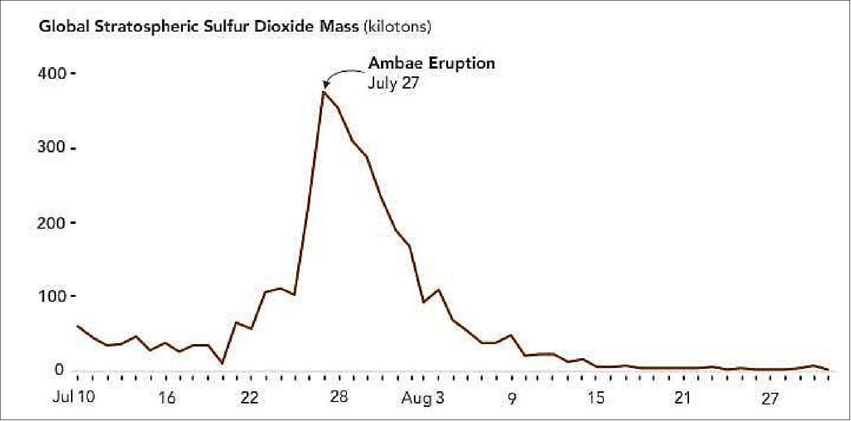
- The volcano injected 400,000 tons of sulfur dioxide into the upper troposphere and stratosphere during its most active phase in July, and a total of 600,000 tons in 2018. That’s three times the amount released from all combined worldwide eruptions in 2017.
- During a series of eruptions at Ambae in 2018, volcanic ash also blackened the sky, buried crops and destroyed homes, and acid rain turned the rainwater, the island’s main source of drinking water, cloudy and “metallic, like sour lemon juice,” said New Zealand volcanologist Brad Scott. Over the course of the year, the island’s entire population of 11,000 was forced to evacuate.
- At the Ambae volcano’s peak eruption in July, measurements showed the results of a powerful burst of energy that pushed gas and ash to the upper part of the troposphere and into the stratosphere, at an altitude of 10.5 miles. Sulfur dioxide is short-lived in the atmosphere, but once it penetrates into the stratosphere, where it combines with water vapor to convert to sulfuric acid aerosols, it can last much longer — for weeks, months or even years, depending on the altitude and latitude of injection, said Simon Carn, professor of volcanology at Michigan Tech.
- In extreme cases, like the 1991 eruption of Mount Pinatubo in the Philippines, these tiny aerosol particles can scatter so much sunlight that they cool the Earth’s surface below.
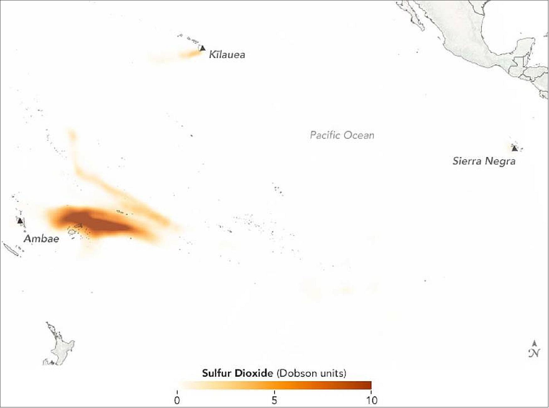
- The OMPS nadir mapper instruments on the Suomi-NPP and NOAA-20 (JPSS-1) satellites contain hyperspectral ultraviolet sensors, which map volcanic clouds and measure sulfur dioxide emissions by observing reflected sunlight. Sulfur dioxide (SO2) and other gases like ozone each have their own spectral absorption signature, their unique fingerprint. OMPS measures these signatures, which are then converted, using complicated algorithms, into the number of SO2 gas molecules in an atmospheric column.
- “Once we know the SO2 amount, we put it on a map and monitor where that cloud moves,” said Nickolay Krotkov, a research scientist at NASA Goddard’s Atmospheric Chemistry and Dynamics Laboratory.
- These maps, which are produced within three hours of the satellite’s overpass, are used at volcanic ash advisory centers to predict the movement of volcanic clouds and reroute aircraft, when needed.
- Mount Pinatubo’s violent eruption injected about 15 million tons of sulfur dioxide into the stratosphere. The resulting sulfuric acid aerosols remained in the stratosphere for about two years, and cooled the Earth’s surface by a range of 1 to 2 degrees Fahrenheit.
- This Ambae eruption was too small to cause any such cooling. “We think to have a measurable climate impact, the eruption needs to produce at least 5 to 10 million tons of SO2,” Carn said.
- Still, scientists are trying to understand the collective impact of volcanoes like Ambae and others on the climate. Stratospheric aerosols and other volcanic gases emitted by volcanoes like Ambae can alter the delicate balance of the chemical composition of the stratosphere. And while none of the smaller eruptions have had measurable climate effects on their own, they may collectively impact the climate by sustaining the stratospheric aerosol layer.
- “Without these eruptions, the stratospheric layer would be much, much smaller,” Krotkov said.
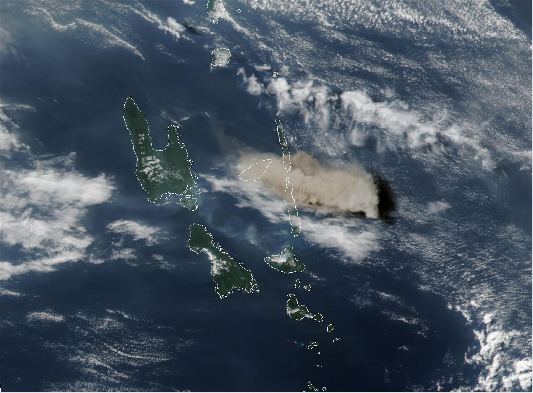
• January 28, 2019: Large fires fueled by extremely dry and hot conditions have been burning for almost two weeks in central and southeast Tasmania, the southernmost state of Australia. This image was acquired on January 28, 2019, by the VIIRS (Visible Infrared Imaging Radiometer Suite) on the Suomi NPP satellite. 42)
- As of January 28, the Tasmania Fire Service reported 44 fires. The Great Pine Tier fire in the Central Plateau had burned more than 40,000 hectares. The Riveaux Road fire in the south had burned more around 14,000 hectares. News outlets reported smoke from some of the fires was visible as far away as New Zealand.
- The Tasmania Fire Service issued several emergency warnings to residents to relocate, as dangerous fire conditions and strong wind persist.
1) ”Gati Makes Historic Landfall in Somalia,” NASA Earth Observatory, Image of the Day for 25 November 2020, URL: https://earthobservatory.nasa.gov/
images/147576/gati-makes-historic-landfall-in-somalia
2) ”A Busy Season for Crop Fires in Northwestern India,” NASA Earth Observatory, Image of the Day for 18 November 2020, URL: https://earthobservatory.nasa.gov/
images/147547/a-busy-season-for-crop-fires-in-northwestern-india
3) ”Vamco Thrashes the Philippines,” NASA Earth Observatory, Image of the Day for 13 November 2020, URL: https://earthobservatory.nasa.gov/images/147525/vamco-thrashes-the-philippines
4) ”Large, Deep Antarctic Ozone Hole in 2020,” NASA Earth Observatory, Image of the Day for 2 November 2020, URL: https://earthobservatory.nasa.gov/images/147465/large-deep-antarctic-ozone-hole-in-2020
5) ”A Meeting of Smoke and Storms,” NASA Earth Observatory, Image of the Day for 19 September 2020, URL: https://earthobservatory.nasa.gov/images/147293/a-meeting-of-smoke-and-storms
6) ”A Slew of September Storms,” NASA Earth Observatory, Image of the Day for 15 September 2020, URL: https://earthobservatory.nasa.gov/images/147283/a-slew-of-september-storms
7) ”Typhoon Bavi Approaches Korean Peninsula,” NASA Earth Observatory, Image of the Day for 26 August 2020, URL: https://earthobservatory.nasa.gov/images/147166/typhoon-bavi-approaches-korean-peninsula
8) ”Double Cloud Trouble,” NASA Earth Observatory, Image of the Day for 17 August 2020, URL: https://earthobservatory.nasa.gov/images/147115/double-cloud-trouble
9) ”Hunting for Ice on Hudson Bay,” NASA Earth Observatory, Image of the Day for 10 August 2020, URL: https://earthobservatory.nasa.gov/images/147086/hunting-for-ice-on-hudson-bay
10) ”Another Intense Summer of Fires in Siberia,” NASA Earth Observatory, Image of the Day for 7 August 2020, URL: https://earthobservatory.nasa.gov/images/147083/another-intense-summer-of-fires-in-siberia
11) ”Hurricane Douglas Heads Toward Hawaii,” NASA Earth Observatory, Image of the Day for 25 July 2020, URL: https://earthobservatory.nasa.gov/images/147028/hurricane-douglas-heads-toward-hawaii
12) Rob Gutro, ”NASA Observes Large Saharan Dust Plume Over Atlantic Ocean,” NASA, 19 June 2020, URL: https://www.nasa.gov/feature/goddard/2020/
nasa-observes-large-saharan-dust-plume-over-atlantic-ocean
13) ”Nighttime Waves Over the South Atlantic,” NASA Earth Observatory, Image of the Day for 16 May 2020, URL: https://earthobservatory.nasa.gov/images/146723/
nighttime-waves-over-the-south-atlantic?utm_source=carousel&utm_campaign=home
14) ”Ocean acidification prediction now possible years in advance,” University of Colorado Boulder, 04 May 2020, URL: https://www.labmanager.com/news/
ocean-acidification-prediction-now-possible-years-in-advance-22580
15) Riley X. Brady, Nicole S. Lovenduski, Stephen G. Yeager, Matthew C. Long & Keith Lindsay, ”Skillful multiyear predictions of ocean acidification in the California Current System,” Nature Communications volume, Volume 11, Article number: 2166, Published: 01 May 2020, https://doi.org/
10.1038/s41467-020-15722-x, https://www.nature.com/articles/s41467-020-15722-x.pdf
16) ”Tropical Cyclone Harold Blasts Vanuatu,” NASA Earth Observatory, Image of the Day for 7 April 2020, URL: https://earthobservatory.nasa.gov/images/146544/tropical-cyclone-harold-blasts-vanuatu?src=eoa-iotd
17) ”Cloud Streets Over the Labrador Sea,” NASA Earth Observatory, Image of the Day for 5 March 2020, URL: https://earthobservatory.nasa.gov/images/146387/cloud-streets-over-the-labrador-sea
18) ”Cyclones over Australia,” NASA Earth Observatory, 25 February 2020, URL: https://earthobservatory.nasa.gov/images/146352/cyclones-over-australia
19) ”Great Lakes, Not so Great Ice,” NASA Earth Observatory, Image of the Day for 20 February 2020, URL: https://earthobservatory.nasa.gov/images/146317/great-lakes-not-so-great-ice
20) ”Canada Lit by Aurora and Moonlight,” NASA Earth Observatory, 6 February 2020, URL: https://earthobservatory.nasa.gov/images/146260/canada-lit-by-aurora-and-moonlight
21) ”Sulfur Spews from Taal,” NASA Earth Observatory, Image of the Day for 14 January 2020, Instruments: Himawari-8, Suomi NPP — OMPS , URL: https://earthobservatory.nasa.gov
/images/146142/sulfur-spews-from-taal
22) Colin Seftor, Rob Gutro, Lynn Jenner, ”NASA Animates World Path of Smoke and Aerosols from Australian Fires,” NASA Feature, 9 January, 2020, URL: https://www.nasa.gov/feature/
goddard/2020/nasa-animates-world-path-of-smoke-and-aerosols-from-australian-fires
23) ”Cloud Streets Stream Over the Great Lakes,” NASA Earth Observatory, 10 December 2019, URL: https://earthobservatory.nasa.gov/images/145973/cloud-streets-stream-over-the-great-lakes
24) ”Early Season Fires Burning in New South Wales,” NASA Earth Observatory, Image of the Day for 9 November 2019, URL: https://earthobservatory.nasa.gov/
images/145859/early-season-fires-burning-in-new-south-wales
25) ”Dust Storm in Southern Africa,” NASA Earth Observatory, Image of the Day for 26 September 2019, URL: https://earthobservatory.nasa.gov/images/145659/dust-storm-in-southern-africa
26) Rob Gutro, ”NASA-NOAA’s Suomi NPP Tracks Fire and Smoke from Two Continents,” NASA Feature, 13 September 2019, URL: https://www.nasa.gov/feature/goddard/2019/
nasa-noaa-s-suomi-npp-tracks-fire-and-smoke-from-two-continents
27) Jenny Marder ,”Suomi-NPP Satellite Instrument Restored After Radiation Damage,” NASA feature, 9 September 2019, URL: https://www.nasa.gov/feature/goddard/
2019/suomi-npp-satellite-instrument-restored-after-radiation-damage
28) ”Dorian Reaches South Carolina,” NASA Earth Observatory, Image of the Day for 6 September 2019, URL: https://earthobservatory.nasa.gov/images/145565/dorian-reaches-south-carolina
29) ”Fire Races Across Gran Canaria,” NASA Earth Observatory, Image of the day for 20 August 2019, URL: https://earthobservatory.nasa.gov/images/145480/fire-races-across-gran-canaria?src=eoa-iotd
30) ”Nighttime Swirls,” NASA Earth Observatory, Image of the Day for 19 August 2019, URL: https://earthobservatory.nasa.gov/images/145471/nighttime-swirls?src=eoa-iotd
31) ”Typhoon Lekima Nears China,” NASA Earth Observatory, Image of the Day for 10 August 2019, URL: https://earthobservatory.nasa.gov/images/145449/typhoon-lekima-nears-china
32) ”Wildfires Threaten Northern Alberta,” NASA Earth Observatory, 22 May 2019, URL: https://earthobservatory.nasa.gov/images/145086/wildfires-threaten-northern-alberta
33) ”Fires Burn Across the UK,” NASA Earth Observatory, 7 May 2019, URL: https://earthobservatory.nasa.gov/images/145005/fires-burn-across-the-uk
34) ”Choking on Saharan Dust,” NASA Earth Observatory, 01 May 2019, URL: https://earthobservatory.nasa.gov/images/144970/choking-on-saharan-dust
35) ”Melting on Lake Balkhash,” NASA Earth Observatory, Image of the day, 17 April 2019, URL: https://earthobservatory.nasa.gov/images/144833/melting-on-lake-balkhash
36) ”Another Blizzard Wallops the Upper Midwest,” NASA Earth Observatory, 16 April 2019, URL: https://earthobservatory.nasa.gov/images/144829/another-blizzard-wallops-the-upper-midwest
37) ”A Bloom after the Storm,” NASA Earth Observatory, 9 April 2019, URL: https://earthobservatory.nasa.gov/images/144774/a-bloom-after-the-storm?src=eoa-iotd
38) ”Darkness in the Wake of Idai,” NASA Earth Observatory, 26 March 2019, URL: https://earthobservatory.nasa.gov/images/144743/darkness-in-the-wake-of-idai
39) ”Northern Australia Braces for a Pair of Cyclones,” NASA Earth Observatory, Image of the day for 23 March 2019, URL: https://earthobservatory.nasa.gov/
images/144733/northern-australia-braces-for-a-pair-of-cyclones
40) Jenny Marder, Lynn Jenner, ”2018’s Biggest Volcanic Eruption of Sulfur Dioxide,” NASA Feature, 28 February 2019, URL: https://www.nasa.gov/feature/
goddard/2019/2018-s-biggest-volcanic-eruption-of-sulfur-dioxide
41) ”2018’s Biggest Volcanic Eruption of Sulfur Dioxide,” NOAA, 28 February 2019, URL: https://www.jpss.noaa.gov/news.html
42) ”Fortnight Fires in Tasmania,” NASA Earth Observatory, 28 January 2019, URL: https://earthobservatory.nasa.gov/images/144486/fortnight-fires-in-tasmania
The information compiled and edited in this article was provided by Herbert J. Kramer from his documentation of: ”Observation of the Earth and Its Environment: Survey of Missions and Sensors” (Springer Verlag) as well as many other sources after the publication of the 4th edition in 2002. - Comments and corrections to this article are always welcome for further updates (herb.kramer@gmx.net).